Form properties
The form tab of the properties panel to the right lets you change basic settings such as the default CSS layout, the form's maximum width and the error style for invalid form fields.
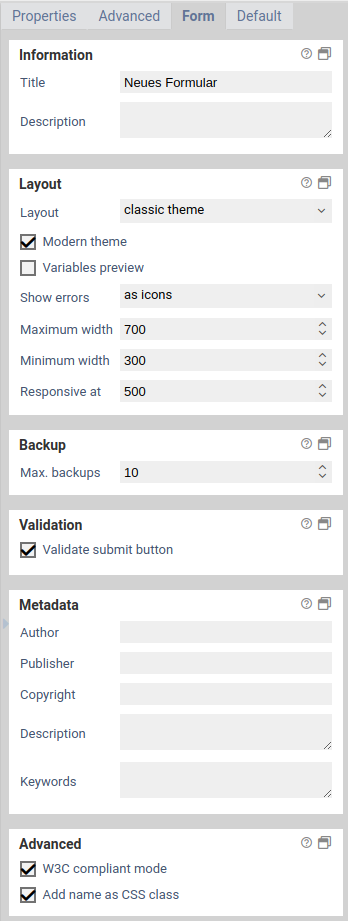
You can change the base settings of the form by clicking on the form tab of the properties panel.
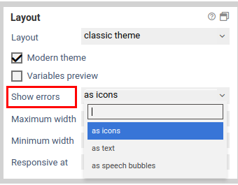
When a required fields was left empty, an error message is shown. This settings lets you change how this error message looks like.
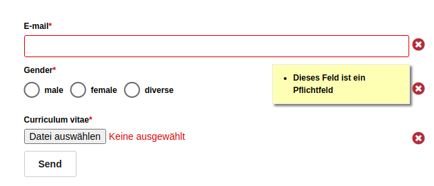
Displaying the error message as a speech bubble below a form element.
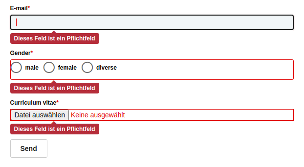
Displaying the error as an icon next to a form element. Hover over the icon with the mouse to view the error message.
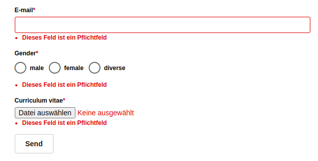
Displaying the error message as text below a form element.
| name | description |
|---|---|
| Title | The form's title. It will be also be shown as the page title in the browser. |
| Description | Description of this form. This is meant for internal use only. When you open the form, this description is not shown anywhere. |
| Layout | The layout (CSS) of the form. The default layout is always available. To add new layouts, create a new CSS templates. After selecting a new layout you can see the changes immediately. |
| Modern theme | When checked, applies some default styles that make the form look more modern. Checkboxes and radio buttons are rendered with custom icons. |
| Placeholder preview | Specifies whether the content of variables that are used in the form should be displayed in the Xima® Formcycle Designer instead of the variable. |
| Show errors | Specifies how errors are displayed. To change the default error messages, edit the global template i18n variables gehalten. |
| Max. width | Maximum width of the form in pixels. |
| Min. width | Minimum width of the form in pixels. Normally, form elements are scaled to fit the width of the browser window. When browser window is smaller than the minimum width, form elements are not scaled anymore, and a vertical scrollbar appears in the browser. |
| Responsive at | Width when the form is displayed in responsive mode. If the width of the browser window is smaller than the specified value, optimizations for mobile devices are applied. All items grouped together in rows are rearranged vertically such that each form field now takes up an entire row. |
| Max. backups | Maximale number of form backups. Each time you save the form, a new backup is created. |
| Validate submit button | If enabled, a check is made to see if the submit button really existed at the time the form was provided. If a submit button event is used in the workflow, this can be used to prevent manipulation of the workflow. |
| Author | Metadata field whose content is placed as a <meta> tag with the name attribute author in the HTML header of the form. |
| Publisher | Metadata field whose content is placed as a <meta> tags with the name attributes publisher and DC.Publisher in the HTML header of the form. |
| Copyright | Metadata field whose content is placed as a <meta> tag with the name attribute copyright in the HTML header of the form. |
| Description | Metadata field whose content is placed as a <meta> tags with the name attributes description and DC.Description in the HTML header of the form. |
| Keywords | Metadata field whose content is placed as a <meta> tag with the name attribute keywords in the HTML header of the form. |
| W3C compliant mode | Makes sure that the HTML generated by the form is well-formed and valid according to the W3C specification W3C. This mode is enabled by default for new forms. When W3C mode is enabled, some attributes on the HTML elements are no longer available, such as cn= and xn=. Therefore, in JavaScript and CSS the [data-cn=...], [data-name=...], [data-xn=...] etc. selectors should be used. The new data attributes are written to the form elements with both W3C mode active and disabled. |
| Append name as CSS class | If enabled, a CSS class with its name will be added to all form elements. This option is enabled by default for new forms. If enabled, you can use $(".tfEmail") instead of $("[name='tfEmail']"). |