Widget-Plugin: Sprachauswahlelement
Funktionsbeschreibung
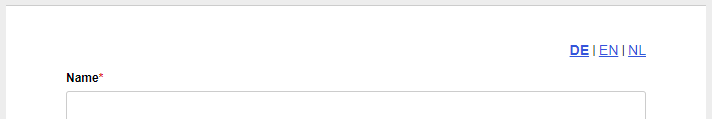
Das Plugin stellt ein neues Widget im Designer zur Verfügung, welches es erlaubt, auf einfache Art eine Auswahlleiste für die Formularsprache einzufügen. Das Widget verwendet individuell im Designer zu konfigurierende Einstellungen im Bezug auf die anzuzeigenden Sprachen und die für sie anzuzeigenden Namen.
Durch einen Klick im Widget auf eine Sprache wird das Formular mit bereits eingegebenen Werten in den entsprechenden Sprache neu geladen.
Zu beachten ist hier, dass es aufgrund von Sicherheitsbeschränkungen der Browser nicht möglich ist, vom Nutzer ausgewählte Dateien in Upload-Elementen wieder einzutragen. Wenn die Option "Automatischer Upload" aktiviert ist, werden Dateien aber gespeichert.
Installation
Das Plugin kann als Mandant-Plugin oder System-Plugin installiert werden. Eine Anleitung zur Installation von Plugins finden Sie hier.
Konfiguration
An Widgets dieses Typs können die folgenden Eigenschaften konfiguriert werden:
Basic properties
Basic settings for Basic properties
The basic properties name, width and hidden are available for all form elements.

| Name | Description |
|---|---|
| Element | You can change an element's type via the drop down menu. For example, you could change a single input field into a multi line input field (textarea). The element types that are available depend on the original element type. Container and fieldsets cannot be changed into other form elements. |
| Name | Technical name of the elements. Only letters and numbers are allowed. The name is used, for example, to refer to the form field during workflow processing. To change the name and update the references to this form element at the same time the Rename form elements function should be used. |
| Alias | An alternative technichal name that may contain any character. |
| Width | The width of the form element, relative to other elements in the same row. For example, when you place three elements next to each other in the same row and set their widths to 10, 10 und 30, they will take up 20% (=10/(10+10+30)), 20%, and 60% of the entire width of the row, respectively. |
| Hidden | When enabled, the form element is hidden and will not be visible to the user. If you wish to hide or show the element dynamically, depending on the value of another element, use the hidden if condition or a JavaScript function such as jQuery.fn.visible. |
| Disabled | When enabled, the value of the form element cannot be edited. Also, the value will not be transmitted to the server when the user submits the form. For text input fields you can optionally decide whether you want to transmit the value when the form is submitted. |
| Repeat | When enabled, the user can create an arbitrary amount of repetition (copies) of the element. This is useful, for example, when the user needs to enter one or more email addresses. Please note that repeated elements cannot be nested: A container or fieldset that is repeated cannot contain elements that are also repeated. |
| Min repetitions | Minimum number of repetition that must exist. When this limit is reached, the user cannot delete any more repetitions. This limit is also the initial number of repeated elements that are displayed when the form is opened for the first time. |
| Max repetitions | Maximumer of allowed repetitions. When this limit is reached, the user cannot add anymore more repetitions. |
| Repeat trigger | When an element is selected, the value of that element determines how many repetitions are created. For example: A select element or input field lets the user enter the number of children they have. A fieldset with the personal data of a child is marked as repeated, and its trigger is set to the select or input field. Now, when the user changes the number of children, the appropriate number of fieldsets are created automatically. |
| Hide buttons | Available only when a repeat trigger was set. When enabled, the plus and minus buttons for adding and removing elements are hidden. This is useful when the number of repetitions should depend only on the value of another field and the user should not be able to alter the number of repetitions directly. |
Alias
When a form is submitted, the entered data is transmitted as key value pairs (element name value. The name must contain only letters and number. You can use the name of an element as form variables during workflow processing to refer to the transmitted values. The name is also used when sending the submitted data to other system via an interface. Sometimes, when you need to integrate external third-party system into FORMCYCLE, the external system may require a particular name for a form field, which may include special character. In this case, you can use the alias name, which allows all special characters to be entered.
When an alias was set, you can use that alias instead of the orignal name to refer to the form field.
Renaming form elements
If form elements are simply renamed, parts of the JavaScript or form workflow may no longer work correctly because they reference the form element by its name. By clicking on the pencil icon next to the form element name, the form element can be renamed, updating all references to the form element at the same time. You can select where to search for references to the form element:
- in the JavaScript area of the form
- in the CSS area of the form
- in JavaScript form files
- in CSS form files
- in the workflow of the form
- for elements on the property "Value"
- for elements on the property "Buttons"
- for elements on the property "Options"
If a reference is found in the selected areas, it will be updated with the new name.
You need to pay special attention to JavaScript code. Common ways of referencing a form element are taken care of. The name in usual selectors such as $('[name="tfEmail"]') is replaced with the new name. However, uncommon selectors such as document.getElementByName("tfEmail") are not replaced.
Moreover, please note that it is not possible, even in principle, to replace all references in a complex programming language such as JavaScript. For example, the name may be be taken from a variable, from a computation or from an external data source: ["EMail", "Vorname", "Nachname"].forEach(name => $(`[name="tf${name}"]`).clear()). Such cases require you to adjust the JavaScript manually. If you have forms with complex JavaScript code, you should always evaluate the effects of renaming a form element beforehand.
This form elements does not possess any additional settings for the section Basic properties.
Darstellung
In diesem Bereich kann für Sprachauswahl-Widgets nur die Positionierung des Inhalts relativ zur Seite eingetragen werden.
Optionen
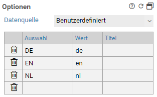
Sprachauswahl-Widgets verfügen über einen zusätzlichen Bereich Optionen. Hier können die in der Sprachauswahl sichtbaren Sprachen und die für die jeweilige Sprache anzuzeigenden Namen festgelegt werden.
Für jede anzuzeigende Sprache ist eine Zeile mit dem sichtbaren Beschreibungstext und dem Kürzel der Sprache einzugeben (z.B. en für Englisch). Optional können in der Spalte Titel die Title-Attribute festgelegt werden. Die Sprachen müssen im Designer unter Formularsprache gepflegt werden, damit eine Übersetzung auch tatsächlich durchgeführt wird.
Neben der Konfiguration der Optionen direkt am Widget ist es zudem möglich, eine CSV-Datenquelle zu verwenden. Diese kann im Auswahlelement Datenquelle selektiert werden.
Help
Basic settings for Help
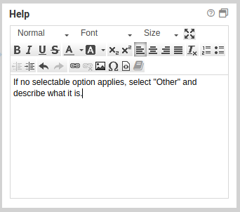

This feature allows you to add an explanation or help text to a form element. By default, the help text is empty. Once you enter a help text, you will see a help icon appear next to the form element. When the user hovers over the help icon with the mouse, the help text is shown as an overlay.
To change the design of the help icon or the overlay bubble, create your own CSS theme.
This form elements does not possess any additional settings for the section Help.
CSS classes
Basic settings for CSS classes
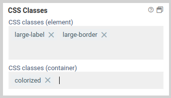
7.0.11+ This property lets you select one or many CSS classes for an element. You can enter any class name you want, and you do not have do include a dot at the beginning (an initial dot is supported for backwards compatibility). In addition, classes defined in CSS files are suggested as autocomplete suggestions. You can add classes to the form element itself, and you can also add classes to the div container of the form element.
CSS classes on the input element are added directly to the HTML input element. This is the same behavior as in previous versions when you added CSS classes to an element.
CSS classes configured for the container, on the other hand, are added to the HTML container element which contains the input element. This is a new feature introduced in 7.0.13. It makes it possible, for example, to style the label of a form element, which is located in the same container as the input element.
Until 7.0.10+ : The available CSS classes are read from the CSS in the CSS tab and from the selected CSS theme. When you select or deselect a class, the changes are applied immediately and any layout or design changes are visible in the form. You can also filter the available classes by using the filter at the end of the list.
This form elements does not possess any additional settings for the section CSS classes.
Attributes
Basic settings for Attributes
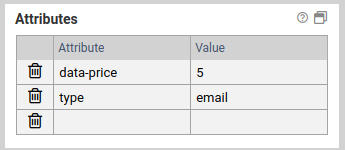
The panel attributes lets you add custom attributes to the corresponding HTML elements of each form element. You can access them with JavaScript later, or add existing HTML attributes such as the attribute type for <input> elements.
Adding an attribute
To add an HTML attribute, just enter the name and the value of the attribute into one of the columns. A new, empty column will be added automatically.
Deleting an attribute
Click on the icon to the left to delete an attribute.
Accessing data attributes via JavaScript
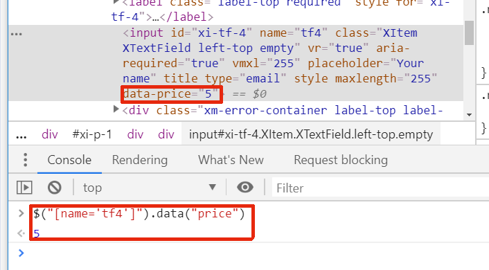
If you want to add custom data to an element, use the prefix data- for the name. Additionally, the attribute name should contain no uppercase letters and use dashes to separate words. For example, data-serial-version is a good data attribute, dataSerialVersion is not. When accessing these attributes via JavaScript, remove the dashes and capitalize the first letter of each word.
Assuming the attribute data-serial-version was set to 1aFXc for the element tfSerialVer, you can access this data as follows:
console.log("Serial version is:" , serialVersion);
This form elements does not possess any additional settings for the section Attributes.
Available only if
Basic settings for Available only if
The property Available only if controls whether elements are displayed or not depending on the current state or user.
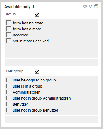
When only one state or a user group is selected, the form element is displayed only when the form is in the selected state or viewed by a user of the selected user group. For each state and user group there is also the opposite option to display a form element only when it is not in the selected state or not viewed by the selected user group. For example, when you want display a form element only when a user fills out the form for the first time, you can select the option no state.
If both a state and a user group are selected, the form element is displayed only when the form is both in the selected state as well as opened by a user belonging to one of the selected user groups.
This form elements does not possess any additional settings for the section Available only if.
Other
Basic settings for Other
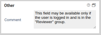
You can add a comment for internal use that will not appear anywhere in the form.
This form elements does not possess any additional settings for the section Other.
Word-/PDF-Export
Standardmäßig ist das Widget so konfiguriert, dass es nicht im Word-/PDF-Export auftaucht. Es ist auch nicht sinnvoll, an dieser Einstellung etwas zu ändern, da das Element in einem exportierten Formular keine Funktion hat.
Mögliche CSS-Anpassungen
Um das Aussehen des Widgets zu individualisieren, können per CSS Anpassungen vorgenommen werden.
Zum Beispiel kann das standardmäßig Unterstreichen der Spracheauswahlen entfernent werden:
text-decoration: none;
}
Die Farbe der aktiven Sprache kann wie folgt verändert werden:
color: red;
}
Versionshistorie
2.0.3
- Fehler beim Neuladen des Formulars in der aktuellen Sprache bei Browser-Navigation behoben
2.0.2
- CSS-Konflikte mit Leitfaden-Plugin behoben
- Probleme beim Zugriff auf die JQuery-Bibliothek behoben
2.0.1
- Fix: Nutze Rquest-URL zum Laden des Formulars bei Sprachwechsel. Bisher ging der Sprachwechsel etwa nicht im Postfach oder bei der Einbindung via AJAX.
- Feature: Beim Wechsel der Sprache wird in der Adresszeile des Browsers die URL angepasst. Damit wird die richtige Sprache genommen, wenn etwa die Seite im Browser neugeladen wird.
- Erfordert wenigstens FORMCYCLE 7.0.7+
2.0.0
- Update für Xima® Formcycle 7