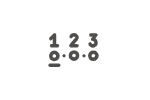
Widget-Plugin: Navigationsleiste
Plugin-Download (erfordert Anmeldung)
Funktionsbeschreibung
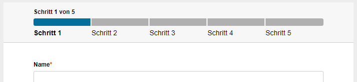
Das Plugin stellt ein neues Widget im Designer zur Verfügung, welches es erlaubt, auf einfache Art eine Navigationsleiste auf Formularseiten einzufügen. Das Widget verwendet individuell im Designer zu konfigurierende Einstellungen im Bezug auf die Benamung der Links und die Seiten auf die diese verweisen. Durch einen Klick im Widget auf vorangegangende Seiten, kann zu diesen zurückgesprungen werden.
Das Navigationsleisten-Widget kann im Header oder Footer des Formulars platziert werden, wodurch man es nur ein Mal konfigurieren muss. Anderenfalls, muss je ein Navigationsleisten-Widget auf jeder Seite, auf der eins sichtbar sein soll, eingefügt und entsprechend konfiguriert werden. In diesem Fall empfiehlt es sich, die Konfiguration einmalig vorzunehmen und das konfigurierte Widget dann zu kopieren und auf den anderen Seiten einzufügen oder die Konfiguration in einer Datenquelle. zu hinterlegen und diese bei Optionen als Quelle auszuwählen.
Installation
Das Plugin kann als Mandant-Plugin oder System-Plugin installiert werden. Eine Anleitung zur Installation von Plugins finden Sie hier.
Konfiguration
An Widgets dieses Typs können die folgenden Eigenschaften konfiguriert werden:
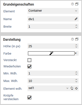
Grundeigenschaften
Basiseinstellungen für Grundeigenschaften
Die Grundeigenschaften Name, Breite und Versteckt stehen jedem Formularelement zur Verfügung.

| Name | Beschreibung |
|---|---|
| Element | Elementtyp des Formularelements. Der Elementtyp kann durch Auswahl eines anderen Elementtyps aus dem Dropdown-Menü geändert werden. Die Elementtypen, in die ein Element umgewandelt werden kann, hängen dabei vom ursprünglichen Typ ab. Container und Fieldsets können nur in den jeweils anderen Elementtyp transformiert werden. Alle anderen Elementtypen können in jeden anderen Typ transformiert werden, außer in Container und Fieldsets. |
| Name | Name des Elements. Es sind nur Buchstaben und Zahlen erlaubt. Um den Namen zu ändern und gleichzeitig die Referenzen auf dieses Formularelement zu aktualisieren sollte die Funktion zum Umbenennen von Formularelementen verwendet werden. |
| Alias | Ein alternativer Name für das Formularelement, der alle Zeichen enthalten darf. |
| Breite | Relative Breite des Elements zu anderen Elementen in einer Formularzeile. Sind etwa drei Elemente nebeneinander platziert und haben für die Breite die Werte 10, 10 und 30 so nehmen sie in dieser Reihenfolge 20%, 20% und 60% der gesamten Breite der Formularzeile ein. |
| Versteckt | Ist hier ein Häkchen gesetzt, so wird das Element versteckt. Um es wieder anzuzeigen, kann die Eigenschaft sichtbar wenn oder eine entsprechende JavaScript-Funktion wie jQuery.fn.visible verwendet werden. |
| Gesperrt | Der Inhalt des Formularelementes kann nicht editiert werden. Der Inhalt wird auch beim Absenden nicht übertragen. Für Textfelder kann zudem ausgewählt werden, ob der Inhalt beim Absenden übertragen wird oder nicht. |
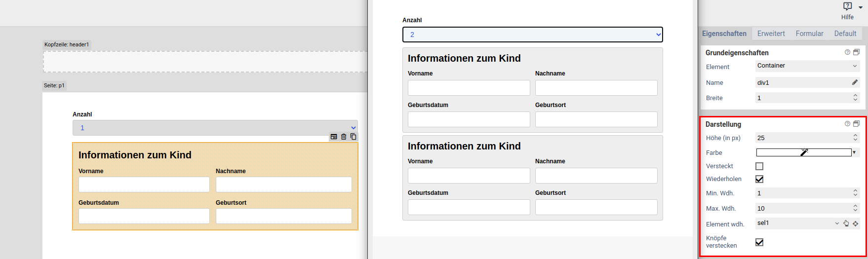
| Wiederholen | Ist diese Option aktiviert, so kann der Nutzer eine beliebige Anzahl an Wiederholunge (Kopien) von diesem Formularelement erstellen. Damit ist es etwa möglich, eine oder mehrere E-Mail-Adressen anzugeben. Es ist nicht möglich, wiederholte Elemente zu verschachteln: Ist ein Fieldset oder Container wiederholt, so kann kein Element darin mehr wiederholt werden. |
| Min. wdh. | Mindestzahl an Wiederholungen, die vorhanden sein müssen. Eine wiederholtes Formularelement ist nicht löschbar, wenn dadurch diese Mindestzahl unterschritten werden würde. Die hier eingestellte Anzahl ist zudem auch anfangs sichtbare Anzahl an Wiederholungen (beim Aufrufs des Formulars). |
| Max. wdh. | Höchstzahl an Wiederholungen, die erlaubt ist. Es kann keine weitere Kopie von einem Formularelement erzeugt werden, wenn dadurch diese Höchstzahl überschritten werden würde. |
| Element wdh. | Falls hier ein Element ausgewählt ist, bestimmt der Wert des ausgewählten Elements (Trigger-Element) die Anzahl an Wiederholungen. Beispiel: Es wird ein Auswahlelement oder Eingabefeld für die Anzahl der Kinder angelegt. Ein Fieldset, wo die Daten zu einem Kind eingegeben werden, wird wiederholt. Die Anzahl der Wiederholungen wird aus dem Auswahlelement bzw. Eingabefeld genommen. Damit ist immer für jedes Kind ein Fieldset vorhanden. |
| Knöpfe verstecken | Nur verfügbar, falls unter Element wdh. ein Element ausgewählt ist. Mit dieser Option können die Plus- und Minusknöpfe zum Hinzufügen und Entfernen von Elementwiederholungen ausgeblendet werden. Dies ist dann sinnvoll, wenn die Anzahl der Wiederholungen nur über das ausgewählte Trigger-Element festgelegt werden soll. |
Alias
Jedes Formular sendet Daten nach dem Prinzip Elementname Wert. Diese Elementnamen können über die Platzhalterersetzung in Aktionen und Templates verwendet werden. In einigen Fällen kann es vorkommen, dass diese Namen nicht für die Weiterverarbeitung verwendet werden können. Das kann z.B. auftreten, wenn für die Weiterverarbeitung spezielle Zeichen verwendet werden müssen, die im Formulardesigner nicht zulässig sind. Für diesen Fall besteht die Möglichkeit, einen Alias zu vergeben.
Wurde ein Alias vergeben, wird nun statt dem Namen des Formularelements der Alias für die Verarbeitung in den Aktionen und bei der Platzhalterersetzung verwendet.
Umbenennen von Formularelementen
Werden Formularelemente ganz einfach umbenannt, funktionieren möglicherweise Teile des JavaScript oder der Verarbeitung nicht mehr korrekt, da diese das Formularelement über dessen Namen referenzieren. Mit einem Klick auf das Stiftsymbol neben dem Formularelementnamen kann das Formularelement umbenannt werden, wobei zugleich sämtliche Referenzen auf das Formularelement aktualisiert werden. Es kann ausgewählt werden, an welchen Stellen nach Referenzen auf das Formularelement gesucht werden soll:
- im JavaScript-Bereich des Formulars
- im CSS-Bereich des Formulars
- in JavaScript-Formulardateien
- in CSS-Formulardateien
- in der Verarbeitung des Formulars
- bei Elementen auf die Eigenschaft "Wert"
- bei Elementen auf die Eigenschaft "Schaltflächen"
- bei Elementen auf die Eigenschaft "Optionen"
Wird eine Referenz in den ausgewählten Bereichen gefunden, wird diese mit dem neuen Namen aktualisiert.
Im JavaScript-Bereich ist darauf zu achten, dass nur übliche Arten behandelt werden, auf ein Formularelement zu referenzieren. In Selektoren wie $('[name="tfEmail"]') wird der Name entsprechend angepasst. Unübliche Selektoren wie document.getElementByName("tfEmail") werden nicht angepasst. Weiterhin ist es prinzipiell unmöglich, alle in einer Programmiersprache möglichen Referenzen anzupassen, beispielsweise wenn der Name aus Variablen, Berechnungen oder externen Datenquellen bezogen wird: ["EMail", "Vorname", "Nachname"].forEach(name => $(`[name="tf${name}"]`).clear()) Daher sollte bei Formular mit komplexen JavaScript immer manuell geprüft werden, welche Auswirkungen eine Umbennenung eines Formularelements hat.
Dieses Element hat keine zusätzlichen Einstellungen im Bereich Grundeigenschaften.
Darstellung
In diesem Bereich kann für Navigationsleisten-Widgets nur die Positionierung der unter Optionen eingetragenen Beschreibungstexte der Seiten relativ zu dem sich darüber befindlichen Fortschrittsbalkenelement bestimmt werden.
Label
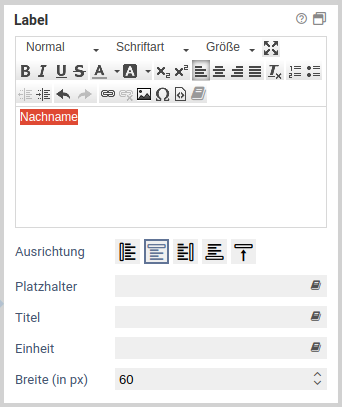
Basiseinstellungen für Label
Über diese Eigenschaft wird das Label eines Elements definiert. Ein Label ist der Text vor, hinter, über oder unter dem Element. Nicht jedes Element besitzt diese Eigenschaft.
| Name | Beschreibung |
|---|---|
| Wert | Wert des Label. Dieser Text wird dann am Element angezeigt. |
| Ausrichtung | Gibt die Position (link, rechts, oben, unten) des Labels an. |
| Breite (in px) | Dies ist der Abstand zwischen Labeltext und Element und ist nur für die Ausrichtung "links" relevant. |
| Platzhalter | Platzhaltertext für Eingabefelder. Dieser Text verschwindet wenn ein Wert in das Feld eingegeben wird. |
| Titel | Wird beim überfahren des Elements mit der Maus als Tooltip angezeigt (HTML Attribut "title"). |
| Einheit | Text der hinter einem Element angezeigt wird. Normalerweise wird dies für Einheiten (z.B. EURO) verwendet. |
| Breite (in px) | Abstand (rechts) der Einheit vom Element |
Dieses Element hat keine zusätzlichen Einstellungen im Bereich Label.
Label
Basiseinstellungen für Label
Über diese Eigenschaft wird das Label eines Elements definiert. Ein Label ist der Text vor, hinter, über oder unter dem Element. Nicht jedes Element besitzt diese Eigenschaft.
| Name | Beschreibung |
|---|---|
| Wert | Wert des Label. Dieser Text wird dann am Element angezeigt. |
| Ausrichtung | Gibt die Position (link, rechts, oben, unten) des Labels an. |
| Breite (in px) | Dies ist der Abstand zwischen Labeltext und Element und ist nur für die Ausrichtung "links" relevant. |
| Platzhalter | Platzhaltertext für Eingabefelder. Dieser Text verschwindet wenn ein Wert in das Feld eingegeben wird. |
| Titel | Wird beim überfahren des Elements mit der Maus als Tooltip angezeigt (HTML Attribut "title"). |
| Einheit | Text der hinter einem Element angezeigt wird. Normalerweise wird dies für Einheiten (z.B. EURO) verwendet. |
| Breite (in px) | Abstand (rechts) der Einheit vom Element |
Dieses Element hat keine zusätzlichen Einstellungen im Bereich Label.
Innerhalb des Labels kann mithilfe der Plathalter {1} und {2} die Nummer der Aktuellen Seite in der Liste und die Anzahl der im Widget konfigurierten Seiten eingefügt werden.
Optionen
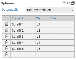
Navigationsleisten-Widgets verfügen über einen zusätzlichen Bereich Optionen. Hier können die in der Navigationsleiste sichtbaren Seiten und die für die jeweilige Formularseite anzuzeigenden Namen festgelegt werden.
Für jede anzuzeigende Formularseite ist eine Zeile mit dem sichtbaren Beschreibungstext und dem technischen Namen der Seite einzugeben. Optional können in der Spalte Titel die Title-Attribute der Beschreibungstexte festgelegt werden.
Neben der Konfiguration der Optionen direkt am Widget ist es zudem möglich, eine CSV-Datenquelle zu verwenden. Diese kann im Auswahlelement Datenquelle selektiert werden.
CSS-Klassen
Basiseinstellungen für CSS-Klassen
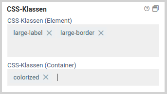
7.0.11+ Diese Eigenschaft ermöglicht es, einem Element beliebige zusätzliche eigene CSS-Klassen zu geben. Es muss kein Punkt am Anfang des Klassennamens stehen, wird aber aus Kompatibilitätsgründen weiterhin unterstützt. Weiterhin werden CSS-Klassen, die in einer CSS-Datei oder im CSS-Bereich definiert sind, als Vorschlag per Autovervollständigung angeboten.
Bei der Konfiguration der CSS-Klassen wird zwischen den CSS-Klassen am Element und den CSS-Klassen am Container unterscheiden.
CSS-Klassen, die am Element konfiguriert sind, werden direkt am HTML-Input-Element angefügt. Dies entspricht dem bisherigen Verhalten vor Version 7.0.11, wenn Klassen zu einem Elementen hinzugefügt wurden.
CSS-Klassen hingegen, die für den Container konfiguriert sind, werden an das HTML-Container-Element angefügt, was das Eingabeelement umschließt. Damit ist es beispielsweise möglich, auch das Label eines Elements per CSS zu beeinflussen, welches sich im gleichen HTML-Container-Element wie Eingabeelement befindet.
Bis 7.0.10+ : Diese Eigenschaft ermöglicht es, dem ausgewählten Element eine oder mehrere CSS-Klassen zuzuordnen.
Die in der Liste dargestellten CSS-Klassen werden aus dem CSS-Bereich und aus dem gewählten CSS-Theme ausgelesen. Nach Auswahl einer CSS-Klasse wird diese sofort angewandt, alle Änderungen des Designs sind also sofort links in der Formularvorschau einsehbar. Im unteren Teil des Eigenschaftenfensters kann nach vorhandenen CSS-Klassen gefiltert werden.
Dieses Element hat keine zusätzlichen Einstellungen im Bereich CSS-Klassen.
Attribute
Basiseinstellungen für Attribute
Im Bereich Attribute können einem Formularelement HTML-Attribute hinzugefügt werden, auf diese dann später wieder im Skriptbereich per Javascript zugegriffen werden kann. Neben eigenen Attributen können auch bestehende HTML-Attribute überschrieben werden, etwa das Attribut type für Input-Elemente.
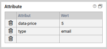
Hinzufügen eines Attributs
Um ein HTML-Attribut hinzuzufügen, tragen Sie einfach in der Spalte Attribut den Namen des HTML-Attributs und in die Spalte Wert den gewünschten Wert ein. Nach der Eingabe wird automatisch eine neue Zeile für weitere Attribute eingefügt.
Löschen eines Attributs
Ein vorhandenes Attribut wird über das Icon links gelöscht.
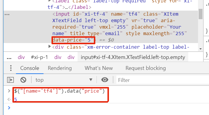
Zugriff auf Data-Attribute mittels JavaScript
Um an einem Element zusätzliche Daten zu hinterlegen, gibt es die sogenannten Data-Attribute. Diese sollten im Namen keine Großbuchstaben enthalten, zudem sollten Wörter durch Bindestriche getrennt werden. Etwa data-serial-version ein guter Attributname, dataSerialVersion hingegen nicht. Beim Zugriff mittels JavaScript werden die Bindestriche entfernt und die Anfangsbuchstaben der Wörter in Großbuchstaben umgewandelt.
Angenommen, am Element tfSerialVer wurde für das Attribut data-serial-version wurde der 1aFXc gesetzt. Dann geschieht der Zugriff über JavaScript wie folgt:
console.log("Serial version ist:" , serialVersion);
Dieses Element hat keine zusätzlichen Einstellungen im Bereich Attribute.
Verfügbar wenn
Basiseinstellungen für Verfügbar wenn
Über die Eigenschaft Verfügbar wenn kann geregelt werden, wann Formularelemente angezeigt werden sollen.
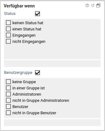
Wird nur ein Status oder nur eine Benutzergruppe gewählt, wird dieses Element nur angezeigt, wenn sich der Vorgang in diesem Status befindet bzw. der angemeldete Benutzer dieser Gruppe angehört. Zudem gibt es für jeden Status und jede Benutzergruppe auch die Möglichkeit, dass Element nur dann anzuzeigen, wenn das Formular nicht in diesem Status ist oder nicht von einem Benutzer dieser Benutzergruppe geöffnet wird. Beispielsweise kann damit ein Formularelement nur dann angezeigt werden, wenn es keinen Status hat, wodurch es nur für Benutzer sichtbar ist, jedoch nicht für Postfachbearbeiter.
Wird sowohl ein Status als auch eine Benutzergruppe ausgewählt, wird dieses Element nur angezeigt, wenn sich der Vorgang sowohl in diesem Status befindet und auch der angemeldete Benutzer dieser Gruppe angehört.
Dieses Element hat keine zusätzlichen Einstellungen im Bereich Verfügbar wenn.
Sonstiges
Basiseinstellungen für Sonstiges
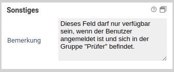
Im Bereich Sonstiges können Bemerkungen zu einem Feld hinzugefügt werden. Diese sind nur im Xima® Formcycle-Designer sichtbar und erscheinen nicht im fertigen Formular.
Dieses Element hat keine zusätzlichen Einstellungen im Bereich Sonstiges.
Word-/PDF-Export
Standardmäßig ist das Widget so konfiguriert, dass es nicht im Word-/PDF-Export auftaucht. Es ist auch nicht sinnvoll, an dieser Einstellung etwas zu ändern, da nur der Labeltext exportiert werden kann und beim Word-/PDF-Export keine Ersetzung der Platzhalter stattfindet.
Mögliche CSS-Anpassungen
Um das Aussehen des Widgets zu individualisieren, können per CSS Anpassungen vorgenommen werden.
Zum Beispiel kann die Farbe des Fortschrittbalkens folgendermaßen angepasst werden:
background-color: red;
}
Versionshistorie
2.2.0
- Vor- und Zurück-Knöpfe sind nun in der Navigationsleiste verfügbar
2.1.1
- Problem bei der AJAX-Einbindung behoben, wenn JQuery bereits geladen ist und mit dem Formular erneut geladen wird.
2.1.0
- Update für Xima® Formcycle 7.1.0, erfordert mind. 7.1.0
2.0.1
- Problem in Zuammenfassung behoben, wenn ein Labeltext leer ist
2.0.0
- Update für Xima® Formcycle 7.0.0, erfordert mind. 7.0.0
1.0.0
- Initialer Release für Xima® Formcycle 6