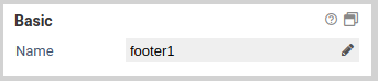
Footer
Functionality
The footer is always shown at the bottom of the form, below the current page. By default, a hint regarding required fields and a logo is shown. Please note that each form can have at most one footer.
Basic properties
Basic settings for Basic properties
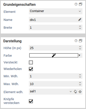
The basic properties name, width and hidden are available for all form elements.

| Name | Description |
|---|---|
| Element | You can change an element's type via the drop down menu. For example, you could change a single input field into a multi line input field (textarea). The element types that are available depend on the original element type. Container and fieldsets cannot be changed into other form elements. |
| Name | Technical name of the elements. Only letters and numbers are allowed. The name is used, for example, to refer to the form field during workflow processing. To change the name and update the references to this form element at the same time the Rename form elements function should be used. |
| Alias | An alternative technichal name that may contain any character. |
| Width | The width of the form element, relative to other elements in the same row. For example, when you place three elements next to each other in the same row and set their widths to 10, 10 und 30, they will take up 20% (=10/(10+10+30)), 20%, and 60% of the entire width of the row, respectively. |
| Hidden | When enabled, the form element is hidden and will not be visible to the user. If you wish to hide or show the element dynamically, depending on the value of another element, use the hidden if condition or a JavaScript function such as jQuery.fn.visible. |
| Disabled | When enabled, the value of the form element cannot be edited. Also, the value will not be transmitted to the server when the user submits the form. For text input fields you can optionally decide whether you want to transmit the value when the form is submitted. |
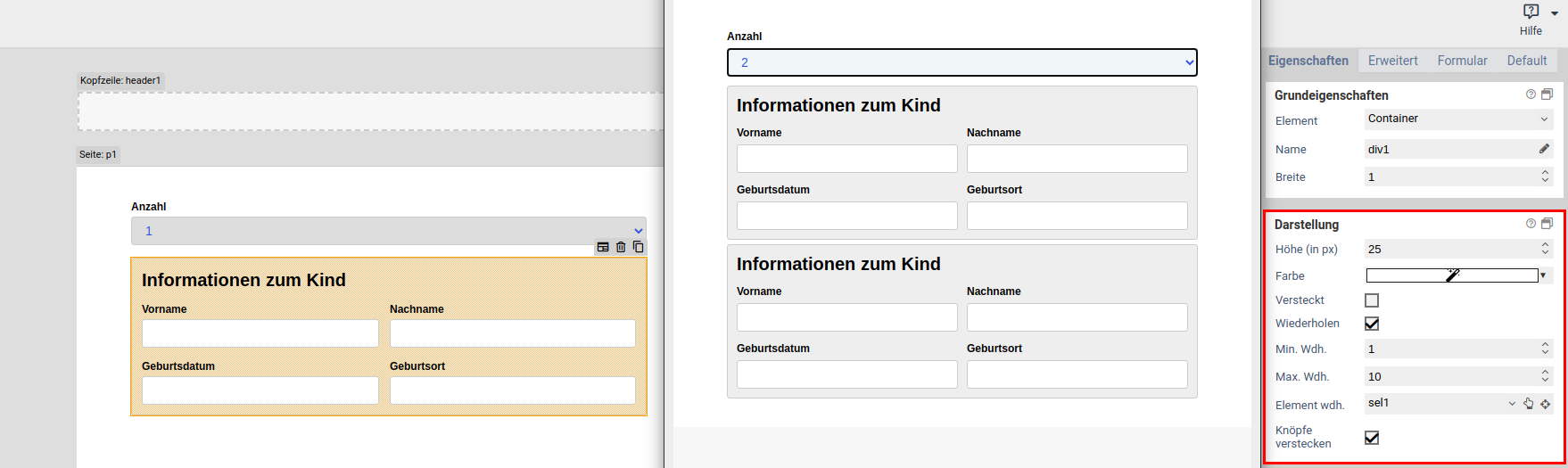
| Repeat | When enabled, the user can create an arbitrary amount of repetition (copies) of the element. This is useful, for example, when the user needs to enter one or more email addresses. Please note that repeated elements cannot be nested: A container or fieldset that is repeated cannot contain elements that are also repeated. |
| Min repetitions | Minimum number of repetition that must exist. When this limit is reached, the user cannot delete any more repetitions. This limit is also the initial number of repeated elements that are displayed when the form is opened for the first time. |
| Max repetitions | Maximumer of allowed repetitions. When this limit is reached, the user cannot add anymore more repetitions. |
| Repeat trigger | When an element is selected, the value of that element determines how many repetitions are created. For example: A select element or input field lets the user enter the number of children they have. A fieldset with the personal data of a child is marked as repeated, and its trigger is set to the select or input field. Now, when the user changes the number of children, the appropriate number of fieldsets are created automatically. |
| Hide buttons | Available only when a repeat trigger was set. When enabled, the plus and minus buttons for adding and removing elements are hidden. This is useful when the number of repetitions should depend only on the value of another field and the user should not be able to alter the number of repetitions directly. |
Alias
When a form is submitted, the entered data is transmitted as key value pairs (element name value. The name must contain only letters and number. You can use the name of an element as form variables during workflow processing to refer to the transmitted values. The name is also used when sending the submitted data to other system via an interface. Sometimes, when you need to integrate external third-party system into FORMCYCLE, the external system may require a particular name for a form field, which may include special character. In this case, you can use the alias name, which allows all special characters to be entered.
When an alias was set, you can use that alias instead of the orignal name to refer to the form field.
Renaming form elements
If form elements are simply renamed, parts of the JavaScript or form workflow may no longer work correctly because they reference the form element by its name. By clicking on the pencil icon next to the form element name, the form element can be renamed, updating all references to the form element at the same time. You can select where to search for references to the form element:
- in the JavaScript area of the form
- in the CSS area of the form
- in JavaScript form files
- in CSS form files
- in the workflow of the form
- for elements on the property "Value"
- for elements on the property "Buttons"
- for elements on the property "Options"
If a reference is found in the selected areas, it will be updated with the new name.
You need to pay special attention to JavaScript code. Common ways of referencing a form element are taken care of. The name in usual selectors such as $('[name="tfEmail"]') is replaced with the new name. However, uncommon selectors such as document.getElementByName("tfEmail") are not replaced.
Moreover, please note that it is not possible, even in principle, to replace all references in a complex programming language such as JavaScript. For example, the name may be be taken from a variable, from a computation or from an external data source: ["EMail", "Vorname", "Nachname"].forEach(name => $(`[name="tf${name}"]`).clear()). Such cases require you to adjust the JavaScript manually. If you have forms with complex JavaScript code, you should always evaluate the effects of renaming a form element beforehand.
This form elements does not possess any additional settings for the section Basic properties.
Style

| Name | Description |
|---|---|
| Background | The background color of the footer. Defaults to transparent. |
| Hint for required fields | When this is enabled, shows a notification regarding required fields and that they are marked with a star (*). |
| Show logo | When enabled, shows a Xima® Formcycle logo. |
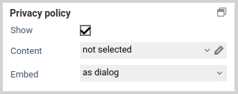
Privacy policy
| Name | Description |
|---|---|
| Show | Whether a privacy policy should be displayed in the footer of the form. |
| Content | Selection of an HTML-Templates, which contains the privacy policy. |
| Embed | The privacy policy can be integrated as a dialog, as a new window or inline. If the option as dialog or as new window is selected, a link appears in the footer, which opens the selected HTML template in a dialog or new browser window. If the content of the HTML template is to be included directly at the end of the footer, then the option inline should be selected. |
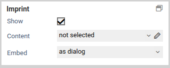
Imprint
| Name | Description |
|---|---|
| Show | Whether an imprint should be displayed in the footer of the form. |
| Content | Selection of an HTML-Templates, which contains the imprint. |
| Embed | The imprint can be integrated as a dialog, as a new window or inline. If the option as dialog or as new window is selected, a link appears in the footer, which opens the selected HTML template in a dialog or new browser window. If the content of the HTML template is to be included directly at the end of the footer, then the option inline should be selected. |