Auswahl
- Verwalten
- Aktionen
- Ansichten
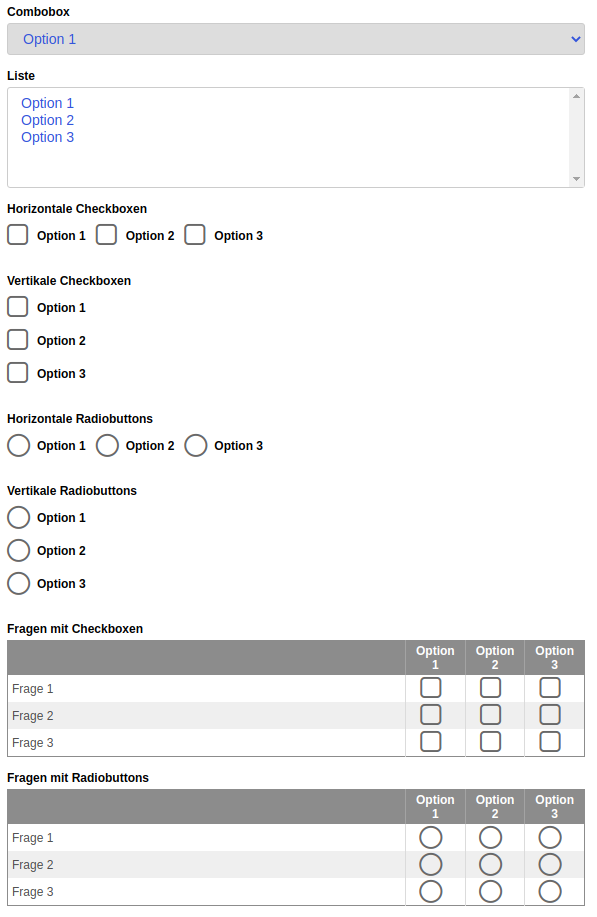
Wählen Sie das Exportformat aus der folgenden Liste:
Optionen für exportFormat Man kann mit den Pfeiltasten, der Home-Taste und der Endetaste durch die Optionen navigieren. Wähle die aktuell markierte Option aus, indem Du die Eingabetaste oder die Leertaste drückst. Die Pfeiltasten nach rechts und links verschieben den Fokus auf die nächste mögliche Option in der Liste. Mit der Home-Taste springt der Fokus an den Anfang der Liste und mit der END-Taste an deren Ende. Mit den Auf- und Abwärtspfeilen kann man schnell zum Anfang der Optionskategorien navigieren.
-
Export als HyperText Markup Language (HTML)
-
Export als Portable Document Format (PDF) mit dem Webbrowser
How it works
Formularelemente vom Typ selection fügen eine Auswahlliste in das aktuelle Formular ein. Über die Elementeigenschaft Label kann das Formularelement zusätzlich mit einem Label beschriftet werden.
Es gibt die folgenden Möglichkeiten, wie eine Auswahlliste dargestellt werden kann.
- Dropdown-Auswahlliste
- Liste mit allen Optionen
- Gruppe von Kontrollkästchen
- Gruppe von Optionsfeldern
- Fragen mit Kontrollkästchen (Umfragen)
- Fragen mit Optionsfeldern (Umfragen)
Die Auswahl der Anzeigeoption erfolgt über die Eigenschaft Grundeinstellung Display.
Wenn eine Auswahl als Dropdown-Auswahlliste angezeigt wird und kein Pflichtfeld ist, wird standardmäßig immer die erste Option ausgewählt. Handelt es sich um ein Pflichtfeld, dann ist standardmäßig keine Option ausgewählt und es erscheint der Text Bitte wählen.
Grundeigenschaften
Basiseinstellungen für Grundeigenschaften
Die Grundeigenschaften Name, Breite und Versteckt stehen jedem Formularelement zur Verfügung.
Das Makro [velocity] konnte nicht ausgeführt werden. Grund: [null]. Klicke auf diese Nachricht, um Details zu erfahren.
org.xwiki.rendering.macro.MacroExecutionException: Failed to evaluate Velocity Macro for content [{{html}}
#set($image="$!xcontext.macro.params.image")
#set($docNameAndImgName = $image.split('@'))
#if ($docNameAndImgName.size() != 2)
#if ($image.indexOf('/') == -1)
#set($image=$doc.getAttachmentURL($image))
#end
#else
#set($targetDoc=$xwiki.getDocument($docNameAndImgName.get(0)))
#set($image=$targetDoc.getAttachmentURL($docNameAndImgName.get(1)))
#end
#set($title="$!xcontext.macro.params.title")
#set($width="$!xcontext.macro.params.width")
#if ($width != "")
#set($width="width=$width")
#end
#set($height="$!xcontext.macro.params.height")
#if ($height != "")
#set($height="height=$height")
#end
#if ($xcontext.macro.params.group)
#set($group="[$xcontext.macro.params.group]")
#else
#set($group="")
#end
#if($context.action == 'edit')
<img src="$image" $width $height/>
#else
<a href="$image" rel="lightbox$group" title="$title"><img src="$image" $width $height /></a>
#end
{{/html}}]
at org.xwiki.rendering.internal.macro.velocity.VelocityMacro.evaluateString(VelocityMacro.java:186)
at org.xwiki.rendering.internal.macro.velocity.VelocityMacro.evaluateString(VelocityMacro.java:60)
at org.xwiki.rendering.macro.script.AbstractScriptMacro.evaluateBlock(AbstractScriptMacro.java:279)
at org.xwiki.rendering.macro.script.AbstractScriptMacro.execute(AbstractScriptMacro.java:182)
at org.xwiki.rendering.macro.script.AbstractScriptMacro.execute(AbstractScriptMacro.java:58)
at org.xwiki.rendering.internal.transformation.macro.MacroTransformation.transform(MacroTransformation.java:441)
at org.xwiki.rendering.internal.transformation.DefaultRenderingContext.transformInContext(DefaultRenderingContext.java:183)
at org.xwiki.rendering.async.internal.block.AbstractBlockAsyncRenderer.transform(AbstractBlockAsyncRenderer.java:76)
at org.xwiki.rendering.wikimacro.internal.DefaultWikiMacroRenderer.transform(DefaultWikiMacroRenderer.java:882)
at org.xwiki.rendering.wikimacro.internal.DefaultWikiMacroRenderer.transform(DefaultWikiMacroRenderer.java:868)
at org.xwiki.rendering.wikimacro.internal.DefaultWikiMacroRenderer.transform(DefaultWikiMacroRenderer.java:594)
at org.xwiki.rendering.wikimacro.internal.DefaultWikiMacroRenderer.execute(DefaultWikiMacroRenderer.java:409)
at org.xwiki.rendering.async.internal.block.AbstractBlockAsyncRenderer.render(AbstractBlockAsyncRenderer.java:157)
at org.xwiki.rendering.async.internal.block.AbstractBlockAsyncRenderer.render(AbstractBlockAsyncRenderer.java:54)
at org.xwiki.rendering.async.internal.DefaultAsyncRendererExecutor.lambda$syncRender$0(DefaultAsyncRendererExecutor.java:284)
at com.xpn.xwiki.internal.security.authorization.DefaultAuthorExecutor.call(DefaultAuthorExecutor.java:98)
at org.xwiki.rendering.async.internal.DefaultAsyncRendererExecutor.syncRender(DefaultAsyncRendererExecutor.java:284)
at org.xwiki.rendering.async.internal.DefaultAsyncRendererExecutor.render(DefaultAsyncRendererExecutor.java:267)
at org.xwiki.rendering.async.internal.block.DefaultBlockAsyncRendererExecutor.execute(DefaultBlockAsyncRendererExecutor.java:125)
at org.xwiki.rendering.wikimacro.internal.DefaultWikiMacro.execute(DefaultWikiMacro.java:132)
at org.xwiki.rendering.wikimacro.internal.DefaultWikiMacro.execute(DefaultWikiMacro.java:61)
at org.xwiki.rendering.internal.transformation.macro.MacroTransformation.transform(MacroTransformation.java:441)
at org.xwiki.rendering.internal.transformation.DefaultRenderingContext.transformInContext(DefaultRenderingContext.java:183)
at org.xwiki.rendering.internal.macro.html.HTMLMacro.renderWikiSyntax(HTMLMacro.java:215)
at org.xwiki.rendering.internal.macro.html.HTMLMacro.execute(HTMLMacro.java:150)
at org.xwiki.rendering.internal.macro.html.HTMLMacro.execute(HTMLMacro.java:70)
at org.xwiki.rendering.internal.transformation.macro.MacroTransformation.transform(MacroTransformation.java:441)
at org.xwiki.rendering.internal.transformation.DefaultRenderingContext.transformInContext(DefaultRenderingContext.java:183)
at org.xwiki.rendering.async.internal.block.AbstractBlockAsyncRenderer.transform(AbstractBlockAsyncRenderer.java:76)
at org.xwiki.rendering.wikimacro.internal.DefaultWikiMacroRenderer.transform(DefaultWikiMacroRenderer.java:882)
at org.xwiki.rendering.wikimacro.internal.DefaultWikiMacroRenderer.transform(DefaultWikiMacroRenderer.java:868)
at org.xwiki.rendering.wikimacro.internal.DefaultWikiMacroRenderer.transform(DefaultWikiMacroRenderer.java:594)
at org.xwiki.rendering.wikimacro.internal.DefaultWikiMacroRenderer.execute(DefaultWikiMacroRenderer.java:409)
at org.xwiki.rendering.async.internal.block.AbstractBlockAsyncRenderer.render(AbstractBlockAsyncRenderer.java:157)
at org.xwiki.rendering.async.internal.block.AbstractBlockAsyncRenderer.render(AbstractBlockAsyncRenderer.java:54)
at org.xwiki.rendering.async.internal.DefaultAsyncRendererExecutor.lambda$syncRender$0(DefaultAsyncRendererExecutor.java:284)
at com.xpn.xwiki.internal.security.authorization.DefaultAuthorExecutor.call(DefaultAuthorExecutor.java:98)
at org.xwiki.rendering.async.internal.DefaultAsyncRendererExecutor.syncRender(DefaultAsyncRendererExecutor.java:284)
at org.xwiki.rendering.async.internal.DefaultAsyncRendererExecutor.render(DefaultAsyncRendererExecutor.java:267)
at org.xwiki.rendering.async.internal.block.DefaultBlockAsyncRendererExecutor.execute(DefaultBlockAsyncRendererExecutor.java:125)
at org.xwiki.rendering.wikimacro.internal.DefaultWikiMacro.execute(DefaultWikiMacro.java:132)
at org.xwiki.rendering.wikimacro.internal.DefaultWikiMacro.execute(DefaultWikiMacro.java:61)
at org.xwiki.rendering.internal.transformation.macro.MacroTransformation.transform(MacroTransformation.java:441)
at org.xwiki.rendering.internal.transformation.DefaultRenderingContext.transformInContext(DefaultRenderingContext.java:183)
at org.xwiki.rendering.internal.transformation.DefaultTransformationManager.performTransformations(DefaultTransformationManager.java:88)
at org.xwiki.display.internal.DocumentContentAsyncExecutor.executeInCurrentExecutionContext(DocumentContentAsyncExecutor.java:396)
at org.xwiki.display.internal.DocumentContentAsyncExecutor.executeInIsolatedExecutionContext(DocumentContentAsyncExecutor.java:365)
at org.xwiki.display.internal.DocumentContentAsyncExecutor.execute(DocumentContentAsyncExecutor.java:267)
at org.xwiki.display.internal.DocumentContentAsyncRenderer.execute(DocumentContentAsyncRenderer.java:112)
at org.xwiki.rendering.async.internal.block.AbstractBlockAsyncRenderer.render(AbstractBlockAsyncRenderer.java:157)
at org.xwiki.rendering.async.internal.block.AbstractBlockAsyncRenderer.render(AbstractBlockAsyncRenderer.java:54)
at org.xwiki.rendering.async.internal.DefaultAsyncRendererExecutor.syncRender(DefaultAsyncRendererExecutor.java:290)
at org.xwiki.rendering.async.internal.DefaultAsyncRendererExecutor.render(DefaultAsyncRendererExecutor.java:267)
at org.xwiki.rendering.async.internal.block.DefaultBlockAsyncRendererExecutor.execute(DefaultBlockAsyncRendererExecutor.java:125)
at org.xwiki.display.internal.DocumentContentDisplayer.display(DocumentContentDisplayer.java:93)
at org.xwiki.display.internal.DocumentContentDisplayer.display(DocumentContentDisplayer.java:46)
at org.xwiki.display.internal.DefaultDocumentDisplayer.display(DefaultDocumentDisplayer.java:96)
at org.xwiki.display.internal.DefaultDocumentDisplayer.display(DefaultDocumentDisplayer.java:39)
at org.xwiki.sheet.internal.SheetDocumentDisplayer.display(SheetDocumentDisplayer.java:123)
at org.xwiki.sheet.internal.SheetDocumentDisplayer.display(SheetDocumentDisplayer.java:52)
at org.xwiki.display.internal.ConfiguredDocumentDisplayer.display(ConfiguredDocumentDisplayer.java:68)
at org.xwiki.display.internal.ConfiguredDocumentDisplayer.display(ConfiguredDocumentDisplayer.java:42)
at org.xwiki.rendering.internal.macro.include.IncludeMacro.execute(IncludeMacro.java:160)
at org.xwiki.rendering.internal.macro.include.IncludeMacro.execute(IncludeMacro.java:59)
at org.xwiki.rendering.internal.transformation.macro.MacroTransformation.transform(MacroTransformation.java:441)
at org.xwiki.rendering.internal.transformation.DefaultRenderingContext.transformInContext(DefaultRenderingContext.java:183)
at org.xwiki.rendering.internal.macro.html.HTMLMacro.renderWikiSyntax(HTMLMacro.java:215)
at org.xwiki.rendering.internal.macro.html.HTMLMacro.execute(HTMLMacro.java:150)
at org.xwiki.rendering.internal.macro.html.HTMLMacro.execute(HTMLMacro.java:70)
at org.xwiki.rendering.internal.transformation.macro.MacroTransformation.transform(MacroTransformation.java:441)
at org.xwiki.rendering.internal.transformation.DefaultRenderingContext.transformInContext(DefaultRenderingContext.java:183)
at org.xwiki.rendering.async.internal.block.AbstractBlockAsyncRenderer.transform(AbstractBlockAsyncRenderer.java:76)
at org.xwiki.rendering.wikimacro.internal.DefaultWikiMacroRenderer.transform(DefaultWikiMacroRenderer.java:882)
at org.xwiki.rendering.wikimacro.internal.DefaultWikiMacroRenderer.transform(DefaultWikiMacroRenderer.java:868)
at org.xwiki.rendering.wikimacro.internal.DefaultWikiMacroRenderer.transform(DefaultWikiMacroRenderer.java:594)
at org.xwiki.rendering.wikimacro.internal.DefaultWikiMacroRenderer.execute(DefaultWikiMacroRenderer.java:409)
at org.xwiki.rendering.async.internal.block.AbstractBlockAsyncRenderer.render(AbstractBlockAsyncRenderer.java:157)
at org.xwiki.rendering.async.internal.block.AbstractBlockAsyncRenderer.render(AbstractBlockAsyncRenderer.java:54)
at org.xwiki.rendering.async.internal.DefaultAsyncRendererExecutor.lambda$syncRender$0(DefaultAsyncRendererExecutor.java:284)
at com.xpn.xwiki.internal.security.authorization.DefaultAuthorExecutor.call(DefaultAuthorExecutor.java:98)
at org.xwiki.rendering.async.internal.DefaultAsyncRendererExecutor.syncRender(DefaultAsyncRendererExecutor.java:284)
at org.xwiki.rendering.async.internal.DefaultAsyncRendererExecutor.render(DefaultAsyncRendererExecutor.java:267)
at org.xwiki.rendering.async.internal.block.DefaultBlockAsyncRendererExecutor.execute(DefaultBlockAsyncRendererExecutor.java:125)
at org.xwiki.rendering.wikimacro.internal.DefaultWikiMacro.execute(DefaultWikiMacro.java:132)
at org.xwiki.rendering.wikimacro.internal.DefaultWikiMacro.execute(DefaultWikiMacro.java:61)
at org.xwiki.rendering.internal.transformation.macro.MacroTransformation.transform(MacroTransformation.java:441)
at org.xwiki.rendering.internal.transformation.DefaultRenderingContext.transformInContext(DefaultRenderingContext.java:183)
at org.xwiki.rendering.internal.transformation.DefaultTransformationManager.performTransformations(DefaultTransformationManager.java:88)
at org.xwiki.display.internal.DocumentContentAsyncExecutor.executeInCurrentExecutionContext(DocumentContentAsyncExecutor.java:396)
at org.xwiki.display.internal.DocumentContentAsyncExecutor.execute(DocumentContentAsyncExecutor.java:269)
at org.xwiki.display.internal.DocumentContentAsyncRenderer.execute(DocumentContentAsyncRenderer.java:112)
at org.xwiki.rendering.async.internal.block.AbstractBlockAsyncRenderer.render(AbstractBlockAsyncRenderer.java:157)
at org.xwiki.rendering.async.internal.block.AbstractBlockAsyncRenderer.render(AbstractBlockAsyncRenderer.java:54)
at org.xwiki.rendering.async.internal.DefaultAsyncRendererExecutor.syncRender(DefaultAsyncRendererExecutor.java:290)
at org.xwiki.rendering.async.internal.DefaultAsyncRendererExecutor.render(DefaultAsyncRendererExecutor.java:267)
at org.xwiki.rendering.async.internal.block.DefaultBlockAsyncRendererExecutor.execute(DefaultBlockAsyncRendererExecutor.java:125)
at org.xwiki.display.internal.DocumentContentDisplayer.display(DocumentContentDisplayer.java:93)
at org.xwiki.display.internal.DocumentContentDisplayer.display(DocumentContentDisplayer.java:46)
at org.xwiki.display.internal.DefaultDocumentDisplayer.display(DefaultDocumentDisplayer.java:96)
at org.xwiki.display.internal.DefaultDocumentDisplayer.display(DefaultDocumentDisplayer.java:39)
at org.xwiki.sheet.internal.SheetDocumentDisplayer.display(SheetDocumentDisplayer.java:123)
at org.xwiki.sheet.internal.SheetDocumentDisplayer.display(SheetDocumentDisplayer.java:52)
at org.xwiki.display.internal.ConfiguredDocumentDisplayer.display(ConfiguredDocumentDisplayer.java:68)
at org.xwiki.display.internal.ConfiguredDocumentDisplayer.display(ConfiguredDocumentDisplayer.java:42)
at com.xpn.xwiki.doc.XWikiDocument.display(XWikiDocument.java:1431)
at com.xpn.xwiki.doc.XWikiDocument.getRenderedContent(XWikiDocument.java:1567)
at com.xpn.xwiki.doc.XWikiDocument.displayDocument(XWikiDocument.java:1517)
at com.xpn.xwiki.doc.XWikiDocument.displayDocument(XWikiDocument.java:1486)
at com.xpn.xwiki.api.Document.displayDocument(Document.java:821)
at jdk.internal.reflect.GeneratedMethodAccessor524.invoke(Unknown Source)
at java.base/jdk.internal.reflect.DelegatingMethodAccessorImpl.invoke(DelegatingMethodAccessorImpl.java:43)
at java.base/java.lang.reflect.Method.invoke(Method.java:569)
at org.apache.velocity.util.introspection.UberspectImpl$VelMethodImpl.doInvoke(UberspectImpl.java:571)
at org.apache.velocity.util.introspection.UberspectImpl$VelMethodImpl.invoke(UberspectImpl.java:554)
at org.apache.velocity.runtime.parser.node.ASTMethod.execute(ASTMethod.java:221)
at org.apache.velocity.runtime.parser.node.ASTReference.execute(ASTReference.java:368)
at org.apache.velocity.runtime.parser.node.ASTReference.value(ASTReference.java:704)
at org.apache.velocity.runtime.parser.node.ASTExpression.value(ASTExpression.java:75)
at org.apache.velocity.runtime.parser.node.ASTSetDirective.render(ASTSetDirective.java:242)
at org.apache.velocity.runtime.parser.node.ASTBlock.render(ASTBlock.java:147)
at org.apache.velocity.runtime.parser.node.SimpleNode.render(SimpleNode.java:439)
at org.apache.velocity.runtime.parser.node.ASTIfStatement.render(ASTIfStatement.java:190)
at org.apache.velocity.runtime.parser.node.ASTBlock.render(ASTBlock.java:147)
at org.xwiki.velocity.internal.directive.TryCatchDirective.render(TryCatchDirective.java:86)
at org.apache.velocity.runtime.parser.node.ASTDirective.render(ASTDirective.java:304)
at org.apache.velocity.runtime.parser.node.SimpleNode.render(SimpleNode.java:439)
at org.apache.velocity.Template.merge(Template.java:358)
at org.apache.velocity.Template.merge(Template.java:262)
at org.xwiki.velocity.internal.InternalVelocityEngine.evaluate(InternalVelocityEngine.java:233)
at com.xpn.xwiki.internal.template.VelocityTemplateEvaluator.evaluateContent(VelocityTemplateEvaluator.java:107)
at com.xpn.xwiki.internal.template.TemplateAsyncRenderer.evaluateContent(TemplateAsyncRenderer.java:219)
at com.xpn.xwiki.internal.template.TemplateAsyncRenderer.renderVelocity(TemplateAsyncRenderer.java:174)
at com.xpn.xwiki.internal.template.TemplateAsyncRenderer.render(TemplateAsyncRenderer.java:135)
at com.xpn.xwiki.internal.template.TemplateAsyncRenderer.render(TemplateAsyncRenderer.java:54)
at org.xwiki.rendering.async.internal.DefaultAsyncRendererExecutor.lambda$syncRender$0(DefaultAsyncRendererExecutor.java:284)
at com.xpn.xwiki.internal.security.authorization.DefaultAuthorExecutor.call(DefaultAuthorExecutor.java:98)
at org.xwiki.rendering.async.internal.DefaultAsyncRendererExecutor.syncRender(DefaultAsyncRendererExecutor.java:284)
at org.xwiki.rendering.async.internal.DefaultAsyncRendererExecutor.render(DefaultAsyncRendererExecutor.java:267)
at org.xwiki.rendering.async.internal.block.DefaultBlockAsyncRendererExecutor.render(DefaultBlockAsyncRendererExecutor.java:154)
at com.xpn.xwiki.internal.template.InternalTemplateManager.render(InternalTemplateManager.java:907)
at com.xpn.xwiki.internal.template.InternalTemplateManager.renderFromSkin(InternalTemplateManager.java:869)
at com.xpn.xwiki.internal.template.InternalTemplateManager.render(InternalTemplateManager.java:856)
at com.xpn.xwiki.internal.template.InternalTemplateManager.renderNoException(InternalTemplateManager.java:811)
at com.xpn.xwiki.internal.template.InternalTemplateManager.renderNoException(InternalTemplateManager.java:803)
at com.xpn.xwiki.internal.template.DefaultTemplateManager.renderNoException(DefaultTemplateManager.java:79)
at com.xpn.xwiki.internal.template.DefaultTemplateManager.renderNoException(DefaultTemplateManager.java:73)
at org.xwiki.template.script.TemplateScriptService.render(TemplateScriptService.java:54)
at jdk.internal.reflect.GeneratedMethodAccessor192.invoke(Unknown Source)
at java.base/jdk.internal.reflect.DelegatingMethodAccessorImpl.invoke(DelegatingMethodAccessorImpl.java:43)
at java.base/java.lang.reflect.Method.invoke(Method.java:569)
at org.apache.velocity.util.introspection.UberspectImpl$VelMethodImpl.doInvoke(UberspectImpl.java:571)
at org.apache.velocity.util.introspection.UberspectImpl$VelMethodImpl.invoke(UberspectImpl.java:554)
at org.apache.velocity.runtime.parser.node.ASTMethod.execute(ASTMethod.java:221)
at org.apache.velocity.runtime.parser.node.ASTReference.execute(ASTReference.java:368)
at org.apache.velocity.runtime.parser.node.ASTReference.render(ASTReference.java:492)
at org.apache.velocity.runtime.parser.node.ASTBlock.render(ASTBlock.java:147)
at org.apache.velocity.runtime.directive.VelocimacroProxy.render(VelocimacroProxy.java:217)
at org.apache.velocity.runtime.directive.RuntimeMacro.render(RuntimeMacro.java:331)
at org.apache.velocity.runtime.directive.RuntimeMacro.render(RuntimeMacro.java:261)
at org.apache.velocity.runtime.parser.node.ASTDirective.render(ASTDirective.java:304)
at org.apache.velocity.runtime.parser.node.ASTBlock.render(ASTBlock.java:147)
at org.apache.velocity.runtime.parser.node.ASTIfStatement.render(ASTIfStatement.java:171)
at org.apache.velocity.runtime.parser.node.ASTBlock.render(ASTBlock.java:147)
at org.apache.velocity.runtime.parser.node.SimpleNode.render(SimpleNode.java:439)
at org.apache.velocity.runtime.parser.node.ASTIfStatement.render(ASTIfStatement.java:190)
at org.apache.velocity.runtime.parser.node.SimpleNode.render(SimpleNode.java:439)
at org.apache.velocity.Template.merge(Template.java:358)
at org.apache.velocity.Template.merge(Template.java:262)
at org.xwiki.velocity.internal.InternalVelocityEngine.evaluate(InternalVelocityEngine.java:233)
at com.xpn.xwiki.internal.template.VelocityTemplateEvaluator.evaluateContent(VelocityTemplateEvaluator.java:107)
at com.xpn.xwiki.internal.template.TemplateAsyncRenderer.evaluateContent(TemplateAsyncRenderer.java:219)
at com.xpn.xwiki.internal.template.TemplateAsyncRenderer.renderVelocity(TemplateAsyncRenderer.java:174)
at com.xpn.xwiki.internal.template.TemplateAsyncRenderer.render(TemplateAsyncRenderer.java:135)
at com.xpn.xwiki.internal.template.TemplateAsyncRenderer.render(TemplateAsyncRenderer.java:54)
at org.xwiki.rendering.async.internal.DefaultAsyncRendererExecutor.lambda$syncRender$0(DefaultAsyncRendererExecutor.java:284)
at com.xpn.xwiki.internal.security.authorization.DefaultAuthorExecutor.call(DefaultAuthorExecutor.java:98)
at org.xwiki.rendering.async.internal.DefaultAsyncRendererExecutor.syncRender(DefaultAsyncRendererExecutor.java:284)
at org.xwiki.rendering.async.internal.DefaultAsyncRendererExecutor.render(DefaultAsyncRendererExecutor.java:267)
at org.xwiki.rendering.async.internal.block.DefaultBlockAsyncRendererExecutor.render(DefaultBlockAsyncRendererExecutor.java:154)
at com.xpn.xwiki.internal.template.InternalTemplateManager.render(InternalTemplateManager.java:907)
at com.xpn.xwiki.internal.template.InternalTemplateManager.renderFromSkin(InternalTemplateManager.java:869)
at com.xpn.xwiki.internal.template.InternalTemplateManager.renderFromSkin(InternalTemplateManager.java:849)
at com.xpn.xwiki.internal.template.InternalTemplateManager.render(InternalTemplateManager.java:835)
at com.xpn.xwiki.internal.template.DefaultTemplateManager.render(DefaultTemplateManager.java:91)
at com.xpn.xwiki.internal.template.DefaultTemplateManager.render(DefaultTemplateManager.java:85)
at com.xpn.xwiki.XWiki.evaluateTemplate(XWiki.java:2569)
at com.xpn.xwiki.web.Utils.parseTemplate(Utils.java:180)
at com.xpn.xwiki.web.XWikiAction.execute(XWikiAction.java:651)
at com.xpn.xwiki.web.XWikiAction.execute(XWikiAction.java:339)
at com.xpn.xwiki.web.LegacyActionServlet.service(LegacyActionServlet.java:108)
at javax.servlet.http.HttpServlet.service(HttpServlet.java:623)
at org.apache.catalina.core.ApplicationFilterChain.internalDoFilter(ApplicationFilterChain.java:199)
at org.apache.catalina.core.ApplicationFilterChain.doFilter(ApplicationFilterChain.java:144)
at com.xpn.xwiki.web.ActionFilter.doFilter(ActionFilter.java:122)
at org.apache.catalina.core.ApplicationFilterChain.internalDoFilter(ApplicationFilterChain.java:168)
at org.apache.catalina.core.ApplicationFilterChain.doFilter(ApplicationFilterChain.java:144)
at org.xwiki.wysiwyg.filter.ConversionFilter.doFilter(ConversionFilter.java:61)
at org.apache.catalina.core.ApplicationFilterChain.internalDoFilter(ApplicationFilterChain.java:168)
at org.apache.catalina.core.ApplicationFilterChain.doFilter(ApplicationFilterChain.java:144)
at org.apache.tomcat.websocket.server.WsFilter.doFilter(WsFilter.java:51)
at org.apache.catalina.core.ApplicationFilterChain.internalDoFilter(ApplicationFilterChain.java:168)
at org.apache.catalina.core.ApplicationFilterChain.doFilter(ApplicationFilterChain.java:144)
at org.xwiki.container.servlet.filters.internal.SetHTTPHeaderFilter.doFilter(SetHTTPHeaderFilter.java:63)
at org.apache.catalina.core.ApplicationFilterChain.internalDoFilter(ApplicationFilterChain.java:168)
at org.apache.catalina.core.ApplicationFilterChain.doFilter(ApplicationFilterChain.java:144)
at org.xwiki.resource.servlet.RoutingFilter.doFilter(RoutingFilter.java:132)
at org.apache.catalina.core.ApplicationFilterChain.internalDoFilter(ApplicationFilterChain.java:168)
at org.apache.catalina.core.ApplicationFilterChain.doFilter(ApplicationFilterChain.java:144)
at org.xwiki.container.servlet.filters.internal.SavedRequestRestorerFilter.doFilter(SavedRequestRestorerFilter.java:209)
at org.apache.catalina.core.ApplicationFilterChain.internalDoFilter(ApplicationFilterChain.java:168)
at org.apache.catalina.core.ApplicationFilterChain.doFilter(ApplicationFilterChain.java:144)
at org.xwiki.container.servlet.filters.internal.SetCharacterEncodingFilter.doFilter(SetCharacterEncodingFilter.java:117)
at org.apache.catalina.core.ApplicationFilterChain.internalDoFilter(ApplicationFilterChain.java:168)
at org.apache.catalina.core.ApplicationFilterChain.doFilter(ApplicationFilterChain.java:144)
at org.apache.catalina.core.StandardWrapperValve.invoke(StandardWrapperValve.java:168)
at org.apache.catalina.core.StandardContextValve.invoke(StandardContextValve.java:90)
at org.apache.catalina.authenticator.AuthenticatorBase.invoke(AuthenticatorBase.java:482)
at org.apache.catalina.core.StandardHostValve.invoke(StandardHostValve.java:130)
at org.apache.catalina.valves.ErrorReportValve.invoke(ErrorReportValve.java:93)
at org.apache.catalina.valves.AbstractAccessLogValve.invoke(AbstractAccessLogValve.java:656)
at org.apache.catalina.core.StandardEngineValve.invoke(StandardEngineValve.java:74)
at org.apache.catalina.connector.CoyoteAdapter.service(CoyoteAdapter.java:346)
at org.apache.coyote.http11.Http11Processor.service(Http11Processor.java:397)
at org.apache.coyote.AbstractProcessorLight.process(AbstractProcessorLight.java:63)
at org.apache.coyote.AbstractProtocol$ConnectionHandler.process(AbstractProtocol.java:935)
at org.apache.tomcat.util.net.NioEndpoint$SocketProcessor.doRun(NioEndpoint.java:1826)
at org.apache.tomcat.util.net.SocketProcessorBase.run(SocketProcessorBase.java:52)
at org.apache.tomcat.util.threads.ThreadPoolExecutor.runWorker(ThreadPoolExecutor.java:1189)
at org.apache.tomcat.util.threads.ThreadPoolExecutor$Worker.run(ThreadPoolExecutor.java:658)
at org.apache.tomcat.util.threads.TaskThread$WrappingRunnable.run(TaskThread.java:63)
at java.base/java.lang.Thread.run(Thread.java:840)
Caused by: org.xwiki.velocity.XWikiVelocityException: Failed to evaluate content with namespace [xwiki:Formcycle.Designer.Form.ElementProperties.BaseProperties]
at org.xwiki.velocity.internal.InternalVelocityEngine.evaluate(InternalVelocityEngine.java:235)
at org.xwiki.rendering.internal.macro.velocity.VelocityMacro.evaluateString(VelocityMacro.java:168)
... 281 more
Caused by: org.apache.velocity.exception.MethodInvocationException: Invocation of method 'getAttachmentURL' in class com.xpn.xwiki.api.Document threw exception java.lang.NullPointerException at xwiki:XWiki.LightboxMacro[line 6, column 18]
at org.apache.velocity.runtime.parser.node.ASTMethod.handleInvocationException(ASTMethod.java:308)
at org.apache.velocity.runtime.parser.node.ASTMethod.execute(ASTMethod.java:235)
at org.apache.velocity.runtime.parser.node.ASTReference.execute(ASTReference.java:368)
at org.apache.velocity.runtime.parser.node.ASTReference.value(ASTReference.java:704)
at org.apache.velocity.runtime.parser.node.ASTExpression.value(ASTExpression.java:75)
at org.apache.velocity.runtime.parser.node.ASTSetDirective.render(ASTSetDirective.java:242)
at org.apache.velocity.runtime.parser.node.ASTBlock.render(ASTBlock.java:147)
at org.apache.velocity.runtime.parser.node.ASTIfStatement.render(ASTIfStatement.java:171)
at org.apache.velocity.runtime.parser.node.ASTBlock.render(ASTBlock.java:147)
at org.apache.velocity.runtime.parser.node.ASTIfStatement.render(ASTIfStatement.java:171)
at org.apache.velocity.runtime.parser.node.SimpleNode.render(SimpleNode.java:439)
at org.apache.velocity.Template.merge(Template.java:358)
at org.apache.velocity.Template.merge(Template.java:262)
at org.xwiki.velocity.internal.InternalVelocityEngine.evaluate(InternalVelocityEngine.java:233)
... 282 more
Caused by: java.lang.NullPointerException
| Name | Beschreibung |
|---|---|
| Element | Elementtyp des Formularelements. Der Elementtyp kann durch Auswahl eines anderen Elementtyps aus dem Dropdown-Menü geändert werden. Die Elementtypen, in die ein Element umgewandelt werden kann, hängen dabei vom ursprünglichen Typ ab. Container und Fieldsets können nur in den jeweils anderen Elementtyp transformiert werden. Alle anderen Elementtypen können in jeden anderen Typ transformiert werden, außer in Container und Fieldsets. |
| Name | Name des Elements. Es sind nur Buchstaben und Zahlen erlaubt. Um den Namen zu ändern und gleichzeitig die Referenzen auf dieses Formularelement zu aktualisieren sollte die Funktion zum Umbenennen von Formularelementen verwendet werden. |
| Alias | Ein alternativer Name für das Formularelement, der alle Zeichen enthalten darf. |
| Breite | Relative Breite des Elements zu anderen Elementen in einer Formularzeile. Sind etwa drei Elemente nebeneinander platziert und haben für die Breite die Werte 10, 10 und 30 so nehmen sie in dieser Reihenfolge 20%, 20% und 60% der gesamten Breite der Formularzeile ein. |
| Versteckt | Ist hier ein Häkchen gesetzt, so wird das Element versteckt. Um es wieder anzuzeigen, kann die Eigenschaft sichtbar wenn oder eine entsprechende JavaScript-Funktion wie jQuery.fn.visible verwendet werden. |
| Gesperrt | Der Inhalt des Formularelementes kann nicht editiert werden. Der Inhalt wird auch beim Absenden nicht übertragen. Für Textfelder kann zudem ausgewählt werden, ob der Inhalt beim Absenden übertragen wird oder nicht. |
| Wiederholen | Ist diese Option aktiviert, so kann der Nutzer eine beliebige Anzahl an Wiederholunge (Kopien) von diesem Formularelement erstellen. Damit ist es etwa möglich, eine oder mehrere E-Mail-Adressen anzugeben. Es ist nicht möglich, wiederholte Elemente zu verschachteln: Ist ein Fieldset oder Container wiederholt, so kann kein Element darin mehr wiederholt werden. |
| Min. wdh. | Mindestzahl an Wiederholungen, die vorhanden sein müssen. Eine wiederholtes Formularelement ist nicht löschbar, wenn dadurch diese Mindestzahl unterschritten werden würde. Die hier eingestellte Anzahl ist zudem auch anfangs sichtbare Anzahl an Wiederholungen (beim Aufrufs des Formulars). |
| Max. wdh. | Höchstzahl an Wiederholungen, die erlaubt ist. Es kann keine weitere Kopie von einem Formularelement erzeugt werden, wenn dadurch diese Höchstzahl überschritten werden würde. |
| Element wdh. | Falls hier ein Element ausgewählt ist, bestimmt der Wert des ausgewählten Elements (Trigger-Element) die Anzahl an Wiederholungen. Beispiel: Es wird ein Auswahlelement oder Eingabefeld für die Anzahl der Kinder angelegt. Ein Fieldset, wo die Daten zu einem Kind eingegeben werden, wird wiederholt. Die Anzahl der Wiederholungen wird aus dem Auswahlelement bzw. Eingabefeld genommen. Damit ist immer für jedes Kind ein Fieldset vorhanden. |
| Knöpfe verstecken | Nur verfügbar, falls unter Element wdh. ein Element ausgewählt ist. Mit dieser Option können die Plus- und Minusknöpfe zum Hinzufügen und Entfernen von Elementwiederholungen ausgeblendet werden. Dies ist dann sinnvoll, wenn die Anzahl der Wiederholungen nur über das ausgewählte Trigger-Element festgelegt werden soll. |
Alias
Jedes Formular sendet Daten nach dem Prinzip Elementname Wert. Diese Elementnamen können über die Platzhalterersetzung in Aktionen und Templates verwendet werden. In einigen Fällen kann es vorkommen, dass diese Namen nicht für die Weiterverarbeitung verwendet werden können. Das kann z.B. auftreten, wenn für die Weiterverarbeitung spezielle Zeichen verwendet werden müssen, die im Formulardesigner nicht zulässig sind. Für diesen Fall besteht die Möglichkeit, einen Alias zu vergeben.
Wurde ein Alias vergeben, wird nun statt dem Namen des Formularelements der Alias für die Verarbeitung in den Aktionen und bei der Platzhalterersetzung verwendet.
Umbenennen von Formularelementen
Werden Formularelemente ganz einfach umbenannt, funktionieren möglicherweise Teile des JavaScript oder der Verarbeitung nicht mehr korrekt, da diese das Formularelement über dessen Namen referenzieren. Mit einem Klick auf das Stiftsymbol neben dem Formularelementnamen kann das Formularelement umbenannt werden, wobei zugleich sämtliche Referenzen auf das Formularelement aktualisiert werden. Es kann ausgewählt werden, an welchen Stellen nach Referenzen auf das Formularelement gesucht werden soll:
- im JavaScript-Bereich des Formulars
- im CSS-Bereich des Formulars
- in JavaScript-Formulardateien
- in CSS-Formulardateien
- in der Verarbeitung des Formulars
- bei Elementen auf die Eigenschaft "Wert"
- bei Elementen auf die Eigenschaft "Schaltflächen"
- bei Elementen auf die Eigenschaft "Optionen"
Wird eine Referenz in den ausgewählten Bereichen gefunden, wird diese mit dem neuen Namen aktualisiert.
Im JavaScript-Bereich ist darauf zu achten, dass nur übliche Arten behandelt werden, auf ein Formularelement zu referenzieren. In Selektoren wie $('[name="tfEmail"]') wird der Name entsprechend angepasst. Unübliche Selektoren wie document.getElementByName("tfEmail") werden nicht angepasst. Weiterhin ist es prinzipiell unmöglich, alle in einer Programmiersprache möglichen Referenzen anzupassen, beispielsweise wenn der Name aus Variablen, Berechnungen oder externen Datenquellen bezogen wird: ["EMail", "Vorname", "Nachname"].forEach(name => $(`[name="tf${name}"]`).clear()) Daher sollte bei Formular mit komplexen JavaScript immer manuell geprüft werden, welche Auswirkungen eine Umbennenung eines Formularelements hat.
Dieses Element hat keine zusätzlichen Einstellungen im Bereich Grundeigenschaften.
Darstellung
Basiseinstellungen für Darstellung
Die in diesem Bereich vorhandenen Eigenschaften dienen dazu, die Sichtbarkeit des Formularelements zu konfigurieren. Die Grundeigenschaft Versteckt steht dabei jedem Formularelement zur Verfügung. Die Eigenschaften Gesperrt und Wiederholen sowie die davon abhängigen Eigenschaften sind nur bei Elemententypen verfügbar, bei denen dies sinnvoll ist.
Das Makro [velocity] konnte nicht ausgeführt werden. Grund: [null]. Klicke auf diese Nachricht, um Details zu erfahren.
org.xwiki.rendering.macro.MacroExecutionException: Failed to evaluate Velocity Macro for content [{{html}}
#set($image="$!xcontext.macro.params.image")
#set($docNameAndImgName = $image.split('@'))
#if ($docNameAndImgName.size() != 2)
#if ($image.indexOf('/') == -1)
#set($image=$doc.getAttachmentURL($image))
#end
#else
#set($targetDoc=$xwiki.getDocument($docNameAndImgName.get(0)))
#set($image=$targetDoc.getAttachmentURL($docNameAndImgName.get(1)))
#end
#set($title="$!xcontext.macro.params.title")
#set($width="$!xcontext.macro.params.width")
#if ($width != "")
#set($width="width=$width")
#end
#set($height="$!xcontext.macro.params.height")
#if ($height != "")
#set($height="height=$height")
#end
#if ($xcontext.macro.params.group)
#set($group="[$xcontext.macro.params.group]")
#else
#set($group="")
#end
#if($context.action == 'edit')
<img src="$image" $width $height/>
#else
<a href="$image" rel="lightbox$group" title="$title"><img src="$image" $width $height /></a>
#end
{{/html}}]
at org.xwiki.rendering.internal.macro.velocity.VelocityMacro.evaluateString(VelocityMacro.java:186)
at org.xwiki.rendering.internal.macro.velocity.VelocityMacro.evaluateString(VelocityMacro.java:60)
at org.xwiki.rendering.macro.script.AbstractScriptMacro.evaluateBlock(AbstractScriptMacro.java:279)
at org.xwiki.rendering.macro.script.AbstractScriptMacro.execute(AbstractScriptMacro.java:182)
at org.xwiki.rendering.macro.script.AbstractScriptMacro.execute(AbstractScriptMacro.java:58)
at org.xwiki.rendering.internal.transformation.macro.MacroTransformation.transform(MacroTransformation.java:441)
at org.xwiki.rendering.internal.transformation.DefaultRenderingContext.transformInContext(DefaultRenderingContext.java:183)
at org.xwiki.rendering.async.internal.block.AbstractBlockAsyncRenderer.transform(AbstractBlockAsyncRenderer.java:76)
at org.xwiki.rendering.wikimacro.internal.DefaultWikiMacroRenderer.transform(DefaultWikiMacroRenderer.java:882)
at org.xwiki.rendering.wikimacro.internal.DefaultWikiMacroRenderer.transform(DefaultWikiMacroRenderer.java:868)
at org.xwiki.rendering.wikimacro.internal.DefaultWikiMacroRenderer.transform(DefaultWikiMacroRenderer.java:594)
at org.xwiki.rendering.wikimacro.internal.DefaultWikiMacroRenderer.execute(DefaultWikiMacroRenderer.java:409)
at org.xwiki.rendering.async.internal.block.AbstractBlockAsyncRenderer.render(AbstractBlockAsyncRenderer.java:157)
at org.xwiki.rendering.async.internal.block.AbstractBlockAsyncRenderer.render(AbstractBlockAsyncRenderer.java:54)
at org.xwiki.rendering.async.internal.DefaultAsyncRendererExecutor.lambda$syncRender$0(DefaultAsyncRendererExecutor.java:284)
at com.xpn.xwiki.internal.security.authorization.DefaultAuthorExecutor.call(DefaultAuthorExecutor.java:98)
at org.xwiki.rendering.async.internal.DefaultAsyncRendererExecutor.syncRender(DefaultAsyncRendererExecutor.java:284)
at org.xwiki.rendering.async.internal.DefaultAsyncRendererExecutor.render(DefaultAsyncRendererExecutor.java:267)
at org.xwiki.rendering.async.internal.block.DefaultBlockAsyncRendererExecutor.execute(DefaultBlockAsyncRendererExecutor.java:125)
at org.xwiki.rendering.wikimacro.internal.DefaultWikiMacro.execute(DefaultWikiMacro.java:132)
at org.xwiki.rendering.wikimacro.internal.DefaultWikiMacro.execute(DefaultWikiMacro.java:61)
at org.xwiki.rendering.internal.transformation.macro.MacroTransformation.transform(MacroTransformation.java:441)
at org.xwiki.rendering.internal.transformation.DefaultRenderingContext.transformInContext(DefaultRenderingContext.java:183)
at org.xwiki.rendering.internal.macro.html.HTMLMacro.renderWikiSyntax(HTMLMacro.java:215)
at org.xwiki.rendering.internal.macro.html.HTMLMacro.execute(HTMLMacro.java:150)
at org.xwiki.rendering.internal.macro.html.HTMLMacro.execute(HTMLMacro.java:70)
at org.xwiki.rendering.internal.transformation.macro.MacroTransformation.transform(MacroTransformation.java:441)
at org.xwiki.rendering.internal.transformation.DefaultRenderingContext.transformInContext(DefaultRenderingContext.java:183)
at org.xwiki.rendering.async.internal.block.AbstractBlockAsyncRenderer.transform(AbstractBlockAsyncRenderer.java:76)
at org.xwiki.rendering.wikimacro.internal.DefaultWikiMacroRenderer.transform(DefaultWikiMacroRenderer.java:882)
at org.xwiki.rendering.wikimacro.internal.DefaultWikiMacroRenderer.transform(DefaultWikiMacroRenderer.java:868)
at org.xwiki.rendering.wikimacro.internal.DefaultWikiMacroRenderer.transform(DefaultWikiMacroRenderer.java:594)
at org.xwiki.rendering.wikimacro.internal.DefaultWikiMacroRenderer.execute(DefaultWikiMacroRenderer.java:409)
at org.xwiki.rendering.async.internal.block.AbstractBlockAsyncRenderer.render(AbstractBlockAsyncRenderer.java:157)
at org.xwiki.rendering.async.internal.block.AbstractBlockAsyncRenderer.render(AbstractBlockAsyncRenderer.java:54)
at org.xwiki.rendering.async.internal.DefaultAsyncRendererExecutor.lambda$syncRender$0(DefaultAsyncRendererExecutor.java:284)
at com.xpn.xwiki.internal.security.authorization.DefaultAuthorExecutor.call(DefaultAuthorExecutor.java:98)
at org.xwiki.rendering.async.internal.DefaultAsyncRendererExecutor.syncRender(DefaultAsyncRendererExecutor.java:284)
at org.xwiki.rendering.async.internal.DefaultAsyncRendererExecutor.render(DefaultAsyncRendererExecutor.java:267)
at org.xwiki.rendering.async.internal.block.DefaultBlockAsyncRendererExecutor.execute(DefaultBlockAsyncRendererExecutor.java:125)
at org.xwiki.rendering.wikimacro.internal.DefaultWikiMacro.execute(DefaultWikiMacro.java:132)
at org.xwiki.rendering.wikimacro.internal.DefaultWikiMacro.execute(DefaultWikiMacro.java:61)
at org.xwiki.rendering.internal.transformation.macro.MacroTransformation.transform(MacroTransformation.java:441)
at org.xwiki.rendering.internal.transformation.DefaultRenderingContext.transformInContext(DefaultRenderingContext.java:183)
at org.xwiki.rendering.internal.transformation.DefaultTransformationManager.performTransformations(DefaultTransformationManager.java:88)
at org.xwiki.display.internal.DocumentContentAsyncExecutor.executeInCurrentExecutionContext(DocumentContentAsyncExecutor.java:396)
at org.xwiki.display.internal.DocumentContentAsyncExecutor.executeInIsolatedExecutionContext(DocumentContentAsyncExecutor.java:365)
at org.xwiki.display.internal.DocumentContentAsyncExecutor.execute(DocumentContentAsyncExecutor.java:267)
at org.xwiki.display.internal.DocumentContentAsyncRenderer.execute(DocumentContentAsyncRenderer.java:112)
at org.xwiki.rendering.async.internal.block.AbstractBlockAsyncRenderer.render(AbstractBlockAsyncRenderer.java:157)
at org.xwiki.rendering.async.internal.block.AbstractBlockAsyncRenderer.render(AbstractBlockAsyncRenderer.java:54)
at org.xwiki.rendering.async.internal.DefaultAsyncRendererExecutor.syncRender(DefaultAsyncRendererExecutor.java:290)
at org.xwiki.rendering.async.internal.DefaultAsyncRendererExecutor.render(DefaultAsyncRendererExecutor.java:267)
at org.xwiki.rendering.async.internal.block.DefaultBlockAsyncRendererExecutor.execute(DefaultBlockAsyncRendererExecutor.java:125)
at org.xwiki.display.internal.DocumentContentDisplayer.display(DocumentContentDisplayer.java:93)
at org.xwiki.display.internal.DocumentContentDisplayer.display(DocumentContentDisplayer.java:46)
at org.xwiki.display.internal.DefaultDocumentDisplayer.display(DefaultDocumentDisplayer.java:96)
at org.xwiki.display.internal.DefaultDocumentDisplayer.display(DefaultDocumentDisplayer.java:39)
at org.xwiki.sheet.internal.SheetDocumentDisplayer.display(SheetDocumentDisplayer.java:123)
at org.xwiki.sheet.internal.SheetDocumentDisplayer.display(SheetDocumentDisplayer.java:52)
at org.xwiki.display.internal.ConfiguredDocumentDisplayer.display(ConfiguredDocumentDisplayer.java:68)
at org.xwiki.display.internal.ConfiguredDocumentDisplayer.display(ConfiguredDocumentDisplayer.java:42)
at org.xwiki.rendering.internal.macro.include.IncludeMacro.execute(IncludeMacro.java:160)
at org.xwiki.rendering.internal.macro.include.IncludeMacro.execute(IncludeMacro.java:59)
at org.xwiki.rendering.internal.transformation.macro.MacroTransformation.transform(MacroTransformation.java:441)
at org.xwiki.rendering.internal.transformation.DefaultRenderingContext.transformInContext(DefaultRenderingContext.java:183)
at org.xwiki.rendering.internal.macro.html.HTMLMacro.renderWikiSyntax(HTMLMacro.java:215)
at org.xwiki.rendering.internal.macro.html.HTMLMacro.execute(HTMLMacro.java:150)
at org.xwiki.rendering.internal.macro.html.HTMLMacro.execute(HTMLMacro.java:70)
at org.xwiki.rendering.internal.transformation.macro.MacroTransformation.transform(MacroTransformation.java:441)
at org.xwiki.rendering.internal.transformation.DefaultRenderingContext.transformInContext(DefaultRenderingContext.java:183)
at org.xwiki.rendering.async.internal.block.AbstractBlockAsyncRenderer.transform(AbstractBlockAsyncRenderer.java:76)
at org.xwiki.rendering.wikimacro.internal.DefaultWikiMacroRenderer.transform(DefaultWikiMacroRenderer.java:882)
at org.xwiki.rendering.wikimacro.internal.DefaultWikiMacroRenderer.transform(DefaultWikiMacroRenderer.java:868)
at org.xwiki.rendering.wikimacro.internal.DefaultWikiMacroRenderer.transform(DefaultWikiMacroRenderer.java:594)
at org.xwiki.rendering.wikimacro.internal.DefaultWikiMacroRenderer.execute(DefaultWikiMacroRenderer.java:409)
at org.xwiki.rendering.async.internal.block.AbstractBlockAsyncRenderer.render(AbstractBlockAsyncRenderer.java:157)
at org.xwiki.rendering.async.internal.block.AbstractBlockAsyncRenderer.render(AbstractBlockAsyncRenderer.java:54)
at org.xwiki.rendering.async.internal.DefaultAsyncRendererExecutor.lambda$syncRender$0(DefaultAsyncRendererExecutor.java:284)
at com.xpn.xwiki.internal.security.authorization.DefaultAuthorExecutor.call(DefaultAuthorExecutor.java:98)
at org.xwiki.rendering.async.internal.DefaultAsyncRendererExecutor.syncRender(DefaultAsyncRendererExecutor.java:284)
at org.xwiki.rendering.async.internal.DefaultAsyncRendererExecutor.render(DefaultAsyncRendererExecutor.java:267)
at org.xwiki.rendering.async.internal.block.DefaultBlockAsyncRendererExecutor.execute(DefaultBlockAsyncRendererExecutor.java:125)
at org.xwiki.rendering.wikimacro.internal.DefaultWikiMacro.execute(DefaultWikiMacro.java:132)
at org.xwiki.rendering.wikimacro.internal.DefaultWikiMacro.execute(DefaultWikiMacro.java:61)
at org.xwiki.rendering.internal.transformation.macro.MacroTransformation.transform(MacroTransformation.java:441)
at org.xwiki.rendering.internal.transformation.DefaultRenderingContext.transformInContext(DefaultRenderingContext.java:183)
at org.xwiki.rendering.async.internal.block.AbstractBlockAsyncRenderer.transform(AbstractBlockAsyncRenderer.java:76)
at org.xwiki.rendering.wikimacro.internal.DefaultWikiMacroRenderer.transform(DefaultWikiMacroRenderer.java:882)
at org.xwiki.rendering.wikimacro.internal.DefaultWikiMacroRenderer.transform(DefaultWikiMacroRenderer.java:868)
at org.xwiki.rendering.wikimacro.internal.DefaultWikiMacroRenderer.transform(DefaultWikiMacroRenderer.java:594)
at org.xwiki.rendering.wikimacro.internal.DefaultWikiMacroRenderer.execute(DefaultWikiMacroRenderer.java:409)
at org.xwiki.rendering.async.internal.block.AbstractBlockAsyncRenderer.render(AbstractBlockAsyncRenderer.java:157)
at org.xwiki.rendering.async.internal.block.AbstractBlockAsyncRenderer.render(AbstractBlockAsyncRenderer.java:54)
at org.xwiki.rendering.async.internal.DefaultAsyncRendererExecutor.lambda$syncRender$0(DefaultAsyncRendererExecutor.java:284)
at com.xpn.xwiki.internal.security.authorization.DefaultAuthorExecutor.call(DefaultAuthorExecutor.java:98)
at org.xwiki.rendering.async.internal.DefaultAsyncRendererExecutor.syncRender(DefaultAsyncRendererExecutor.java:284)
at org.xwiki.rendering.async.internal.DefaultAsyncRendererExecutor.render(DefaultAsyncRendererExecutor.java:267)
at org.xwiki.rendering.async.internal.block.DefaultBlockAsyncRendererExecutor.execute(DefaultBlockAsyncRendererExecutor.java:125)
at org.xwiki.rendering.wikimacro.internal.DefaultWikiMacro.execute(DefaultWikiMacro.java:132)
at org.xwiki.rendering.wikimacro.internal.DefaultWikiMacro.execute(DefaultWikiMacro.java:61)
at org.xwiki.rendering.internal.transformation.macro.MacroTransformation.transform(MacroTransformation.java:441)
at org.xwiki.rendering.internal.transformation.DefaultRenderingContext.transformInContext(DefaultRenderingContext.java:183)
at org.xwiki.rendering.internal.transformation.DefaultTransformationManager.performTransformations(DefaultTransformationManager.java:88)
at org.xwiki.display.internal.DocumentContentAsyncExecutor.executeInCurrentExecutionContext(DocumentContentAsyncExecutor.java:396)
at org.xwiki.display.internal.DocumentContentAsyncExecutor.execute(DocumentContentAsyncExecutor.java:269)
at org.xwiki.display.internal.DocumentContentAsyncRenderer.execute(DocumentContentAsyncRenderer.java:112)
at org.xwiki.rendering.async.internal.block.AbstractBlockAsyncRenderer.render(AbstractBlockAsyncRenderer.java:157)
at org.xwiki.rendering.async.internal.block.AbstractBlockAsyncRenderer.render(AbstractBlockAsyncRenderer.java:54)
at org.xwiki.rendering.async.internal.DefaultAsyncRendererExecutor.syncRender(DefaultAsyncRendererExecutor.java:290)
at org.xwiki.rendering.async.internal.DefaultAsyncRendererExecutor.render(DefaultAsyncRendererExecutor.java:267)
at org.xwiki.rendering.async.internal.block.DefaultBlockAsyncRendererExecutor.execute(DefaultBlockAsyncRendererExecutor.java:125)
at org.xwiki.display.internal.DocumentContentDisplayer.display(DocumentContentDisplayer.java:93)
at org.xwiki.display.internal.DocumentContentDisplayer.display(DocumentContentDisplayer.java:46)
at org.xwiki.display.internal.DefaultDocumentDisplayer.display(DefaultDocumentDisplayer.java:96)
at org.xwiki.display.internal.DefaultDocumentDisplayer.display(DefaultDocumentDisplayer.java:39)
at org.xwiki.sheet.internal.SheetDocumentDisplayer.display(SheetDocumentDisplayer.java:123)
at org.xwiki.sheet.internal.SheetDocumentDisplayer.display(SheetDocumentDisplayer.java:52)
at org.xwiki.display.internal.ConfiguredDocumentDisplayer.display(ConfiguredDocumentDisplayer.java:68)
at org.xwiki.display.internal.ConfiguredDocumentDisplayer.display(ConfiguredDocumentDisplayer.java:42)
at com.xpn.xwiki.doc.XWikiDocument.display(XWikiDocument.java:1431)
at com.xpn.xwiki.doc.XWikiDocument.getRenderedContent(XWikiDocument.java:1567)
at com.xpn.xwiki.doc.XWikiDocument.displayDocument(XWikiDocument.java:1517)
at com.xpn.xwiki.doc.XWikiDocument.displayDocument(XWikiDocument.java:1486)
at com.xpn.xwiki.api.Document.displayDocument(Document.java:821)
at jdk.internal.reflect.GeneratedMethodAccessor524.invoke(Unknown Source)
at java.base/jdk.internal.reflect.DelegatingMethodAccessorImpl.invoke(DelegatingMethodAccessorImpl.java:43)
at java.base/java.lang.reflect.Method.invoke(Method.java:569)
at org.apache.velocity.util.introspection.UberspectImpl$VelMethodImpl.doInvoke(UberspectImpl.java:571)
at org.apache.velocity.util.introspection.UberspectImpl$VelMethodImpl.invoke(UberspectImpl.java:554)
at org.apache.velocity.runtime.parser.node.ASTMethod.execute(ASTMethod.java:221)
at org.apache.velocity.runtime.parser.node.ASTReference.execute(ASTReference.java:368)
at org.apache.velocity.runtime.parser.node.ASTReference.value(ASTReference.java:704)
at org.apache.velocity.runtime.parser.node.ASTExpression.value(ASTExpression.java:75)
at org.apache.velocity.runtime.parser.node.ASTSetDirective.render(ASTSetDirective.java:242)
at org.apache.velocity.runtime.parser.node.ASTBlock.render(ASTBlock.java:147)
at org.apache.velocity.runtime.parser.node.SimpleNode.render(SimpleNode.java:439)
at org.apache.velocity.runtime.parser.node.ASTIfStatement.render(ASTIfStatement.java:190)
at org.apache.velocity.runtime.parser.node.ASTBlock.render(ASTBlock.java:147)
at org.xwiki.velocity.internal.directive.TryCatchDirective.render(TryCatchDirective.java:86)
at org.apache.velocity.runtime.parser.node.ASTDirective.render(ASTDirective.java:304)
at org.apache.velocity.runtime.parser.node.SimpleNode.render(SimpleNode.java:439)
at org.apache.velocity.Template.merge(Template.java:358)
at org.apache.velocity.Template.merge(Template.java:262)
at org.xwiki.velocity.internal.InternalVelocityEngine.evaluate(InternalVelocityEngine.java:233)
at com.xpn.xwiki.internal.template.VelocityTemplateEvaluator.evaluateContent(VelocityTemplateEvaluator.java:107)
at com.xpn.xwiki.internal.template.TemplateAsyncRenderer.evaluateContent(TemplateAsyncRenderer.java:219)
at com.xpn.xwiki.internal.template.TemplateAsyncRenderer.renderVelocity(TemplateAsyncRenderer.java:174)
at com.xpn.xwiki.internal.template.TemplateAsyncRenderer.render(TemplateAsyncRenderer.java:135)
at com.xpn.xwiki.internal.template.TemplateAsyncRenderer.render(TemplateAsyncRenderer.java:54)
at org.xwiki.rendering.async.internal.DefaultAsyncRendererExecutor.lambda$syncRender$0(DefaultAsyncRendererExecutor.java:284)
at com.xpn.xwiki.internal.security.authorization.DefaultAuthorExecutor.call(DefaultAuthorExecutor.java:98)
at org.xwiki.rendering.async.internal.DefaultAsyncRendererExecutor.syncRender(DefaultAsyncRendererExecutor.java:284)
at org.xwiki.rendering.async.internal.DefaultAsyncRendererExecutor.render(DefaultAsyncRendererExecutor.java:267)
at org.xwiki.rendering.async.internal.block.DefaultBlockAsyncRendererExecutor.render(DefaultBlockAsyncRendererExecutor.java:154)
at com.xpn.xwiki.internal.template.InternalTemplateManager.render(InternalTemplateManager.java:907)
at com.xpn.xwiki.internal.template.InternalTemplateManager.renderFromSkin(InternalTemplateManager.java:869)
at com.xpn.xwiki.internal.template.InternalTemplateManager.render(InternalTemplateManager.java:856)
at com.xpn.xwiki.internal.template.InternalTemplateManager.renderNoException(InternalTemplateManager.java:811)
at com.xpn.xwiki.internal.template.InternalTemplateManager.renderNoException(InternalTemplateManager.java:803)
at com.xpn.xwiki.internal.template.DefaultTemplateManager.renderNoException(DefaultTemplateManager.java:79)
at com.xpn.xwiki.internal.template.DefaultTemplateManager.renderNoException(DefaultTemplateManager.java:73)
at org.xwiki.template.script.TemplateScriptService.render(TemplateScriptService.java:54)
at jdk.internal.reflect.GeneratedMethodAccessor192.invoke(Unknown Source)
at java.base/jdk.internal.reflect.DelegatingMethodAccessorImpl.invoke(DelegatingMethodAccessorImpl.java:43)
at java.base/java.lang.reflect.Method.invoke(Method.java:569)
at org.apache.velocity.util.introspection.UberspectImpl$VelMethodImpl.doInvoke(UberspectImpl.java:571)
at org.apache.velocity.util.introspection.UberspectImpl$VelMethodImpl.invoke(UberspectImpl.java:554)
at org.apache.velocity.runtime.parser.node.ASTMethod.execute(ASTMethod.java:221)
at org.apache.velocity.runtime.parser.node.ASTReference.execute(ASTReference.java:368)
at org.apache.velocity.runtime.parser.node.ASTReference.render(ASTReference.java:492)
at org.apache.velocity.runtime.parser.node.ASTBlock.render(ASTBlock.java:147)
at org.apache.velocity.runtime.directive.VelocimacroProxy.render(VelocimacroProxy.java:217)
at org.apache.velocity.runtime.directive.RuntimeMacro.render(RuntimeMacro.java:331)
at org.apache.velocity.runtime.directive.RuntimeMacro.render(RuntimeMacro.java:261)
at org.apache.velocity.runtime.parser.node.ASTDirective.render(ASTDirective.java:304)
at org.apache.velocity.runtime.parser.node.SimpleNode.render(SimpleNode.java:439)
at org.apache.velocity.Template.merge(Template.java:358)
at org.apache.velocity.Template.merge(Template.java:262)
at org.xwiki.velocity.internal.InternalVelocityEngine.evaluate(InternalVelocityEngine.java:233)
at com.xpn.xwiki.internal.template.VelocityTemplateEvaluator.evaluateContent(VelocityTemplateEvaluator.java:107)
at com.xpn.xwiki.internal.template.TemplateAsyncRenderer.evaluateContent(TemplateAsyncRenderer.java:219)
at com.xpn.xwiki.internal.template.TemplateAsyncRenderer.renderVelocity(TemplateAsyncRenderer.java:174)
at com.xpn.xwiki.internal.template.TemplateAsyncRenderer.render(TemplateAsyncRenderer.java:135)
at com.xpn.xwiki.internal.template.TemplateAsyncRenderer.render(TemplateAsyncRenderer.java:54)
at org.xwiki.rendering.async.internal.DefaultAsyncRendererExecutor.lambda$syncRender$0(DefaultAsyncRendererExecutor.java:284)
at com.xpn.xwiki.internal.security.authorization.DefaultAuthorExecutor.call(DefaultAuthorExecutor.java:98)
at org.xwiki.rendering.async.internal.DefaultAsyncRendererExecutor.syncRender(DefaultAsyncRendererExecutor.java:284)
at org.xwiki.rendering.async.internal.DefaultAsyncRendererExecutor.render(DefaultAsyncRendererExecutor.java:267)
at org.xwiki.rendering.async.internal.block.DefaultBlockAsyncRendererExecutor.render(DefaultBlockAsyncRendererExecutor.java:154)
at com.xpn.xwiki.internal.template.InternalTemplateManager.render(InternalTemplateManager.java:907)
at com.xpn.xwiki.internal.template.InternalTemplateManager.renderFromSkin(InternalTemplateManager.java:869)
at com.xpn.xwiki.internal.template.InternalTemplateManager.render(InternalTemplateManager.java:856)
at com.xpn.xwiki.internal.template.InternalTemplateManager.renderNoException(InternalTemplateManager.java:811)
at com.xpn.xwiki.internal.template.InternalTemplateManager.renderNoException(InternalTemplateManager.java:803)
at com.xpn.xwiki.internal.template.DefaultTemplateManager.renderNoException(DefaultTemplateManager.java:79)
at com.xpn.xwiki.internal.template.DefaultTemplateManager.renderNoException(DefaultTemplateManager.java:73)
at org.xwiki.template.script.TemplateScriptService.render(TemplateScriptService.java:54)
at jdk.internal.reflect.GeneratedMethodAccessor192.invoke(Unknown Source)
at java.base/jdk.internal.reflect.DelegatingMethodAccessorImpl.invoke(DelegatingMethodAccessorImpl.java:43)
at java.base/java.lang.reflect.Method.invoke(Method.java:569)
at org.apache.velocity.util.introspection.UberspectImpl$VelMethodImpl.doInvoke(UberspectImpl.java:571)
at org.apache.velocity.util.introspection.UberspectImpl$VelMethodImpl.invoke(UberspectImpl.java:554)
at org.apache.velocity.runtime.parser.node.ASTMethod.execute(ASTMethod.java:221)
at org.apache.velocity.runtime.parser.node.ASTReference.execute(ASTReference.java:368)
at org.apache.velocity.runtime.parser.node.ASTReference.render(ASTReference.java:492)
at org.apache.velocity.runtime.parser.node.ASTBlock.render(ASTBlock.java:147)
at org.apache.velocity.runtime.directive.VelocimacroProxy.render(VelocimacroProxy.java:217)
at org.apache.velocity.runtime.directive.RuntimeMacro.render(RuntimeMacro.java:331)
at org.apache.velocity.runtime.directive.RuntimeMacro.render(RuntimeMacro.java:261)
at org.apache.velocity.runtime.parser.node.ASTDirective.render(ASTDirective.java:304)
at org.apache.velocity.runtime.parser.node.ASTBlock.render(ASTBlock.java:147)
at org.apache.velocity.runtime.parser.node.ASTIfStatement.render(ASTIfStatement.java:171)
at org.apache.velocity.runtime.parser.node.ASTBlock.render(ASTBlock.java:147)
at org.apache.velocity.runtime.parser.node.SimpleNode.render(SimpleNode.java:439)
at org.apache.velocity.runtime.parser.node.ASTIfStatement.render(ASTIfStatement.java:190)
at org.apache.velocity.runtime.parser.node.SimpleNode.render(SimpleNode.java:439)
at org.apache.velocity.Template.merge(Template.java:358)
at org.apache.velocity.Template.merge(Template.java:262)
at org.xwiki.velocity.internal.InternalVelocityEngine.evaluate(InternalVelocityEngine.java:233)
at com.xpn.xwiki.internal.template.VelocityTemplateEvaluator.evaluateContent(VelocityTemplateEvaluator.java:107)
at com.xpn.xwiki.internal.template.TemplateAsyncRenderer.evaluateContent(TemplateAsyncRenderer.java:219)
at com.xpn.xwiki.internal.template.TemplateAsyncRenderer.renderVelocity(TemplateAsyncRenderer.java:174)
at com.xpn.xwiki.internal.template.TemplateAsyncRenderer.render(TemplateAsyncRenderer.java:135)
at com.xpn.xwiki.internal.template.TemplateAsyncRenderer.render(TemplateAsyncRenderer.java:54)
at org.xwiki.rendering.async.internal.DefaultAsyncRendererExecutor.lambda$syncRender$0(DefaultAsyncRendererExecutor.java:284)
at com.xpn.xwiki.internal.security.authorization.DefaultAuthorExecutor.call(DefaultAuthorExecutor.java:98)
at org.xwiki.rendering.async.internal.DefaultAsyncRendererExecutor.syncRender(DefaultAsyncRendererExecutor.java:284)
at org.xwiki.rendering.async.internal.DefaultAsyncRendererExecutor.render(DefaultAsyncRendererExecutor.java:267)
at org.xwiki.rendering.async.internal.block.DefaultBlockAsyncRendererExecutor.render(DefaultBlockAsyncRendererExecutor.java:154)
at com.xpn.xwiki.internal.template.InternalTemplateManager.render(InternalTemplateManager.java:907)
at com.xpn.xwiki.internal.template.InternalTemplateManager.renderFromSkin(InternalTemplateManager.java:869)
at com.xpn.xwiki.internal.template.InternalTemplateManager.renderFromSkin(InternalTemplateManager.java:849)
at com.xpn.xwiki.internal.template.InternalTemplateManager.render(InternalTemplateManager.java:835)
at com.xpn.xwiki.internal.template.DefaultTemplateManager.render(DefaultTemplateManager.java:91)
at com.xpn.xwiki.internal.template.DefaultTemplateManager.render(DefaultTemplateManager.java:85)
at com.xpn.xwiki.XWiki.evaluateTemplate(XWiki.java:2569)
at com.xpn.xwiki.web.Utils.parseTemplate(Utils.java:180)
at com.xpn.xwiki.web.XWikiAction.execute(XWikiAction.java:651)
at com.xpn.xwiki.web.XWikiAction.execute(XWikiAction.java:339)
at com.xpn.xwiki.web.LegacyActionServlet.service(LegacyActionServlet.java:108)
at javax.servlet.http.HttpServlet.service(HttpServlet.java:623)
at org.apache.catalina.core.ApplicationFilterChain.internalDoFilter(ApplicationFilterChain.java:199)
at org.apache.catalina.core.ApplicationFilterChain.doFilter(ApplicationFilterChain.java:144)
at com.xpn.xwiki.web.ActionFilter.doFilter(ActionFilter.java:122)
at org.apache.catalina.core.ApplicationFilterChain.internalDoFilter(ApplicationFilterChain.java:168)
at org.apache.catalina.core.ApplicationFilterChain.doFilter(ApplicationFilterChain.java:144)
at org.xwiki.wysiwyg.filter.ConversionFilter.doFilter(ConversionFilter.java:61)
at org.apache.catalina.core.ApplicationFilterChain.internalDoFilter(ApplicationFilterChain.java:168)
at org.apache.catalina.core.ApplicationFilterChain.doFilter(ApplicationFilterChain.java:144)
at org.apache.tomcat.websocket.server.WsFilter.doFilter(WsFilter.java:51)
at org.apache.catalina.core.ApplicationFilterChain.internalDoFilter(ApplicationFilterChain.java:168)
at org.apache.catalina.core.ApplicationFilterChain.doFilter(ApplicationFilterChain.java:144)
at org.xwiki.container.servlet.filters.internal.SetHTTPHeaderFilter.doFilter(SetHTTPHeaderFilter.java:63)
at org.apache.catalina.core.ApplicationFilterChain.internalDoFilter(ApplicationFilterChain.java:168)
at org.apache.catalina.core.ApplicationFilterChain.doFilter(ApplicationFilterChain.java:144)
at org.xwiki.resource.servlet.RoutingFilter.doFilter(RoutingFilter.java:132)
at org.apache.catalina.core.ApplicationFilterChain.internalDoFilter(ApplicationFilterChain.java:168)
at org.apache.catalina.core.ApplicationFilterChain.doFilter(ApplicationFilterChain.java:144)
at org.xwiki.container.servlet.filters.internal.SavedRequestRestorerFilter.doFilter(SavedRequestRestorerFilter.java:209)
at org.apache.catalina.core.ApplicationFilterChain.internalDoFilter(ApplicationFilterChain.java:168)
at org.apache.catalina.core.ApplicationFilterChain.doFilter(ApplicationFilterChain.java:144)
at org.xwiki.container.servlet.filters.internal.SetCharacterEncodingFilter.doFilter(SetCharacterEncodingFilter.java:117)
at org.apache.catalina.core.ApplicationFilterChain.internalDoFilter(ApplicationFilterChain.java:168)
at org.apache.catalina.core.ApplicationFilterChain.doFilter(ApplicationFilterChain.java:144)
at org.apache.catalina.core.StandardWrapperValve.invoke(StandardWrapperValve.java:168)
at org.apache.catalina.core.StandardContextValve.invoke(StandardContextValve.java:90)
at org.apache.catalina.authenticator.AuthenticatorBase.invoke(AuthenticatorBase.java:482)
at org.apache.catalina.core.StandardHostValve.invoke(StandardHostValve.java:130)
at org.apache.catalina.valves.ErrorReportValve.invoke(ErrorReportValve.java:93)
at org.apache.catalina.valves.AbstractAccessLogValve.invoke(AbstractAccessLogValve.java:656)
at org.apache.catalina.core.StandardEngineValve.invoke(StandardEngineValve.java:74)
at org.apache.catalina.connector.CoyoteAdapter.service(CoyoteAdapter.java:346)
at org.apache.coyote.http11.Http11Processor.service(Http11Processor.java:397)
at org.apache.coyote.AbstractProcessorLight.process(AbstractProcessorLight.java:63)
at org.apache.coyote.AbstractProtocol$ConnectionHandler.process(AbstractProtocol.java:935)
at org.apache.tomcat.util.net.NioEndpoint$SocketProcessor.doRun(NioEndpoint.java:1826)
at org.apache.tomcat.util.net.SocketProcessorBase.run(SocketProcessorBase.java:52)
at org.apache.tomcat.util.threads.ThreadPoolExecutor.runWorker(ThreadPoolExecutor.java:1189)
at org.apache.tomcat.util.threads.ThreadPoolExecutor$Worker.run(ThreadPoolExecutor.java:658)
at org.apache.tomcat.util.threads.TaskThread$WrappingRunnable.run(TaskThread.java:63)
at java.base/java.lang.Thread.run(Thread.java:840)
Caused by: org.xwiki.velocity.XWikiVelocityException: Failed to evaluate content with namespace [xwiki:Formcycle.Designer.Form.ElementProperties.Style]
at org.xwiki.velocity.internal.InternalVelocityEngine.evaluate(InternalVelocityEngine.java:235)
at org.xwiki.rendering.internal.macro.velocity.VelocityMacro.evaluateString(VelocityMacro.java:168)
... 281 more
Caused by: org.apache.velocity.exception.MethodInvocationException: Invocation of method 'getAttachmentURL' in class com.xpn.xwiki.api.Document threw exception java.lang.NullPointerException at xwiki:XWiki.LightboxMacro[line 6, column 18]
at org.apache.velocity.runtime.parser.node.ASTMethod.handleInvocationException(ASTMethod.java:308)
at org.apache.velocity.runtime.parser.node.ASTMethod.execute(ASTMethod.java:235)
at org.apache.velocity.runtime.parser.node.ASTReference.execute(ASTReference.java:368)
at org.apache.velocity.runtime.parser.node.ASTReference.value(ASTReference.java:704)
at org.apache.velocity.runtime.parser.node.ASTExpression.value(ASTExpression.java:75)
at org.apache.velocity.runtime.parser.node.ASTSetDirective.render(ASTSetDirective.java:242)
at org.apache.velocity.runtime.parser.node.ASTBlock.render(ASTBlock.java:147)
at org.apache.velocity.runtime.parser.node.ASTIfStatement.render(ASTIfStatement.java:171)
at org.apache.velocity.runtime.parser.node.ASTBlock.render(ASTBlock.java:147)
at org.apache.velocity.runtime.parser.node.ASTIfStatement.render(ASTIfStatement.java:171)
at org.apache.velocity.runtime.parser.node.SimpleNode.render(SimpleNode.java:439)
at org.apache.velocity.Template.merge(Template.java:358)
at org.apache.velocity.Template.merge(Template.java:262)
at org.xwiki.velocity.internal.InternalVelocityEngine.evaluate(InternalVelocityEngine.java:233)
... 282 more
Caused by: java.lang.NullPointerException
| Name | Beschreibung |
|---|---|
| Versteckt | Ist hier ein Häkchen gesetzt, so wird das Element versteckt. Um es wieder anzuzeigen, kann die Eigenschaft sichtbar wenn oder eine entsprechende JavaScript-Funktion wie jQuery.fn.visible verwendet werden. |
| Gesperrt | Der Inhalt des Formularelementes kann nicht editiert werden. Der Inhalt wird auch beim Absenden nicht übertragen. Für Textfelder kann zudem ausgewählt werden, ob der Inhalt beim Absenden übertragen wird oder nicht. |
| Wiederholen | Ist diese Option aktiviert, so kann der Nutzer eine beliebige Anzahl an Wiederholungen (Kopien) von diesem Formularelement erstellen. Damit ist es etwa möglich, eine oder mehrere E-Mail-Adressen anzugeben. Es ist nicht möglich, wiederholte Elemente zu verschachteln: Ist ein Fieldset oder Container wiederholt, so kann kein Element darin mehr wiederholt werden. |
| Min. wdh. | Mindestzahl an Wiederholungen, die vorhanden sein müssen. Eine wiederholtes Formularelement ist nicht löschbar, wenn dadurch diese Mindestzahl unterschritten werden würde. Die hier eingestellte Anzahl ist zudem auch anfangs sichtbare Anzahl an Wiederholungen (beim Aufrufs des Formulars). |
| Max. wdh. | Höchstzahl an Wiederholungen, die erlaubt ist. Es kann keine weitere Kopie von einem Formularelement erzeugt werden, wenn dadurch diese Höchstzahl überschritten werden würde. |
| Element wdh. | Falls hier ein Element ausgewählt ist, bestimmt der Wert des ausgewählten Elements (Trigger-Element) die Anzahl an Wiederholungen. Beispiel: Es wird ein Auswahlelement oder Eingabefeld für die Anzahl der Kinder angelegt. Ein Fieldset, wo die Daten zu einem Kind eingegeben werden, wird wiederholt. Die Anzahl der Wiederholungen wird aus dem Auswahlelement bzw. Eingabefeld genommen. Damit ist immer für jedes Kind ein Fieldset vorhanden. |
| Knöpfe verstecken | Nur verfügbar, falls unter Element wdh. ein Element ausgewählt ist. Mit dieser Option können die Plus- und Minusknöpfe zum Hinzufügen und Entfernen von Elementwiederholungen ausgeblendet werden. Dies ist dann sinnvoll, wenn die Anzahl der Wiederholungen nur über das ausgewählte Trigger-Element festgelegt werden soll. |
Zusätzlich hat dieses Formularelement noch folgende Eigenschaften im Bereich Darstellung.
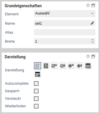
| Name | Description |
|---|---|
| Display | Changes the display of the selection options. |
| Text Alignment | Changes the text alignment (left, right, top, bottom) of the item text (option name) to the item. Not available with a drop-down selection list or a list with all options. |
| Autocomplete | Only available when drop-down selection list is selected as the display type. If this option is activated, the selection is displayed as a text field. While the user then enters text, the possible selection options are offered. |
| Column width | Distance in pixels between elements. Only available for horizontal display of checkboxes and radio buttons. |
Bedingungen
Basiseinstellungen für Bedingungen
Über die Bedingungen werden Validierungen und Sichtbarkeiten für die Formularelemente festgelegt. Einige Bedingungen sind nur für manche Formularelemente verfügbar, diese sind auch noch einmal in der Hilfe zu den einzelnen Elementen beschrieben.
Steuerbare Eigenschaften
Das Makro [velocity] konnte nicht ausgeführt werden. Grund: [null]. Klicke auf diese Nachricht, um Details zu erfahren.
org.xwiki.rendering.macro.MacroExecutionException: Failed to evaluate Velocity Macro for content [{{html}}
#set($image="$!xcontext.macro.params.image")
#set($docNameAndImgName = $image.split('@'))
#if ($docNameAndImgName.size() != 2)
#if ($image.indexOf('/') == -1)
#set($image=$doc.getAttachmentURL($image))
#end
#else
#set($targetDoc=$xwiki.getDocument($docNameAndImgName.get(0)))
#set($image=$targetDoc.getAttachmentURL($docNameAndImgName.get(1)))
#end
#set($title="$!xcontext.macro.params.title")
#set($width="$!xcontext.macro.params.width")
#if ($width != "")
#set($width="width=$width")
#end
#set($height="$!xcontext.macro.params.height")
#if ($height != "")
#set($height="height=$height")
#end
#if ($xcontext.macro.params.group)
#set($group="[$xcontext.macro.params.group]")
#else
#set($group="")
#end
#if($context.action == 'edit')
<img src="$image" $width $height/>
#else
<a href="$image" rel="lightbox$group" title="$title"><img src="$image" $width $height /></a>
#end
{{/html}}]
at org.xwiki.rendering.internal.macro.velocity.VelocityMacro.evaluateString(VelocityMacro.java:186)
at org.xwiki.rendering.internal.macro.velocity.VelocityMacro.evaluateString(VelocityMacro.java:60)
at org.xwiki.rendering.macro.script.AbstractScriptMacro.evaluateBlock(AbstractScriptMacro.java:279)
at org.xwiki.rendering.macro.script.AbstractScriptMacro.execute(AbstractScriptMacro.java:182)
at org.xwiki.rendering.macro.script.AbstractScriptMacro.execute(AbstractScriptMacro.java:58)
at org.xwiki.rendering.internal.transformation.macro.MacroTransformation.transform(MacroTransformation.java:441)
at org.xwiki.rendering.internal.transformation.DefaultRenderingContext.transformInContext(DefaultRenderingContext.java:183)
at org.xwiki.rendering.async.internal.block.AbstractBlockAsyncRenderer.transform(AbstractBlockAsyncRenderer.java:76)
at org.xwiki.rendering.wikimacro.internal.DefaultWikiMacroRenderer.transform(DefaultWikiMacroRenderer.java:882)
at org.xwiki.rendering.wikimacro.internal.DefaultWikiMacroRenderer.transform(DefaultWikiMacroRenderer.java:868)
at org.xwiki.rendering.wikimacro.internal.DefaultWikiMacroRenderer.transform(DefaultWikiMacroRenderer.java:594)
at org.xwiki.rendering.wikimacro.internal.DefaultWikiMacroRenderer.execute(DefaultWikiMacroRenderer.java:409)
at org.xwiki.rendering.async.internal.block.AbstractBlockAsyncRenderer.render(AbstractBlockAsyncRenderer.java:157)
at org.xwiki.rendering.async.internal.block.AbstractBlockAsyncRenderer.render(AbstractBlockAsyncRenderer.java:54)
at org.xwiki.rendering.async.internal.DefaultAsyncRendererExecutor.lambda$syncRender$0(DefaultAsyncRendererExecutor.java:284)
at com.xpn.xwiki.internal.security.authorization.DefaultAuthorExecutor.call(DefaultAuthorExecutor.java:98)
at org.xwiki.rendering.async.internal.DefaultAsyncRendererExecutor.syncRender(DefaultAsyncRendererExecutor.java:284)
at org.xwiki.rendering.async.internal.DefaultAsyncRendererExecutor.render(DefaultAsyncRendererExecutor.java:267)
at org.xwiki.rendering.async.internal.block.DefaultBlockAsyncRendererExecutor.execute(DefaultBlockAsyncRendererExecutor.java:125)
at org.xwiki.rendering.wikimacro.internal.DefaultWikiMacro.execute(DefaultWikiMacro.java:132)
at org.xwiki.rendering.wikimacro.internal.DefaultWikiMacro.execute(DefaultWikiMacro.java:61)
at org.xwiki.rendering.internal.transformation.macro.MacroTransformation.transform(MacroTransformation.java:441)
at org.xwiki.rendering.internal.transformation.DefaultRenderingContext.transformInContext(DefaultRenderingContext.java:183)
at org.xwiki.rendering.internal.macro.html.HTMLMacro.renderWikiSyntax(HTMLMacro.java:215)
at org.xwiki.rendering.internal.macro.html.HTMLMacro.execute(HTMLMacro.java:150)
at org.xwiki.rendering.internal.macro.html.HTMLMacro.execute(HTMLMacro.java:70)
at org.xwiki.rendering.internal.transformation.macro.MacroTransformation.transform(MacroTransformation.java:441)
at org.xwiki.rendering.internal.transformation.DefaultRenderingContext.transformInContext(DefaultRenderingContext.java:183)
at org.xwiki.rendering.async.internal.block.AbstractBlockAsyncRenderer.transform(AbstractBlockAsyncRenderer.java:76)
at org.xwiki.rendering.wikimacro.internal.DefaultWikiMacroRenderer.transform(DefaultWikiMacroRenderer.java:882)
at org.xwiki.rendering.wikimacro.internal.DefaultWikiMacroRenderer.transform(DefaultWikiMacroRenderer.java:868)
at org.xwiki.rendering.wikimacro.internal.DefaultWikiMacroRenderer.transform(DefaultWikiMacroRenderer.java:594)
at org.xwiki.rendering.wikimacro.internal.DefaultWikiMacroRenderer.execute(DefaultWikiMacroRenderer.java:409)
at org.xwiki.rendering.async.internal.block.AbstractBlockAsyncRenderer.render(AbstractBlockAsyncRenderer.java:157)
at org.xwiki.rendering.async.internal.block.AbstractBlockAsyncRenderer.render(AbstractBlockAsyncRenderer.java:54)
at org.xwiki.rendering.async.internal.DefaultAsyncRendererExecutor.lambda$syncRender$0(DefaultAsyncRendererExecutor.java:284)
at com.xpn.xwiki.internal.security.authorization.DefaultAuthorExecutor.call(DefaultAuthorExecutor.java:98)
at org.xwiki.rendering.async.internal.DefaultAsyncRendererExecutor.syncRender(DefaultAsyncRendererExecutor.java:284)
at org.xwiki.rendering.async.internal.DefaultAsyncRendererExecutor.render(DefaultAsyncRendererExecutor.java:267)
at org.xwiki.rendering.async.internal.block.DefaultBlockAsyncRendererExecutor.execute(DefaultBlockAsyncRendererExecutor.java:125)
at org.xwiki.rendering.wikimacro.internal.DefaultWikiMacro.execute(DefaultWikiMacro.java:132)
at org.xwiki.rendering.wikimacro.internal.DefaultWikiMacro.execute(DefaultWikiMacro.java:61)
at org.xwiki.rendering.internal.transformation.macro.MacroTransformation.transform(MacroTransformation.java:441)
at org.xwiki.rendering.internal.transformation.DefaultRenderingContext.transformInContext(DefaultRenderingContext.java:183)
at org.xwiki.rendering.internal.transformation.DefaultTransformationManager.performTransformations(DefaultTransformationManager.java:88)
at org.xwiki.display.internal.DocumentContentAsyncExecutor.executeInCurrentExecutionContext(DocumentContentAsyncExecutor.java:396)
at org.xwiki.display.internal.DocumentContentAsyncExecutor.executeInIsolatedExecutionContext(DocumentContentAsyncExecutor.java:365)
at org.xwiki.display.internal.DocumentContentAsyncExecutor.execute(DocumentContentAsyncExecutor.java:267)
at org.xwiki.display.internal.DocumentContentAsyncRenderer.execute(DocumentContentAsyncRenderer.java:112)
at org.xwiki.rendering.async.internal.block.AbstractBlockAsyncRenderer.render(AbstractBlockAsyncRenderer.java:157)
at org.xwiki.rendering.async.internal.block.AbstractBlockAsyncRenderer.render(AbstractBlockAsyncRenderer.java:54)
at org.xwiki.rendering.async.internal.DefaultAsyncRendererExecutor.syncRender(DefaultAsyncRendererExecutor.java:290)
at org.xwiki.rendering.async.internal.DefaultAsyncRendererExecutor.render(DefaultAsyncRendererExecutor.java:267)
at org.xwiki.rendering.async.internal.block.DefaultBlockAsyncRendererExecutor.execute(DefaultBlockAsyncRendererExecutor.java:125)
at org.xwiki.display.internal.DocumentContentDisplayer.display(DocumentContentDisplayer.java:93)
at org.xwiki.display.internal.DocumentContentDisplayer.display(DocumentContentDisplayer.java:46)
at org.xwiki.display.internal.DefaultDocumentDisplayer.display(DefaultDocumentDisplayer.java:96)
at org.xwiki.display.internal.DefaultDocumentDisplayer.display(DefaultDocumentDisplayer.java:39)
at org.xwiki.sheet.internal.SheetDocumentDisplayer.display(SheetDocumentDisplayer.java:123)
at org.xwiki.sheet.internal.SheetDocumentDisplayer.display(SheetDocumentDisplayer.java:52)
at org.xwiki.display.internal.ConfiguredDocumentDisplayer.display(ConfiguredDocumentDisplayer.java:68)
at org.xwiki.display.internal.ConfiguredDocumentDisplayer.display(ConfiguredDocumentDisplayer.java:42)
at org.xwiki.rendering.internal.macro.include.IncludeMacro.execute(IncludeMacro.java:160)
at org.xwiki.rendering.internal.macro.include.IncludeMacro.execute(IncludeMacro.java:59)
at org.xwiki.rendering.internal.transformation.macro.MacroTransformation.transform(MacroTransformation.java:441)
at org.xwiki.rendering.internal.transformation.DefaultRenderingContext.transformInContext(DefaultRenderingContext.java:183)
at org.xwiki.rendering.internal.macro.html.HTMLMacro.renderWikiSyntax(HTMLMacro.java:215)
at org.xwiki.rendering.internal.macro.html.HTMLMacro.execute(HTMLMacro.java:150)
at org.xwiki.rendering.internal.macro.html.HTMLMacro.execute(HTMLMacro.java:70)
at org.xwiki.rendering.internal.transformation.macro.MacroTransformation.transform(MacroTransformation.java:441)
at org.xwiki.rendering.internal.transformation.DefaultRenderingContext.transformInContext(DefaultRenderingContext.java:183)
at org.xwiki.rendering.async.internal.block.AbstractBlockAsyncRenderer.transform(AbstractBlockAsyncRenderer.java:76)
at org.xwiki.rendering.wikimacro.internal.DefaultWikiMacroRenderer.transform(DefaultWikiMacroRenderer.java:882)
at org.xwiki.rendering.wikimacro.internal.DefaultWikiMacroRenderer.transform(DefaultWikiMacroRenderer.java:868)
at org.xwiki.rendering.wikimacro.internal.DefaultWikiMacroRenderer.transform(DefaultWikiMacroRenderer.java:594)
at org.xwiki.rendering.wikimacro.internal.DefaultWikiMacroRenderer.execute(DefaultWikiMacroRenderer.java:409)
at org.xwiki.rendering.async.internal.block.AbstractBlockAsyncRenderer.render(AbstractBlockAsyncRenderer.java:157)
at org.xwiki.rendering.async.internal.block.AbstractBlockAsyncRenderer.render(AbstractBlockAsyncRenderer.java:54)
at org.xwiki.rendering.async.internal.DefaultAsyncRendererExecutor.lambda$syncRender$0(DefaultAsyncRendererExecutor.java:284)
at com.xpn.xwiki.internal.security.authorization.DefaultAuthorExecutor.call(DefaultAuthorExecutor.java:98)
at org.xwiki.rendering.async.internal.DefaultAsyncRendererExecutor.syncRender(DefaultAsyncRendererExecutor.java:284)
at org.xwiki.rendering.async.internal.DefaultAsyncRendererExecutor.render(DefaultAsyncRendererExecutor.java:267)
at org.xwiki.rendering.async.internal.block.DefaultBlockAsyncRendererExecutor.execute(DefaultBlockAsyncRendererExecutor.java:125)
at org.xwiki.rendering.wikimacro.internal.DefaultWikiMacro.execute(DefaultWikiMacro.java:132)
at org.xwiki.rendering.wikimacro.internal.DefaultWikiMacro.execute(DefaultWikiMacro.java:61)
at org.xwiki.rendering.internal.transformation.macro.MacroTransformation.transform(MacroTransformation.java:441)
at org.xwiki.rendering.internal.transformation.DefaultRenderingContext.transformInContext(DefaultRenderingContext.java:183)
at org.xwiki.rendering.async.internal.block.AbstractBlockAsyncRenderer.transform(AbstractBlockAsyncRenderer.java:76)
at org.xwiki.rendering.wikimacro.internal.DefaultWikiMacroRenderer.transform(DefaultWikiMacroRenderer.java:882)
at org.xwiki.rendering.wikimacro.internal.DefaultWikiMacroRenderer.transform(DefaultWikiMacroRenderer.java:868)
at org.xwiki.rendering.wikimacro.internal.DefaultWikiMacroRenderer.transform(DefaultWikiMacroRenderer.java:594)
at org.xwiki.rendering.wikimacro.internal.DefaultWikiMacroRenderer.execute(DefaultWikiMacroRenderer.java:409)
at org.xwiki.rendering.async.internal.block.AbstractBlockAsyncRenderer.render(AbstractBlockAsyncRenderer.java:157)
at org.xwiki.rendering.async.internal.block.AbstractBlockAsyncRenderer.render(AbstractBlockAsyncRenderer.java:54)
at org.xwiki.rendering.async.internal.DefaultAsyncRendererExecutor.lambda$syncRender$0(DefaultAsyncRendererExecutor.java:284)
at com.xpn.xwiki.internal.security.authorization.DefaultAuthorExecutor.call(DefaultAuthorExecutor.java:98)
at org.xwiki.rendering.async.internal.DefaultAsyncRendererExecutor.syncRender(DefaultAsyncRendererExecutor.java:284)
at org.xwiki.rendering.async.internal.DefaultAsyncRendererExecutor.render(DefaultAsyncRendererExecutor.java:267)
at org.xwiki.rendering.async.internal.block.DefaultBlockAsyncRendererExecutor.execute(DefaultBlockAsyncRendererExecutor.java:125)
at org.xwiki.rendering.wikimacro.internal.DefaultWikiMacro.execute(DefaultWikiMacro.java:132)
at org.xwiki.rendering.wikimacro.internal.DefaultWikiMacro.execute(DefaultWikiMacro.java:61)
at org.xwiki.rendering.internal.transformation.macro.MacroTransformation.transform(MacroTransformation.java:441)
at org.xwiki.rendering.internal.transformation.DefaultRenderingContext.transformInContext(DefaultRenderingContext.java:183)
at org.xwiki.rendering.internal.transformation.DefaultTransformationManager.performTransformations(DefaultTransformationManager.java:88)
at org.xwiki.display.internal.DocumentContentAsyncExecutor.executeInCurrentExecutionContext(DocumentContentAsyncExecutor.java:396)
at org.xwiki.display.internal.DocumentContentAsyncExecutor.execute(DocumentContentAsyncExecutor.java:269)
at org.xwiki.display.internal.DocumentContentAsyncRenderer.execute(DocumentContentAsyncRenderer.java:112)
at org.xwiki.rendering.async.internal.block.AbstractBlockAsyncRenderer.render(AbstractBlockAsyncRenderer.java:157)
at org.xwiki.rendering.async.internal.block.AbstractBlockAsyncRenderer.render(AbstractBlockAsyncRenderer.java:54)
at org.xwiki.rendering.async.internal.DefaultAsyncRendererExecutor.syncRender(DefaultAsyncRendererExecutor.java:290)
at org.xwiki.rendering.async.internal.DefaultAsyncRendererExecutor.render(DefaultAsyncRendererExecutor.java:267)
at org.xwiki.rendering.async.internal.block.DefaultBlockAsyncRendererExecutor.execute(DefaultBlockAsyncRendererExecutor.java:125)
at org.xwiki.display.internal.DocumentContentDisplayer.display(DocumentContentDisplayer.java:93)
at org.xwiki.display.internal.DocumentContentDisplayer.display(DocumentContentDisplayer.java:46)
at org.xwiki.display.internal.DefaultDocumentDisplayer.display(DefaultDocumentDisplayer.java:96)
at org.xwiki.display.internal.DefaultDocumentDisplayer.display(DefaultDocumentDisplayer.java:39)
at org.xwiki.sheet.internal.SheetDocumentDisplayer.display(SheetDocumentDisplayer.java:123)
at org.xwiki.sheet.internal.SheetDocumentDisplayer.display(SheetDocumentDisplayer.java:52)
at org.xwiki.display.internal.ConfiguredDocumentDisplayer.display(ConfiguredDocumentDisplayer.java:68)
at org.xwiki.display.internal.ConfiguredDocumentDisplayer.display(ConfiguredDocumentDisplayer.java:42)
at com.xpn.xwiki.doc.XWikiDocument.display(XWikiDocument.java:1431)
at com.xpn.xwiki.doc.XWikiDocument.getRenderedContent(XWikiDocument.java:1567)
at com.xpn.xwiki.doc.XWikiDocument.displayDocument(XWikiDocument.java:1517)
at com.xpn.xwiki.doc.XWikiDocument.displayDocument(XWikiDocument.java:1486)
at com.xpn.xwiki.api.Document.displayDocument(Document.java:821)
at jdk.internal.reflect.GeneratedMethodAccessor524.invoke(Unknown Source)
at java.base/jdk.internal.reflect.DelegatingMethodAccessorImpl.invoke(DelegatingMethodAccessorImpl.java:43)
at java.base/java.lang.reflect.Method.invoke(Method.java:569)
at org.apache.velocity.util.introspection.UberspectImpl$VelMethodImpl.doInvoke(UberspectImpl.java:571)
at org.apache.velocity.util.introspection.UberspectImpl$VelMethodImpl.invoke(UberspectImpl.java:554)
at org.apache.velocity.runtime.parser.node.ASTMethod.execute(ASTMethod.java:221)
at org.apache.velocity.runtime.parser.node.ASTReference.execute(ASTReference.java:368)
at org.apache.velocity.runtime.parser.node.ASTReference.value(ASTReference.java:704)
at org.apache.velocity.runtime.parser.node.ASTExpression.value(ASTExpression.java:75)
at org.apache.velocity.runtime.parser.node.ASTSetDirective.render(ASTSetDirective.java:242)
at org.apache.velocity.runtime.parser.node.ASTBlock.render(ASTBlock.java:147)
at org.apache.velocity.runtime.parser.node.SimpleNode.render(SimpleNode.java:439)
at org.apache.velocity.runtime.parser.node.ASTIfStatement.render(ASTIfStatement.java:190)
at org.apache.velocity.runtime.parser.node.ASTBlock.render(ASTBlock.java:147)
at org.xwiki.velocity.internal.directive.TryCatchDirective.render(TryCatchDirective.java:86)
at org.apache.velocity.runtime.parser.node.ASTDirective.render(ASTDirective.java:304)
at org.apache.velocity.runtime.parser.node.SimpleNode.render(SimpleNode.java:439)
at org.apache.velocity.Template.merge(Template.java:358)
at org.apache.velocity.Template.merge(Template.java:262)
at org.xwiki.velocity.internal.InternalVelocityEngine.evaluate(InternalVelocityEngine.java:233)
at com.xpn.xwiki.internal.template.VelocityTemplateEvaluator.evaluateContent(VelocityTemplateEvaluator.java:107)
at com.xpn.xwiki.internal.template.TemplateAsyncRenderer.evaluateContent(TemplateAsyncRenderer.java:219)
at com.xpn.xwiki.internal.template.TemplateAsyncRenderer.renderVelocity(TemplateAsyncRenderer.java:174)
at com.xpn.xwiki.internal.template.TemplateAsyncRenderer.render(TemplateAsyncRenderer.java:135)
at com.xpn.xwiki.internal.template.TemplateAsyncRenderer.render(TemplateAsyncRenderer.java:54)
at org.xwiki.rendering.async.internal.DefaultAsyncRendererExecutor.lambda$syncRender$0(DefaultAsyncRendererExecutor.java:284)
at com.xpn.xwiki.internal.security.authorization.DefaultAuthorExecutor.call(DefaultAuthorExecutor.java:98)
at org.xwiki.rendering.async.internal.DefaultAsyncRendererExecutor.syncRender(DefaultAsyncRendererExecutor.java:284)
at org.xwiki.rendering.async.internal.DefaultAsyncRendererExecutor.render(DefaultAsyncRendererExecutor.java:267)
at org.xwiki.rendering.async.internal.block.DefaultBlockAsyncRendererExecutor.render(DefaultBlockAsyncRendererExecutor.java:154)
at com.xpn.xwiki.internal.template.InternalTemplateManager.render(InternalTemplateManager.java:907)
at com.xpn.xwiki.internal.template.InternalTemplateManager.renderFromSkin(InternalTemplateManager.java:869)
at com.xpn.xwiki.internal.template.InternalTemplateManager.render(InternalTemplateManager.java:856)
at com.xpn.xwiki.internal.template.InternalTemplateManager.renderNoException(InternalTemplateManager.java:811)
at com.xpn.xwiki.internal.template.InternalTemplateManager.renderNoException(InternalTemplateManager.java:803)
at com.xpn.xwiki.internal.template.DefaultTemplateManager.renderNoException(DefaultTemplateManager.java:79)
at com.xpn.xwiki.internal.template.DefaultTemplateManager.renderNoException(DefaultTemplateManager.java:73)
at org.xwiki.template.script.TemplateScriptService.render(TemplateScriptService.java:54)
at jdk.internal.reflect.GeneratedMethodAccessor192.invoke(Unknown Source)
at java.base/jdk.internal.reflect.DelegatingMethodAccessorImpl.invoke(DelegatingMethodAccessorImpl.java:43)
at java.base/java.lang.reflect.Method.invoke(Method.java:569)
at org.apache.velocity.util.introspection.UberspectImpl$VelMethodImpl.doInvoke(UberspectImpl.java:571)
at org.apache.velocity.util.introspection.UberspectImpl$VelMethodImpl.invoke(UberspectImpl.java:554)
at org.apache.velocity.runtime.parser.node.ASTMethod.execute(ASTMethod.java:221)
at org.apache.velocity.runtime.parser.node.ASTReference.execute(ASTReference.java:368)
at org.apache.velocity.runtime.parser.node.ASTReference.render(ASTReference.java:492)
at org.apache.velocity.runtime.parser.node.ASTBlock.render(ASTBlock.java:147)
at org.apache.velocity.runtime.directive.VelocimacroProxy.render(VelocimacroProxy.java:217)
at org.apache.velocity.runtime.directive.RuntimeMacro.render(RuntimeMacro.java:331)
at org.apache.velocity.runtime.directive.RuntimeMacro.render(RuntimeMacro.java:261)
at org.apache.velocity.runtime.parser.node.ASTDirective.render(ASTDirective.java:304)
at org.apache.velocity.runtime.parser.node.SimpleNode.render(SimpleNode.java:439)
at org.apache.velocity.Template.merge(Template.java:358)
at org.apache.velocity.Template.merge(Template.java:262)
at org.xwiki.velocity.internal.InternalVelocityEngine.evaluate(InternalVelocityEngine.java:233)
at com.xpn.xwiki.internal.template.VelocityTemplateEvaluator.evaluateContent(VelocityTemplateEvaluator.java:107)
at com.xpn.xwiki.internal.template.TemplateAsyncRenderer.evaluateContent(TemplateAsyncRenderer.java:219)
at com.xpn.xwiki.internal.template.TemplateAsyncRenderer.renderVelocity(TemplateAsyncRenderer.java:174)
at com.xpn.xwiki.internal.template.TemplateAsyncRenderer.render(TemplateAsyncRenderer.java:135)
at com.xpn.xwiki.internal.template.TemplateAsyncRenderer.render(TemplateAsyncRenderer.java:54)
at org.xwiki.rendering.async.internal.DefaultAsyncRendererExecutor.lambda$syncRender$0(DefaultAsyncRendererExecutor.java:284)
at com.xpn.xwiki.internal.security.authorization.DefaultAuthorExecutor.call(DefaultAuthorExecutor.java:98)
at org.xwiki.rendering.async.internal.DefaultAsyncRendererExecutor.syncRender(DefaultAsyncRendererExecutor.java:284)
at org.xwiki.rendering.async.internal.DefaultAsyncRendererExecutor.render(DefaultAsyncRendererExecutor.java:267)
at org.xwiki.rendering.async.internal.block.DefaultBlockAsyncRendererExecutor.render(DefaultBlockAsyncRendererExecutor.java:154)
at com.xpn.xwiki.internal.template.InternalTemplateManager.render(InternalTemplateManager.java:907)
at com.xpn.xwiki.internal.template.InternalTemplateManager.renderFromSkin(InternalTemplateManager.java:869)
at com.xpn.xwiki.internal.template.InternalTemplateManager.render(InternalTemplateManager.java:856)
at com.xpn.xwiki.internal.template.InternalTemplateManager.renderNoException(InternalTemplateManager.java:811)
at com.xpn.xwiki.internal.template.InternalTemplateManager.renderNoException(InternalTemplateManager.java:803)
at com.xpn.xwiki.internal.template.DefaultTemplateManager.renderNoException(DefaultTemplateManager.java:79)
at com.xpn.xwiki.internal.template.DefaultTemplateManager.renderNoException(DefaultTemplateManager.java:73)
at org.xwiki.template.script.TemplateScriptService.render(TemplateScriptService.java:54)
at jdk.internal.reflect.GeneratedMethodAccessor192.invoke(Unknown Source)
at java.base/jdk.internal.reflect.DelegatingMethodAccessorImpl.invoke(DelegatingMethodAccessorImpl.java:43)
at java.base/java.lang.reflect.Method.invoke(Method.java:569)
at org.apache.velocity.util.introspection.UberspectImpl$VelMethodImpl.doInvoke(UberspectImpl.java:571)
at org.apache.velocity.util.introspection.UberspectImpl$VelMethodImpl.invoke(UberspectImpl.java:554)
at org.apache.velocity.runtime.parser.node.ASTMethod.execute(ASTMethod.java:221)
at org.apache.velocity.runtime.parser.node.ASTReference.execute(ASTReference.java:368)
at org.apache.velocity.runtime.parser.node.ASTReference.render(ASTReference.java:492)
at org.apache.velocity.runtime.parser.node.ASTBlock.render(ASTBlock.java:147)
at org.apache.velocity.runtime.directive.VelocimacroProxy.render(VelocimacroProxy.java:217)
at org.apache.velocity.runtime.directive.RuntimeMacro.render(RuntimeMacro.java:331)
at org.apache.velocity.runtime.directive.RuntimeMacro.render(RuntimeMacro.java:261)
at org.apache.velocity.runtime.parser.node.ASTDirective.render(ASTDirective.java:304)
at org.apache.velocity.runtime.parser.node.ASTBlock.render(ASTBlock.java:147)
at org.apache.velocity.runtime.parser.node.ASTIfStatement.render(ASTIfStatement.java:171)
at org.apache.velocity.runtime.parser.node.ASTBlock.render(ASTBlock.java:147)
at org.apache.velocity.runtime.parser.node.SimpleNode.render(SimpleNode.java:439)
at org.apache.velocity.runtime.parser.node.ASTIfStatement.render(ASTIfStatement.java:190)
at org.apache.velocity.runtime.parser.node.SimpleNode.render(SimpleNode.java:439)
at org.apache.velocity.Template.merge(Template.java:358)
at org.apache.velocity.Template.merge(Template.java:262)
at org.xwiki.velocity.internal.InternalVelocityEngine.evaluate(InternalVelocityEngine.java:233)
at com.xpn.xwiki.internal.template.VelocityTemplateEvaluator.evaluateContent(VelocityTemplateEvaluator.java:107)
at com.xpn.xwiki.internal.template.TemplateAsyncRenderer.evaluateContent(TemplateAsyncRenderer.java:219)
at com.xpn.xwiki.internal.template.TemplateAsyncRenderer.renderVelocity(TemplateAsyncRenderer.java:174)
at com.xpn.xwiki.internal.template.TemplateAsyncRenderer.render(TemplateAsyncRenderer.java:135)
at com.xpn.xwiki.internal.template.TemplateAsyncRenderer.render(TemplateAsyncRenderer.java:54)
at org.xwiki.rendering.async.internal.DefaultAsyncRendererExecutor.lambda$syncRender$0(DefaultAsyncRendererExecutor.java:284)
at com.xpn.xwiki.internal.security.authorization.DefaultAuthorExecutor.call(DefaultAuthorExecutor.java:98)
at org.xwiki.rendering.async.internal.DefaultAsyncRendererExecutor.syncRender(DefaultAsyncRendererExecutor.java:284)
at org.xwiki.rendering.async.internal.DefaultAsyncRendererExecutor.render(DefaultAsyncRendererExecutor.java:267)
at org.xwiki.rendering.async.internal.block.DefaultBlockAsyncRendererExecutor.render(DefaultBlockAsyncRendererExecutor.java:154)
at com.xpn.xwiki.internal.template.InternalTemplateManager.render(InternalTemplateManager.java:907)
at com.xpn.xwiki.internal.template.InternalTemplateManager.renderFromSkin(InternalTemplateManager.java:869)
at com.xpn.xwiki.internal.template.InternalTemplateManager.renderFromSkin(InternalTemplateManager.java:849)
at com.xpn.xwiki.internal.template.InternalTemplateManager.render(InternalTemplateManager.java:835)
at com.xpn.xwiki.internal.template.DefaultTemplateManager.render(DefaultTemplateManager.java:91)
at com.xpn.xwiki.internal.template.DefaultTemplateManager.render(DefaultTemplateManager.java:85)
at com.xpn.xwiki.XWiki.evaluateTemplate(XWiki.java:2569)
at com.xpn.xwiki.web.Utils.parseTemplate(Utils.java:180)
at com.xpn.xwiki.web.XWikiAction.execute(XWikiAction.java:651)
at com.xpn.xwiki.web.XWikiAction.execute(XWikiAction.java:339)
at com.xpn.xwiki.web.LegacyActionServlet.service(LegacyActionServlet.java:108)
at javax.servlet.http.HttpServlet.service(HttpServlet.java:623)
at org.apache.catalina.core.ApplicationFilterChain.internalDoFilter(ApplicationFilterChain.java:199)
at org.apache.catalina.core.ApplicationFilterChain.doFilter(ApplicationFilterChain.java:144)
at com.xpn.xwiki.web.ActionFilter.doFilter(ActionFilter.java:122)
at org.apache.catalina.core.ApplicationFilterChain.internalDoFilter(ApplicationFilterChain.java:168)
at org.apache.catalina.core.ApplicationFilterChain.doFilter(ApplicationFilterChain.java:144)
at org.xwiki.wysiwyg.filter.ConversionFilter.doFilter(ConversionFilter.java:61)
at org.apache.catalina.core.ApplicationFilterChain.internalDoFilter(ApplicationFilterChain.java:168)
at org.apache.catalina.core.ApplicationFilterChain.doFilter(ApplicationFilterChain.java:144)
at org.apache.tomcat.websocket.server.WsFilter.doFilter(WsFilter.java:51)
at org.apache.catalina.core.ApplicationFilterChain.internalDoFilter(ApplicationFilterChain.java:168)
at org.apache.catalina.core.ApplicationFilterChain.doFilter(ApplicationFilterChain.java:144)
at org.xwiki.container.servlet.filters.internal.SetHTTPHeaderFilter.doFilter(SetHTTPHeaderFilter.java:63)
at org.apache.catalina.core.ApplicationFilterChain.internalDoFilter(ApplicationFilterChain.java:168)
at org.apache.catalina.core.ApplicationFilterChain.doFilter(ApplicationFilterChain.java:144)
at org.xwiki.resource.servlet.RoutingFilter.doFilter(RoutingFilter.java:132)
at org.apache.catalina.core.ApplicationFilterChain.internalDoFilter(ApplicationFilterChain.java:168)
at org.apache.catalina.core.ApplicationFilterChain.doFilter(ApplicationFilterChain.java:144)
at org.xwiki.container.servlet.filters.internal.SavedRequestRestorerFilter.doFilter(SavedRequestRestorerFilter.java:209)
at org.apache.catalina.core.ApplicationFilterChain.internalDoFilter(ApplicationFilterChain.java:168)
at org.apache.catalina.core.ApplicationFilterChain.doFilter(ApplicationFilterChain.java:144)
at org.xwiki.container.servlet.filters.internal.SetCharacterEncodingFilter.doFilter(SetCharacterEncodingFilter.java:117)
at org.apache.catalina.core.ApplicationFilterChain.internalDoFilter(ApplicationFilterChain.java:168)
at org.apache.catalina.core.ApplicationFilterChain.doFilter(ApplicationFilterChain.java:144)
at org.apache.catalina.core.StandardWrapperValve.invoke(StandardWrapperValve.java:168)
at org.apache.catalina.core.StandardContextValve.invoke(StandardContextValve.java:90)
at org.apache.catalina.authenticator.AuthenticatorBase.invoke(AuthenticatorBase.java:482)
at org.apache.catalina.core.StandardHostValve.invoke(StandardHostValve.java:130)
at org.apache.catalina.valves.ErrorReportValve.invoke(ErrorReportValve.java:93)
at org.apache.catalina.valves.AbstractAccessLogValve.invoke(AbstractAccessLogValve.java:656)
at org.apache.catalina.core.StandardEngineValve.invoke(StandardEngineValve.java:74)
at org.apache.catalina.connector.CoyoteAdapter.service(CoyoteAdapter.java:346)
at org.apache.coyote.http11.Http11Processor.service(Http11Processor.java:397)
at org.apache.coyote.AbstractProcessorLight.process(AbstractProcessorLight.java:63)
at org.apache.coyote.AbstractProtocol$ConnectionHandler.process(AbstractProtocol.java:935)
at org.apache.tomcat.util.net.NioEndpoint$SocketProcessor.doRun(NioEndpoint.java:1826)
at org.apache.tomcat.util.net.SocketProcessorBase.run(SocketProcessorBase.java:52)
at org.apache.tomcat.util.threads.ThreadPoolExecutor.runWorker(ThreadPoolExecutor.java:1189)
at org.apache.tomcat.util.threads.ThreadPoolExecutor$Worker.run(ThreadPoolExecutor.java:658)
at org.apache.tomcat.util.threads.TaskThread$WrappingRunnable.run(TaskThread.java:63)
at java.base/java.lang.Thread.run(Thread.java:840)
Caused by: org.xwiki.velocity.XWikiVelocityException: Failed to evaluate content with namespace [xwiki:Formcycle.Designer.Form.ElementProperties.Constraints]
at org.xwiki.velocity.internal.InternalVelocityEngine.evaluate(InternalVelocityEngine.java:235)
at org.xwiki.rendering.internal.macro.velocity.VelocityMacro.evaluateString(VelocityMacro.java:168)
... 281 more
Caused by: org.apache.velocity.exception.MethodInvocationException: Invocation of method 'getAttachmentURL' in class com.xpn.xwiki.api.Document threw exception java.lang.NullPointerException at xwiki:XWiki.LightboxMacro[line 6, column 18]
at org.apache.velocity.runtime.parser.node.ASTMethod.handleInvocationException(ASTMethod.java:308)
at org.apache.velocity.runtime.parser.node.ASTMethod.execute(ASTMethod.java:235)
at org.apache.velocity.runtime.parser.node.ASTReference.execute(ASTReference.java:368)
at org.apache.velocity.runtime.parser.node.ASTReference.value(ASTReference.java:704)
at org.apache.velocity.runtime.parser.node.ASTExpression.value(ASTExpression.java:75)
at org.apache.velocity.runtime.parser.node.ASTSetDirective.render(ASTSetDirective.java:242)
at org.apache.velocity.runtime.parser.node.ASTBlock.render(ASTBlock.java:147)
at org.apache.velocity.runtime.parser.node.ASTIfStatement.render(ASTIfStatement.java:171)
at org.apache.velocity.runtime.parser.node.ASTBlock.render(ASTBlock.java:147)
at org.apache.velocity.runtime.parser.node.ASTIfStatement.render(ASTIfStatement.java:171)
at org.apache.velocity.runtime.parser.node.SimpleNode.render(SimpleNode.java:439)
at org.apache.velocity.Template.merge(Template.java:358)
at org.apache.velocity.Template.merge(Template.java:262)
at org.xwiki.velocity.internal.InternalVelocityEngine.evaluate(InternalVelocityEngine.java:233)
... 282 more
Caused by: java.lang.NullPointerException
| Name | Beschreibung |
|---|---|
| Versteckt wenn | Wenn die Bedingung erfüllt ist, wird das Formularelement versteckt. |
| Sichtbar wenn | Wenn die Bedingung erfüllt ist, wird das Formularelement angezeigt. Diese Option erscheint, wenn das Formularfeld auf versteckt geschalten wurde. |
| Gesperrt wenn | Wenn die Bedingung erfüllt ist, wird das Formularelement nicht-editierbar geschaltet. |
| Editierbar wenn | Wenn die Bedingung erfüllt ist, wird das Formularelement wieder editierbar geschaltet. Diese Option erscheint, wenn das Formularfeld auf gesperrt geschalten wurde. |
| Mussfeld | Ist diese Option aktiviert, muss das Formularfeld zwingend ausgefüllt werden. Wenn diese Option aktiviert ist, werden unter Mussfeld wenn konfigurierte Bedingung ignoriert. |
| Mussfeld wenn | Wenn die Bedingung erfüllt ist, wird das Formularelement zu einem Mussfeld. |
| Mussfeldgruppe | Nur verfügbar, wenn Mussfeld ausgewählt ist. Legt die Mussfeldgruppe fest, zu der das Element gehören soll. Wenn zwei oder mehr Elemente zu einer Mussfeldgruppe gehören, muss mindestens eines davon einen Wert haben, alle anderen müssen aber nicht ausgefüllt werden. |
| Prüfe serverseitig | Wenn diese Option aktiviert ist, werden die abgesendeten Daten auch auf dem Server geprüft. Die Daten werden im Browser geprüft, dennoch ist es technisch möglich, ungültige Formulare abzusenden. Schlägt die serverseitige Validierung fehl, erscheint im Formular die entsprechende Fehlermeldung. 7.2.0+ Bei der Verwendung einer benutzerdefinierten Formel als Bedingung ist diese Option funktionslos. Es kann in diesem Fall keine serverseitige Validierung durchgeführt werden. |
Bedingungen
Das Makro [velocity] konnte nicht ausgeführt werden. Grund: [null]. Klicke auf diese Nachricht, um Details zu erfahren.
org.xwiki.rendering.macro.MacroExecutionException: Failed to evaluate Velocity Macro for content [{{html}}
#set($image="$!xcontext.macro.params.image")
#set($docNameAndImgName = $image.split('@'))
#if ($docNameAndImgName.size() != 2)
#if ($image.indexOf('/') == -1)
#set($image=$doc.getAttachmentURL($image))
#end
#else
#set($targetDoc=$xwiki.getDocument($docNameAndImgName.get(0)))
#set($image=$targetDoc.getAttachmentURL($docNameAndImgName.get(1)))
#end
#set($title="$!xcontext.macro.params.title")
#set($width="$!xcontext.macro.params.width")
#if ($width != "")
#set($width="width=$width")
#end
#set($height="$!xcontext.macro.params.height")
#if ($height != "")
#set($height="height=$height")
#end
#if ($xcontext.macro.params.group)
#set($group="[$xcontext.macro.params.group]")
#else
#set($group="")
#end
#if($context.action == 'edit')
<img src="$image" $width $height/>
#else
<a href="$image" rel="lightbox$group" title="$title"><img src="$image" $width $height /></a>
#end
{{/html}}]
at org.xwiki.rendering.internal.macro.velocity.VelocityMacro.evaluateString(VelocityMacro.java:186)
at org.xwiki.rendering.internal.macro.velocity.VelocityMacro.evaluateString(VelocityMacro.java:60)
at org.xwiki.rendering.macro.script.AbstractScriptMacro.evaluateBlock(AbstractScriptMacro.java:279)
at org.xwiki.rendering.macro.script.AbstractScriptMacro.execute(AbstractScriptMacro.java:182)
at org.xwiki.rendering.macro.script.AbstractScriptMacro.execute(AbstractScriptMacro.java:58)
at org.xwiki.rendering.internal.transformation.macro.MacroTransformation.transform(MacroTransformation.java:441)
at org.xwiki.rendering.internal.transformation.DefaultRenderingContext.transformInContext(DefaultRenderingContext.java:183)
at org.xwiki.rendering.async.internal.block.AbstractBlockAsyncRenderer.transform(AbstractBlockAsyncRenderer.java:76)
at org.xwiki.rendering.wikimacro.internal.DefaultWikiMacroRenderer.transform(DefaultWikiMacroRenderer.java:882)
at org.xwiki.rendering.wikimacro.internal.DefaultWikiMacroRenderer.transform(DefaultWikiMacroRenderer.java:868)
at org.xwiki.rendering.wikimacro.internal.DefaultWikiMacroRenderer.transform(DefaultWikiMacroRenderer.java:594)
at org.xwiki.rendering.wikimacro.internal.DefaultWikiMacroRenderer.execute(DefaultWikiMacroRenderer.java:409)
at org.xwiki.rendering.async.internal.block.AbstractBlockAsyncRenderer.render(AbstractBlockAsyncRenderer.java:157)
at org.xwiki.rendering.async.internal.block.AbstractBlockAsyncRenderer.render(AbstractBlockAsyncRenderer.java:54)
at org.xwiki.rendering.async.internal.DefaultAsyncRendererExecutor.lambda$syncRender$0(DefaultAsyncRendererExecutor.java:284)
at com.xpn.xwiki.internal.security.authorization.DefaultAuthorExecutor.call(DefaultAuthorExecutor.java:98)
at org.xwiki.rendering.async.internal.DefaultAsyncRendererExecutor.syncRender(DefaultAsyncRendererExecutor.java:284)
at org.xwiki.rendering.async.internal.DefaultAsyncRendererExecutor.render(DefaultAsyncRendererExecutor.java:267)
at org.xwiki.rendering.async.internal.block.DefaultBlockAsyncRendererExecutor.execute(DefaultBlockAsyncRendererExecutor.java:125)
at org.xwiki.rendering.wikimacro.internal.DefaultWikiMacro.execute(DefaultWikiMacro.java:132)
at org.xwiki.rendering.wikimacro.internal.DefaultWikiMacro.execute(DefaultWikiMacro.java:61)
at org.xwiki.rendering.internal.transformation.macro.MacroTransformation.transform(MacroTransformation.java:441)
at org.xwiki.rendering.internal.transformation.DefaultRenderingContext.transformInContext(DefaultRenderingContext.java:183)
at org.xwiki.rendering.internal.macro.html.HTMLMacro.renderWikiSyntax(HTMLMacro.java:215)
at org.xwiki.rendering.internal.macro.html.HTMLMacro.execute(HTMLMacro.java:150)
at org.xwiki.rendering.internal.macro.html.HTMLMacro.execute(HTMLMacro.java:70)
at org.xwiki.rendering.internal.transformation.macro.MacroTransformation.transform(MacroTransformation.java:441)
at org.xwiki.rendering.internal.transformation.DefaultRenderingContext.transformInContext(DefaultRenderingContext.java:183)
at org.xwiki.rendering.async.internal.block.AbstractBlockAsyncRenderer.transform(AbstractBlockAsyncRenderer.java:76)
at org.xwiki.rendering.wikimacro.internal.DefaultWikiMacroRenderer.transform(DefaultWikiMacroRenderer.java:882)
at org.xwiki.rendering.wikimacro.internal.DefaultWikiMacroRenderer.transform(DefaultWikiMacroRenderer.java:868)
at org.xwiki.rendering.wikimacro.internal.DefaultWikiMacroRenderer.transform(DefaultWikiMacroRenderer.java:594)
at org.xwiki.rendering.wikimacro.internal.DefaultWikiMacroRenderer.execute(DefaultWikiMacroRenderer.java:409)
at org.xwiki.rendering.async.internal.block.AbstractBlockAsyncRenderer.render(AbstractBlockAsyncRenderer.java:157)
at org.xwiki.rendering.async.internal.block.AbstractBlockAsyncRenderer.render(AbstractBlockAsyncRenderer.java:54)
at org.xwiki.rendering.async.internal.DefaultAsyncRendererExecutor.lambda$syncRender$0(DefaultAsyncRendererExecutor.java:284)
at com.xpn.xwiki.internal.security.authorization.DefaultAuthorExecutor.call(DefaultAuthorExecutor.java:98)
at org.xwiki.rendering.async.internal.DefaultAsyncRendererExecutor.syncRender(DefaultAsyncRendererExecutor.java:284)
at org.xwiki.rendering.async.internal.DefaultAsyncRendererExecutor.render(DefaultAsyncRendererExecutor.java:267)
at org.xwiki.rendering.async.internal.block.DefaultBlockAsyncRendererExecutor.execute(DefaultBlockAsyncRendererExecutor.java:125)
at org.xwiki.rendering.wikimacro.internal.DefaultWikiMacro.execute(DefaultWikiMacro.java:132)
at org.xwiki.rendering.wikimacro.internal.DefaultWikiMacro.execute(DefaultWikiMacro.java:61)
at org.xwiki.rendering.internal.transformation.macro.MacroTransformation.transform(MacroTransformation.java:441)
at org.xwiki.rendering.internal.transformation.DefaultRenderingContext.transformInContext(DefaultRenderingContext.java:183)
at org.xwiki.rendering.internal.transformation.DefaultTransformationManager.performTransformations(DefaultTransformationManager.java:88)
at org.xwiki.display.internal.DocumentContentAsyncExecutor.executeInCurrentExecutionContext(DocumentContentAsyncExecutor.java:396)
at org.xwiki.display.internal.DocumentContentAsyncExecutor.executeInIsolatedExecutionContext(DocumentContentAsyncExecutor.java:365)
at org.xwiki.display.internal.DocumentContentAsyncExecutor.execute(DocumentContentAsyncExecutor.java:267)
at org.xwiki.display.internal.DocumentContentAsyncRenderer.execute(DocumentContentAsyncRenderer.java:112)
at org.xwiki.rendering.async.internal.block.AbstractBlockAsyncRenderer.render(AbstractBlockAsyncRenderer.java:157)
at org.xwiki.rendering.async.internal.block.AbstractBlockAsyncRenderer.render(AbstractBlockAsyncRenderer.java:54)
at org.xwiki.rendering.async.internal.DefaultAsyncRendererExecutor.syncRender(DefaultAsyncRendererExecutor.java:290)
at org.xwiki.rendering.async.internal.DefaultAsyncRendererExecutor.render(DefaultAsyncRendererExecutor.java:267)
at org.xwiki.rendering.async.internal.block.DefaultBlockAsyncRendererExecutor.execute(DefaultBlockAsyncRendererExecutor.java:125)
at org.xwiki.display.internal.DocumentContentDisplayer.display(DocumentContentDisplayer.java:93)
at org.xwiki.display.internal.DocumentContentDisplayer.display(DocumentContentDisplayer.java:46)
at org.xwiki.display.internal.DefaultDocumentDisplayer.display(DefaultDocumentDisplayer.java:96)
at org.xwiki.display.internal.DefaultDocumentDisplayer.display(DefaultDocumentDisplayer.java:39)
at org.xwiki.sheet.internal.SheetDocumentDisplayer.display(SheetDocumentDisplayer.java:123)
at org.xwiki.sheet.internal.SheetDocumentDisplayer.display(SheetDocumentDisplayer.java:52)
at org.xwiki.display.internal.ConfiguredDocumentDisplayer.display(ConfiguredDocumentDisplayer.java:68)
at org.xwiki.display.internal.ConfiguredDocumentDisplayer.display(ConfiguredDocumentDisplayer.java:42)
at org.xwiki.rendering.internal.macro.include.IncludeMacro.execute(IncludeMacro.java:160)
at org.xwiki.rendering.internal.macro.include.IncludeMacro.execute(IncludeMacro.java:59)
at org.xwiki.rendering.internal.transformation.macro.MacroTransformation.transform(MacroTransformation.java:441)
at org.xwiki.rendering.internal.transformation.DefaultRenderingContext.transformInContext(DefaultRenderingContext.java:183)
at org.xwiki.rendering.internal.macro.html.HTMLMacro.renderWikiSyntax(HTMLMacro.java:215)
at org.xwiki.rendering.internal.macro.html.HTMLMacro.execute(HTMLMacro.java:150)
at org.xwiki.rendering.internal.macro.html.HTMLMacro.execute(HTMLMacro.java:70)
at org.xwiki.rendering.internal.transformation.macro.MacroTransformation.transform(MacroTransformation.java:441)
at org.xwiki.rendering.internal.transformation.DefaultRenderingContext.transformInContext(DefaultRenderingContext.java:183)
at org.xwiki.rendering.async.internal.block.AbstractBlockAsyncRenderer.transform(AbstractBlockAsyncRenderer.java:76)
at org.xwiki.rendering.wikimacro.internal.DefaultWikiMacroRenderer.transform(DefaultWikiMacroRenderer.java:882)
at org.xwiki.rendering.wikimacro.internal.DefaultWikiMacroRenderer.transform(DefaultWikiMacroRenderer.java:868)
at org.xwiki.rendering.wikimacro.internal.DefaultWikiMacroRenderer.transform(DefaultWikiMacroRenderer.java:594)
at org.xwiki.rendering.wikimacro.internal.DefaultWikiMacroRenderer.execute(DefaultWikiMacroRenderer.java:409)
at org.xwiki.rendering.async.internal.block.AbstractBlockAsyncRenderer.render(AbstractBlockAsyncRenderer.java:157)
at org.xwiki.rendering.async.internal.block.AbstractBlockAsyncRenderer.render(AbstractBlockAsyncRenderer.java:54)
at org.xwiki.rendering.async.internal.DefaultAsyncRendererExecutor.lambda$syncRender$0(DefaultAsyncRendererExecutor.java:284)
at com.xpn.xwiki.internal.security.authorization.DefaultAuthorExecutor.call(DefaultAuthorExecutor.java:98)
at org.xwiki.rendering.async.internal.DefaultAsyncRendererExecutor.syncRender(DefaultAsyncRendererExecutor.java:284)
at org.xwiki.rendering.async.internal.DefaultAsyncRendererExecutor.render(DefaultAsyncRendererExecutor.java:267)
at org.xwiki.rendering.async.internal.block.DefaultBlockAsyncRendererExecutor.execute(DefaultBlockAsyncRendererExecutor.java:125)
at org.xwiki.rendering.wikimacro.internal.DefaultWikiMacro.execute(DefaultWikiMacro.java:132)
at org.xwiki.rendering.wikimacro.internal.DefaultWikiMacro.execute(DefaultWikiMacro.java:61)
at org.xwiki.rendering.internal.transformation.macro.MacroTransformation.transform(MacroTransformation.java:441)
at org.xwiki.rendering.internal.transformation.DefaultRenderingContext.transformInContext(DefaultRenderingContext.java:183)
at org.xwiki.rendering.async.internal.block.AbstractBlockAsyncRenderer.transform(AbstractBlockAsyncRenderer.java:76)
at org.xwiki.rendering.wikimacro.internal.DefaultWikiMacroRenderer.transform(DefaultWikiMacroRenderer.java:882)
at org.xwiki.rendering.wikimacro.internal.DefaultWikiMacroRenderer.transform(DefaultWikiMacroRenderer.java:868)
at org.xwiki.rendering.wikimacro.internal.DefaultWikiMacroRenderer.transform(DefaultWikiMacroRenderer.java:594)
at org.xwiki.rendering.wikimacro.internal.DefaultWikiMacroRenderer.execute(DefaultWikiMacroRenderer.java:409)
at org.xwiki.rendering.async.internal.block.AbstractBlockAsyncRenderer.render(AbstractBlockAsyncRenderer.java:157)
at org.xwiki.rendering.async.internal.block.AbstractBlockAsyncRenderer.render(AbstractBlockAsyncRenderer.java:54)
at org.xwiki.rendering.async.internal.DefaultAsyncRendererExecutor.lambda$syncRender$0(DefaultAsyncRendererExecutor.java:284)
at com.xpn.xwiki.internal.security.authorization.DefaultAuthorExecutor.call(DefaultAuthorExecutor.java:98)
at org.xwiki.rendering.async.internal.DefaultAsyncRendererExecutor.syncRender(DefaultAsyncRendererExecutor.java:284)
at org.xwiki.rendering.async.internal.DefaultAsyncRendererExecutor.render(DefaultAsyncRendererExecutor.java:267)
at org.xwiki.rendering.async.internal.block.DefaultBlockAsyncRendererExecutor.execute(DefaultBlockAsyncRendererExecutor.java:125)
at org.xwiki.rendering.wikimacro.internal.DefaultWikiMacro.execute(DefaultWikiMacro.java:132)
at org.xwiki.rendering.wikimacro.internal.DefaultWikiMacro.execute(DefaultWikiMacro.java:61)
at org.xwiki.rendering.internal.transformation.macro.MacroTransformation.transform(MacroTransformation.java:441)
at org.xwiki.rendering.internal.transformation.DefaultRenderingContext.transformInContext(DefaultRenderingContext.java:183)
at org.xwiki.rendering.internal.transformation.DefaultTransformationManager.performTransformations(DefaultTransformationManager.java:88)
at org.xwiki.display.internal.DocumentContentAsyncExecutor.executeInCurrentExecutionContext(DocumentContentAsyncExecutor.java:396)
at org.xwiki.display.internal.DocumentContentAsyncExecutor.execute(DocumentContentAsyncExecutor.java:269)
at org.xwiki.display.internal.DocumentContentAsyncRenderer.execute(DocumentContentAsyncRenderer.java:112)
at org.xwiki.rendering.async.internal.block.AbstractBlockAsyncRenderer.render(AbstractBlockAsyncRenderer.java:157)
at org.xwiki.rendering.async.internal.block.AbstractBlockAsyncRenderer.render(AbstractBlockAsyncRenderer.java:54)
at org.xwiki.rendering.async.internal.DefaultAsyncRendererExecutor.syncRender(DefaultAsyncRendererExecutor.java:290)
at org.xwiki.rendering.async.internal.DefaultAsyncRendererExecutor.render(DefaultAsyncRendererExecutor.java:267)
at org.xwiki.rendering.async.internal.block.DefaultBlockAsyncRendererExecutor.execute(DefaultBlockAsyncRendererExecutor.java:125)
at org.xwiki.display.internal.DocumentContentDisplayer.display(DocumentContentDisplayer.java:93)
at org.xwiki.display.internal.DocumentContentDisplayer.display(DocumentContentDisplayer.java:46)
at org.xwiki.display.internal.DefaultDocumentDisplayer.display(DefaultDocumentDisplayer.java:96)
at org.xwiki.display.internal.DefaultDocumentDisplayer.display(DefaultDocumentDisplayer.java:39)
at org.xwiki.sheet.internal.SheetDocumentDisplayer.display(SheetDocumentDisplayer.java:123)
at org.xwiki.sheet.internal.SheetDocumentDisplayer.display(SheetDocumentDisplayer.java:52)
at org.xwiki.display.internal.ConfiguredDocumentDisplayer.display(ConfiguredDocumentDisplayer.java:68)
at org.xwiki.display.internal.ConfiguredDocumentDisplayer.display(ConfiguredDocumentDisplayer.java:42)
at com.xpn.xwiki.doc.XWikiDocument.display(XWikiDocument.java:1431)
at com.xpn.xwiki.doc.XWikiDocument.getRenderedContent(XWikiDocument.java:1567)
at com.xpn.xwiki.doc.XWikiDocument.displayDocument(XWikiDocument.java:1517)
at com.xpn.xwiki.doc.XWikiDocument.displayDocument(XWikiDocument.java:1486)
at com.xpn.xwiki.api.Document.displayDocument(Document.java:821)
at jdk.internal.reflect.GeneratedMethodAccessor524.invoke(Unknown Source)
at java.base/jdk.internal.reflect.DelegatingMethodAccessorImpl.invoke(DelegatingMethodAccessorImpl.java:43)
at java.base/java.lang.reflect.Method.invoke(Method.java:569)
at org.apache.velocity.util.introspection.UberspectImpl$VelMethodImpl.doInvoke(UberspectImpl.java:571)
at org.apache.velocity.util.introspection.UberspectImpl$VelMethodImpl.invoke(UberspectImpl.java:554)
at org.apache.velocity.runtime.parser.node.ASTMethod.execute(ASTMethod.java:221)
at org.apache.velocity.runtime.parser.node.ASTReference.execute(ASTReference.java:368)
at org.apache.velocity.runtime.parser.node.ASTReference.value(ASTReference.java:704)
at org.apache.velocity.runtime.parser.node.ASTExpression.value(ASTExpression.java:75)
at org.apache.velocity.runtime.parser.node.ASTSetDirective.render(ASTSetDirective.java:242)
at org.apache.velocity.runtime.parser.node.ASTBlock.render(ASTBlock.java:147)
at org.apache.velocity.runtime.parser.node.SimpleNode.render(SimpleNode.java:439)
at org.apache.velocity.runtime.parser.node.ASTIfStatement.render(ASTIfStatement.java:190)
at org.apache.velocity.runtime.parser.node.ASTBlock.render(ASTBlock.java:147)
at org.xwiki.velocity.internal.directive.TryCatchDirective.render(TryCatchDirective.java:86)
at org.apache.velocity.runtime.parser.node.ASTDirective.render(ASTDirective.java:304)
at org.apache.velocity.runtime.parser.node.SimpleNode.render(SimpleNode.java:439)
at org.apache.velocity.Template.merge(Template.java:358)
at org.apache.velocity.Template.merge(Template.java:262)
at org.xwiki.velocity.internal.InternalVelocityEngine.evaluate(InternalVelocityEngine.java:233)
at com.xpn.xwiki.internal.template.VelocityTemplateEvaluator.evaluateContent(VelocityTemplateEvaluator.java:107)
at com.xpn.xwiki.internal.template.TemplateAsyncRenderer.evaluateContent(TemplateAsyncRenderer.java:219)
at com.xpn.xwiki.internal.template.TemplateAsyncRenderer.renderVelocity(TemplateAsyncRenderer.java:174)
at com.xpn.xwiki.internal.template.TemplateAsyncRenderer.render(TemplateAsyncRenderer.java:135)
at com.xpn.xwiki.internal.template.TemplateAsyncRenderer.render(TemplateAsyncRenderer.java:54)
at org.xwiki.rendering.async.internal.DefaultAsyncRendererExecutor.lambda$syncRender$0(DefaultAsyncRendererExecutor.java:284)
at com.xpn.xwiki.internal.security.authorization.DefaultAuthorExecutor.call(DefaultAuthorExecutor.java:98)
at org.xwiki.rendering.async.internal.DefaultAsyncRendererExecutor.syncRender(DefaultAsyncRendererExecutor.java:284)
at org.xwiki.rendering.async.internal.DefaultAsyncRendererExecutor.render(DefaultAsyncRendererExecutor.java:267)
at org.xwiki.rendering.async.internal.block.DefaultBlockAsyncRendererExecutor.render(DefaultBlockAsyncRendererExecutor.java:154)
at com.xpn.xwiki.internal.template.InternalTemplateManager.render(InternalTemplateManager.java:907)
at com.xpn.xwiki.internal.template.InternalTemplateManager.renderFromSkin(InternalTemplateManager.java:869)
at com.xpn.xwiki.internal.template.InternalTemplateManager.render(InternalTemplateManager.java:856)
at com.xpn.xwiki.internal.template.InternalTemplateManager.renderNoException(InternalTemplateManager.java:811)
at com.xpn.xwiki.internal.template.InternalTemplateManager.renderNoException(InternalTemplateManager.java:803)
at com.xpn.xwiki.internal.template.DefaultTemplateManager.renderNoException(DefaultTemplateManager.java:79)
at com.xpn.xwiki.internal.template.DefaultTemplateManager.renderNoException(DefaultTemplateManager.java:73)
at org.xwiki.template.script.TemplateScriptService.render(TemplateScriptService.java:54)
at jdk.internal.reflect.GeneratedMethodAccessor192.invoke(Unknown Source)
at java.base/jdk.internal.reflect.DelegatingMethodAccessorImpl.invoke(DelegatingMethodAccessorImpl.java:43)
at java.base/java.lang.reflect.Method.invoke(Method.java:569)
at org.apache.velocity.util.introspection.UberspectImpl$VelMethodImpl.doInvoke(UberspectImpl.java:571)
at org.apache.velocity.util.introspection.UberspectImpl$VelMethodImpl.invoke(UberspectImpl.java:554)
at org.apache.velocity.runtime.parser.node.ASTMethod.execute(ASTMethod.java:221)
at org.apache.velocity.runtime.parser.node.ASTReference.execute(ASTReference.java:368)
at org.apache.velocity.runtime.parser.node.ASTReference.render(ASTReference.java:492)
at org.apache.velocity.runtime.parser.node.ASTBlock.render(ASTBlock.java:147)
at org.apache.velocity.runtime.directive.VelocimacroProxy.render(VelocimacroProxy.java:217)
at org.apache.velocity.runtime.directive.RuntimeMacro.render(RuntimeMacro.java:331)
at org.apache.velocity.runtime.directive.RuntimeMacro.render(RuntimeMacro.java:261)
at org.apache.velocity.runtime.parser.node.ASTDirective.render(ASTDirective.java:304)
at org.apache.velocity.runtime.parser.node.SimpleNode.render(SimpleNode.java:439)
at org.apache.velocity.Template.merge(Template.java:358)
at org.apache.velocity.Template.merge(Template.java:262)
at org.xwiki.velocity.internal.InternalVelocityEngine.evaluate(InternalVelocityEngine.java:233)
at com.xpn.xwiki.internal.template.VelocityTemplateEvaluator.evaluateContent(VelocityTemplateEvaluator.java:107)
at com.xpn.xwiki.internal.template.TemplateAsyncRenderer.evaluateContent(TemplateAsyncRenderer.java:219)
at com.xpn.xwiki.internal.template.TemplateAsyncRenderer.renderVelocity(TemplateAsyncRenderer.java:174)
at com.xpn.xwiki.internal.template.TemplateAsyncRenderer.render(TemplateAsyncRenderer.java:135)
at com.xpn.xwiki.internal.template.TemplateAsyncRenderer.render(TemplateAsyncRenderer.java:54)
at org.xwiki.rendering.async.internal.DefaultAsyncRendererExecutor.lambda$syncRender$0(DefaultAsyncRendererExecutor.java:284)
at com.xpn.xwiki.internal.security.authorization.DefaultAuthorExecutor.call(DefaultAuthorExecutor.java:98)
at org.xwiki.rendering.async.internal.DefaultAsyncRendererExecutor.syncRender(DefaultAsyncRendererExecutor.java:284)
at org.xwiki.rendering.async.internal.DefaultAsyncRendererExecutor.render(DefaultAsyncRendererExecutor.java:267)
at org.xwiki.rendering.async.internal.block.DefaultBlockAsyncRendererExecutor.render(DefaultBlockAsyncRendererExecutor.java:154)
at com.xpn.xwiki.internal.template.InternalTemplateManager.render(InternalTemplateManager.java:907)
at com.xpn.xwiki.internal.template.InternalTemplateManager.renderFromSkin(InternalTemplateManager.java:869)
at com.xpn.xwiki.internal.template.InternalTemplateManager.render(InternalTemplateManager.java:856)
at com.xpn.xwiki.internal.template.InternalTemplateManager.renderNoException(InternalTemplateManager.java:811)
at com.xpn.xwiki.internal.template.InternalTemplateManager.renderNoException(InternalTemplateManager.java:803)
at com.xpn.xwiki.internal.template.DefaultTemplateManager.renderNoException(DefaultTemplateManager.java:79)
at com.xpn.xwiki.internal.template.DefaultTemplateManager.renderNoException(DefaultTemplateManager.java:73)
at org.xwiki.template.script.TemplateScriptService.render(TemplateScriptService.java:54)
at jdk.internal.reflect.GeneratedMethodAccessor192.invoke(Unknown Source)
at java.base/jdk.internal.reflect.DelegatingMethodAccessorImpl.invoke(DelegatingMethodAccessorImpl.java:43)
at java.base/java.lang.reflect.Method.invoke(Method.java:569)
at org.apache.velocity.util.introspection.UberspectImpl$VelMethodImpl.doInvoke(UberspectImpl.java:571)
at org.apache.velocity.util.introspection.UberspectImpl$VelMethodImpl.invoke(UberspectImpl.java:554)
at org.apache.velocity.runtime.parser.node.ASTMethod.execute(ASTMethod.java:221)
at org.apache.velocity.runtime.parser.node.ASTReference.execute(ASTReference.java:368)
at org.apache.velocity.runtime.parser.node.ASTReference.render(ASTReference.java:492)
at org.apache.velocity.runtime.parser.node.ASTBlock.render(ASTBlock.java:147)
at org.apache.velocity.runtime.directive.VelocimacroProxy.render(VelocimacroProxy.java:217)
at org.apache.velocity.runtime.directive.RuntimeMacro.render(RuntimeMacro.java:331)
at org.apache.velocity.runtime.directive.RuntimeMacro.render(RuntimeMacro.java:261)
at org.apache.velocity.runtime.parser.node.ASTDirective.render(ASTDirective.java:304)
at org.apache.velocity.runtime.parser.node.ASTBlock.render(ASTBlock.java:147)
at org.apache.velocity.runtime.parser.node.ASTIfStatement.render(ASTIfStatement.java:171)
at org.apache.velocity.runtime.parser.node.ASTBlock.render(ASTBlock.java:147)
at org.apache.velocity.runtime.parser.node.SimpleNode.render(SimpleNode.java:439)
at org.apache.velocity.runtime.parser.node.ASTIfStatement.render(ASTIfStatement.java:190)
at org.apache.velocity.runtime.parser.node.SimpleNode.render(SimpleNode.java:439)
at org.apache.velocity.Template.merge(Template.java:358)
at org.apache.velocity.Template.merge(Template.java:262)
at org.xwiki.velocity.internal.InternalVelocityEngine.evaluate(InternalVelocityEngine.java:233)
at com.xpn.xwiki.internal.template.VelocityTemplateEvaluator.evaluateContent(VelocityTemplateEvaluator.java:107)
at com.xpn.xwiki.internal.template.TemplateAsyncRenderer.evaluateContent(TemplateAsyncRenderer.java:219)
at com.xpn.xwiki.internal.template.TemplateAsyncRenderer.renderVelocity(TemplateAsyncRenderer.java:174)
at com.xpn.xwiki.internal.template.TemplateAsyncRenderer.render(TemplateAsyncRenderer.java:135)
at com.xpn.xwiki.internal.template.TemplateAsyncRenderer.render(TemplateAsyncRenderer.java:54)
at org.xwiki.rendering.async.internal.DefaultAsyncRendererExecutor.lambda$syncRender$0(DefaultAsyncRendererExecutor.java:284)
at com.xpn.xwiki.internal.security.authorization.DefaultAuthorExecutor.call(DefaultAuthorExecutor.java:98)
at org.xwiki.rendering.async.internal.DefaultAsyncRendererExecutor.syncRender(DefaultAsyncRendererExecutor.java:284)
at org.xwiki.rendering.async.internal.DefaultAsyncRendererExecutor.render(DefaultAsyncRendererExecutor.java:267)
at org.xwiki.rendering.async.internal.block.DefaultBlockAsyncRendererExecutor.render(DefaultBlockAsyncRendererExecutor.java:154)
at com.xpn.xwiki.internal.template.InternalTemplateManager.render(InternalTemplateManager.java:907)
at com.xpn.xwiki.internal.template.InternalTemplateManager.renderFromSkin(InternalTemplateManager.java:869)
at com.xpn.xwiki.internal.template.InternalTemplateManager.renderFromSkin(InternalTemplateManager.java:849)
at com.xpn.xwiki.internal.template.InternalTemplateManager.render(InternalTemplateManager.java:835)
at com.xpn.xwiki.internal.template.DefaultTemplateManager.render(DefaultTemplateManager.java:91)
at com.xpn.xwiki.internal.template.DefaultTemplateManager.render(DefaultTemplateManager.java:85)
at com.xpn.xwiki.XWiki.evaluateTemplate(XWiki.java:2569)
at com.xpn.xwiki.web.Utils.parseTemplate(Utils.java:180)
at com.xpn.xwiki.web.XWikiAction.execute(XWikiAction.java:651)
at com.xpn.xwiki.web.XWikiAction.execute(XWikiAction.java:339)
at com.xpn.xwiki.web.LegacyActionServlet.service(LegacyActionServlet.java:108)
at javax.servlet.http.HttpServlet.service(HttpServlet.java:623)
at org.apache.catalina.core.ApplicationFilterChain.internalDoFilter(ApplicationFilterChain.java:199)
at org.apache.catalina.core.ApplicationFilterChain.doFilter(ApplicationFilterChain.java:144)
at com.xpn.xwiki.web.ActionFilter.doFilter(ActionFilter.java:122)
at org.apache.catalina.core.ApplicationFilterChain.internalDoFilter(ApplicationFilterChain.java:168)
at org.apache.catalina.core.ApplicationFilterChain.doFilter(ApplicationFilterChain.java:144)
at org.xwiki.wysiwyg.filter.ConversionFilter.doFilter(ConversionFilter.java:61)
at org.apache.catalina.core.ApplicationFilterChain.internalDoFilter(ApplicationFilterChain.java:168)
at org.apache.catalina.core.ApplicationFilterChain.doFilter(ApplicationFilterChain.java:144)
at org.apache.tomcat.websocket.server.WsFilter.doFilter(WsFilter.java:51)
at org.apache.catalina.core.ApplicationFilterChain.internalDoFilter(ApplicationFilterChain.java:168)
at org.apache.catalina.core.ApplicationFilterChain.doFilter(ApplicationFilterChain.java:144)
at org.xwiki.container.servlet.filters.internal.SetHTTPHeaderFilter.doFilter(SetHTTPHeaderFilter.java:63)
at org.apache.catalina.core.ApplicationFilterChain.internalDoFilter(ApplicationFilterChain.java:168)
at org.apache.catalina.core.ApplicationFilterChain.doFilter(ApplicationFilterChain.java:144)
at org.xwiki.resource.servlet.RoutingFilter.doFilter(RoutingFilter.java:132)
at org.apache.catalina.core.ApplicationFilterChain.internalDoFilter(ApplicationFilterChain.java:168)
at org.apache.catalina.core.ApplicationFilterChain.doFilter(ApplicationFilterChain.java:144)
at org.xwiki.container.servlet.filters.internal.SavedRequestRestorerFilter.doFilter(SavedRequestRestorerFilter.java:209)
at org.apache.catalina.core.ApplicationFilterChain.internalDoFilter(ApplicationFilterChain.java:168)
at org.apache.catalina.core.ApplicationFilterChain.doFilter(ApplicationFilterChain.java:144)
at org.xwiki.container.servlet.filters.internal.SetCharacterEncodingFilter.doFilter(SetCharacterEncodingFilter.java:117)
at org.apache.catalina.core.ApplicationFilterChain.internalDoFilter(ApplicationFilterChain.java:168)
at org.apache.catalina.core.ApplicationFilterChain.doFilter(ApplicationFilterChain.java:144)
at org.apache.catalina.core.StandardWrapperValve.invoke(StandardWrapperValve.java:168)
at org.apache.catalina.core.StandardContextValve.invoke(StandardContextValve.java:90)
at org.apache.catalina.authenticator.AuthenticatorBase.invoke(AuthenticatorBase.java:482)
at org.apache.catalina.core.StandardHostValve.invoke(StandardHostValve.java:130)
at org.apache.catalina.valves.ErrorReportValve.invoke(ErrorReportValve.java:93)
at org.apache.catalina.valves.AbstractAccessLogValve.invoke(AbstractAccessLogValve.java:656)
at org.apache.catalina.core.StandardEngineValve.invoke(StandardEngineValve.java:74)
at org.apache.catalina.connector.CoyoteAdapter.service(CoyoteAdapter.java:346)
at org.apache.coyote.http11.Http11Processor.service(Http11Processor.java:397)
at org.apache.coyote.AbstractProcessorLight.process(AbstractProcessorLight.java:63)
at org.apache.coyote.AbstractProtocol$ConnectionHandler.process(AbstractProtocol.java:935)
at org.apache.tomcat.util.net.NioEndpoint$SocketProcessor.doRun(NioEndpoint.java:1826)
at org.apache.tomcat.util.net.SocketProcessorBase.run(SocketProcessorBase.java:52)
at org.apache.tomcat.util.threads.ThreadPoolExecutor.runWorker(ThreadPoolExecutor.java:1189)
at org.apache.tomcat.util.threads.ThreadPoolExecutor$Worker.run(ThreadPoolExecutor.java:658)
at org.apache.tomcat.util.threads.TaskThread$WrappingRunnable.run(TaskThread.java:63)
at java.base/java.lang.Thread.run(Thread.java:840)
Caused by: org.xwiki.velocity.XWikiVelocityException: Failed to evaluate content with namespace [xwiki:Formcycle.Designer.Form.ElementProperties.Constraints]
at org.xwiki.velocity.internal.InternalVelocityEngine.evaluate(InternalVelocityEngine.java:235)
at org.xwiki.rendering.internal.macro.velocity.VelocityMacro.evaluateString(VelocityMacro.java:168)
... 281 more
Caused by: org.apache.velocity.exception.MethodInvocationException: Invocation of method 'getAttachmentURL' in class com.xpn.xwiki.api.Document threw exception java.lang.NullPointerException at xwiki:XWiki.LightboxMacro[line 6, column 18]
at org.apache.velocity.runtime.parser.node.ASTMethod.handleInvocationException(ASTMethod.java:308)
at org.apache.velocity.runtime.parser.node.ASTMethod.execute(ASTMethod.java:235)
at org.apache.velocity.runtime.parser.node.ASTReference.execute(ASTReference.java:368)
at org.apache.velocity.runtime.parser.node.ASTReference.value(ASTReference.java:704)
at org.apache.velocity.runtime.parser.node.ASTExpression.value(ASTExpression.java:75)
at org.apache.velocity.runtime.parser.node.ASTSetDirective.render(ASTSetDirective.java:242)
at org.apache.velocity.runtime.parser.node.ASTBlock.render(ASTBlock.java:147)
at org.apache.velocity.runtime.parser.node.ASTIfStatement.render(ASTIfStatement.java:171)
at org.apache.velocity.runtime.parser.node.ASTBlock.render(ASTBlock.java:147)
at org.apache.velocity.runtime.parser.node.ASTIfStatement.render(ASTIfStatement.java:171)
at org.apache.velocity.runtime.parser.node.SimpleNode.render(SimpleNode.java:439)
at org.apache.velocity.Template.merge(Template.java:358)
at org.apache.velocity.Template.merge(Template.java:262)
at org.xwiki.velocity.internal.InternalVelocityEngine.evaluate(InternalVelocityEngine.java:233)
... 282 more
Caused by: java.lang.NullPointerException
Bei allen Eigenschaften kann für die Bedingung ein Formularelement ausgewählt werden, welches dann geprüft wird. In der Auswahlliste stehen alle Elemente Namen zur Verfügung.
7.2.0+ Neben existierenden Formularelementen kann auch Formel ausgewählt werden. Es kann dann eine benutzerdefinierte Formel eingegeben werden, um beliebige Logik zu implementieren. Folgendes ist dabei zu beachten:
- Es muss sich um einen gültigen JavaScript-Ausdruck (expression) handeln, etwa $("[name='tfVorname']").val() === "Max".
- JavaScript-Anweisungen (statements) sind nicht möglich, beispielsweise darf var x = $("[name='tfVorname']").val() ; x === "Max" nicht verwendet werden.
- Falls doch einmal erforderlich, sind Anweisungen durch Kapselung in einer IIFE (immediately invoked function expression) möglich: (function(){var x = $("[name='tfVorname']").val() ; return x === "Max"})()
- Formular-Platzhalter können verwendet werden, um einfacher auf den Wert von Formularelementen zuzugreifen. Der Platzhalter wird durch den Wert des jeweiligen Formularelements ersetzt. Beispiel: [%tfVorname%]==="Max"
- Repräsentiert der Wert eines Formularelements eine Gleitkommazahl, wird der Platzhalter durch eine JavaScript-Zahl ersetzt. Beispiel: [%tf1%]+[%tf2%] < 10 (Summe beider Felder < 10). Andernfalls wird der Wert durch einen JavaScript-String ersetzt. Beispiel: [%tf1%].toUpperCase() === "MAX" (Feldwert gleich "Max", ohne Berücksichtigung von Groß- und Kleinschreibung).
- Der Wert, durch den der Platzhalter ersetzt wird, hängt von der Art des Elements ab:
- Bei Checkboxen wird der Wert genommen, welcher im Formulardesigner unter Wert bei angehakt hinterlegt ist.
- Bei Eingabefeldern und Textarea wird der vom Nutzer eingegebene Text als Wert genommen.
- Bei Auswahlelementen mit Darstellung Combobox wird der technische Wert der ausgewählten Option als Wert genommen.
- Bei Auswahlelementen mit Darstellung Checkbox und Radio-Button wird die Summe aller technischen Werte der ausgewählten Optionen als Wert genommen. Dies gilt auch für die Darstellung als Frage.
- Bei Upload-Elementen wird der Dateiname der ausgewählten Datei als Wert genommen.
- Bei Terminwähler wird das angezeigte Datum mit Uhrzeit als Wert genommen.
- Andere Platzhalter wie System-Platzhalter können ebenfalls verwendet werden: [%$PROJECT_TITLE%] === "Mein Formular".
- Es wird KEINE serverseitige Validierung von Formeln durchgeführt, auch wenn diese Option aktiviert ist.
Nach der Auswahl eines Elements öffnet sich eine weitere Auswahlliste mit folgenden Optionen:
- einen Wert hat
- keinen Wert hat
- gleich
- ungleich
- kleiner
- kleiner gleich
- größer
- größer gleich
- zwischen
- regulärer Ausdruck
Durch Klick auf das Auswahlsymbol rechts neben der Auswahlleiste kann mit der Maus direkt ein Formularelement ausgewählt werden. Bei großen Formularen kann die Auswahlliste sehr lang werden und man findet das gesuchte Elemente nur langsam.
Wird der Wert eines Auswahlelements (Checkbox, Radiobutton oder Liste) geprüft, wird von der ausgewählten Option der Wert für die Prüfung verwendet, der am Formularelement in den Eigenschaften unter Werte in der Spalte Wert eingestellt ist.
| Bedingung | Beschreibung |
|---|---|
| einen Wert hat / keinen Wert hat | Das Element wird versteckt, wenn das ausgewählte Element einen (keinen) Wert hat. Einen Wert haben bedeutet dabei folgendes.
|
| gleich | Es erscheint ein weiteres Eingabefeld zur Eingabe des zu prüfenden Wertes. Das Element wird nur versteckt, wenn der Wert des ausgewählten Elements den gleichen Wert hat. |
| ungleich | Es erscheint ein weiteres Eingabefeld zur Eingabe des zu prüfenden Wertes. Das Element wird nur versteckt, wenn der Wert des ausgewählten Elements nicht den gleichen Wert hat. |
| kleiner / kleiner gleich | Es erscheint ein weiteres Eingabefeld zur Eingabe des zu prüfenden Wertes. Das Element wird nur versteckt, wenn der Wert des ausgewählten Elements kleiner bzw. kleiner gleich dem eingegebenen Wert ist. |
| größer / größer gleich | Es erscheint ein weiteres Eingabefeld zur Eingabe des zu prüfenden Wertes. Das Element wird nur versteckt, wenn der Wert des ausgewählten Elements größer bzw. größer gleich dem eingegebenen Wert ist. |
| zwischen | Es erscheint ein weiteres Eingabefeld zur Eingabe des zu prüfenden Wertes. Das Element wird nur versteckt, wenn der Wert des ausgewählten Elements zwischen dem eingegebenen Wert ist. Das Interval wird als zwei mit einem Strich (-) getrennte Zahlen eingegeben, z.B. 2-10. Negative Zahlen müssen in Klammern gesetzt werden, z.B. (-10)-(-5). |
| RegExp | Es erscheint ein weiteres Eingabefeld zur Eingabe des regulären Ausdruck. Das Element wird nur versteckt, wenn der Wert des ausgewählten Elements auf den regulären Ausdruck passt. |
Automatisch leeren oder zurücksetzen
Bei den Eigenschaften Versteckt wenn und Gesperrt wenn kann zusätzlich noch ausgewählt werden, ob das Formularelement geleert oder zurückgesetzt (reset) werden soll, wenn es durch die Bedingung versteckt beziehungsweise gesperrt wird. Leeren bezieht sich dabei auf das Löschen des Werts. Beim Zurücksetzen wird der Wert des Formularelements auf den ursprünglichen Wert zurückgesetzt, den es beim Öffnen des Formulars hatte. Wird das Formular neu geöffnet, ist das der Wert, wie er im Xima® Formcycle-Designer eingestellt ist. Wird ein abgesendetes Formular im Posteingang geöffnet, ist der Initialwert der zuletzt abgesendete Wert.
Dies kann zum Beispiel für die Eingabe einer Adresse verwendet werden, wo zwischen einer Adresse und einem Postfach ausgewählt werden kann. Ist Postfach ausgewählt, dann ist das Eingabefeld für die Adresse nicht sichtbar und wird geleert. Beim Absenden des Formulars werden so nur die Postfachdaten und nicht die Adressdaten mitgesendet.
Beim Leeren oder Zurücksetzen von Formularelementen, die andere Formularelemente enthalten, werden alle Unterelemente geleert oder zurückgesetzt. Dies betrifft die Elemente Seite, Container, und Fieldset.
Zusätzlich hat dieses Formularelement noch folgende Eigenschaften im Bereich Bedingungen.

| Name | Description |
|---|---|
| Min. Selection | Determines the minimum number of selections to be selected for Checkbox Groups (list of Checkboxes). If a number greater than 0 is set, at least one checkbox must be selected. |
| Max. Selection | Determines the maximum number of selections that can be selected for checkbox groups (list of checkboxes). |
Label
Basiseinstellungen für Label
Über diese Eigenschaft wird das Label eines Elements definiert. Ein Label ist der Text vor, hinter, über oder unter dem Element. Nicht jedes Element besitzt diese Eigenschaft.
Das Makro [velocity] konnte nicht ausgeführt werden. Grund: [null]. Klicke auf diese Nachricht, um Details zu erfahren.
org.xwiki.rendering.macro.MacroExecutionException: Failed to evaluate Velocity Macro for content [{{html}}
#set($image="$!xcontext.macro.params.image")
#set($docNameAndImgName = $image.split('@'))
#if ($docNameAndImgName.size() != 2)
#if ($image.indexOf('/') == -1)
#set($image=$doc.getAttachmentURL($image))
#end
#else
#set($targetDoc=$xwiki.getDocument($docNameAndImgName.get(0)))
#set($image=$targetDoc.getAttachmentURL($docNameAndImgName.get(1)))
#end
#set($title="$!xcontext.macro.params.title")
#set($width="$!xcontext.macro.params.width")
#if ($width != "")
#set($width="width=$width")
#end
#set($height="$!xcontext.macro.params.height")
#if ($height != "")
#set($height="height=$height")
#end
#if ($xcontext.macro.params.group)
#set($group="[$xcontext.macro.params.group]")
#else
#set($group="")
#end
#if($context.action == 'edit')
<img src="$image" $width $height/>
#else
<a href="$image" rel="lightbox$group" title="$title"><img src="$image" $width $height /></a>
#end
{{/html}}]
at org.xwiki.rendering.internal.macro.velocity.VelocityMacro.evaluateString(VelocityMacro.java:186)
at org.xwiki.rendering.internal.macro.velocity.VelocityMacro.evaluateString(VelocityMacro.java:60)
at org.xwiki.rendering.macro.script.AbstractScriptMacro.evaluateBlock(AbstractScriptMacro.java:279)
at org.xwiki.rendering.macro.script.AbstractScriptMacro.execute(AbstractScriptMacro.java:182)
at org.xwiki.rendering.macro.script.AbstractScriptMacro.execute(AbstractScriptMacro.java:58)
at org.xwiki.rendering.internal.transformation.macro.MacroTransformation.transform(MacroTransformation.java:441)
at org.xwiki.rendering.internal.transformation.DefaultRenderingContext.transformInContext(DefaultRenderingContext.java:183)
at org.xwiki.rendering.async.internal.block.AbstractBlockAsyncRenderer.transform(AbstractBlockAsyncRenderer.java:76)
at org.xwiki.rendering.wikimacro.internal.DefaultWikiMacroRenderer.transform(DefaultWikiMacroRenderer.java:882)
at org.xwiki.rendering.wikimacro.internal.DefaultWikiMacroRenderer.transform(DefaultWikiMacroRenderer.java:868)
at org.xwiki.rendering.wikimacro.internal.DefaultWikiMacroRenderer.transform(DefaultWikiMacroRenderer.java:594)
at org.xwiki.rendering.wikimacro.internal.DefaultWikiMacroRenderer.execute(DefaultWikiMacroRenderer.java:409)
at org.xwiki.rendering.async.internal.block.AbstractBlockAsyncRenderer.render(AbstractBlockAsyncRenderer.java:157)
at org.xwiki.rendering.async.internal.block.AbstractBlockAsyncRenderer.render(AbstractBlockAsyncRenderer.java:54)
at org.xwiki.rendering.async.internal.DefaultAsyncRendererExecutor.lambda$syncRender$0(DefaultAsyncRendererExecutor.java:284)
at com.xpn.xwiki.internal.security.authorization.DefaultAuthorExecutor.call(DefaultAuthorExecutor.java:98)
at org.xwiki.rendering.async.internal.DefaultAsyncRendererExecutor.syncRender(DefaultAsyncRendererExecutor.java:284)
at org.xwiki.rendering.async.internal.DefaultAsyncRendererExecutor.render(DefaultAsyncRendererExecutor.java:267)
at org.xwiki.rendering.async.internal.block.DefaultBlockAsyncRendererExecutor.execute(DefaultBlockAsyncRendererExecutor.java:125)
at org.xwiki.rendering.wikimacro.internal.DefaultWikiMacro.execute(DefaultWikiMacro.java:132)
at org.xwiki.rendering.wikimacro.internal.DefaultWikiMacro.execute(DefaultWikiMacro.java:61)
at org.xwiki.rendering.internal.transformation.macro.MacroTransformation.transform(MacroTransformation.java:441)
at org.xwiki.rendering.internal.transformation.DefaultRenderingContext.transformInContext(DefaultRenderingContext.java:183)
at org.xwiki.rendering.internal.macro.html.HTMLMacro.renderWikiSyntax(HTMLMacro.java:215)
at org.xwiki.rendering.internal.macro.html.HTMLMacro.execute(HTMLMacro.java:150)
at org.xwiki.rendering.internal.macro.html.HTMLMacro.execute(HTMLMacro.java:70)
at org.xwiki.rendering.internal.transformation.macro.MacroTransformation.transform(MacroTransformation.java:441)
at org.xwiki.rendering.internal.transformation.DefaultRenderingContext.transformInContext(DefaultRenderingContext.java:183)
at org.xwiki.rendering.async.internal.block.AbstractBlockAsyncRenderer.transform(AbstractBlockAsyncRenderer.java:76)
at org.xwiki.rendering.wikimacro.internal.DefaultWikiMacroRenderer.transform(DefaultWikiMacroRenderer.java:882)
at org.xwiki.rendering.wikimacro.internal.DefaultWikiMacroRenderer.transform(DefaultWikiMacroRenderer.java:868)
at org.xwiki.rendering.wikimacro.internal.DefaultWikiMacroRenderer.transform(DefaultWikiMacroRenderer.java:594)
at org.xwiki.rendering.wikimacro.internal.DefaultWikiMacroRenderer.execute(DefaultWikiMacroRenderer.java:409)
at org.xwiki.rendering.async.internal.block.AbstractBlockAsyncRenderer.render(AbstractBlockAsyncRenderer.java:157)
at org.xwiki.rendering.async.internal.block.AbstractBlockAsyncRenderer.render(AbstractBlockAsyncRenderer.java:54)
at org.xwiki.rendering.async.internal.DefaultAsyncRendererExecutor.lambda$syncRender$0(DefaultAsyncRendererExecutor.java:284)
at com.xpn.xwiki.internal.security.authorization.DefaultAuthorExecutor.call(DefaultAuthorExecutor.java:98)
at org.xwiki.rendering.async.internal.DefaultAsyncRendererExecutor.syncRender(DefaultAsyncRendererExecutor.java:284)
at org.xwiki.rendering.async.internal.DefaultAsyncRendererExecutor.render(DefaultAsyncRendererExecutor.java:267)
at org.xwiki.rendering.async.internal.block.DefaultBlockAsyncRendererExecutor.execute(DefaultBlockAsyncRendererExecutor.java:125)
at org.xwiki.rendering.wikimacro.internal.DefaultWikiMacro.execute(DefaultWikiMacro.java:132)
at org.xwiki.rendering.wikimacro.internal.DefaultWikiMacro.execute(DefaultWikiMacro.java:61)
at org.xwiki.rendering.internal.transformation.macro.MacroTransformation.transform(MacroTransformation.java:441)
at org.xwiki.rendering.internal.transformation.DefaultRenderingContext.transformInContext(DefaultRenderingContext.java:183)
at org.xwiki.rendering.internal.transformation.DefaultTransformationManager.performTransformations(DefaultTransformationManager.java:88)
at org.xwiki.display.internal.DocumentContentAsyncExecutor.executeInCurrentExecutionContext(DocumentContentAsyncExecutor.java:396)
at org.xwiki.display.internal.DocumentContentAsyncExecutor.executeInIsolatedExecutionContext(DocumentContentAsyncExecutor.java:365)
at org.xwiki.display.internal.DocumentContentAsyncExecutor.execute(DocumentContentAsyncExecutor.java:267)
at org.xwiki.display.internal.DocumentContentAsyncRenderer.execute(DocumentContentAsyncRenderer.java:112)
at org.xwiki.rendering.async.internal.block.AbstractBlockAsyncRenderer.render(AbstractBlockAsyncRenderer.java:157)
at org.xwiki.rendering.async.internal.block.AbstractBlockAsyncRenderer.render(AbstractBlockAsyncRenderer.java:54)
at org.xwiki.rendering.async.internal.DefaultAsyncRendererExecutor.syncRender(DefaultAsyncRendererExecutor.java:290)
at org.xwiki.rendering.async.internal.DefaultAsyncRendererExecutor.render(DefaultAsyncRendererExecutor.java:267)
at org.xwiki.rendering.async.internal.block.DefaultBlockAsyncRendererExecutor.execute(DefaultBlockAsyncRendererExecutor.java:125)
at org.xwiki.display.internal.DocumentContentDisplayer.display(DocumentContentDisplayer.java:93)
at org.xwiki.display.internal.DocumentContentDisplayer.display(DocumentContentDisplayer.java:46)
at org.xwiki.display.internal.DefaultDocumentDisplayer.display(DefaultDocumentDisplayer.java:96)
at org.xwiki.display.internal.DefaultDocumentDisplayer.display(DefaultDocumentDisplayer.java:39)
at org.xwiki.sheet.internal.SheetDocumentDisplayer.display(SheetDocumentDisplayer.java:123)
at org.xwiki.sheet.internal.SheetDocumentDisplayer.display(SheetDocumentDisplayer.java:52)
at org.xwiki.display.internal.ConfiguredDocumentDisplayer.display(ConfiguredDocumentDisplayer.java:68)
at org.xwiki.display.internal.ConfiguredDocumentDisplayer.display(ConfiguredDocumentDisplayer.java:42)
at org.xwiki.rendering.internal.macro.include.IncludeMacro.execute(IncludeMacro.java:160)
at org.xwiki.rendering.internal.macro.include.IncludeMacro.execute(IncludeMacro.java:59)
at org.xwiki.rendering.internal.transformation.macro.MacroTransformation.transform(MacroTransformation.java:441)
at org.xwiki.rendering.internal.transformation.DefaultRenderingContext.transformInContext(DefaultRenderingContext.java:183)
at org.xwiki.rendering.internal.macro.html.HTMLMacro.renderWikiSyntax(HTMLMacro.java:215)
at org.xwiki.rendering.internal.macro.html.HTMLMacro.execute(HTMLMacro.java:150)
at org.xwiki.rendering.internal.macro.html.HTMLMacro.execute(HTMLMacro.java:70)
at org.xwiki.rendering.internal.transformation.macro.MacroTransformation.transform(MacroTransformation.java:441)
at org.xwiki.rendering.internal.transformation.DefaultRenderingContext.transformInContext(DefaultRenderingContext.java:183)
at org.xwiki.rendering.async.internal.block.AbstractBlockAsyncRenderer.transform(AbstractBlockAsyncRenderer.java:76)
at org.xwiki.rendering.wikimacro.internal.DefaultWikiMacroRenderer.transform(DefaultWikiMacroRenderer.java:882)
at org.xwiki.rendering.wikimacro.internal.DefaultWikiMacroRenderer.transform(DefaultWikiMacroRenderer.java:868)
at org.xwiki.rendering.wikimacro.internal.DefaultWikiMacroRenderer.transform(DefaultWikiMacroRenderer.java:594)
at org.xwiki.rendering.wikimacro.internal.DefaultWikiMacroRenderer.execute(DefaultWikiMacroRenderer.java:409)
at org.xwiki.rendering.async.internal.block.AbstractBlockAsyncRenderer.render(AbstractBlockAsyncRenderer.java:157)
at org.xwiki.rendering.async.internal.block.AbstractBlockAsyncRenderer.render(AbstractBlockAsyncRenderer.java:54)
at org.xwiki.rendering.async.internal.DefaultAsyncRendererExecutor.lambda$syncRender$0(DefaultAsyncRendererExecutor.java:284)
at com.xpn.xwiki.internal.security.authorization.DefaultAuthorExecutor.call(DefaultAuthorExecutor.java:98)
at org.xwiki.rendering.async.internal.DefaultAsyncRendererExecutor.syncRender(DefaultAsyncRendererExecutor.java:284)
at org.xwiki.rendering.async.internal.DefaultAsyncRendererExecutor.render(DefaultAsyncRendererExecutor.java:267)
at org.xwiki.rendering.async.internal.block.DefaultBlockAsyncRendererExecutor.execute(DefaultBlockAsyncRendererExecutor.java:125)
at org.xwiki.rendering.wikimacro.internal.DefaultWikiMacro.execute(DefaultWikiMacro.java:132)
at org.xwiki.rendering.wikimacro.internal.DefaultWikiMacro.execute(DefaultWikiMacro.java:61)
at org.xwiki.rendering.internal.transformation.macro.MacroTransformation.transform(MacroTransformation.java:441)
at org.xwiki.rendering.internal.transformation.DefaultRenderingContext.transformInContext(DefaultRenderingContext.java:183)
at org.xwiki.rendering.async.internal.block.AbstractBlockAsyncRenderer.transform(AbstractBlockAsyncRenderer.java:76)
at org.xwiki.rendering.wikimacro.internal.DefaultWikiMacroRenderer.transform(DefaultWikiMacroRenderer.java:882)
at org.xwiki.rendering.wikimacro.internal.DefaultWikiMacroRenderer.transform(DefaultWikiMacroRenderer.java:868)
at org.xwiki.rendering.wikimacro.internal.DefaultWikiMacroRenderer.transform(DefaultWikiMacroRenderer.java:594)
at org.xwiki.rendering.wikimacro.internal.DefaultWikiMacroRenderer.execute(DefaultWikiMacroRenderer.java:409)
at org.xwiki.rendering.async.internal.block.AbstractBlockAsyncRenderer.render(AbstractBlockAsyncRenderer.java:157)
at org.xwiki.rendering.async.internal.block.AbstractBlockAsyncRenderer.render(AbstractBlockAsyncRenderer.java:54)
at org.xwiki.rendering.async.internal.DefaultAsyncRendererExecutor.lambda$syncRender$0(DefaultAsyncRendererExecutor.java:284)
at com.xpn.xwiki.internal.security.authorization.DefaultAuthorExecutor.call(DefaultAuthorExecutor.java:98)
at org.xwiki.rendering.async.internal.DefaultAsyncRendererExecutor.syncRender(DefaultAsyncRendererExecutor.java:284)
at org.xwiki.rendering.async.internal.DefaultAsyncRendererExecutor.render(DefaultAsyncRendererExecutor.java:267)
at org.xwiki.rendering.async.internal.block.DefaultBlockAsyncRendererExecutor.execute(DefaultBlockAsyncRendererExecutor.java:125)
at org.xwiki.rendering.wikimacro.internal.DefaultWikiMacro.execute(DefaultWikiMacro.java:132)
at org.xwiki.rendering.wikimacro.internal.DefaultWikiMacro.execute(DefaultWikiMacro.java:61)
at org.xwiki.rendering.internal.transformation.macro.MacroTransformation.transform(MacroTransformation.java:441)
at org.xwiki.rendering.internal.transformation.DefaultRenderingContext.transformInContext(DefaultRenderingContext.java:183)
at org.xwiki.rendering.internal.transformation.DefaultTransformationManager.performTransformations(DefaultTransformationManager.java:88)
at org.xwiki.display.internal.DocumentContentAsyncExecutor.executeInCurrentExecutionContext(DocumentContentAsyncExecutor.java:396)
at org.xwiki.display.internal.DocumentContentAsyncExecutor.execute(DocumentContentAsyncExecutor.java:269)
at org.xwiki.display.internal.DocumentContentAsyncRenderer.execute(DocumentContentAsyncRenderer.java:112)
at org.xwiki.rendering.async.internal.block.AbstractBlockAsyncRenderer.render(AbstractBlockAsyncRenderer.java:157)
at org.xwiki.rendering.async.internal.block.AbstractBlockAsyncRenderer.render(AbstractBlockAsyncRenderer.java:54)
at org.xwiki.rendering.async.internal.DefaultAsyncRendererExecutor.syncRender(DefaultAsyncRendererExecutor.java:290)
at org.xwiki.rendering.async.internal.DefaultAsyncRendererExecutor.render(DefaultAsyncRendererExecutor.java:267)
at org.xwiki.rendering.async.internal.block.DefaultBlockAsyncRendererExecutor.execute(DefaultBlockAsyncRendererExecutor.java:125)
at org.xwiki.display.internal.DocumentContentDisplayer.display(DocumentContentDisplayer.java:93)
at org.xwiki.display.internal.DocumentContentDisplayer.display(DocumentContentDisplayer.java:46)
at org.xwiki.display.internal.DefaultDocumentDisplayer.display(DefaultDocumentDisplayer.java:96)
at org.xwiki.display.internal.DefaultDocumentDisplayer.display(DefaultDocumentDisplayer.java:39)
at org.xwiki.sheet.internal.SheetDocumentDisplayer.display(SheetDocumentDisplayer.java:123)
at org.xwiki.sheet.internal.SheetDocumentDisplayer.display(SheetDocumentDisplayer.java:52)
at org.xwiki.display.internal.ConfiguredDocumentDisplayer.display(ConfiguredDocumentDisplayer.java:68)
at org.xwiki.display.internal.ConfiguredDocumentDisplayer.display(ConfiguredDocumentDisplayer.java:42)
at com.xpn.xwiki.doc.XWikiDocument.display(XWikiDocument.java:1431)
at com.xpn.xwiki.doc.XWikiDocument.getRenderedContent(XWikiDocument.java:1567)
at com.xpn.xwiki.doc.XWikiDocument.displayDocument(XWikiDocument.java:1517)
at com.xpn.xwiki.doc.XWikiDocument.displayDocument(XWikiDocument.java:1486)
at com.xpn.xwiki.api.Document.displayDocument(Document.java:821)
at jdk.internal.reflect.GeneratedMethodAccessor524.invoke(Unknown Source)
at java.base/jdk.internal.reflect.DelegatingMethodAccessorImpl.invoke(DelegatingMethodAccessorImpl.java:43)
at java.base/java.lang.reflect.Method.invoke(Method.java:569)
at org.apache.velocity.util.introspection.UberspectImpl$VelMethodImpl.doInvoke(UberspectImpl.java:571)
at org.apache.velocity.util.introspection.UberspectImpl$VelMethodImpl.invoke(UberspectImpl.java:554)
at org.apache.velocity.runtime.parser.node.ASTMethod.execute(ASTMethod.java:221)
at org.apache.velocity.runtime.parser.node.ASTReference.execute(ASTReference.java:368)
at org.apache.velocity.runtime.parser.node.ASTReference.value(ASTReference.java:704)
at org.apache.velocity.runtime.parser.node.ASTExpression.value(ASTExpression.java:75)
at org.apache.velocity.runtime.parser.node.ASTSetDirective.render(ASTSetDirective.java:242)
at org.apache.velocity.runtime.parser.node.ASTBlock.render(ASTBlock.java:147)
at org.apache.velocity.runtime.parser.node.SimpleNode.render(SimpleNode.java:439)
at org.apache.velocity.runtime.parser.node.ASTIfStatement.render(ASTIfStatement.java:190)
at org.apache.velocity.runtime.parser.node.ASTBlock.render(ASTBlock.java:147)
at org.xwiki.velocity.internal.directive.TryCatchDirective.render(TryCatchDirective.java:86)
at org.apache.velocity.runtime.parser.node.ASTDirective.render(ASTDirective.java:304)
at org.apache.velocity.runtime.parser.node.SimpleNode.render(SimpleNode.java:439)
at org.apache.velocity.Template.merge(Template.java:358)
at org.apache.velocity.Template.merge(Template.java:262)
at org.xwiki.velocity.internal.InternalVelocityEngine.evaluate(InternalVelocityEngine.java:233)
at com.xpn.xwiki.internal.template.VelocityTemplateEvaluator.evaluateContent(VelocityTemplateEvaluator.java:107)
at com.xpn.xwiki.internal.template.TemplateAsyncRenderer.evaluateContent(TemplateAsyncRenderer.java:219)
at com.xpn.xwiki.internal.template.TemplateAsyncRenderer.renderVelocity(TemplateAsyncRenderer.java:174)
at com.xpn.xwiki.internal.template.TemplateAsyncRenderer.render(TemplateAsyncRenderer.java:135)
at com.xpn.xwiki.internal.template.TemplateAsyncRenderer.render(TemplateAsyncRenderer.java:54)
at org.xwiki.rendering.async.internal.DefaultAsyncRendererExecutor.lambda$syncRender$0(DefaultAsyncRendererExecutor.java:284)
at com.xpn.xwiki.internal.security.authorization.DefaultAuthorExecutor.call(DefaultAuthorExecutor.java:98)
at org.xwiki.rendering.async.internal.DefaultAsyncRendererExecutor.syncRender(DefaultAsyncRendererExecutor.java:284)
at org.xwiki.rendering.async.internal.DefaultAsyncRendererExecutor.render(DefaultAsyncRendererExecutor.java:267)
at org.xwiki.rendering.async.internal.block.DefaultBlockAsyncRendererExecutor.render(DefaultBlockAsyncRendererExecutor.java:154)
at com.xpn.xwiki.internal.template.InternalTemplateManager.render(InternalTemplateManager.java:907)
at com.xpn.xwiki.internal.template.InternalTemplateManager.renderFromSkin(InternalTemplateManager.java:869)
at com.xpn.xwiki.internal.template.InternalTemplateManager.render(InternalTemplateManager.java:856)
at com.xpn.xwiki.internal.template.InternalTemplateManager.renderNoException(InternalTemplateManager.java:811)
at com.xpn.xwiki.internal.template.InternalTemplateManager.renderNoException(InternalTemplateManager.java:803)
at com.xpn.xwiki.internal.template.DefaultTemplateManager.renderNoException(DefaultTemplateManager.java:79)
at com.xpn.xwiki.internal.template.DefaultTemplateManager.renderNoException(DefaultTemplateManager.java:73)
at org.xwiki.template.script.TemplateScriptService.render(TemplateScriptService.java:54)
at jdk.internal.reflect.GeneratedMethodAccessor192.invoke(Unknown Source)
at java.base/jdk.internal.reflect.DelegatingMethodAccessorImpl.invoke(DelegatingMethodAccessorImpl.java:43)
at java.base/java.lang.reflect.Method.invoke(Method.java:569)
at org.apache.velocity.util.introspection.UberspectImpl$VelMethodImpl.doInvoke(UberspectImpl.java:571)
at org.apache.velocity.util.introspection.UberspectImpl$VelMethodImpl.invoke(UberspectImpl.java:554)
at org.apache.velocity.runtime.parser.node.ASTMethod.execute(ASTMethod.java:221)
at org.apache.velocity.runtime.parser.node.ASTReference.execute(ASTReference.java:368)
at org.apache.velocity.runtime.parser.node.ASTReference.render(ASTReference.java:492)
at org.apache.velocity.runtime.parser.node.ASTBlock.render(ASTBlock.java:147)
at org.apache.velocity.runtime.directive.VelocimacroProxy.render(VelocimacroProxy.java:217)
at org.apache.velocity.runtime.directive.RuntimeMacro.render(RuntimeMacro.java:331)
at org.apache.velocity.runtime.directive.RuntimeMacro.render(RuntimeMacro.java:261)
at org.apache.velocity.runtime.parser.node.ASTDirective.render(ASTDirective.java:304)
at org.apache.velocity.runtime.parser.node.SimpleNode.render(SimpleNode.java:439)
at org.apache.velocity.Template.merge(Template.java:358)
at org.apache.velocity.Template.merge(Template.java:262)
at org.xwiki.velocity.internal.InternalVelocityEngine.evaluate(InternalVelocityEngine.java:233)
at com.xpn.xwiki.internal.template.VelocityTemplateEvaluator.evaluateContent(VelocityTemplateEvaluator.java:107)
at com.xpn.xwiki.internal.template.TemplateAsyncRenderer.evaluateContent(TemplateAsyncRenderer.java:219)
at com.xpn.xwiki.internal.template.TemplateAsyncRenderer.renderVelocity(TemplateAsyncRenderer.java:174)
at com.xpn.xwiki.internal.template.TemplateAsyncRenderer.render(TemplateAsyncRenderer.java:135)
at com.xpn.xwiki.internal.template.TemplateAsyncRenderer.render(TemplateAsyncRenderer.java:54)
at org.xwiki.rendering.async.internal.DefaultAsyncRendererExecutor.lambda$syncRender$0(DefaultAsyncRendererExecutor.java:284)
at com.xpn.xwiki.internal.security.authorization.DefaultAuthorExecutor.call(DefaultAuthorExecutor.java:98)
at org.xwiki.rendering.async.internal.DefaultAsyncRendererExecutor.syncRender(DefaultAsyncRendererExecutor.java:284)
at org.xwiki.rendering.async.internal.DefaultAsyncRendererExecutor.render(DefaultAsyncRendererExecutor.java:267)
at org.xwiki.rendering.async.internal.block.DefaultBlockAsyncRendererExecutor.render(DefaultBlockAsyncRendererExecutor.java:154)
at com.xpn.xwiki.internal.template.InternalTemplateManager.render(InternalTemplateManager.java:907)
at com.xpn.xwiki.internal.template.InternalTemplateManager.renderFromSkin(InternalTemplateManager.java:869)
at com.xpn.xwiki.internal.template.InternalTemplateManager.render(InternalTemplateManager.java:856)
at com.xpn.xwiki.internal.template.InternalTemplateManager.renderNoException(InternalTemplateManager.java:811)
at com.xpn.xwiki.internal.template.InternalTemplateManager.renderNoException(InternalTemplateManager.java:803)
at com.xpn.xwiki.internal.template.DefaultTemplateManager.renderNoException(DefaultTemplateManager.java:79)
at com.xpn.xwiki.internal.template.DefaultTemplateManager.renderNoException(DefaultTemplateManager.java:73)
at org.xwiki.template.script.TemplateScriptService.render(TemplateScriptService.java:54)
at jdk.internal.reflect.GeneratedMethodAccessor192.invoke(Unknown Source)
at java.base/jdk.internal.reflect.DelegatingMethodAccessorImpl.invoke(DelegatingMethodAccessorImpl.java:43)
at java.base/java.lang.reflect.Method.invoke(Method.java:569)
at org.apache.velocity.util.introspection.UberspectImpl$VelMethodImpl.doInvoke(UberspectImpl.java:571)
at org.apache.velocity.util.introspection.UberspectImpl$VelMethodImpl.invoke(UberspectImpl.java:554)
at org.apache.velocity.runtime.parser.node.ASTMethod.execute(ASTMethod.java:221)
at org.apache.velocity.runtime.parser.node.ASTReference.execute(ASTReference.java:368)
at org.apache.velocity.runtime.parser.node.ASTReference.render(ASTReference.java:492)
at org.apache.velocity.runtime.parser.node.ASTBlock.render(ASTBlock.java:147)
at org.apache.velocity.runtime.directive.VelocimacroProxy.render(VelocimacroProxy.java:217)
at org.apache.velocity.runtime.directive.RuntimeMacro.render(RuntimeMacro.java:331)
at org.apache.velocity.runtime.directive.RuntimeMacro.render(RuntimeMacro.java:261)
at org.apache.velocity.runtime.parser.node.ASTDirective.render(ASTDirective.java:304)
at org.apache.velocity.runtime.parser.node.ASTBlock.render(ASTBlock.java:147)
at org.apache.velocity.runtime.parser.node.ASTIfStatement.render(ASTIfStatement.java:171)
at org.apache.velocity.runtime.parser.node.ASTBlock.render(ASTBlock.java:147)
at org.apache.velocity.runtime.parser.node.SimpleNode.render(SimpleNode.java:439)
at org.apache.velocity.runtime.parser.node.ASTIfStatement.render(ASTIfStatement.java:190)
at org.apache.velocity.runtime.parser.node.SimpleNode.render(SimpleNode.java:439)
at org.apache.velocity.Template.merge(Template.java:358)
at org.apache.velocity.Template.merge(Template.java:262)
at org.xwiki.velocity.internal.InternalVelocityEngine.evaluate(InternalVelocityEngine.java:233)
at com.xpn.xwiki.internal.template.VelocityTemplateEvaluator.evaluateContent(VelocityTemplateEvaluator.java:107)
at com.xpn.xwiki.internal.template.TemplateAsyncRenderer.evaluateContent(TemplateAsyncRenderer.java:219)
at com.xpn.xwiki.internal.template.TemplateAsyncRenderer.renderVelocity(TemplateAsyncRenderer.java:174)
at com.xpn.xwiki.internal.template.TemplateAsyncRenderer.render(TemplateAsyncRenderer.java:135)
at com.xpn.xwiki.internal.template.TemplateAsyncRenderer.render(TemplateAsyncRenderer.java:54)
at org.xwiki.rendering.async.internal.DefaultAsyncRendererExecutor.lambda$syncRender$0(DefaultAsyncRendererExecutor.java:284)
at com.xpn.xwiki.internal.security.authorization.DefaultAuthorExecutor.call(DefaultAuthorExecutor.java:98)
at org.xwiki.rendering.async.internal.DefaultAsyncRendererExecutor.syncRender(DefaultAsyncRendererExecutor.java:284)
at org.xwiki.rendering.async.internal.DefaultAsyncRendererExecutor.render(DefaultAsyncRendererExecutor.java:267)
at org.xwiki.rendering.async.internal.block.DefaultBlockAsyncRendererExecutor.render(DefaultBlockAsyncRendererExecutor.java:154)
at com.xpn.xwiki.internal.template.InternalTemplateManager.render(InternalTemplateManager.java:907)
at com.xpn.xwiki.internal.template.InternalTemplateManager.renderFromSkin(InternalTemplateManager.java:869)
at com.xpn.xwiki.internal.template.InternalTemplateManager.renderFromSkin(InternalTemplateManager.java:849)
at com.xpn.xwiki.internal.template.InternalTemplateManager.render(InternalTemplateManager.java:835)
at com.xpn.xwiki.internal.template.DefaultTemplateManager.render(DefaultTemplateManager.java:91)
at com.xpn.xwiki.internal.template.DefaultTemplateManager.render(DefaultTemplateManager.java:85)
at com.xpn.xwiki.XWiki.evaluateTemplate(XWiki.java:2569)
at com.xpn.xwiki.web.Utils.parseTemplate(Utils.java:180)
at com.xpn.xwiki.web.XWikiAction.execute(XWikiAction.java:651)
at com.xpn.xwiki.web.XWikiAction.execute(XWikiAction.java:339)
at com.xpn.xwiki.web.LegacyActionServlet.service(LegacyActionServlet.java:108)
at javax.servlet.http.HttpServlet.service(HttpServlet.java:623)
at org.apache.catalina.core.ApplicationFilterChain.internalDoFilter(ApplicationFilterChain.java:199)
at org.apache.catalina.core.ApplicationFilterChain.doFilter(ApplicationFilterChain.java:144)
at com.xpn.xwiki.web.ActionFilter.doFilter(ActionFilter.java:122)
at org.apache.catalina.core.ApplicationFilterChain.internalDoFilter(ApplicationFilterChain.java:168)
at org.apache.catalina.core.ApplicationFilterChain.doFilter(ApplicationFilterChain.java:144)
at org.xwiki.wysiwyg.filter.ConversionFilter.doFilter(ConversionFilter.java:61)
at org.apache.catalina.core.ApplicationFilterChain.internalDoFilter(ApplicationFilterChain.java:168)
at org.apache.catalina.core.ApplicationFilterChain.doFilter(ApplicationFilterChain.java:144)
at org.apache.tomcat.websocket.server.WsFilter.doFilter(WsFilter.java:51)
at org.apache.catalina.core.ApplicationFilterChain.internalDoFilter(ApplicationFilterChain.java:168)
at org.apache.catalina.core.ApplicationFilterChain.doFilter(ApplicationFilterChain.java:144)
at org.xwiki.container.servlet.filters.internal.SetHTTPHeaderFilter.doFilter(SetHTTPHeaderFilter.java:63)
at org.apache.catalina.core.ApplicationFilterChain.internalDoFilter(ApplicationFilterChain.java:168)
at org.apache.catalina.core.ApplicationFilterChain.doFilter(ApplicationFilterChain.java:144)
at org.xwiki.resource.servlet.RoutingFilter.doFilter(RoutingFilter.java:132)
at org.apache.catalina.core.ApplicationFilterChain.internalDoFilter(ApplicationFilterChain.java:168)
at org.apache.catalina.core.ApplicationFilterChain.doFilter(ApplicationFilterChain.java:144)
at org.xwiki.container.servlet.filters.internal.SavedRequestRestorerFilter.doFilter(SavedRequestRestorerFilter.java:209)
at org.apache.catalina.core.ApplicationFilterChain.internalDoFilter(ApplicationFilterChain.java:168)
at org.apache.catalina.core.ApplicationFilterChain.doFilter(ApplicationFilterChain.java:144)
at org.xwiki.container.servlet.filters.internal.SetCharacterEncodingFilter.doFilter(SetCharacterEncodingFilter.java:117)
at org.apache.catalina.core.ApplicationFilterChain.internalDoFilter(ApplicationFilterChain.java:168)
at org.apache.catalina.core.ApplicationFilterChain.doFilter(ApplicationFilterChain.java:144)
at org.apache.catalina.core.StandardWrapperValve.invoke(StandardWrapperValve.java:168)
at org.apache.catalina.core.StandardContextValve.invoke(StandardContextValve.java:90)
at org.apache.catalina.authenticator.AuthenticatorBase.invoke(AuthenticatorBase.java:482)
at org.apache.catalina.core.StandardHostValve.invoke(StandardHostValve.java:130)
at org.apache.catalina.valves.ErrorReportValve.invoke(ErrorReportValve.java:93)
at org.apache.catalina.valves.AbstractAccessLogValve.invoke(AbstractAccessLogValve.java:656)
at org.apache.catalina.core.StandardEngineValve.invoke(StandardEngineValve.java:74)
at org.apache.catalina.connector.CoyoteAdapter.service(CoyoteAdapter.java:346)
at org.apache.coyote.http11.Http11Processor.service(Http11Processor.java:397)
at org.apache.coyote.AbstractProcessorLight.process(AbstractProcessorLight.java:63)
at org.apache.coyote.AbstractProtocol$ConnectionHandler.process(AbstractProtocol.java:935)
at org.apache.tomcat.util.net.NioEndpoint$SocketProcessor.doRun(NioEndpoint.java:1826)
at org.apache.tomcat.util.net.SocketProcessorBase.run(SocketProcessorBase.java:52)
at org.apache.tomcat.util.threads.ThreadPoolExecutor.runWorker(ThreadPoolExecutor.java:1189)
at org.apache.tomcat.util.threads.ThreadPoolExecutor$Worker.run(ThreadPoolExecutor.java:658)
at org.apache.tomcat.util.threads.TaskThread$WrappingRunnable.run(TaskThread.java:63)
at java.base/java.lang.Thread.run(Thread.java:840)
Caused by: org.xwiki.velocity.XWikiVelocityException: Failed to evaluate content with namespace [xwiki:Formcycle.Designer.Form.ElementProperties.Label]
at org.xwiki.velocity.internal.InternalVelocityEngine.evaluate(InternalVelocityEngine.java:235)
at org.xwiki.rendering.internal.macro.velocity.VelocityMacro.evaluateString(VelocityMacro.java:168)
... 281 more
Caused by: org.apache.velocity.exception.MethodInvocationException: Invocation of method 'getAttachmentURL' in class com.xpn.xwiki.api.Document threw exception java.lang.NullPointerException at xwiki:XWiki.LightboxMacro[line 6, column 18]
at org.apache.velocity.runtime.parser.node.ASTMethod.handleInvocationException(ASTMethod.java:308)
at org.apache.velocity.runtime.parser.node.ASTMethod.execute(ASTMethod.java:235)
at org.apache.velocity.runtime.parser.node.ASTReference.execute(ASTReference.java:368)
at org.apache.velocity.runtime.parser.node.ASTReference.value(ASTReference.java:704)
at org.apache.velocity.runtime.parser.node.ASTExpression.value(ASTExpression.java:75)
at org.apache.velocity.runtime.parser.node.ASTSetDirective.render(ASTSetDirective.java:242)
at org.apache.velocity.runtime.parser.node.ASTBlock.render(ASTBlock.java:147)
at org.apache.velocity.runtime.parser.node.ASTIfStatement.render(ASTIfStatement.java:171)
at org.apache.velocity.runtime.parser.node.ASTBlock.render(ASTBlock.java:147)
at org.apache.velocity.runtime.parser.node.ASTIfStatement.render(ASTIfStatement.java:171)
at org.apache.velocity.runtime.parser.node.SimpleNode.render(SimpleNode.java:439)
at org.apache.velocity.Template.merge(Template.java:358)
at org.apache.velocity.Template.merge(Template.java:262)
at org.xwiki.velocity.internal.InternalVelocityEngine.evaluate(InternalVelocityEngine.java:233)
... 282 more
Caused by: java.lang.NullPointerException
| Name | Beschreibung |
|---|---|
| Wert | Wert des Label. Dieser Text wird dann am Element angezeigt. |
| Ausrichtung | Gibt die Position (link, rechts, oben, unten) des Labels an. |
| Breite (in px) | Dies ist der Abstand zwischen Labeltext und Element und ist nur für die Ausrichtung "links" relevant. |
| Platzhalter | Platzhaltertext für Eingabefelder. Dieser Text verschwindet wenn ein Wert in das Feld eingegeben wird. |
| Titel | Wird beim überfahren des Elements mit der Maus als Tooltip angezeigt (HTML Attribut "title"). |
| Einheit | Text der hinter einem Element angezeigt wird. Normalerweise wird dies für Einheiten (z.B. EURO) verwendet. |
| Breite (in px) | Abstand (rechts) der Einheit vom Element |
Dieses Element hat keine zusätzlichen Einstellungen im Bereich Label.
Options
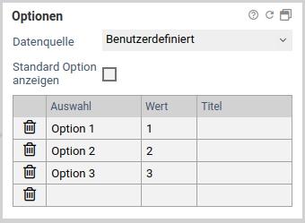
Selection elements have an additional area Options. Here the selection options can be set.
| Name | Description |
|---|---|
| Data Source | The selection Data Source links the form element to a data source. By default, User Defined is selected as an option here, which means that the selection texts and values to be used must be entered in a list. If, on the other hand, a data source is selected, its values are displayed in the selection. Any values entered in the list are then only displayed as Fallback if the data source is not accessible. CSV data sources>>doc:Formcycle.UserInterface.Data.Sources]] and DB Queries can be used as data sources. For selection elements of the type questions (checkboxes) and questions (radio buttons), another list is displayed in which the questions to be used must be entered. These cannot be read from data sources and must therefore always be configured in the form at the element. |
| Text column | {version major="6" minor="1" patch="0"/}} Only if a data source has been selected: Selection from which column of the selected data source the selection texts visible to the user are to be taken. |
| Value Column | 6.1.0+ Only if a data source has been selected: Selection from which column of the selected data source the (technical) value to be transferred is to be taken. |
| Display default option | {version major="6" minor="4" patch="0"/}} Only for drop-down selection lists: Select whether a default option Please select should always be displayed. This option is activated by default when the selection element is switched to a required field, but can be deactivated again individually. If, on the other hand, the selection element is configured so that it is no longer a required field, this option is automatically deactivated again and can then be individually reactivated. |
Werte
Basiseinstellungen für Werte
Das Makro [velocity] konnte nicht ausgeführt werden. Grund: [null]. Klicke auf diese Nachricht, um Details zu erfahren.
org.xwiki.rendering.macro.MacroExecutionException: Failed to evaluate Velocity Macro for content [{{html}}
#set($image="$!xcontext.macro.params.image")
#set($docNameAndImgName = $image.split('@'))
#if ($docNameAndImgName.size() != 2)
#if ($image.indexOf('/') == -1)
#set($image=$doc.getAttachmentURL($image))
#end
#else
#set($targetDoc=$xwiki.getDocument($docNameAndImgName.get(0)))
#set($image=$targetDoc.getAttachmentURL($docNameAndImgName.get(1)))
#end
#set($title="$!xcontext.macro.params.title")
#set($width="$!xcontext.macro.params.width")
#if ($width != "")
#set($width="width=$width")
#end
#set($height="$!xcontext.macro.params.height")
#if ($height != "")
#set($height="height=$height")
#end
#if ($xcontext.macro.params.group)
#set($group="[$xcontext.macro.params.group]")
#else
#set($group="")
#end
#if($context.action == 'edit')
<img src="$image" $width $height/>
#else
<a href="$image" rel="lightbox$group" title="$title"><img src="$image" $width $height /></a>
#end
{{/html}}]
at org.xwiki.rendering.internal.macro.velocity.VelocityMacro.evaluateString(VelocityMacro.java:186)
at org.xwiki.rendering.internal.macro.velocity.VelocityMacro.evaluateString(VelocityMacro.java:60)
at org.xwiki.rendering.macro.script.AbstractScriptMacro.evaluateBlock(AbstractScriptMacro.java:279)
at org.xwiki.rendering.macro.script.AbstractScriptMacro.execute(AbstractScriptMacro.java:182)
at org.xwiki.rendering.macro.script.AbstractScriptMacro.execute(AbstractScriptMacro.java:58)
at org.xwiki.rendering.internal.transformation.macro.MacroTransformation.transform(MacroTransformation.java:441)
at org.xwiki.rendering.internal.transformation.DefaultRenderingContext.transformInContext(DefaultRenderingContext.java:183)
at org.xwiki.rendering.async.internal.block.AbstractBlockAsyncRenderer.transform(AbstractBlockAsyncRenderer.java:76)
at org.xwiki.rendering.wikimacro.internal.DefaultWikiMacroRenderer.transform(DefaultWikiMacroRenderer.java:882)
at org.xwiki.rendering.wikimacro.internal.DefaultWikiMacroRenderer.transform(DefaultWikiMacroRenderer.java:868)
at org.xwiki.rendering.wikimacro.internal.DefaultWikiMacroRenderer.transform(DefaultWikiMacroRenderer.java:594)
at org.xwiki.rendering.wikimacro.internal.DefaultWikiMacroRenderer.execute(DefaultWikiMacroRenderer.java:409)
at org.xwiki.rendering.async.internal.block.AbstractBlockAsyncRenderer.render(AbstractBlockAsyncRenderer.java:157)
at org.xwiki.rendering.async.internal.block.AbstractBlockAsyncRenderer.render(AbstractBlockAsyncRenderer.java:54)
at org.xwiki.rendering.async.internal.DefaultAsyncRendererExecutor.lambda$syncRender$0(DefaultAsyncRendererExecutor.java:284)
at com.xpn.xwiki.internal.security.authorization.DefaultAuthorExecutor.call(DefaultAuthorExecutor.java:98)
at org.xwiki.rendering.async.internal.DefaultAsyncRendererExecutor.syncRender(DefaultAsyncRendererExecutor.java:284)
at org.xwiki.rendering.async.internal.DefaultAsyncRendererExecutor.render(DefaultAsyncRendererExecutor.java:267)
at org.xwiki.rendering.async.internal.block.DefaultBlockAsyncRendererExecutor.execute(DefaultBlockAsyncRendererExecutor.java:125)
at org.xwiki.rendering.wikimacro.internal.DefaultWikiMacro.execute(DefaultWikiMacro.java:132)
at org.xwiki.rendering.wikimacro.internal.DefaultWikiMacro.execute(DefaultWikiMacro.java:61)
at org.xwiki.rendering.internal.transformation.macro.MacroTransformation.transform(MacroTransformation.java:441)
at org.xwiki.rendering.internal.transformation.DefaultRenderingContext.transformInContext(DefaultRenderingContext.java:183)
at org.xwiki.rendering.internal.macro.html.HTMLMacro.renderWikiSyntax(HTMLMacro.java:215)
at org.xwiki.rendering.internal.macro.html.HTMLMacro.execute(HTMLMacro.java:150)
at org.xwiki.rendering.internal.macro.html.HTMLMacro.execute(HTMLMacro.java:70)
at org.xwiki.rendering.internal.transformation.macro.MacroTransformation.transform(MacroTransformation.java:441)
at org.xwiki.rendering.internal.transformation.DefaultRenderingContext.transformInContext(DefaultRenderingContext.java:183)
at org.xwiki.rendering.async.internal.block.AbstractBlockAsyncRenderer.transform(AbstractBlockAsyncRenderer.java:76)
at org.xwiki.rendering.wikimacro.internal.DefaultWikiMacroRenderer.transform(DefaultWikiMacroRenderer.java:882)
at org.xwiki.rendering.wikimacro.internal.DefaultWikiMacroRenderer.transform(DefaultWikiMacroRenderer.java:868)
at org.xwiki.rendering.wikimacro.internal.DefaultWikiMacroRenderer.transform(DefaultWikiMacroRenderer.java:594)
at org.xwiki.rendering.wikimacro.internal.DefaultWikiMacroRenderer.execute(DefaultWikiMacroRenderer.java:409)
at org.xwiki.rendering.async.internal.block.AbstractBlockAsyncRenderer.render(AbstractBlockAsyncRenderer.java:157)
at org.xwiki.rendering.async.internal.block.AbstractBlockAsyncRenderer.render(AbstractBlockAsyncRenderer.java:54)
at org.xwiki.rendering.async.internal.DefaultAsyncRendererExecutor.lambda$syncRender$0(DefaultAsyncRendererExecutor.java:284)
at com.xpn.xwiki.internal.security.authorization.DefaultAuthorExecutor.call(DefaultAuthorExecutor.java:98)
at org.xwiki.rendering.async.internal.DefaultAsyncRendererExecutor.syncRender(DefaultAsyncRendererExecutor.java:284)
at org.xwiki.rendering.async.internal.DefaultAsyncRendererExecutor.render(DefaultAsyncRendererExecutor.java:267)
at org.xwiki.rendering.async.internal.block.DefaultBlockAsyncRendererExecutor.execute(DefaultBlockAsyncRendererExecutor.java:125)
at org.xwiki.rendering.wikimacro.internal.DefaultWikiMacro.execute(DefaultWikiMacro.java:132)
at org.xwiki.rendering.wikimacro.internal.DefaultWikiMacro.execute(DefaultWikiMacro.java:61)
at org.xwiki.rendering.internal.transformation.macro.MacroTransformation.transform(MacroTransformation.java:441)
at org.xwiki.rendering.internal.transformation.DefaultRenderingContext.transformInContext(DefaultRenderingContext.java:183)
at org.xwiki.rendering.internal.transformation.DefaultTransformationManager.performTransformations(DefaultTransformationManager.java:88)
at org.xwiki.display.internal.DocumentContentAsyncExecutor.executeInCurrentExecutionContext(DocumentContentAsyncExecutor.java:396)
at org.xwiki.display.internal.DocumentContentAsyncExecutor.executeInIsolatedExecutionContext(DocumentContentAsyncExecutor.java:365)
at org.xwiki.display.internal.DocumentContentAsyncExecutor.execute(DocumentContentAsyncExecutor.java:267)
at org.xwiki.display.internal.DocumentContentAsyncRenderer.execute(DocumentContentAsyncRenderer.java:112)
at org.xwiki.rendering.async.internal.block.AbstractBlockAsyncRenderer.render(AbstractBlockAsyncRenderer.java:157)
at org.xwiki.rendering.async.internal.block.AbstractBlockAsyncRenderer.render(AbstractBlockAsyncRenderer.java:54)
at org.xwiki.rendering.async.internal.DefaultAsyncRendererExecutor.syncRender(DefaultAsyncRendererExecutor.java:290)
at org.xwiki.rendering.async.internal.DefaultAsyncRendererExecutor.render(DefaultAsyncRendererExecutor.java:267)
at org.xwiki.rendering.async.internal.block.DefaultBlockAsyncRendererExecutor.execute(DefaultBlockAsyncRendererExecutor.java:125)
at org.xwiki.display.internal.DocumentContentDisplayer.display(DocumentContentDisplayer.java:93)
at org.xwiki.display.internal.DocumentContentDisplayer.display(DocumentContentDisplayer.java:46)
at org.xwiki.display.internal.DefaultDocumentDisplayer.display(DefaultDocumentDisplayer.java:96)
at org.xwiki.display.internal.DefaultDocumentDisplayer.display(DefaultDocumentDisplayer.java:39)
at org.xwiki.sheet.internal.SheetDocumentDisplayer.display(SheetDocumentDisplayer.java:123)
at org.xwiki.sheet.internal.SheetDocumentDisplayer.display(SheetDocumentDisplayer.java:52)
at org.xwiki.display.internal.ConfiguredDocumentDisplayer.display(ConfiguredDocumentDisplayer.java:68)
at org.xwiki.display.internal.ConfiguredDocumentDisplayer.display(ConfiguredDocumentDisplayer.java:42)
at org.xwiki.rendering.internal.macro.include.IncludeMacro.execute(IncludeMacro.java:160)
at org.xwiki.rendering.internal.macro.include.IncludeMacro.execute(IncludeMacro.java:59)
at org.xwiki.rendering.internal.transformation.macro.MacroTransformation.transform(MacroTransformation.java:441)
at org.xwiki.rendering.internal.transformation.DefaultRenderingContext.transformInContext(DefaultRenderingContext.java:183)
at org.xwiki.rendering.internal.macro.html.HTMLMacro.renderWikiSyntax(HTMLMacro.java:215)
at org.xwiki.rendering.internal.macro.html.HTMLMacro.execute(HTMLMacro.java:150)
at org.xwiki.rendering.internal.macro.html.HTMLMacro.execute(HTMLMacro.java:70)
at org.xwiki.rendering.internal.transformation.macro.MacroTransformation.transform(MacroTransformation.java:441)
at org.xwiki.rendering.internal.transformation.DefaultRenderingContext.transformInContext(DefaultRenderingContext.java:183)
at org.xwiki.rendering.async.internal.block.AbstractBlockAsyncRenderer.transform(AbstractBlockAsyncRenderer.java:76)
at org.xwiki.rendering.wikimacro.internal.DefaultWikiMacroRenderer.transform(DefaultWikiMacroRenderer.java:882)
at org.xwiki.rendering.wikimacro.internal.DefaultWikiMacroRenderer.transform(DefaultWikiMacroRenderer.java:868)
at org.xwiki.rendering.wikimacro.internal.DefaultWikiMacroRenderer.transform(DefaultWikiMacroRenderer.java:594)
at org.xwiki.rendering.wikimacro.internal.DefaultWikiMacroRenderer.execute(DefaultWikiMacroRenderer.java:409)
at org.xwiki.rendering.async.internal.block.AbstractBlockAsyncRenderer.render(AbstractBlockAsyncRenderer.java:157)
at org.xwiki.rendering.async.internal.block.AbstractBlockAsyncRenderer.render(AbstractBlockAsyncRenderer.java:54)
at org.xwiki.rendering.async.internal.DefaultAsyncRendererExecutor.lambda$syncRender$0(DefaultAsyncRendererExecutor.java:284)
at com.xpn.xwiki.internal.security.authorization.DefaultAuthorExecutor.call(DefaultAuthorExecutor.java:98)
at org.xwiki.rendering.async.internal.DefaultAsyncRendererExecutor.syncRender(DefaultAsyncRendererExecutor.java:284)
at org.xwiki.rendering.async.internal.DefaultAsyncRendererExecutor.render(DefaultAsyncRendererExecutor.java:267)
at org.xwiki.rendering.async.internal.block.DefaultBlockAsyncRendererExecutor.execute(DefaultBlockAsyncRendererExecutor.java:125)
at org.xwiki.rendering.wikimacro.internal.DefaultWikiMacro.execute(DefaultWikiMacro.java:132)
at org.xwiki.rendering.wikimacro.internal.DefaultWikiMacro.execute(DefaultWikiMacro.java:61)
at org.xwiki.rendering.internal.transformation.macro.MacroTransformation.transform(MacroTransformation.java:441)
at org.xwiki.rendering.internal.transformation.DefaultRenderingContext.transformInContext(DefaultRenderingContext.java:183)
at org.xwiki.rendering.async.internal.block.AbstractBlockAsyncRenderer.transform(AbstractBlockAsyncRenderer.java:76)
at org.xwiki.rendering.wikimacro.internal.DefaultWikiMacroRenderer.transform(DefaultWikiMacroRenderer.java:882)
at org.xwiki.rendering.wikimacro.internal.DefaultWikiMacroRenderer.transform(DefaultWikiMacroRenderer.java:868)
at org.xwiki.rendering.wikimacro.internal.DefaultWikiMacroRenderer.transform(DefaultWikiMacroRenderer.java:594)
at org.xwiki.rendering.wikimacro.internal.DefaultWikiMacroRenderer.execute(DefaultWikiMacroRenderer.java:409)
at org.xwiki.rendering.async.internal.block.AbstractBlockAsyncRenderer.render(AbstractBlockAsyncRenderer.java:157)
at org.xwiki.rendering.async.internal.block.AbstractBlockAsyncRenderer.render(AbstractBlockAsyncRenderer.java:54)
at org.xwiki.rendering.async.internal.DefaultAsyncRendererExecutor.lambda$syncRender$0(DefaultAsyncRendererExecutor.java:284)
at com.xpn.xwiki.internal.security.authorization.DefaultAuthorExecutor.call(DefaultAuthorExecutor.java:98)
at org.xwiki.rendering.async.internal.DefaultAsyncRendererExecutor.syncRender(DefaultAsyncRendererExecutor.java:284)
at org.xwiki.rendering.async.internal.DefaultAsyncRendererExecutor.render(DefaultAsyncRendererExecutor.java:267)
at org.xwiki.rendering.async.internal.block.DefaultBlockAsyncRendererExecutor.execute(DefaultBlockAsyncRendererExecutor.java:125)
at org.xwiki.rendering.wikimacro.internal.DefaultWikiMacro.execute(DefaultWikiMacro.java:132)
at org.xwiki.rendering.wikimacro.internal.DefaultWikiMacro.execute(DefaultWikiMacro.java:61)
at org.xwiki.rendering.internal.transformation.macro.MacroTransformation.transform(MacroTransformation.java:441)
at org.xwiki.rendering.internal.transformation.DefaultRenderingContext.transformInContext(DefaultRenderingContext.java:183)
at org.xwiki.rendering.internal.transformation.DefaultTransformationManager.performTransformations(DefaultTransformationManager.java:88)
at org.xwiki.display.internal.DocumentContentAsyncExecutor.executeInCurrentExecutionContext(DocumentContentAsyncExecutor.java:396)
at org.xwiki.display.internal.DocumentContentAsyncExecutor.execute(DocumentContentAsyncExecutor.java:269)
at org.xwiki.display.internal.DocumentContentAsyncRenderer.execute(DocumentContentAsyncRenderer.java:112)
at org.xwiki.rendering.async.internal.block.AbstractBlockAsyncRenderer.render(AbstractBlockAsyncRenderer.java:157)
at org.xwiki.rendering.async.internal.block.AbstractBlockAsyncRenderer.render(AbstractBlockAsyncRenderer.java:54)
at org.xwiki.rendering.async.internal.DefaultAsyncRendererExecutor.syncRender(DefaultAsyncRendererExecutor.java:290)
at org.xwiki.rendering.async.internal.DefaultAsyncRendererExecutor.render(DefaultAsyncRendererExecutor.java:267)
at org.xwiki.rendering.async.internal.block.DefaultBlockAsyncRendererExecutor.execute(DefaultBlockAsyncRendererExecutor.java:125)
at org.xwiki.display.internal.DocumentContentDisplayer.display(DocumentContentDisplayer.java:93)
at org.xwiki.display.internal.DocumentContentDisplayer.display(DocumentContentDisplayer.java:46)
at org.xwiki.display.internal.DefaultDocumentDisplayer.display(DefaultDocumentDisplayer.java:96)
at org.xwiki.display.internal.DefaultDocumentDisplayer.display(DefaultDocumentDisplayer.java:39)
at org.xwiki.sheet.internal.SheetDocumentDisplayer.display(SheetDocumentDisplayer.java:123)
at org.xwiki.sheet.internal.SheetDocumentDisplayer.display(SheetDocumentDisplayer.java:52)
at org.xwiki.display.internal.ConfiguredDocumentDisplayer.display(ConfiguredDocumentDisplayer.java:68)
at org.xwiki.display.internal.ConfiguredDocumentDisplayer.display(ConfiguredDocumentDisplayer.java:42)
at com.xpn.xwiki.doc.XWikiDocument.display(XWikiDocument.java:1431)
at com.xpn.xwiki.doc.XWikiDocument.getRenderedContent(XWikiDocument.java:1567)
at com.xpn.xwiki.doc.XWikiDocument.displayDocument(XWikiDocument.java:1517)
at com.xpn.xwiki.doc.XWikiDocument.displayDocument(XWikiDocument.java:1486)
at com.xpn.xwiki.api.Document.displayDocument(Document.java:821)
at jdk.internal.reflect.GeneratedMethodAccessor524.invoke(Unknown Source)
at java.base/jdk.internal.reflect.DelegatingMethodAccessorImpl.invoke(DelegatingMethodAccessorImpl.java:43)
at java.base/java.lang.reflect.Method.invoke(Method.java:569)
at org.apache.velocity.util.introspection.UberspectImpl$VelMethodImpl.doInvoke(UberspectImpl.java:571)
at org.apache.velocity.util.introspection.UberspectImpl$VelMethodImpl.invoke(UberspectImpl.java:554)
at org.apache.velocity.runtime.parser.node.ASTMethod.execute(ASTMethod.java:221)
at org.apache.velocity.runtime.parser.node.ASTReference.execute(ASTReference.java:368)
at org.apache.velocity.runtime.parser.node.ASTReference.value(ASTReference.java:704)
at org.apache.velocity.runtime.parser.node.ASTExpression.value(ASTExpression.java:75)
at org.apache.velocity.runtime.parser.node.ASTSetDirective.render(ASTSetDirective.java:242)
at org.apache.velocity.runtime.parser.node.ASTBlock.render(ASTBlock.java:147)
at org.apache.velocity.runtime.parser.node.SimpleNode.render(SimpleNode.java:439)
at org.apache.velocity.runtime.parser.node.ASTIfStatement.render(ASTIfStatement.java:190)
at org.apache.velocity.runtime.parser.node.ASTBlock.render(ASTBlock.java:147)
at org.xwiki.velocity.internal.directive.TryCatchDirective.render(TryCatchDirective.java:86)
at org.apache.velocity.runtime.parser.node.ASTDirective.render(ASTDirective.java:304)
at org.apache.velocity.runtime.parser.node.SimpleNode.render(SimpleNode.java:439)
at org.apache.velocity.Template.merge(Template.java:358)
at org.apache.velocity.Template.merge(Template.java:262)
at org.xwiki.velocity.internal.InternalVelocityEngine.evaluate(InternalVelocityEngine.java:233)
at com.xpn.xwiki.internal.template.VelocityTemplateEvaluator.evaluateContent(VelocityTemplateEvaluator.java:107)
at com.xpn.xwiki.internal.template.TemplateAsyncRenderer.evaluateContent(TemplateAsyncRenderer.java:219)
at com.xpn.xwiki.internal.template.TemplateAsyncRenderer.renderVelocity(TemplateAsyncRenderer.java:174)
at com.xpn.xwiki.internal.template.TemplateAsyncRenderer.render(TemplateAsyncRenderer.java:135)
at com.xpn.xwiki.internal.template.TemplateAsyncRenderer.render(TemplateAsyncRenderer.java:54)
at org.xwiki.rendering.async.internal.DefaultAsyncRendererExecutor.lambda$syncRender$0(DefaultAsyncRendererExecutor.java:284)
at com.xpn.xwiki.internal.security.authorization.DefaultAuthorExecutor.call(DefaultAuthorExecutor.java:98)
at org.xwiki.rendering.async.internal.DefaultAsyncRendererExecutor.syncRender(DefaultAsyncRendererExecutor.java:284)
at org.xwiki.rendering.async.internal.DefaultAsyncRendererExecutor.render(DefaultAsyncRendererExecutor.java:267)
at org.xwiki.rendering.async.internal.block.DefaultBlockAsyncRendererExecutor.render(DefaultBlockAsyncRendererExecutor.java:154)
at com.xpn.xwiki.internal.template.InternalTemplateManager.render(InternalTemplateManager.java:907)
at com.xpn.xwiki.internal.template.InternalTemplateManager.renderFromSkin(InternalTemplateManager.java:869)
at com.xpn.xwiki.internal.template.InternalTemplateManager.render(InternalTemplateManager.java:856)
at com.xpn.xwiki.internal.template.InternalTemplateManager.renderNoException(InternalTemplateManager.java:811)
at com.xpn.xwiki.internal.template.InternalTemplateManager.renderNoException(InternalTemplateManager.java:803)
at com.xpn.xwiki.internal.template.DefaultTemplateManager.renderNoException(DefaultTemplateManager.java:79)
at com.xpn.xwiki.internal.template.DefaultTemplateManager.renderNoException(DefaultTemplateManager.java:73)
at org.xwiki.template.script.TemplateScriptService.render(TemplateScriptService.java:54)
at jdk.internal.reflect.GeneratedMethodAccessor192.invoke(Unknown Source)
at java.base/jdk.internal.reflect.DelegatingMethodAccessorImpl.invoke(DelegatingMethodAccessorImpl.java:43)
at java.base/java.lang.reflect.Method.invoke(Method.java:569)
at org.apache.velocity.util.introspection.UberspectImpl$VelMethodImpl.doInvoke(UberspectImpl.java:571)
at org.apache.velocity.util.introspection.UberspectImpl$VelMethodImpl.invoke(UberspectImpl.java:554)
at org.apache.velocity.runtime.parser.node.ASTMethod.execute(ASTMethod.java:221)
at org.apache.velocity.runtime.parser.node.ASTReference.execute(ASTReference.java:368)
at org.apache.velocity.runtime.parser.node.ASTReference.render(ASTReference.java:492)
at org.apache.velocity.runtime.parser.node.ASTBlock.render(ASTBlock.java:147)
at org.apache.velocity.runtime.directive.VelocimacroProxy.render(VelocimacroProxy.java:217)
at org.apache.velocity.runtime.directive.RuntimeMacro.render(RuntimeMacro.java:331)
at org.apache.velocity.runtime.directive.RuntimeMacro.render(RuntimeMacro.java:261)
at org.apache.velocity.runtime.parser.node.ASTDirective.render(ASTDirective.java:304)
at org.apache.velocity.runtime.parser.node.SimpleNode.render(SimpleNode.java:439)
at org.apache.velocity.Template.merge(Template.java:358)
at org.apache.velocity.Template.merge(Template.java:262)
at org.xwiki.velocity.internal.InternalVelocityEngine.evaluate(InternalVelocityEngine.java:233)
at com.xpn.xwiki.internal.template.VelocityTemplateEvaluator.evaluateContent(VelocityTemplateEvaluator.java:107)
at com.xpn.xwiki.internal.template.TemplateAsyncRenderer.evaluateContent(TemplateAsyncRenderer.java:219)
at com.xpn.xwiki.internal.template.TemplateAsyncRenderer.renderVelocity(TemplateAsyncRenderer.java:174)
at com.xpn.xwiki.internal.template.TemplateAsyncRenderer.render(TemplateAsyncRenderer.java:135)
at com.xpn.xwiki.internal.template.TemplateAsyncRenderer.render(TemplateAsyncRenderer.java:54)
at org.xwiki.rendering.async.internal.DefaultAsyncRendererExecutor.lambda$syncRender$0(DefaultAsyncRendererExecutor.java:284)
at com.xpn.xwiki.internal.security.authorization.DefaultAuthorExecutor.call(DefaultAuthorExecutor.java:98)
at org.xwiki.rendering.async.internal.DefaultAsyncRendererExecutor.syncRender(DefaultAsyncRendererExecutor.java:284)
at org.xwiki.rendering.async.internal.DefaultAsyncRendererExecutor.render(DefaultAsyncRendererExecutor.java:267)
at org.xwiki.rendering.async.internal.block.DefaultBlockAsyncRendererExecutor.render(DefaultBlockAsyncRendererExecutor.java:154)
at com.xpn.xwiki.internal.template.InternalTemplateManager.render(InternalTemplateManager.java:907)
at com.xpn.xwiki.internal.template.InternalTemplateManager.renderFromSkin(InternalTemplateManager.java:869)
at com.xpn.xwiki.internal.template.InternalTemplateManager.render(InternalTemplateManager.java:856)
at com.xpn.xwiki.internal.template.InternalTemplateManager.renderNoException(InternalTemplateManager.java:811)
at com.xpn.xwiki.internal.template.InternalTemplateManager.renderNoException(InternalTemplateManager.java:803)
at com.xpn.xwiki.internal.template.DefaultTemplateManager.renderNoException(DefaultTemplateManager.java:79)
at com.xpn.xwiki.internal.template.DefaultTemplateManager.renderNoException(DefaultTemplateManager.java:73)
at org.xwiki.template.script.TemplateScriptService.render(TemplateScriptService.java:54)
at jdk.internal.reflect.GeneratedMethodAccessor192.invoke(Unknown Source)
at java.base/jdk.internal.reflect.DelegatingMethodAccessorImpl.invoke(DelegatingMethodAccessorImpl.java:43)
at java.base/java.lang.reflect.Method.invoke(Method.java:569)
at org.apache.velocity.util.introspection.UberspectImpl$VelMethodImpl.doInvoke(UberspectImpl.java:571)
at org.apache.velocity.util.introspection.UberspectImpl$VelMethodImpl.invoke(UberspectImpl.java:554)
at org.apache.velocity.runtime.parser.node.ASTMethod.execute(ASTMethod.java:221)
at org.apache.velocity.runtime.parser.node.ASTReference.execute(ASTReference.java:368)
at org.apache.velocity.runtime.parser.node.ASTReference.render(ASTReference.java:492)
at org.apache.velocity.runtime.parser.node.ASTBlock.render(ASTBlock.java:147)
at org.apache.velocity.runtime.directive.VelocimacroProxy.render(VelocimacroProxy.java:217)
at org.apache.velocity.runtime.directive.RuntimeMacro.render(RuntimeMacro.java:331)
at org.apache.velocity.runtime.directive.RuntimeMacro.render(RuntimeMacro.java:261)
at org.apache.velocity.runtime.parser.node.ASTDirective.render(ASTDirective.java:304)
at org.apache.velocity.runtime.parser.node.ASTBlock.render(ASTBlock.java:147)
at org.apache.velocity.runtime.parser.node.ASTIfStatement.render(ASTIfStatement.java:171)
at org.apache.velocity.runtime.parser.node.ASTBlock.render(ASTBlock.java:147)
at org.apache.velocity.runtime.parser.node.SimpleNode.render(SimpleNode.java:439)
at org.apache.velocity.runtime.parser.node.ASTIfStatement.render(ASTIfStatement.java:190)
at org.apache.velocity.runtime.parser.node.SimpleNode.render(SimpleNode.java:439)
at org.apache.velocity.Template.merge(Template.java:358)
at org.apache.velocity.Template.merge(Template.java:262)
at org.xwiki.velocity.internal.InternalVelocityEngine.evaluate(InternalVelocityEngine.java:233)
at com.xpn.xwiki.internal.template.VelocityTemplateEvaluator.evaluateContent(VelocityTemplateEvaluator.java:107)
at com.xpn.xwiki.internal.template.TemplateAsyncRenderer.evaluateContent(TemplateAsyncRenderer.java:219)
at com.xpn.xwiki.internal.template.TemplateAsyncRenderer.renderVelocity(TemplateAsyncRenderer.java:174)
at com.xpn.xwiki.internal.template.TemplateAsyncRenderer.render(TemplateAsyncRenderer.java:135)
at com.xpn.xwiki.internal.template.TemplateAsyncRenderer.render(TemplateAsyncRenderer.java:54)
at org.xwiki.rendering.async.internal.DefaultAsyncRendererExecutor.lambda$syncRender$0(DefaultAsyncRendererExecutor.java:284)
at com.xpn.xwiki.internal.security.authorization.DefaultAuthorExecutor.call(DefaultAuthorExecutor.java:98)
at org.xwiki.rendering.async.internal.DefaultAsyncRendererExecutor.syncRender(DefaultAsyncRendererExecutor.java:284)
at org.xwiki.rendering.async.internal.DefaultAsyncRendererExecutor.render(DefaultAsyncRendererExecutor.java:267)
at org.xwiki.rendering.async.internal.block.DefaultBlockAsyncRendererExecutor.render(DefaultBlockAsyncRendererExecutor.java:154)
at com.xpn.xwiki.internal.template.InternalTemplateManager.render(InternalTemplateManager.java:907)
at com.xpn.xwiki.internal.template.InternalTemplateManager.renderFromSkin(InternalTemplateManager.java:869)
at com.xpn.xwiki.internal.template.InternalTemplateManager.renderFromSkin(InternalTemplateManager.java:849)
at com.xpn.xwiki.internal.template.InternalTemplateManager.render(InternalTemplateManager.java:835)
at com.xpn.xwiki.internal.template.DefaultTemplateManager.render(DefaultTemplateManager.java:91)
at com.xpn.xwiki.internal.template.DefaultTemplateManager.render(DefaultTemplateManager.java:85)
at com.xpn.xwiki.XWiki.evaluateTemplate(XWiki.java:2569)
at com.xpn.xwiki.web.Utils.parseTemplate(Utils.java:180)
at com.xpn.xwiki.web.XWikiAction.execute(XWikiAction.java:651)
at com.xpn.xwiki.web.XWikiAction.execute(XWikiAction.java:339)
at com.xpn.xwiki.web.LegacyActionServlet.service(LegacyActionServlet.java:108)
at javax.servlet.http.HttpServlet.service(HttpServlet.java:623)
at org.apache.catalina.core.ApplicationFilterChain.internalDoFilter(ApplicationFilterChain.java:199)
at org.apache.catalina.core.ApplicationFilterChain.doFilter(ApplicationFilterChain.java:144)
at com.xpn.xwiki.web.ActionFilter.doFilter(ActionFilter.java:122)
at org.apache.catalina.core.ApplicationFilterChain.internalDoFilter(ApplicationFilterChain.java:168)
at org.apache.catalina.core.ApplicationFilterChain.doFilter(ApplicationFilterChain.java:144)
at org.xwiki.wysiwyg.filter.ConversionFilter.doFilter(ConversionFilter.java:61)
at org.apache.catalina.core.ApplicationFilterChain.internalDoFilter(ApplicationFilterChain.java:168)
at org.apache.catalina.core.ApplicationFilterChain.doFilter(ApplicationFilterChain.java:144)
at org.apache.tomcat.websocket.server.WsFilter.doFilter(WsFilter.java:51)
at org.apache.catalina.core.ApplicationFilterChain.internalDoFilter(ApplicationFilterChain.java:168)
at org.apache.catalina.core.ApplicationFilterChain.doFilter(ApplicationFilterChain.java:144)
at org.xwiki.container.servlet.filters.internal.SetHTTPHeaderFilter.doFilter(SetHTTPHeaderFilter.java:63)
at org.apache.catalina.core.ApplicationFilterChain.internalDoFilter(ApplicationFilterChain.java:168)
at org.apache.catalina.core.ApplicationFilterChain.doFilter(ApplicationFilterChain.java:144)
at org.xwiki.resource.servlet.RoutingFilter.doFilter(RoutingFilter.java:132)
at org.apache.catalina.core.ApplicationFilterChain.internalDoFilter(ApplicationFilterChain.java:168)
at org.apache.catalina.core.ApplicationFilterChain.doFilter(ApplicationFilterChain.java:144)
at org.xwiki.container.servlet.filters.internal.SavedRequestRestorerFilter.doFilter(SavedRequestRestorerFilter.java:209)
at org.apache.catalina.core.ApplicationFilterChain.internalDoFilter(ApplicationFilterChain.java:168)
at org.apache.catalina.core.ApplicationFilterChain.doFilter(ApplicationFilterChain.java:144)
at org.xwiki.container.servlet.filters.internal.SetCharacterEncodingFilter.doFilter(SetCharacterEncodingFilter.java:117)
at org.apache.catalina.core.ApplicationFilterChain.internalDoFilter(ApplicationFilterChain.java:168)
at org.apache.catalina.core.ApplicationFilterChain.doFilter(ApplicationFilterChain.java:144)
at org.apache.catalina.core.StandardWrapperValve.invoke(StandardWrapperValve.java:168)
at org.apache.catalina.core.StandardContextValve.invoke(StandardContextValve.java:90)
at org.apache.catalina.authenticator.AuthenticatorBase.invoke(AuthenticatorBase.java:482)
at org.apache.catalina.core.StandardHostValve.invoke(StandardHostValve.java:130)
at org.apache.catalina.valves.ErrorReportValve.invoke(ErrorReportValve.java:93)
at org.apache.catalina.valves.AbstractAccessLogValve.invoke(AbstractAccessLogValve.java:656)
at org.apache.catalina.core.StandardEngineValve.invoke(StandardEngineValve.java:74)
at org.apache.catalina.connector.CoyoteAdapter.service(CoyoteAdapter.java:346)
at org.apache.coyote.http11.Http11Processor.service(Http11Processor.java:397)
at org.apache.coyote.AbstractProcessorLight.process(AbstractProcessorLight.java:63)
at org.apache.coyote.AbstractProtocol$ConnectionHandler.process(AbstractProtocol.java:935)
at org.apache.tomcat.util.net.NioEndpoint$SocketProcessor.doRun(NioEndpoint.java:1826)
at org.apache.tomcat.util.net.SocketProcessorBase.run(SocketProcessorBase.java:52)
at org.apache.tomcat.util.threads.ThreadPoolExecutor.runWorker(ThreadPoolExecutor.java:1189)
at org.apache.tomcat.util.threads.ThreadPoolExecutor$Worker.run(ThreadPoolExecutor.java:658)
at org.apache.tomcat.util.threads.TaskThread$WrappingRunnable.run(TaskThread.java:63)
at java.base/java.lang.Thread.run(Thread.java:840)
Caused by: org.xwiki.velocity.XWikiVelocityException: Failed to evaluate content with namespace [xwiki:Formcycle.Designer.Form.ElementProperties.Value]
at org.xwiki.velocity.internal.InternalVelocityEngine.evaluate(InternalVelocityEngine.java:235)
at org.xwiki.rendering.internal.macro.velocity.VelocityMacro.evaluateString(VelocityMacro.java:168)
... 281 more
Caused by: org.apache.velocity.exception.MethodInvocationException: Invocation of method 'getAttachmentURL' in class com.xpn.xwiki.api.Document threw exception java.lang.NullPointerException at xwiki:XWiki.LightboxMacro[line 6, column 18]
at org.apache.velocity.runtime.parser.node.ASTMethod.handleInvocationException(ASTMethod.java:308)
at org.apache.velocity.runtime.parser.node.ASTMethod.execute(ASTMethod.java:235)
at org.apache.velocity.runtime.parser.node.ASTReference.execute(ASTReference.java:368)
at org.apache.velocity.runtime.parser.node.ASTReference.value(ASTReference.java:704)
at org.apache.velocity.runtime.parser.node.ASTExpression.value(ASTExpression.java:75)
at org.apache.velocity.runtime.parser.node.ASTSetDirective.render(ASTSetDirective.java:242)
at org.apache.velocity.runtime.parser.node.ASTBlock.render(ASTBlock.java:147)
at org.apache.velocity.runtime.parser.node.ASTIfStatement.render(ASTIfStatement.java:171)
at org.apache.velocity.runtime.parser.node.ASTBlock.render(ASTBlock.java:147)
at org.apache.velocity.runtime.parser.node.ASTIfStatement.render(ASTIfStatement.java:171)
at org.apache.velocity.runtime.parser.node.SimpleNode.render(SimpleNode.java:439)
at org.apache.velocity.Template.merge(Template.java:358)
at org.apache.velocity.Template.merge(Template.java:262)
at org.xwiki.velocity.internal.InternalVelocityEngine.evaluate(InternalVelocityEngine.java:233)
... 282 more
Caused by: java.lang.NullPointerException
Über diese Eigenschaft werden die initialen Werte von Elementen definiert. In Abhängigkeit des ausgewählten Elements stehen verschiedene Möglichkeiten zur Auswahl. Eine genaue Beschreibung dieser Möglichkeiten ist in der Hilfe zum jeweiligen Element zu finden.
Die Festlegung von initialen Werten bei "wiederholten" Elementen bzw. bei Elementen, die sich in wiederholten Containern befinden, ist auf diese Weise nicht möglich.
Dieses Element hat keine zusätzlichen Einstellungen im Bereich Werte.
CSS-Klassen
Basiseinstellungen für CSS-Klassen
Das Makro [velocity] konnte nicht ausgeführt werden. Grund: [null]. Klicke auf diese Nachricht, um Details zu erfahren.
org.xwiki.rendering.macro.MacroExecutionException: Failed to evaluate Velocity Macro for content [{{html}}
#set($image="$!xcontext.macro.params.image")
#set($docNameAndImgName = $image.split('@'))
#if ($docNameAndImgName.size() != 2)
#if ($image.indexOf('/') == -1)
#set($image=$doc.getAttachmentURL($image))
#end
#else
#set($targetDoc=$xwiki.getDocument($docNameAndImgName.get(0)))
#set($image=$targetDoc.getAttachmentURL($docNameAndImgName.get(1)))
#end
#set($title="$!xcontext.macro.params.title")
#set($width="$!xcontext.macro.params.width")
#if ($width != "")
#set($width="width=$width")
#end
#set($height="$!xcontext.macro.params.height")
#if ($height != "")
#set($height="height=$height")
#end
#if ($xcontext.macro.params.group)
#set($group="[$xcontext.macro.params.group]")
#else
#set($group="")
#end
#if($context.action == 'edit')
<img src="$image" $width $height/>
#else
<a href="$image" rel="lightbox$group" title="$title"><img src="$image" $width $height /></a>
#end
{{/html}}]
at org.xwiki.rendering.internal.macro.velocity.VelocityMacro.evaluateString(VelocityMacro.java:186)
at org.xwiki.rendering.internal.macro.velocity.VelocityMacro.evaluateString(VelocityMacro.java:60)
at org.xwiki.rendering.macro.script.AbstractScriptMacro.evaluateBlock(AbstractScriptMacro.java:279)
at org.xwiki.rendering.macro.script.AbstractScriptMacro.execute(AbstractScriptMacro.java:182)
at org.xwiki.rendering.macro.script.AbstractScriptMacro.execute(AbstractScriptMacro.java:58)
at org.xwiki.rendering.internal.transformation.macro.MacroTransformation.transform(MacroTransformation.java:441)
at org.xwiki.rendering.internal.transformation.DefaultRenderingContext.transformInContext(DefaultRenderingContext.java:183)
at org.xwiki.rendering.async.internal.block.AbstractBlockAsyncRenderer.transform(AbstractBlockAsyncRenderer.java:76)
at org.xwiki.rendering.wikimacro.internal.DefaultWikiMacroRenderer.transform(DefaultWikiMacroRenderer.java:882)
at org.xwiki.rendering.wikimacro.internal.DefaultWikiMacroRenderer.transform(DefaultWikiMacroRenderer.java:868)
at org.xwiki.rendering.wikimacro.internal.DefaultWikiMacroRenderer.transform(DefaultWikiMacroRenderer.java:594)
at org.xwiki.rendering.wikimacro.internal.DefaultWikiMacroRenderer.execute(DefaultWikiMacroRenderer.java:409)
at org.xwiki.rendering.async.internal.block.AbstractBlockAsyncRenderer.render(AbstractBlockAsyncRenderer.java:157)
at org.xwiki.rendering.async.internal.block.AbstractBlockAsyncRenderer.render(AbstractBlockAsyncRenderer.java:54)
at org.xwiki.rendering.async.internal.DefaultAsyncRendererExecutor.lambda$syncRender$0(DefaultAsyncRendererExecutor.java:284)
at com.xpn.xwiki.internal.security.authorization.DefaultAuthorExecutor.call(DefaultAuthorExecutor.java:98)
at org.xwiki.rendering.async.internal.DefaultAsyncRendererExecutor.syncRender(DefaultAsyncRendererExecutor.java:284)
at org.xwiki.rendering.async.internal.DefaultAsyncRendererExecutor.render(DefaultAsyncRendererExecutor.java:267)
at org.xwiki.rendering.async.internal.block.DefaultBlockAsyncRendererExecutor.execute(DefaultBlockAsyncRendererExecutor.java:125)
at org.xwiki.rendering.wikimacro.internal.DefaultWikiMacro.execute(DefaultWikiMacro.java:132)
at org.xwiki.rendering.wikimacro.internal.DefaultWikiMacro.execute(DefaultWikiMacro.java:61)
at org.xwiki.rendering.internal.transformation.macro.MacroTransformation.transform(MacroTransformation.java:441)
at org.xwiki.rendering.internal.transformation.DefaultRenderingContext.transformInContext(DefaultRenderingContext.java:183)
at org.xwiki.rendering.internal.macro.html.HTMLMacro.renderWikiSyntax(HTMLMacro.java:215)
at org.xwiki.rendering.internal.macro.html.HTMLMacro.execute(HTMLMacro.java:150)
at org.xwiki.rendering.internal.macro.html.HTMLMacro.execute(HTMLMacro.java:70)
at org.xwiki.rendering.internal.transformation.macro.MacroTransformation.transform(MacroTransformation.java:441)
at org.xwiki.rendering.internal.transformation.DefaultRenderingContext.transformInContext(DefaultRenderingContext.java:183)
at org.xwiki.rendering.async.internal.block.AbstractBlockAsyncRenderer.transform(AbstractBlockAsyncRenderer.java:76)
at org.xwiki.rendering.wikimacro.internal.DefaultWikiMacroRenderer.transform(DefaultWikiMacroRenderer.java:882)
at org.xwiki.rendering.wikimacro.internal.DefaultWikiMacroRenderer.transform(DefaultWikiMacroRenderer.java:868)
at org.xwiki.rendering.wikimacro.internal.DefaultWikiMacroRenderer.transform(DefaultWikiMacroRenderer.java:594)
at org.xwiki.rendering.wikimacro.internal.DefaultWikiMacroRenderer.execute(DefaultWikiMacroRenderer.java:409)
at org.xwiki.rendering.async.internal.block.AbstractBlockAsyncRenderer.render(AbstractBlockAsyncRenderer.java:157)
at org.xwiki.rendering.async.internal.block.AbstractBlockAsyncRenderer.render(AbstractBlockAsyncRenderer.java:54)
at org.xwiki.rendering.async.internal.DefaultAsyncRendererExecutor.lambda$syncRender$0(DefaultAsyncRendererExecutor.java:284)
at com.xpn.xwiki.internal.security.authorization.DefaultAuthorExecutor.call(DefaultAuthorExecutor.java:98)
at org.xwiki.rendering.async.internal.DefaultAsyncRendererExecutor.syncRender(DefaultAsyncRendererExecutor.java:284)
at org.xwiki.rendering.async.internal.DefaultAsyncRendererExecutor.render(DefaultAsyncRendererExecutor.java:267)
at org.xwiki.rendering.async.internal.block.DefaultBlockAsyncRendererExecutor.execute(DefaultBlockAsyncRendererExecutor.java:125)
at org.xwiki.rendering.wikimacro.internal.DefaultWikiMacro.execute(DefaultWikiMacro.java:132)
at org.xwiki.rendering.wikimacro.internal.DefaultWikiMacro.execute(DefaultWikiMacro.java:61)
at org.xwiki.rendering.internal.transformation.macro.MacroTransformation.transform(MacroTransformation.java:441)
at org.xwiki.rendering.internal.transformation.DefaultRenderingContext.transformInContext(DefaultRenderingContext.java:183)
at org.xwiki.rendering.internal.transformation.DefaultTransformationManager.performTransformations(DefaultTransformationManager.java:88)
at org.xwiki.display.internal.DocumentContentAsyncExecutor.executeInCurrentExecutionContext(DocumentContentAsyncExecutor.java:396)
at org.xwiki.display.internal.DocumentContentAsyncExecutor.executeInIsolatedExecutionContext(DocumentContentAsyncExecutor.java:365)
at org.xwiki.display.internal.DocumentContentAsyncExecutor.execute(DocumentContentAsyncExecutor.java:267)
at org.xwiki.display.internal.DocumentContentAsyncRenderer.execute(DocumentContentAsyncRenderer.java:112)
at org.xwiki.rendering.async.internal.block.AbstractBlockAsyncRenderer.render(AbstractBlockAsyncRenderer.java:157)
at org.xwiki.rendering.async.internal.block.AbstractBlockAsyncRenderer.render(AbstractBlockAsyncRenderer.java:54)
at org.xwiki.rendering.async.internal.DefaultAsyncRendererExecutor.syncRender(DefaultAsyncRendererExecutor.java:290)
at org.xwiki.rendering.async.internal.DefaultAsyncRendererExecutor.render(DefaultAsyncRendererExecutor.java:267)
at org.xwiki.rendering.async.internal.block.DefaultBlockAsyncRendererExecutor.execute(DefaultBlockAsyncRendererExecutor.java:125)
at org.xwiki.display.internal.DocumentContentDisplayer.display(DocumentContentDisplayer.java:93)
at org.xwiki.display.internal.DocumentContentDisplayer.display(DocumentContentDisplayer.java:46)
at org.xwiki.display.internal.DefaultDocumentDisplayer.display(DefaultDocumentDisplayer.java:96)
at org.xwiki.display.internal.DefaultDocumentDisplayer.display(DefaultDocumentDisplayer.java:39)
at org.xwiki.sheet.internal.SheetDocumentDisplayer.display(SheetDocumentDisplayer.java:123)
at org.xwiki.sheet.internal.SheetDocumentDisplayer.display(SheetDocumentDisplayer.java:52)
at org.xwiki.display.internal.ConfiguredDocumentDisplayer.display(ConfiguredDocumentDisplayer.java:68)
at org.xwiki.display.internal.ConfiguredDocumentDisplayer.display(ConfiguredDocumentDisplayer.java:42)
at org.xwiki.rendering.internal.macro.include.IncludeMacro.execute(IncludeMacro.java:160)
at org.xwiki.rendering.internal.macro.include.IncludeMacro.execute(IncludeMacro.java:59)
at org.xwiki.rendering.internal.transformation.macro.MacroTransformation.transform(MacroTransformation.java:441)
at org.xwiki.rendering.internal.transformation.DefaultRenderingContext.transformInContext(DefaultRenderingContext.java:183)
at org.xwiki.rendering.internal.macro.html.HTMLMacro.renderWikiSyntax(HTMLMacro.java:215)
at org.xwiki.rendering.internal.macro.html.HTMLMacro.execute(HTMLMacro.java:150)
at org.xwiki.rendering.internal.macro.html.HTMLMacro.execute(HTMLMacro.java:70)
at org.xwiki.rendering.internal.transformation.macro.MacroTransformation.transform(MacroTransformation.java:441)
at org.xwiki.rendering.internal.transformation.DefaultRenderingContext.transformInContext(DefaultRenderingContext.java:183)
at org.xwiki.rendering.async.internal.block.AbstractBlockAsyncRenderer.transform(AbstractBlockAsyncRenderer.java:76)
at org.xwiki.rendering.wikimacro.internal.DefaultWikiMacroRenderer.transform(DefaultWikiMacroRenderer.java:882)
at org.xwiki.rendering.wikimacro.internal.DefaultWikiMacroRenderer.transform(DefaultWikiMacroRenderer.java:868)
at org.xwiki.rendering.wikimacro.internal.DefaultWikiMacroRenderer.transform(DefaultWikiMacroRenderer.java:594)
at org.xwiki.rendering.wikimacro.internal.DefaultWikiMacroRenderer.execute(DefaultWikiMacroRenderer.java:409)
at org.xwiki.rendering.async.internal.block.AbstractBlockAsyncRenderer.render(AbstractBlockAsyncRenderer.java:157)
at org.xwiki.rendering.async.internal.block.AbstractBlockAsyncRenderer.render(AbstractBlockAsyncRenderer.java:54)
at org.xwiki.rendering.async.internal.DefaultAsyncRendererExecutor.lambda$syncRender$0(DefaultAsyncRendererExecutor.java:284)
at com.xpn.xwiki.internal.security.authorization.DefaultAuthorExecutor.call(DefaultAuthorExecutor.java:98)
at org.xwiki.rendering.async.internal.DefaultAsyncRendererExecutor.syncRender(DefaultAsyncRendererExecutor.java:284)
at org.xwiki.rendering.async.internal.DefaultAsyncRendererExecutor.render(DefaultAsyncRendererExecutor.java:267)
at org.xwiki.rendering.async.internal.block.DefaultBlockAsyncRendererExecutor.execute(DefaultBlockAsyncRendererExecutor.java:125)
at org.xwiki.rendering.wikimacro.internal.DefaultWikiMacro.execute(DefaultWikiMacro.java:132)
at org.xwiki.rendering.wikimacro.internal.DefaultWikiMacro.execute(DefaultWikiMacro.java:61)
at org.xwiki.rendering.internal.transformation.macro.MacroTransformation.transform(MacroTransformation.java:441)
at org.xwiki.rendering.internal.transformation.DefaultRenderingContext.transformInContext(DefaultRenderingContext.java:183)
at org.xwiki.rendering.async.internal.block.AbstractBlockAsyncRenderer.transform(AbstractBlockAsyncRenderer.java:76)
at org.xwiki.rendering.wikimacro.internal.DefaultWikiMacroRenderer.transform(DefaultWikiMacroRenderer.java:882)
at org.xwiki.rendering.wikimacro.internal.DefaultWikiMacroRenderer.transform(DefaultWikiMacroRenderer.java:868)
at org.xwiki.rendering.wikimacro.internal.DefaultWikiMacroRenderer.transform(DefaultWikiMacroRenderer.java:594)
at org.xwiki.rendering.wikimacro.internal.DefaultWikiMacroRenderer.execute(DefaultWikiMacroRenderer.java:409)
at org.xwiki.rendering.async.internal.block.AbstractBlockAsyncRenderer.render(AbstractBlockAsyncRenderer.java:157)
at org.xwiki.rendering.async.internal.block.AbstractBlockAsyncRenderer.render(AbstractBlockAsyncRenderer.java:54)
at org.xwiki.rendering.async.internal.DefaultAsyncRendererExecutor.lambda$syncRender$0(DefaultAsyncRendererExecutor.java:284)
at com.xpn.xwiki.internal.security.authorization.DefaultAuthorExecutor.call(DefaultAuthorExecutor.java:98)
at org.xwiki.rendering.async.internal.DefaultAsyncRendererExecutor.syncRender(DefaultAsyncRendererExecutor.java:284)
at org.xwiki.rendering.async.internal.DefaultAsyncRendererExecutor.render(DefaultAsyncRendererExecutor.java:267)
at org.xwiki.rendering.async.internal.block.DefaultBlockAsyncRendererExecutor.execute(DefaultBlockAsyncRendererExecutor.java:125)
at org.xwiki.rendering.wikimacro.internal.DefaultWikiMacro.execute(DefaultWikiMacro.java:132)
at org.xwiki.rendering.wikimacro.internal.DefaultWikiMacro.execute(DefaultWikiMacro.java:61)
at org.xwiki.rendering.internal.transformation.macro.MacroTransformation.transform(MacroTransformation.java:441)
at org.xwiki.rendering.internal.transformation.DefaultRenderingContext.transformInContext(DefaultRenderingContext.java:183)
at org.xwiki.rendering.internal.transformation.DefaultTransformationManager.performTransformations(DefaultTransformationManager.java:88)
at org.xwiki.display.internal.DocumentContentAsyncExecutor.executeInCurrentExecutionContext(DocumentContentAsyncExecutor.java:396)
at org.xwiki.display.internal.DocumentContentAsyncExecutor.execute(DocumentContentAsyncExecutor.java:269)
at org.xwiki.display.internal.DocumentContentAsyncRenderer.execute(DocumentContentAsyncRenderer.java:112)
at org.xwiki.rendering.async.internal.block.AbstractBlockAsyncRenderer.render(AbstractBlockAsyncRenderer.java:157)
at org.xwiki.rendering.async.internal.block.AbstractBlockAsyncRenderer.render(AbstractBlockAsyncRenderer.java:54)
at org.xwiki.rendering.async.internal.DefaultAsyncRendererExecutor.syncRender(DefaultAsyncRendererExecutor.java:290)
at org.xwiki.rendering.async.internal.DefaultAsyncRendererExecutor.render(DefaultAsyncRendererExecutor.java:267)
at org.xwiki.rendering.async.internal.block.DefaultBlockAsyncRendererExecutor.execute(DefaultBlockAsyncRendererExecutor.java:125)
at org.xwiki.display.internal.DocumentContentDisplayer.display(DocumentContentDisplayer.java:93)
at org.xwiki.display.internal.DocumentContentDisplayer.display(DocumentContentDisplayer.java:46)
at org.xwiki.display.internal.DefaultDocumentDisplayer.display(DefaultDocumentDisplayer.java:96)
at org.xwiki.display.internal.DefaultDocumentDisplayer.display(DefaultDocumentDisplayer.java:39)
at org.xwiki.sheet.internal.SheetDocumentDisplayer.display(SheetDocumentDisplayer.java:123)
at org.xwiki.sheet.internal.SheetDocumentDisplayer.display(SheetDocumentDisplayer.java:52)
at org.xwiki.display.internal.ConfiguredDocumentDisplayer.display(ConfiguredDocumentDisplayer.java:68)
at org.xwiki.display.internal.ConfiguredDocumentDisplayer.display(ConfiguredDocumentDisplayer.java:42)
at com.xpn.xwiki.doc.XWikiDocument.display(XWikiDocument.java:1431)
at com.xpn.xwiki.doc.XWikiDocument.getRenderedContent(XWikiDocument.java:1567)
at com.xpn.xwiki.doc.XWikiDocument.displayDocument(XWikiDocument.java:1517)
at com.xpn.xwiki.doc.XWikiDocument.displayDocument(XWikiDocument.java:1486)
at com.xpn.xwiki.api.Document.displayDocument(Document.java:821)
at jdk.internal.reflect.GeneratedMethodAccessor524.invoke(Unknown Source)
at java.base/jdk.internal.reflect.DelegatingMethodAccessorImpl.invoke(DelegatingMethodAccessorImpl.java:43)
at java.base/java.lang.reflect.Method.invoke(Method.java:569)
at org.apache.velocity.util.introspection.UberspectImpl$VelMethodImpl.doInvoke(UberspectImpl.java:571)
at org.apache.velocity.util.introspection.UberspectImpl$VelMethodImpl.invoke(UberspectImpl.java:554)
at org.apache.velocity.runtime.parser.node.ASTMethod.execute(ASTMethod.java:221)
at org.apache.velocity.runtime.parser.node.ASTReference.execute(ASTReference.java:368)
at org.apache.velocity.runtime.parser.node.ASTReference.value(ASTReference.java:704)
at org.apache.velocity.runtime.parser.node.ASTExpression.value(ASTExpression.java:75)
at org.apache.velocity.runtime.parser.node.ASTSetDirective.render(ASTSetDirective.java:242)
at org.apache.velocity.runtime.parser.node.ASTBlock.render(ASTBlock.java:147)
at org.apache.velocity.runtime.parser.node.SimpleNode.render(SimpleNode.java:439)
at org.apache.velocity.runtime.parser.node.ASTIfStatement.render(ASTIfStatement.java:190)
at org.apache.velocity.runtime.parser.node.ASTBlock.render(ASTBlock.java:147)
at org.xwiki.velocity.internal.directive.TryCatchDirective.render(TryCatchDirective.java:86)
at org.apache.velocity.runtime.parser.node.ASTDirective.render(ASTDirective.java:304)
at org.apache.velocity.runtime.parser.node.SimpleNode.render(SimpleNode.java:439)
at org.apache.velocity.Template.merge(Template.java:358)
at org.apache.velocity.Template.merge(Template.java:262)
at org.xwiki.velocity.internal.InternalVelocityEngine.evaluate(InternalVelocityEngine.java:233)
at com.xpn.xwiki.internal.template.VelocityTemplateEvaluator.evaluateContent(VelocityTemplateEvaluator.java:107)
at com.xpn.xwiki.internal.template.TemplateAsyncRenderer.evaluateContent(TemplateAsyncRenderer.java:219)
at com.xpn.xwiki.internal.template.TemplateAsyncRenderer.renderVelocity(TemplateAsyncRenderer.java:174)
at com.xpn.xwiki.internal.template.TemplateAsyncRenderer.render(TemplateAsyncRenderer.java:135)
at com.xpn.xwiki.internal.template.TemplateAsyncRenderer.render(TemplateAsyncRenderer.java:54)
at org.xwiki.rendering.async.internal.DefaultAsyncRendererExecutor.lambda$syncRender$0(DefaultAsyncRendererExecutor.java:284)
at com.xpn.xwiki.internal.security.authorization.DefaultAuthorExecutor.call(DefaultAuthorExecutor.java:98)
at org.xwiki.rendering.async.internal.DefaultAsyncRendererExecutor.syncRender(DefaultAsyncRendererExecutor.java:284)
at org.xwiki.rendering.async.internal.DefaultAsyncRendererExecutor.render(DefaultAsyncRendererExecutor.java:267)
at org.xwiki.rendering.async.internal.block.DefaultBlockAsyncRendererExecutor.render(DefaultBlockAsyncRendererExecutor.java:154)
at com.xpn.xwiki.internal.template.InternalTemplateManager.render(InternalTemplateManager.java:907)
at com.xpn.xwiki.internal.template.InternalTemplateManager.renderFromSkin(InternalTemplateManager.java:869)
at com.xpn.xwiki.internal.template.InternalTemplateManager.render(InternalTemplateManager.java:856)
at com.xpn.xwiki.internal.template.InternalTemplateManager.renderNoException(InternalTemplateManager.java:811)
at com.xpn.xwiki.internal.template.InternalTemplateManager.renderNoException(InternalTemplateManager.java:803)
at com.xpn.xwiki.internal.template.DefaultTemplateManager.renderNoException(DefaultTemplateManager.java:79)
at com.xpn.xwiki.internal.template.DefaultTemplateManager.renderNoException(DefaultTemplateManager.java:73)
at org.xwiki.template.script.TemplateScriptService.render(TemplateScriptService.java:54)
at jdk.internal.reflect.GeneratedMethodAccessor192.invoke(Unknown Source)
at java.base/jdk.internal.reflect.DelegatingMethodAccessorImpl.invoke(DelegatingMethodAccessorImpl.java:43)
at java.base/java.lang.reflect.Method.invoke(Method.java:569)
at org.apache.velocity.util.introspection.UberspectImpl$VelMethodImpl.doInvoke(UberspectImpl.java:571)
at org.apache.velocity.util.introspection.UberspectImpl$VelMethodImpl.invoke(UberspectImpl.java:554)
at org.apache.velocity.runtime.parser.node.ASTMethod.execute(ASTMethod.java:221)
at org.apache.velocity.runtime.parser.node.ASTReference.execute(ASTReference.java:368)
at org.apache.velocity.runtime.parser.node.ASTReference.render(ASTReference.java:492)
at org.apache.velocity.runtime.parser.node.ASTBlock.render(ASTBlock.java:147)
at org.apache.velocity.runtime.directive.VelocimacroProxy.render(VelocimacroProxy.java:217)
at org.apache.velocity.runtime.directive.RuntimeMacro.render(RuntimeMacro.java:331)
at org.apache.velocity.runtime.directive.RuntimeMacro.render(RuntimeMacro.java:261)
at org.apache.velocity.runtime.parser.node.ASTDirective.render(ASTDirective.java:304)
at org.apache.velocity.runtime.parser.node.SimpleNode.render(SimpleNode.java:439)
at org.apache.velocity.Template.merge(Template.java:358)
at org.apache.velocity.Template.merge(Template.java:262)
at org.xwiki.velocity.internal.InternalVelocityEngine.evaluate(InternalVelocityEngine.java:233)
at com.xpn.xwiki.internal.template.VelocityTemplateEvaluator.evaluateContent(VelocityTemplateEvaluator.java:107)
at com.xpn.xwiki.internal.template.TemplateAsyncRenderer.evaluateContent(TemplateAsyncRenderer.java:219)
at com.xpn.xwiki.internal.template.TemplateAsyncRenderer.renderVelocity(TemplateAsyncRenderer.java:174)
at com.xpn.xwiki.internal.template.TemplateAsyncRenderer.render(TemplateAsyncRenderer.java:135)
at com.xpn.xwiki.internal.template.TemplateAsyncRenderer.render(TemplateAsyncRenderer.java:54)
at org.xwiki.rendering.async.internal.DefaultAsyncRendererExecutor.lambda$syncRender$0(DefaultAsyncRendererExecutor.java:284)
at com.xpn.xwiki.internal.security.authorization.DefaultAuthorExecutor.call(DefaultAuthorExecutor.java:98)
at org.xwiki.rendering.async.internal.DefaultAsyncRendererExecutor.syncRender(DefaultAsyncRendererExecutor.java:284)
at org.xwiki.rendering.async.internal.DefaultAsyncRendererExecutor.render(DefaultAsyncRendererExecutor.java:267)
at org.xwiki.rendering.async.internal.block.DefaultBlockAsyncRendererExecutor.render(DefaultBlockAsyncRendererExecutor.java:154)
at com.xpn.xwiki.internal.template.InternalTemplateManager.render(InternalTemplateManager.java:907)
at com.xpn.xwiki.internal.template.InternalTemplateManager.renderFromSkin(InternalTemplateManager.java:869)
at com.xpn.xwiki.internal.template.InternalTemplateManager.render(InternalTemplateManager.java:856)
at com.xpn.xwiki.internal.template.InternalTemplateManager.renderNoException(InternalTemplateManager.java:811)
at com.xpn.xwiki.internal.template.InternalTemplateManager.renderNoException(InternalTemplateManager.java:803)
at com.xpn.xwiki.internal.template.DefaultTemplateManager.renderNoException(DefaultTemplateManager.java:79)
at com.xpn.xwiki.internal.template.DefaultTemplateManager.renderNoException(DefaultTemplateManager.java:73)
at org.xwiki.template.script.TemplateScriptService.render(TemplateScriptService.java:54)
at jdk.internal.reflect.GeneratedMethodAccessor192.invoke(Unknown Source)
at java.base/jdk.internal.reflect.DelegatingMethodAccessorImpl.invoke(DelegatingMethodAccessorImpl.java:43)
at java.base/java.lang.reflect.Method.invoke(Method.java:569)
at org.apache.velocity.util.introspection.UberspectImpl$VelMethodImpl.doInvoke(UberspectImpl.java:571)
at org.apache.velocity.util.introspection.UberspectImpl$VelMethodImpl.invoke(UberspectImpl.java:554)
at org.apache.velocity.runtime.parser.node.ASTMethod.execute(ASTMethod.java:221)
at org.apache.velocity.runtime.parser.node.ASTReference.execute(ASTReference.java:368)
at org.apache.velocity.runtime.parser.node.ASTReference.render(ASTReference.java:492)
at org.apache.velocity.runtime.parser.node.ASTBlock.render(ASTBlock.java:147)
at org.apache.velocity.runtime.directive.VelocimacroProxy.render(VelocimacroProxy.java:217)
at org.apache.velocity.runtime.directive.RuntimeMacro.render(RuntimeMacro.java:331)
at org.apache.velocity.runtime.directive.RuntimeMacro.render(RuntimeMacro.java:261)
at org.apache.velocity.runtime.parser.node.ASTDirective.render(ASTDirective.java:304)
at org.apache.velocity.runtime.parser.node.ASTBlock.render(ASTBlock.java:147)
at org.apache.velocity.runtime.parser.node.ASTIfStatement.render(ASTIfStatement.java:171)
at org.apache.velocity.runtime.parser.node.ASTBlock.render(ASTBlock.java:147)
at org.apache.velocity.runtime.parser.node.SimpleNode.render(SimpleNode.java:439)
at org.apache.velocity.runtime.parser.node.ASTIfStatement.render(ASTIfStatement.java:190)
at org.apache.velocity.runtime.parser.node.SimpleNode.render(SimpleNode.java:439)
at org.apache.velocity.Template.merge(Template.java:358)
at org.apache.velocity.Template.merge(Template.java:262)
at org.xwiki.velocity.internal.InternalVelocityEngine.evaluate(InternalVelocityEngine.java:233)
at com.xpn.xwiki.internal.template.VelocityTemplateEvaluator.evaluateContent(VelocityTemplateEvaluator.java:107)
at com.xpn.xwiki.internal.template.TemplateAsyncRenderer.evaluateContent(TemplateAsyncRenderer.java:219)
at com.xpn.xwiki.internal.template.TemplateAsyncRenderer.renderVelocity(TemplateAsyncRenderer.java:174)
at com.xpn.xwiki.internal.template.TemplateAsyncRenderer.render(TemplateAsyncRenderer.java:135)
at com.xpn.xwiki.internal.template.TemplateAsyncRenderer.render(TemplateAsyncRenderer.java:54)
at org.xwiki.rendering.async.internal.DefaultAsyncRendererExecutor.lambda$syncRender$0(DefaultAsyncRendererExecutor.java:284)
at com.xpn.xwiki.internal.security.authorization.DefaultAuthorExecutor.call(DefaultAuthorExecutor.java:98)
at org.xwiki.rendering.async.internal.DefaultAsyncRendererExecutor.syncRender(DefaultAsyncRendererExecutor.java:284)
at org.xwiki.rendering.async.internal.DefaultAsyncRendererExecutor.render(DefaultAsyncRendererExecutor.java:267)
at org.xwiki.rendering.async.internal.block.DefaultBlockAsyncRendererExecutor.render(DefaultBlockAsyncRendererExecutor.java:154)
at com.xpn.xwiki.internal.template.InternalTemplateManager.render(InternalTemplateManager.java:907)
at com.xpn.xwiki.internal.template.InternalTemplateManager.renderFromSkin(InternalTemplateManager.java:869)
at com.xpn.xwiki.internal.template.InternalTemplateManager.renderFromSkin(InternalTemplateManager.java:849)
at com.xpn.xwiki.internal.template.InternalTemplateManager.render(InternalTemplateManager.java:835)
at com.xpn.xwiki.internal.template.DefaultTemplateManager.render(DefaultTemplateManager.java:91)
at com.xpn.xwiki.internal.template.DefaultTemplateManager.render(DefaultTemplateManager.java:85)
at com.xpn.xwiki.XWiki.evaluateTemplate(XWiki.java:2569)
at com.xpn.xwiki.web.Utils.parseTemplate(Utils.java:180)
at com.xpn.xwiki.web.XWikiAction.execute(XWikiAction.java:651)
at com.xpn.xwiki.web.XWikiAction.execute(XWikiAction.java:339)
at com.xpn.xwiki.web.LegacyActionServlet.service(LegacyActionServlet.java:108)
at javax.servlet.http.HttpServlet.service(HttpServlet.java:623)
at org.apache.catalina.core.ApplicationFilterChain.internalDoFilter(ApplicationFilterChain.java:199)
at org.apache.catalina.core.ApplicationFilterChain.doFilter(ApplicationFilterChain.java:144)
at com.xpn.xwiki.web.ActionFilter.doFilter(ActionFilter.java:122)
at org.apache.catalina.core.ApplicationFilterChain.internalDoFilter(ApplicationFilterChain.java:168)
at org.apache.catalina.core.ApplicationFilterChain.doFilter(ApplicationFilterChain.java:144)
at org.xwiki.wysiwyg.filter.ConversionFilter.doFilter(ConversionFilter.java:61)
at org.apache.catalina.core.ApplicationFilterChain.internalDoFilter(ApplicationFilterChain.java:168)
at org.apache.catalina.core.ApplicationFilterChain.doFilter(ApplicationFilterChain.java:144)
at org.apache.tomcat.websocket.server.WsFilter.doFilter(WsFilter.java:51)
at org.apache.catalina.core.ApplicationFilterChain.internalDoFilter(ApplicationFilterChain.java:168)
at org.apache.catalina.core.ApplicationFilterChain.doFilter(ApplicationFilterChain.java:144)
at org.xwiki.container.servlet.filters.internal.SetHTTPHeaderFilter.doFilter(SetHTTPHeaderFilter.java:63)
at org.apache.catalina.core.ApplicationFilterChain.internalDoFilter(ApplicationFilterChain.java:168)
at org.apache.catalina.core.ApplicationFilterChain.doFilter(ApplicationFilterChain.java:144)
at org.xwiki.resource.servlet.RoutingFilter.doFilter(RoutingFilter.java:132)
at org.apache.catalina.core.ApplicationFilterChain.internalDoFilter(ApplicationFilterChain.java:168)
at org.apache.catalina.core.ApplicationFilterChain.doFilter(ApplicationFilterChain.java:144)
at org.xwiki.container.servlet.filters.internal.SavedRequestRestorerFilter.doFilter(SavedRequestRestorerFilter.java:209)
at org.apache.catalina.core.ApplicationFilterChain.internalDoFilter(ApplicationFilterChain.java:168)
at org.apache.catalina.core.ApplicationFilterChain.doFilter(ApplicationFilterChain.java:144)
at org.xwiki.container.servlet.filters.internal.SetCharacterEncodingFilter.doFilter(SetCharacterEncodingFilter.java:117)
at org.apache.catalina.core.ApplicationFilterChain.internalDoFilter(ApplicationFilterChain.java:168)
at org.apache.catalina.core.ApplicationFilterChain.doFilter(ApplicationFilterChain.java:144)
at org.apache.catalina.core.StandardWrapperValve.invoke(StandardWrapperValve.java:168)
at org.apache.catalina.core.StandardContextValve.invoke(StandardContextValve.java:90)
at org.apache.catalina.authenticator.AuthenticatorBase.invoke(AuthenticatorBase.java:482)
at org.apache.catalina.core.StandardHostValve.invoke(StandardHostValve.java:130)
at org.apache.catalina.valves.ErrorReportValve.invoke(ErrorReportValve.java:93)
at org.apache.catalina.valves.AbstractAccessLogValve.invoke(AbstractAccessLogValve.java:656)
at org.apache.catalina.core.StandardEngineValve.invoke(StandardEngineValve.java:74)
at org.apache.catalina.connector.CoyoteAdapter.service(CoyoteAdapter.java:346)
at org.apache.coyote.http11.Http11Processor.service(Http11Processor.java:397)
at org.apache.coyote.AbstractProcessorLight.process(AbstractProcessorLight.java:63)
at org.apache.coyote.AbstractProtocol$ConnectionHandler.process(AbstractProtocol.java:935)
at org.apache.tomcat.util.net.NioEndpoint$SocketProcessor.doRun(NioEndpoint.java:1826)
at org.apache.tomcat.util.net.SocketProcessorBase.run(SocketProcessorBase.java:52)
at org.apache.tomcat.util.threads.ThreadPoolExecutor.runWorker(ThreadPoolExecutor.java:1189)
at org.apache.tomcat.util.threads.ThreadPoolExecutor$Worker.run(ThreadPoolExecutor.java:658)
at org.apache.tomcat.util.threads.TaskThread$WrappingRunnable.run(TaskThread.java:63)
at java.base/java.lang.Thread.run(Thread.java:840)
Caused by: org.xwiki.velocity.XWikiVelocityException: Failed to evaluate content with namespace [xwiki:Formcycle.Designer.Form.ElementProperties.CSSClasses]
at org.xwiki.velocity.internal.InternalVelocityEngine.evaluate(InternalVelocityEngine.java:235)
at org.xwiki.rendering.internal.macro.velocity.VelocityMacro.evaluateString(VelocityMacro.java:168)
... 281 more
Caused by: org.apache.velocity.exception.MethodInvocationException: Invocation of method 'getAttachmentURL' in class com.xpn.xwiki.api.Document threw exception java.lang.NullPointerException at xwiki:XWiki.LightboxMacro[line 6, column 18]
at org.apache.velocity.runtime.parser.node.ASTMethod.handleInvocationException(ASTMethod.java:308)
at org.apache.velocity.runtime.parser.node.ASTMethod.execute(ASTMethod.java:235)
at org.apache.velocity.runtime.parser.node.ASTReference.execute(ASTReference.java:368)
at org.apache.velocity.runtime.parser.node.ASTReference.value(ASTReference.java:704)
at org.apache.velocity.runtime.parser.node.ASTExpression.value(ASTExpression.java:75)
at org.apache.velocity.runtime.parser.node.ASTSetDirective.render(ASTSetDirective.java:242)
at org.apache.velocity.runtime.parser.node.ASTBlock.render(ASTBlock.java:147)
at org.apache.velocity.runtime.parser.node.ASTIfStatement.render(ASTIfStatement.java:171)
at org.apache.velocity.runtime.parser.node.ASTBlock.render(ASTBlock.java:147)
at org.apache.velocity.runtime.parser.node.ASTIfStatement.render(ASTIfStatement.java:171)
at org.apache.velocity.runtime.parser.node.SimpleNode.render(SimpleNode.java:439)
at org.apache.velocity.Template.merge(Template.java:358)
at org.apache.velocity.Template.merge(Template.java:262)
at org.xwiki.velocity.internal.InternalVelocityEngine.evaluate(InternalVelocityEngine.java:233)
... 282 more
Caused by: java.lang.NullPointerException
7.0.11+ Diese Eigenschaft ermöglicht es, einem Element beliebige zusätzliche eigene CSS-Klassen zu geben. Es muss kein Punkt am Anfang des Klassennamens stehen, wird aber aus Kompatibilitätsgründen weiterhin unterstützt. Weiterhin werden CSS-Klassen, die in einer CSS-Datei oder im CSS-Bereich definiert sind, als Vorschlag per Autovervollständigung angeboten.
Bei der Konfiguration der CSS-Klassen wird zwischen den CSS-Klassen am Element und den CSS-Klassen am Container unterscheiden.
CSS-Klassen, die am Element konfiguriert sind, werden direkt am HTML-Input-Element angefügt. Dies entspricht dem bisherigen Verhalten vor Version 7.0.11, wenn Klassen zu einem Elementen hinzugefügt wurden.
CSS-Klassen hingegen, die für den Container konfiguriert sind, werden an das HTML-Container-Element angefügt, was das Eingabeelement umschließt. Damit ist es beispielsweise möglich, auch das Label eines Elements per CSS zu beeinflussen, welches sich im gleichen HTML-Container-Element wie Eingabeelement befindet.
Bis 7.0.10+ : Diese Eigenschaft ermöglicht es, dem ausgewählten Element eine oder mehrere CSS-Klassen zuzuordnen.
Die in der Liste dargestellten CSS-Klassen werden aus dem CSS-Bereich und aus dem gewählten CSS-Theme ausgelesen. Nach Auswahl einer CSS-Klasse wird diese sofort angewandt, alle Änderungen des Designs sind also sofort links in der Formularvorschau einsehbar. Im unteren Teil des Eigenschaftenfensters kann nach vorhandenen CSS-Klassen gefiltert werden.
Dieses Element hat keine zusätzlichen Einstellungen im Bereich CSS-Klassen.
Hilfe
Basiseinstellungen für Hilfe
Das Makro [velocity] konnte nicht ausgeführt werden. Grund: [null]. Klicke auf diese Nachricht, um Details zu erfahren.
org.xwiki.rendering.macro.MacroExecutionException: Failed to evaluate Velocity Macro for content [{{html}}
#set($image="$!xcontext.macro.params.image")
#set($docNameAndImgName = $image.split('@'))
#if ($docNameAndImgName.size() != 2)
#if ($image.indexOf('/') == -1)
#set($image=$doc.getAttachmentURL($image))
#end
#else
#set($targetDoc=$xwiki.getDocument($docNameAndImgName.get(0)))
#set($image=$targetDoc.getAttachmentURL($docNameAndImgName.get(1)))
#end
#set($title="$!xcontext.macro.params.title")
#set($width="$!xcontext.macro.params.width")
#if ($width != "")
#set($width="width=$width")
#end
#set($height="$!xcontext.macro.params.height")
#if ($height != "")
#set($height="height=$height")
#end
#if ($xcontext.macro.params.group)
#set($group="[$xcontext.macro.params.group]")
#else
#set($group="")
#end
#if($context.action == 'edit')
<img src="$image" $width $height/>
#else
<a href="$image" rel="lightbox$group" title="$title"><img src="$image" $width $height /></a>
#end
{{/html}}]
at org.xwiki.rendering.internal.macro.velocity.VelocityMacro.evaluateString(VelocityMacro.java:186)
at org.xwiki.rendering.internal.macro.velocity.VelocityMacro.evaluateString(VelocityMacro.java:60)
at org.xwiki.rendering.macro.script.AbstractScriptMacro.evaluateBlock(AbstractScriptMacro.java:279)
at org.xwiki.rendering.macro.script.AbstractScriptMacro.execute(AbstractScriptMacro.java:182)
at org.xwiki.rendering.macro.script.AbstractScriptMacro.execute(AbstractScriptMacro.java:58)
at org.xwiki.rendering.internal.transformation.macro.MacroTransformation.transform(MacroTransformation.java:441)
at org.xwiki.rendering.internal.transformation.DefaultRenderingContext.transformInContext(DefaultRenderingContext.java:183)
at org.xwiki.rendering.async.internal.block.AbstractBlockAsyncRenderer.transform(AbstractBlockAsyncRenderer.java:76)
at org.xwiki.rendering.wikimacro.internal.DefaultWikiMacroRenderer.transform(DefaultWikiMacroRenderer.java:882)
at org.xwiki.rendering.wikimacro.internal.DefaultWikiMacroRenderer.transform(DefaultWikiMacroRenderer.java:868)
at org.xwiki.rendering.wikimacro.internal.DefaultWikiMacroRenderer.transform(DefaultWikiMacroRenderer.java:594)
at org.xwiki.rendering.wikimacro.internal.DefaultWikiMacroRenderer.execute(DefaultWikiMacroRenderer.java:409)
at org.xwiki.rendering.async.internal.block.AbstractBlockAsyncRenderer.render(AbstractBlockAsyncRenderer.java:157)
at org.xwiki.rendering.async.internal.block.AbstractBlockAsyncRenderer.render(AbstractBlockAsyncRenderer.java:54)
at org.xwiki.rendering.async.internal.DefaultAsyncRendererExecutor.lambda$syncRender$0(DefaultAsyncRendererExecutor.java:284)
at com.xpn.xwiki.internal.security.authorization.DefaultAuthorExecutor.call(DefaultAuthorExecutor.java:98)
at org.xwiki.rendering.async.internal.DefaultAsyncRendererExecutor.syncRender(DefaultAsyncRendererExecutor.java:284)
at org.xwiki.rendering.async.internal.DefaultAsyncRendererExecutor.render(DefaultAsyncRendererExecutor.java:267)
at org.xwiki.rendering.async.internal.block.DefaultBlockAsyncRendererExecutor.execute(DefaultBlockAsyncRendererExecutor.java:125)
at org.xwiki.rendering.wikimacro.internal.DefaultWikiMacro.execute(DefaultWikiMacro.java:132)
at org.xwiki.rendering.wikimacro.internal.DefaultWikiMacro.execute(DefaultWikiMacro.java:61)
at org.xwiki.rendering.internal.transformation.macro.MacroTransformation.transform(MacroTransformation.java:441)
at org.xwiki.rendering.internal.transformation.DefaultRenderingContext.transformInContext(DefaultRenderingContext.java:183)
at org.xwiki.rendering.internal.macro.html.HTMLMacro.renderWikiSyntax(HTMLMacro.java:215)
at org.xwiki.rendering.internal.macro.html.HTMLMacro.execute(HTMLMacro.java:150)
at org.xwiki.rendering.internal.macro.html.HTMLMacro.execute(HTMLMacro.java:70)
at org.xwiki.rendering.internal.transformation.macro.MacroTransformation.transform(MacroTransformation.java:441)
at org.xwiki.rendering.internal.transformation.DefaultRenderingContext.transformInContext(DefaultRenderingContext.java:183)
at org.xwiki.rendering.async.internal.block.AbstractBlockAsyncRenderer.transform(AbstractBlockAsyncRenderer.java:76)
at org.xwiki.rendering.wikimacro.internal.DefaultWikiMacroRenderer.transform(DefaultWikiMacroRenderer.java:882)
at org.xwiki.rendering.wikimacro.internal.DefaultWikiMacroRenderer.transform(DefaultWikiMacroRenderer.java:868)
at org.xwiki.rendering.wikimacro.internal.DefaultWikiMacroRenderer.transform(DefaultWikiMacroRenderer.java:594)
at org.xwiki.rendering.wikimacro.internal.DefaultWikiMacroRenderer.execute(DefaultWikiMacroRenderer.java:409)
at org.xwiki.rendering.async.internal.block.AbstractBlockAsyncRenderer.render(AbstractBlockAsyncRenderer.java:157)
at org.xwiki.rendering.async.internal.block.AbstractBlockAsyncRenderer.render(AbstractBlockAsyncRenderer.java:54)
at org.xwiki.rendering.async.internal.DefaultAsyncRendererExecutor.lambda$syncRender$0(DefaultAsyncRendererExecutor.java:284)
at com.xpn.xwiki.internal.security.authorization.DefaultAuthorExecutor.call(DefaultAuthorExecutor.java:98)
at org.xwiki.rendering.async.internal.DefaultAsyncRendererExecutor.syncRender(DefaultAsyncRendererExecutor.java:284)
at org.xwiki.rendering.async.internal.DefaultAsyncRendererExecutor.render(DefaultAsyncRendererExecutor.java:267)
at org.xwiki.rendering.async.internal.block.DefaultBlockAsyncRendererExecutor.execute(DefaultBlockAsyncRendererExecutor.java:125)
at org.xwiki.rendering.wikimacro.internal.DefaultWikiMacro.execute(DefaultWikiMacro.java:132)
at org.xwiki.rendering.wikimacro.internal.DefaultWikiMacro.execute(DefaultWikiMacro.java:61)
at org.xwiki.rendering.internal.transformation.macro.MacroTransformation.transform(MacroTransformation.java:441)
at org.xwiki.rendering.internal.transformation.DefaultRenderingContext.transformInContext(DefaultRenderingContext.java:183)
at org.xwiki.rendering.internal.transformation.DefaultTransformationManager.performTransformations(DefaultTransformationManager.java:88)
at org.xwiki.display.internal.DocumentContentAsyncExecutor.executeInCurrentExecutionContext(DocumentContentAsyncExecutor.java:396)
at org.xwiki.display.internal.DocumentContentAsyncExecutor.executeInIsolatedExecutionContext(DocumentContentAsyncExecutor.java:365)
at org.xwiki.display.internal.DocumentContentAsyncExecutor.execute(DocumentContentAsyncExecutor.java:267)
at org.xwiki.display.internal.DocumentContentAsyncRenderer.execute(DocumentContentAsyncRenderer.java:112)
at org.xwiki.rendering.async.internal.block.AbstractBlockAsyncRenderer.render(AbstractBlockAsyncRenderer.java:157)
at org.xwiki.rendering.async.internal.block.AbstractBlockAsyncRenderer.render(AbstractBlockAsyncRenderer.java:54)
at org.xwiki.rendering.async.internal.DefaultAsyncRendererExecutor.syncRender(DefaultAsyncRendererExecutor.java:290)
at org.xwiki.rendering.async.internal.DefaultAsyncRendererExecutor.render(DefaultAsyncRendererExecutor.java:267)
at org.xwiki.rendering.async.internal.block.DefaultBlockAsyncRendererExecutor.execute(DefaultBlockAsyncRendererExecutor.java:125)
at org.xwiki.display.internal.DocumentContentDisplayer.display(DocumentContentDisplayer.java:93)
at org.xwiki.display.internal.DocumentContentDisplayer.display(DocumentContentDisplayer.java:46)
at org.xwiki.display.internal.DefaultDocumentDisplayer.display(DefaultDocumentDisplayer.java:96)
at org.xwiki.display.internal.DefaultDocumentDisplayer.display(DefaultDocumentDisplayer.java:39)
at org.xwiki.sheet.internal.SheetDocumentDisplayer.display(SheetDocumentDisplayer.java:123)
at org.xwiki.sheet.internal.SheetDocumentDisplayer.display(SheetDocumentDisplayer.java:52)
at org.xwiki.display.internal.ConfiguredDocumentDisplayer.display(ConfiguredDocumentDisplayer.java:68)
at org.xwiki.display.internal.ConfiguredDocumentDisplayer.display(ConfiguredDocumentDisplayer.java:42)
at org.xwiki.rendering.internal.macro.include.IncludeMacro.execute(IncludeMacro.java:160)
at org.xwiki.rendering.internal.macro.include.IncludeMacro.execute(IncludeMacro.java:59)
at org.xwiki.rendering.internal.transformation.macro.MacroTransformation.transform(MacroTransformation.java:441)
at org.xwiki.rendering.internal.transformation.DefaultRenderingContext.transformInContext(DefaultRenderingContext.java:183)
at org.xwiki.rendering.internal.macro.html.HTMLMacro.renderWikiSyntax(HTMLMacro.java:215)
at org.xwiki.rendering.internal.macro.html.HTMLMacro.execute(HTMLMacro.java:150)
at org.xwiki.rendering.internal.macro.html.HTMLMacro.execute(HTMLMacro.java:70)
at org.xwiki.rendering.internal.transformation.macro.MacroTransformation.transform(MacroTransformation.java:441)
at org.xwiki.rendering.internal.transformation.DefaultRenderingContext.transformInContext(DefaultRenderingContext.java:183)
at org.xwiki.rendering.async.internal.block.AbstractBlockAsyncRenderer.transform(AbstractBlockAsyncRenderer.java:76)
at org.xwiki.rendering.wikimacro.internal.DefaultWikiMacroRenderer.transform(DefaultWikiMacroRenderer.java:882)
at org.xwiki.rendering.wikimacro.internal.DefaultWikiMacroRenderer.transform(DefaultWikiMacroRenderer.java:868)
at org.xwiki.rendering.wikimacro.internal.DefaultWikiMacroRenderer.transform(DefaultWikiMacroRenderer.java:594)
at org.xwiki.rendering.wikimacro.internal.DefaultWikiMacroRenderer.execute(DefaultWikiMacroRenderer.java:409)
at org.xwiki.rendering.async.internal.block.AbstractBlockAsyncRenderer.render(AbstractBlockAsyncRenderer.java:157)
at org.xwiki.rendering.async.internal.block.AbstractBlockAsyncRenderer.render(AbstractBlockAsyncRenderer.java:54)
at org.xwiki.rendering.async.internal.DefaultAsyncRendererExecutor.lambda$syncRender$0(DefaultAsyncRendererExecutor.java:284)
at com.xpn.xwiki.internal.security.authorization.DefaultAuthorExecutor.call(DefaultAuthorExecutor.java:98)
at org.xwiki.rendering.async.internal.DefaultAsyncRendererExecutor.syncRender(DefaultAsyncRendererExecutor.java:284)
at org.xwiki.rendering.async.internal.DefaultAsyncRendererExecutor.render(DefaultAsyncRendererExecutor.java:267)
at org.xwiki.rendering.async.internal.block.DefaultBlockAsyncRendererExecutor.execute(DefaultBlockAsyncRendererExecutor.java:125)
at org.xwiki.rendering.wikimacro.internal.DefaultWikiMacro.execute(DefaultWikiMacro.java:132)
at org.xwiki.rendering.wikimacro.internal.DefaultWikiMacro.execute(DefaultWikiMacro.java:61)
at org.xwiki.rendering.internal.transformation.macro.MacroTransformation.transform(MacroTransformation.java:441)
at org.xwiki.rendering.internal.transformation.DefaultRenderingContext.transformInContext(DefaultRenderingContext.java:183)
at org.xwiki.rendering.async.internal.block.AbstractBlockAsyncRenderer.transform(AbstractBlockAsyncRenderer.java:76)
at org.xwiki.rendering.wikimacro.internal.DefaultWikiMacroRenderer.transform(DefaultWikiMacroRenderer.java:882)
at org.xwiki.rendering.wikimacro.internal.DefaultWikiMacroRenderer.transform(DefaultWikiMacroRenderer.java:868)
at org.xwiki.rendering.wikimacro.internal.DefaultWikiMacroRenderer.transform(DefaultWikiMacroRenderer.java:594)
at org.xwiki.rendering.wikimacro.internal.DefaultWikiMacroRenderer.execute(DefaultWikiMacroRenderer.java:409)
at org.xwiki.rendering.async.internal.block.AbstractBlockAsyncRenderer.render(AbstractBlockAsyncRenderer.java:157)
at org.xwiki.rendering.async.internal.block.AbstractBlockAsyncRenderer.render(AbstractBlockAsyncRenderer.java:54)
at org.xwiki.rendering.async.internal.DefaultAsyncRendererExecutor.lambda$syncRender$0(DefaultAsyncRendererExecutor.java:284)
at com.xpn.xwiki.internal.security.authorization.DefaultAuthorExecutor.call(DefaultAuthorExecutor.java:98)
at org.xwiki.rendering.async.internal.DefaultAsyncRendererExecutor.syncRender(DefaultAsyncRendererExecutor.java:284)
at org.xwiki.rendering.async.internal.DefaultAsyncRendererExecutor.render(DefaultAsyncRendererExecutor.java:267)
at org.xwiki.rendering.async.internal.block.DefaultBlockAsyncRendererExecutor.execute(DefaultBlockAsyncRendererExecutor.java:125)
at org.xwiki.rendering.wikimacro.internal.DefaultWikiMacro.execute(DefaultWikiMacro.java:132)
at org.xwiki.rendering.wikimacro.internal.DefaultWikiMacro.execute(DefaultWikiMacro.java:61)
at org.xwiki.rendering.internal.transformation.macro.MacroTransformation.transform(MacroTransformation.java:441)
at org.xwiki.rendering.internal.transformation.DefaultRenderingContext.transformInContext(DefaultRenderingContext.java:183)
at org.xwiki.rendering.internal.transformation.DefaultTransformationManager.performTransformations(DefaultTransformationManager.java:88)
at org.xwiki.display.internal.DocumentContentAsyncExecutor.executeInCurrentExecutionContext(DocumentContentAsyncExecutor.java:396)
at org.xwiki.display.internal.DocumentContentAsyncExecutor.execute(DocumentContentAsyncExecutor.java:269)
at org.xwiki.display.internal.DocumentContentAsyncRenderer.execute(DocumentContentAsyncRenderer.java:112)
at org.xwiki.rendering.async.internal.block.AbstractBlockAsyncRenderer.render(AbstractBlockAsyncRenderer.java:157)
at org.xwiki.rendering.async.internal.block.AbstractBlockAsyncRenderer.render(AbstractBlockAsyncRenderer.java:54)
at org.xwiki.rendering.async.internal.DefaultAsyncRendererExecutor.syncRender(DefaultAsyncRendererExecutor.java:290)
at org.xwiki.rendering.async.internal.DefaultAsyncRendererExecutor.render(DefaultAsyncRendererExecutor.java:267)
at org.xwiki.rendering.async.internal.block.DefaultBlockAsyncRendererExecutor.execute(DefaultBlockAsyncRendererExecutor.java:125)
at org.xwiki.display.internal.DocumentContentDisplayer.display(DocumentContentDisplayer.java:93)
at org.xwiki.display.internal.DocumentContentDisplayer.display(DocumentContentDisplayer.java:46)
at org.xwiki.display.internal.DefaultDocumentDisplayer.display(DefaultDocumentDisplayer.java:96)
at org.xwiki.display.internal.DefaultDocumentDisplayer.display(DefaultDocumentDisplayer.java:39)
at org.xwiki.sheet.internal.SheetDocumentDisplayer.display(SheetDocumentDisplayer.java:123)
at org.xwiki.sheet.internal.SheetDocumentDisplayer.display(SheetDocumentDisplayer.java:52)
at org.xwiki.display.internal.ConfiguredDocumentDisplayer.display(ConfiguredDocumentDisplayer.java:68)
at org.xwiki.display.internal.ConfiguredDocumentDisplayer.display(ConfiguredDocumentDisplayer.java:42)
at com.xpn.xwiki.doc.XWikiDocument.display(XWikiDocument.java:1431)
at com.xpn.xwiki.doc.XWikiDocument.getRenderedContent(XWikiDocument.java:1567)
at com.xpn.xwiki.doc.XWikiDocument.displayDocument(XWikiDocument.java:1517)
at com.xpn.xwiki.doc.XWikiDocument.displayDocument(XWikiDocument.java:1486)
at com.xpn.xwiki.api.Document.displayDocument(Document.java:821)
at jdk.internal.reflect.GeneratedMethodAccessor524.invoke(Unknown Source)
at java.base/jdk.internal.reflect.DelegatingMethodAccessorImpl.invoke(DelegatingMethodAccessorImpl.java:43)
at java.base/java.lang.reflect.Method.invoke(Method.java:569)
at org.apache.velocity.util.introspection.UberspectImpl$VelMethodImpl.doInvoke(UberspectImpl.java:571)
at org.apache.velocity.util.introspection.UberspectImpl$VelMethodImpl.invoke(UberspectImpl.java:554)
at org.apache.velocity.runtime.parser.node.ASTMethod.execute(ASTMethod.java:221)
at org.apache.velocity.runtime.parser.node.ASTReference.execute(ASTReference.java:368)
at org.apache.velocity.runtime.parser.node.ASTReference.value(ASTReference.java:704)
at org.apache.velocity.runtime.parser.node.ASTExpression.value(ASTExpression.java:75)
at org.apache.velocity.runtime.parser.node.ASTSetDirective.render(ASTSetDirective.java:242)
at org.apache.velocity.runtime.parser.node.ASTBlock.render(ASTBlock.java:147)
at org.apache.velocity.runtime.parser.node.SimpleNode.render(SimpleNode.java:439)
at org.apache.velocity.runtime.parser.node.ASTIfStatement.render(ASTIfStatement.java:190)
at org.apache.velocity.runtime.parser.node.ASTBlock.render(ASTBlock.java:147)
at org.xwiki.velocity.internal.directive.TryCatchDirective.render(TryCatchDirective.java:86)
at org.apache.velocity.runtime.parser.node.ASTDirective.render(ASTDirective.java:304)
at org.apache.velocity.runtime.parser.node.SimpleNode.render(SimpleNode.java:439)
at org.apache.velocity.Template.merge(Template.java:358)
at org.apache.velocity.Template.merge(Template.java:262)
at org.xwiki.velocity.internal.InternalVelocityEngine.evaluate(InternalVelocityEngine.java:233)
at com.xpn.xwiki.internal.template.VelocityTemplateEvaluator.evaluateContent(VelocityTemplateEvaluator.java:107)
at com.xpn.xwiki.internal.template.TemplateAsyncRenderer.evaluateContent(TemplateAsyncRenderer.java:219)
at com.xpn.xwiki.internal.template.TemplateAsyncRenderer.renderVelocity(TemplateAsyncRenderer.java:174)
at com.xpn.xwiki.internal.template.TemplateAsyncRenderer.render(TemplateAsyncRenderer.java:135)
at com.xpn.xwiki.internal.template.TemplateAsyncRenderer.render(TemplateAsyncRenderer.java:54)
at org.xwiki.rendering.async.internal.DefaultAsyncRendererExecutor.lambda$syncRender$0(DefaultAsyncRendererExecutor.java:284)
at com.xpn.xwiki.internal.security.authorization.DefaultAuthorExecutor.call(DefaultAuthorExecutor.java:98)
at org.xwiki.rendering.async.internal.DefaultAsyncRendererExecutor.syncRender(DefaultAsyncRendererExecutor.java:284)
at org.xwiki.rendering.async.internal.DefaultAsyncRendererExecutor.render(DefaultAsyncRendererExecutor.java:267)
at org.xwiki.rendering.async.internal.block.DefaultBlockAsyncRendererExecutor.render(DefaultBlockAsyncRendererExecutor.java:154)
at com.xpn.xwiki.internal.template.InternalTemplateManager.render(InternalTemplateManager.java:907)
at com.xpn.xwiki.internal.template.InternalTemplateManager.renderFromSkin(InternalTemplateManager.java:869)
at com.xpn.xwiki.internal.template.InternalTemplateManager.render(InternalTemplateManager.java:856)
at com.xpn.xwiki.internal.template.InternalTemplateManager.renderNoException(InternalTemplateManager.java:811)
at com.xpn.xwiki.internal.template.InternalTemplateManager.renderNoException(InternalTemplateManager.java:803)
at com.xpn.xwiki.internal.template.DefaultTemplateManager.renderNoException(DefaultTemplateManager.java:79)
at com.xpn.xwiki.internal.template.DefaultTemplateManager.renderNoException(DefaultTemplateManager.java:73)
at org.xwiki.template.script.TemplateScriptService.render(TemplateScriptService.java:54)
at jdk.internal.reflect.GeneratedMethodAccessor192.invoke(Unknown Source)
at java.base/jdk.internal.reflect.DelegatingMethodAccessorImpl.invoke(DelegatingMethodAccessorImpl.java:43)
at java.base/java.lang.reflect.Method.invoke(Method.java:569)
at org.apache.velocity.util.introspection.UberspectImpl$VelMethodImpl.doInvoke(UberspectImpl.java:571)
at org.apache.velocity.util.introspection.UberspectImpl$VelMethodImpl.invoke(UberspectImpl.java:554)
at org.apache.velocity.runtime.parser.node.ASTMethod.execute(ASTMethod.java:221)
at org.apache.velocity.runtime.parser.node.ASTReference.execute(ASTReference.java:368)
at org.apache.velocity.runtime.parser.node.ASTReference.render(ASTReference.java:492)
at org.apache.velocity.runtime.parser.node.ASTBlock.render(ASTBlock.java:147)
at org.apache.velocity.runtime.directive.VelocimacroProxy.render(VelocimacroProxy.java:217)
at org.apache.velocity.runtime.directive.RuntimeMacro.render(RuntimeMacro.java:331)
at org.apache.velocity.runtime.directive.RuntimeMacro.render(RuntimeMacro.java:261)
at org.apache.velocity.runtime.parser.node.ASTDirective.render(ASTDirective.java:304)
at org.apache.velocity.runtime.parser.node.SimpleNode.render(SimpleNode.java:439)
at org.apache.velocity.Template.merge(Template.java:358)
at org.apache.velocity.Template.merge(Template.java:262)
at org.xwiki.velocity.internal.InternalVelocityEngine.evaluate(InternalVelocityEngine.java:233)
at com.xpn.xwiki.internal.template.VelocityTemplateEvaluator.evaluateContent(VelocityTemplateEvaluator.java:107)
at com.xpn.xwiki.internal.template.TemplateAsyncRenderer.evaluateContent(TemplateAsyncRenderer.java:219)
at com.xpn.xwiki.internal.template.TemplateAsyncRenderer.renderVelocity(TemplateAsyncRenderer.java:174)
at com.xpn.xwiki.internal.template.TemplateAsyncRenderer.render(TemplateAsyncRenderer.java:135)
at com.xpn.xwiki.internal.template.TemplateAsyncRenderer.render(TemplateAsyncRenderer.java:54)
at org.xwiki.rendering.async.internal.DefaultAsyncRendererExecutor.lambda$syncRender$0(DefaultAsyncRendererExecutor.java:284)
at com.xpn.xwiki.internal.security.authorization.DefaultAuthorExecutor.call(DefaultAuthorExecutor.java:98)
at org.xwiki.rendering.async.internal.DefaultAsyncRendererExecutor.syncRender(DefaultAsyncRendererExecutor.java:284)
at org.xwiki.rendering.async.internal.DefaultAsyncRendererExecutor.render(DefaultAsyncRendererExecutor.java:267)
at org.xwiki.rendering.async.internal.block.DefaultBlockAsyncRendererExecutor.render(DefaultBlockAsyncRendererExecutor.java:154)
at com.xpn.xwiki.internal.template.InternalTemplateManager.render(InternalTemplateManager.java:907)
at com.xpn.xwiki.internal.template.InternalTemplateManager.renderFromSkin(InternalTemplateManager.java:869)
at com.xpn.xwiki.internal.template.InternalTemplateManager.render(InternalTemplateManager.java:856)
at com.xpn.xwiki.internal.template.InternalTemplateManager.renderNoException(InternalTemplateManager.java:811)
at com.xpn.xwiki.internal.template.InternalTemplateManager.renderNoException(InternalTemplateManager.java:803)
at com.xpn.xwiki.internal.template.DefaultTemplateManager.renderNoException(DefaultTemplateManager.java:79)
at com.xpn.xwiki.internal.template.DefaultTemplateManager.renderNoException(DefaultTemplateManager.java:73)
at org.xwiki.template.script.TemplateScriptService.render(TemplateScriptService.java:54)
at jdk.internal.reflect.GeneratedMethodAccessor192.invoke(Unknown Source)
at java.base/jdk.internal.reflect.DelegatingMethodAccessorImpl.invoke(DelegatingMethodAccessorImpl.java:43)
at java.base/java.lang.reflect.Method.invoke(Method.java:569)
at org.apache.velocity.util.introspection.UberspectImpl$VelMethodImpl.doInvoke(UberspectImpl.java:571)
at org.apache.velocity.util.introspection.UberspectImpl$VelMethodImpl.invoke(UberspectImpl.java:554)
at org.apache.velocity.runtime.parser.node.ASTMethod.execute(ASTMethod.java:221)
at org.apache.velocity.runtime.parser.node.ASTReference.execute(ASTReference.java:368)
at org.apache.velocity.runtime.parser.node.ASTReference.render(ASTReference.java:492)
at org.apache.velocity.runtime.parser.node.ASTBlock.render(ASTBlock.java:147)
at org.apache.velocity.runtime.directive.VelocimacroProxy.render(VelocimacroProxy.java:217)
at org.apache.velocity.runtime.directive.RuntimeMacro.render(RuntimeMacro.java:331)
at org.apache.velocity.runtime.directive.RuntimeMacro.render(RuntimeMacro.java:261)
at org.apache.velocity.runtime.parser.node.ASTDirective.render(ASTDirective.java:304)
at org.apache.velocity.runtime.parser.node.ASTBlock.render(ASTBlock.java:147)
at org.apache.velocity.runtime.parser.node.ASTIfStatement.render(ASTIfStatement.java:171)
at org.apache.velocity.runtime.parser.node.ASTBlock.render(ASTBlock.java:147)
at org.apache.velocity.runtime.parser.node.SimpleNode.render(SimpleNode.java:439)
at org.apache.velocity.runtime.parser.node.ASTIfStatement.render(ASTIfStatement.java:190)
at org.apache.velocity.runtime.parser.node.SimpleNode.render(SimpleNode.java:439)
at org.apache.velocity.Template.merge(Template.java:358)
at org.apache.velocity.Template.merge(Template.java:262)
at org.xwiki.velocity.internal.InternalVelocityEngine.evaluate(InternalVelocityEngine.java:233)
at com.xpn.xwiki.internal.template.VelocityTemplateEvaluator.evaluateContent(VelocityTemplateEvaluator.java:107)
at com.xpn.xwiki.internal.template.TemplateAsyncRenderer.evaluateContent(TemplateAsyncRenderer.java:219)
at com.xpn.xwiki.internal.template.TemplateAsyncRenderer.renderVelocity(TemplateAsyncRenderer.java:174)
at com.xpn.xwiki.internal.template.TemplateAsyncRenderer.render(TemplateAsyncRenderer.java:135)
at com.xpn.xwiki.internal.template.TemplateAsyncRenderer.render(TemplateAsyncRenderer.java:54)
at org.xwiki.rendering.async.internal.DefaultAsyncRendererExecutor.lambda$syncRender$0(DefaultAsyncRendererExecutor.java:284)
at com.xpn.xwiki.internal.security.authorization.DefaultAuthorExecutor.call(DefaultAuthorExecutor.java:98)
at org.xwiki.rendering.async.internal.DefaultAsyncRendererExecutor.syncRender(DefaultAsyncRendererExecutor.java:284)
at org.xwiki.rendering.async.internal.DefaultAsyncRendererExecutor.render(DefaultAsyncRendererExecutor.java:267)
at org.xwiki.rendering.async.internal.block.DefaultBlockAsyncRendererExecutor.render(DefaultBlockAsyncRendererExecutor.java:154)
at com.xpn.xwiki.internal.template.InternalTemplateManager.render(InternalTemplateManager.java:907)
at com.xpn.xwiki.internal.template.InternalTemplateManager.renderFromSkin(InternalTemplateManager.java:869)
at com.xpn.xwiki.internal.template.InternalTemplateManager.renderFromSkin(InternalTemplateManager.java:849)
at com.xpn.xwiki.internal.template.InternalTemplateManager.render(InternalTemplateManager.java:835)
at com.xpn.xwiki.internal.template.DefaultTemplateManager.render(DefaultTemplateManager.java:91)
at com.xpn.xwiki.internal.template.DefaultTemplateManager.render(DefaultTemplateManager.java:85)
at com.xpn.xwiki.XWiki.evaluateTemplate(XWiki.java:2569)
at com.xpn.xwiki.web.Utils.parseTemplate(Utils.java:180)
at com.xpn.xwiki.web.XWikiAction.execute(XWikiAction.java:651)
at com.xpn.xwiki.web.XWikiAction.execute(XWikiAction.java:339)
at com.xpn.xwiki.web.LegacyActionServlet.service(LegacyActionServlet.java:108)
at javax.servlet.http.HttpServlet.service(HttpServlet.java:623)
at org.apache.catalina.core.ApplicationFilterChain.internalDoFilter(ApplicationFilterChain.java:199)
at org.apache.catalina.core.ApplicationFilterChain.doFilter(ApplicationFilterChain.java:144)
at com.xpn.xwiki.web.ActionFilter.doFilter(ActionFilter.java:122)
at org.apache.catalina.core.ApplicationFilterChain.internalDoFilter(ApplicationFilterChain.java:168)
at org.apache.catalina.core.ApplicationFilterChain.doFilter(ApplicationFilterChain.java:144)
at org.xwiki.wysiwyg.filter.ConversionFilter.doFilter(ConversionFilter.java:61)
at org.apache.catalina.core.ApplicationFilterChain.internalDoFilter(ApplicationFilterChain.java:168)
at org.apache.catalina.core.ApplicationFilterChain.doFilter(ApplicationFilterChain.java:144)
at org.apache.tomcat.websocket.server.WsFilter.doFilter(WsFilter.java:51)
at org.apache.catalina.core.ApplicationFilterChain.internalDoFilter(ApplicationFilterChain.java:168)
at org.apache.catalina.core.ApplicationFilterChain.doFilter(ApplicationFilterChain.java:144)
at org.xwiki.container.servlet.filters.internal.SetHTTPHeaderFilter.doFilter(SetHTTPHeaderFilter.java:63)
at org.apache.catalina.core.ApplicationFilterChain.internalDoFilter(ApplicationFilterChain.java:168)
at org.apache.catalina.core.ApplicationFilterChain.doFilter(ApplicationFilterChain.java:144)
at org.xwiki.resource.servlet.RoutingFilter.doFilter(RoutingFilter.java:132)
at org.apache.catalina.core.ApplicationFilterChain.internalDoFilter(ApplicationFilterChain.java:168)
at org.apache.catalina.core.ApplicationFilterChain.doFilter(ApplicationFilterChain.java:144)
at org.xwiki.container.servlet.filters.internal.SavedRequestRestorerFilter.doFilter(SavedRequestRestorerFilter.java:209)
at org.apache.catalina.core.ApplicationFilterChain.internalDoFilter(ApplicationFilterChain.java:168)
at org.apache.catalina.core.ApplicationFilterChain.doFilter(ApplicationFilterChain.java:144)
at org.xwiki.container.servlet.filters.internal.SetCharacterEncodingFilter.doFilter(SetCharacterEncodingFilter.java:117)
at org.apache.catalina.core.ApplicationFilterChain.internalDoFilter(ApplicationFilterChain.java:168)
at org.apache.catalina.core.ApplicationFilterChain.doFilter(ApplicationFilterChain.java:144)
at org.apache.catalina.core.StandardWrapperValve.invoke(StandardWrapperValve.java:168)
at org.apache.catalina.core.StandardContextValve.invoke(StandardContextValve.java:90)
at org.apache.catalina.authenticator.AuthenticatorBase.invoke(AuthenticatorBase.java:482)
at org.apache.catalina.core.StandardHostValve.invoke(StandardHostValve.java:130)
at org.apache.catalina.valves.ErrorReportValve.invoke(ErrorReportValve.java:93)
at org.apache.catalina.valves.AbstractAccessLogValve.invoke(AbstractAccessLogValve.java:656)
at org.apache.catalina.core.StandardEngineValve.invoke(StandardEngineValve.java:74)
at org.apache.catalina.connector.CoyoteAdapter.service(CoyoteAdapter.java:346)
at org.apache.coyote.http11.Http11Processor.service(Http11Processor.java:397)
at org.apache.coyote.AbstractProcessorLight.process(AbstractProcessorLight.java:63)
at org.apache.coyote.AbstractProtocol$ConnectionHandler.process(AbstractProtocol.java:935)
at org.apache.tomcat.util.net.NioEndpoint$SocketProcessor.doRun(NioEndpoint.java:1826)
at org.apache.tomcat.util.net.SocketProcessorBase.run(SocketProcessorBase.java:52)
at org.apache.tomcat.util.threads.ThreadPoolExecutor.runWorker(ThreadPoolExecutor.java:1189)
at org.apache.tomcat.util.threads.ThreadPoolExecutor$Worker.run(ThreadPoolExecutor.java:658)
at org.apache.tomcat.util.threads.TaskThread$WrappingRunnable.run(TaskThread.java:63)
at java.base/java.lang.Thread.run(Thread.java:840)
Caused by: org.xwiki.velocity.XWikiVelocityException: Failed to evaluate content with namespace [xwiki:Formcycle.Designer.Form.ElementProperties.Help]
at org.xwiki.velocity.internal.InternalVelocityEngine.evaluate(InternalVelocityEngine.java:235)
at org.xwiki.rendering.internal.macro.velocity.VelocityMacro.evaluateString(VelocityMacro.java:168)
... 281 more
Caused by: org.apache.velocity.exception.MethodInvocationException: Invocation of method 'getAttachmentURL' in class com.xpn.xwiki.api.Document threw exception java.lang.NullPointerException at xwiki:XWiki.LightboxMacro[line 6, column 18]
at org.apache.velocity.runtime.parser.node.ASTMethod.handleInvocationException(ASTMethod.java:308)
at org.apache.velocity.runtime.parser.node.ASTMethod.execute(ASTMethod.java:235)
at org.apache.velocity.runtime.parser.node.ASTReference.execute(ASTReference.java:368)
at org.apache.velocity.runtime.parser.node.ASTReference.value(ASTReference.java:704)
at org.apache.velocity.runtime.parser.node.ASTExpression.value(ASTExpression.java:75)
at org.apache.velocity.runtime.parser.node.ASTSetDirective.render(ASTSetDirective.java:242)
at org.apache.velocity.runtime.parser.node.ASTBlock.render(ASTBlock.java:147)
at org.apache.velocity.runtime.parser.node.ASTIfStatement.render(ASTIfStatement.java:171)
at org.apache.velocity.runtime.parser.node.ASTBlock.render(ASTBlock.java:147)
at org.apache.velocity.runtime.parser.node.ASTIfStatement.render(ASTIfStatement.java:171)
at org.apache.velocity.runtime.parser.node.SimpleNode.render(SimpleNode.java:439)
at org.apache.velocity.Template.merge(Template.java:358)
at org.apache.velocity.Template.merge(Template.java:262)
at org.xwiki.velocity.internal.InternalVelocityEngine.evaluate(InternalVelocityEngine.java:233)
... 282 more
Caused by: java.lang.NullPointerException
Diese Eigenschaft ermöglicht es, einen Hilfetextes zu einem Formularelement hinzuzufügen. Der Hilfetext erscheint, wenn mit der Maus über das Hilfe-Icons gefahren wird. Wenn unter Hilfe ein Text eingetragen ist, wird das Hilfe-Icon neben dem Element angezeigt. Wird Hilfetext wieder gelöscht, wird auch das Hilfe-Icon an dem Element wieder entfernt.
Um das Design des Hilfesymbols oder der Overlay-Blase zu ändern, erstellen Sie Ihr eigenes CSS.
Dieses Element hat keine zusätzlichen Einstellungen im Bereich Hilfe.
Attribute
Basiseinstellungen für Attribute
Es sollten keine eigenen HTML-Attribute mit beliebigen Namen mehr benutzt werden. In HTML5 gibt es sogenannte data-Attribute, die stattdessen genutzt werden können. Diese beginnen mit der Vorsilbe data-. Beispielsweise ist data-price als Attributname in Ordnung, nicht aber price.
Im Bereich Attribute können einem Formularelement HTML-Attribute hinzugefügt werden, auf diese dann später wieder im Skriptbereich per Javascript zugegriffen werden kann. Neben eigenen Attributen können auch bestehende HTML-Attribute überschrieben werden, etwa das Attribut type für Input-Elemente.
Das Makro [velocity] konnte nicht ausgeführt werden. Grund: [null]. Klicke auf diese Nachricht, um Details zu erfahren.
org.xwiki.rendering.macro.MacroExecutionException: Failed to evaluate Velocity Macro for content [{{html}}
#set($image="$!xcontext.macro.params.image")
#set($docNameAndImgName = $image.split('@'))
#if ($docNameAndImgName.size() != 2)
#if ($image.indexOf('/') == -1)
#set($image=$doc.getAttachmentURL($image))
#end
#else
#set($targetDoc=$xwiki.getDocument($docNameAndImgName.get(0)))
#set($image=$targetDoc.getAttachmentURL($docNameAndImgName.get(1)))
#end
#set($title="$!xcontext.macro.params.title")
#set($width="$!xcontext.macro.params.width")
#if ($width != "")
#set($width="width=$width")
#end
#set($height="$!xcontext.macro.params.height")
#if ($height != "")
#set($height="height=$height")
#end
#if ($xcontext.macro.params.group)
#set($group="[$xcontext.macro.params.group]")
#else
#set($group="")
#end
#if($context.action == 'edit')
<img src="$image" $width $height/>
#else
<a href="$image" rel="lightbox$group" title="$title"><img src="$image" $width $height /></a>
#end
{{/html}}]
at org.xwiki.rendering.internal.macro.velocity.VelocityMacro.evaluateString(VelocityMacro.java:186)
at org.xwiki.rendering.internal.macro.velocity.VelocityMacro.evaluateString(VelocityMacro.java:60)
at org.xwiki.rendering.macro.script.AbstractScriptMacro.evaluateBlock(AbstractScriptMacro.java:279)
at org.xwiki.rendering.macro.script.AbstractScriptMacro.execute(AbstractScriptMacro.java:182)
at org.xwiki.rendering.macro.script.AbstractScriptMacro.execute(AbstractScriptMacro.java:58)
at org.xwiki.rendering.internal.transformation.macro.MacroTransformation.transform(MacroTransformation.java:441)
at org.xwiki.rendering.internal.transformation.DefaultRenderingContext.transformInContext(DefaultRenderingContext.java:183)
at org.xwiki.rendering.async.internal.block.AbstractBlockAsyncRenderer.transform(AbstractBlockAsyncRenderer.java:76)
at org.xwiki.rendering.wikimacro.internal.DefaultWikiMacroRenderer.transform(DefaultWikiMacroRenderer.java:882)
at org.xwiki.rendering.wikimacro.internal.DefaultWikiMacroRenderer.transform(DefaultWikiMacroRenderer.java:868)
at org.xwiki.rendering.wikimacro.internal.DefaultWikiMacroRenderer.transform(DefaultWikiMacroRenderer.java:594)
at org.xwiki.rendering.wikimacro.internal.DefaultWikiMacroRenderer.execute(DefaultWikiMacroRenderer.java:409)
at org.xwiki.rendering.async.internal.block.AbstractBlockAsyncRenderer.render(AbstractBlockAsyncRenderer.java:157)
at org.xwiki.rendering.async.internal.block.AbstractBlockAsyncRenderer.render(AbstractBlockAsyncRenderer.java:54)
at org.xwiki.rendering.async.internal.DefaultAsyncRendererExecutor.lambda$syncRender$0(DefaultAsyncRendererExecutor.java:284)
at com.xpn.xwiki.internal.security.authorization.DefaultAuthorExecutor.call(DefaultAuthorExecutor.java:98)
at org.xwiki.rendering.async.internal.DefaultAsyncRendererExecutor.syncRender(DefaultAsyncRendererExecutor.java:284)
at org.xwiki.rendering.async.internal.DefaultAsyncRendererExecutor.render(DefaultAsyncRendererExecutor.java:267)
at org.xwiki.rendering.async.internal.block.DefaultBlockAsyncRendererExecutor.execute(DefaultBlockAsyncRendererExecutor.java:125)
at org.xwiki.rendering.wikimacro.internal.DefaultWikiMacro.execute(DefaultWikiMacro.java:132)
at org.xwiki.rendering.wikimacro.internal.DefaultWikiMacro.execute(DefaultWikiMacro.java:61)
at org.xwiki.rendering.internal.transformation.macro.MacroTransformation.transform(MacroTransformation.java:441)
at org.xwiki.rendering.internal.transformation.DefaultRenderingContext.transformInContext(DefaultRenderingContext.java:183)
at org.xwiki.rendering.internal.macro.html.HTMLMacro.renderWikiSyntax(HTMLMacro.java:215)
at org.xwiki.rendering.internal.macro.html.HTMLMacro.execute(HTMLMacro.java:150)
at org.xwiki.rendering.internal.macro.html.HTMLMacro.execute(HTMLMacro.java:70)
at org.xwiki.rendering.internal.transformation.macro.MacroTransformation.transform(MacroTransformation.java:441)
at org.xwiki.rendering.internal.transformation.DefaultRenderingContext.transformInContext(DefaultRenderingContext.java:183)
at org.xwiki.rendering.async.internal.block.AbstractBlockAsyncRenderer.transform(AbstractBlockAsyncRenderer.java:76)
at org.xwiki.rendering.wikimacro.internal.DefaultWikiMacroRenderer.transform(DefaultWikiMacroRenderer.java:882)
at org.xwiki.rendering.wikimacro.internal.DefaultWikiMacroRenderer.transform(DefaultWikiMacroRenderer.java:868)
at org.xwiki.rendering.wikimacro.internal.DefaultWikiMacroRenderer.transform(DefaultWikiMacroRenderer.java:594)
at org.xwiki.rendering.wikimacro.internal.DefaultWikiMacroRenderer.execute(DefaultWikiMacroRenderer.java:409)
at org.xwiki.rendering.async.internal.block.AbstractBlockAsyncRenderer.render(AbstractBlockAsyncRenderer.java:157)
at org.xwiki.rendering.async.internal.block.AbstractBlockAsyncRenderer.render(AbstractBlockAsyncRenderer.java:54)
at org.xwiki.rendering.async.internal.DefaultAsyncRendererExecutor.lambda$syncRender$0(DefaultAsyncRendererExecutor.java:284)
at com.xpn.xwiki.internal.security.authorization.DefaultAuthorExecutor.call(DefaultAuthorExecutor.java:98)
at org.xwiki.rendering.async.internal.DefaultAsyncRendererExecutor.syncRender(DefaultAsyncRendererExecutor.java:284)
at org.xwiki.rendering.async.internal.DefaultAsyncRendererExecutor.render(DefaultAsyncRendererExecutor.java:267)
at org.xwiki.rendering.async.internal.block.DefaultBlockAsyncRendererExecutor.execute(DefaultBlockAsyncRendererExecutor.java:125)
at org.xwiki.rendering.wikimacro.internal.DefaultWikiMacro.execute(DefaultWikiMacro.java:132)
at org.xwiki.rendering.wikimacro.internal.DefaultWikiMacro.execute(DefaultWikiMacro.java:61)
at org.xwiki.rendering.internal.transformation.macro.MacroTransformation.transform(MacroTransformation.java:441)
at org.xwiki.rendering.internal.transformation.DefaultRenderingContext.transformInContext(DefaultRenderingContext.java:183)
at org.xwiki.rendering.internal.transformation.DefaultTransformationManager.performTransformations(DefaultTransformationManager.java:88)
at org.xwiki.display.internal.DocumentContentAsyncExecutor.executeInCurrentExecutionContext(DocumentContentAsyncExecutor.java:396)
at org.xwiki.display.internal.DocumentContentAsyncExecutor.executeInIsolatedExecutionContext(DocumentContentAsyncExecutor.java:365)
at org.xwiki.display.internal.DocumentContentAsyncExecutor.execute(DocumentContentAsyncExecutor.java:267)
at org.xwiki.display.internal.DocumentContentAsyncRenderer.execute(DocumentContentAsyncRenderer.java:112)
at org.xwiki.rendering.async.internal.block.AbstractBlockAsyncRenderer.render(AbstractBlockAsyncRenderer.java:157)
at org.xwiki.rendering.async.internal.block.AbstractBlockAsyncRenderer.render(AbstractBlockAsyncRenderer.java:54)
at org.xwiki.rendering.async.internal.DefaultAsyncRendererExecutor.syncRender(DefaultAsyncRendererExecutor.java:290)
at org.xwiki.rendering.async.internal.DefaultAsyncRendererExecutor.render(DefaultAsyncRendererExecutor.java:267)
at org.xwiki.rendering.async.internal.block.DefaultBlockAsyncRendererExecutor.execute(DefaultBlockAsyncRendererExecutor.java:125)
at org.xwiki.display.internal.DocumentContentDisplayer.display(DocumentContentDisplayer.java:93)
at org.xwiki.display.internal.DocumentContentDisplayer.display(DocumentContentDisplayer.java:46)
at org.xwiki.display.internal.DefaultDocumentDisplayer.display(DefaultDocumentDisplayer.java:96)
at org.xwiki.display.internal.DefaultDocumentDisplayer.display(DefaultDocumentDisplayer.java:39)
at org.xwiki.sheet.internal.SheetDocumentDisplayer.display(SheetDocumentDisplayer.java:123)
at org.xwiki.sheet.internal.SheetDocumentDisplayer.display(SheetDocumentDisplayer.java:52)
at org.xwiki.display.internal.ConfiguredDocumentDisplayer.display(ConfiguredDocumentDisplayer.java:68)
at org.xwiki.display.internal.ConfiguredDocumentDisplayer.display(ConfiguredDocumentDisplayer.java:42)
at org.xwiki.rendering.internal.macro.include.IncludeMacro.execute(IncludeMacro.java:160)
at org.xwiki.rendering.internal.macro.include.IncludeMacro.execute(IncludeMacro.java:59)
at org.xwiki.rendering.internal.transformation.macro.MacroTransformation.transform(MacroTransformation.java:441)
at org.xwiki.rendering.internal.transformation.DefaultRenderingContext.transformInContext(DefaultRenderingContext.java:183)
at org.xwiki.rendering.internal.macro.html.HTMLMacro.renderWikiSyntax(HTMLMacro.java:215)
at org.xwiki.rendering.internal.macro.html.HTMLMacro.execute(HTMLMacro.java:150)
at org.xwiki.rendering.internal.macro.html.HTMLMacro.execute(HTMLMacro.java:70)
at org.xwiki.rendering.internal.transformation.macro.MacroTransformation.transform(MacroTransformation.java:441)
at org.xwiki.rendering.internal.transformation.DefaultRenderingContext.transformInContext(DefaultRenderingContext.java:183)
at org.xwiki.rendering.async.internal.block.AbstractBlockAsyncRenderer.transform(AbstractBlockAsyncRenderer.java:76)
at org.xwiki.rendering.wikimacro.internal.DefaultWikiMacroRenderer.transform(DefaultWikiMacroRenderer.java:882)
at org.xwiki.rendering.wikimacro.internal.DefaultWikiMacroRenderer.transform(DefaultWikiMacroRenderer.java:868)
at org.xwiki.rendering.wikimacro.internal.DefaultWikiMacroRenderer.transform(DefaultWikiMacroRenderer.java:594)
at org.xwiki.rendering.wikimacro.internal.DefaultWikiMacroRenderer.execute(DefaultWikiMacroRenderer.java:409)
at org.xwiki.rendering.async.internal.block.AbstractBlockAsyncRenderer.render(AbstractBlockAsyncRenderer.java:157)
at org.xwiki.rendering.async.internal.block.AbstractBlockAsyncRenderer.render(AbstractBlockAsyncRenderer.java:54)
at org.xwiki.rendering.async.internal.DefaultAsyncRendererExecutor.lambda$syncRender$0(DefaultAsyncRendererExecutor.java:284)
at com.xpn.xwiki.internal.security.authorization.DefaultAuthorExecutor.call(DefaultAuthorExecutor.java:98)
at org.xwiki.rendering.async.internal.DefaultAsyncRendererExecutor.syncRender(DefaultAsyncRendererExecutor.java:284)
at org.xwiki.rendering.async.internal.DefaultAsyncRendererExecutor.render(DefaultAsyncRendererExecutor.java:267)
at org.xwiki.rendering.async.internal.block.DefaultBlockAsyncRendererExecutor.execute(DefaultBlockAsyncRendererExecutor.java:125)
at org.xwiki.rendering.wikimacro.internal.DefaultWikiMacro.execute(DefaultWikiMacro.java:132)
at org.xwiki.rendering.wikimacro.internal.DefaultWikiMacro.execute(DefaultWikiMacro.java:61)
at org.xwiki.rendering.internal.transformation.macro.MacroTransformation.transform(MacroTransformation.java:441)
at org.xwiki.rendering.internal.transformation.DefaultRenderingContext.transformInContext(DefaultRenderingContext.java:183)
at org.xwiki.rendering.async.internal.block.AbstractBlockAsyncRenderer.transform(AbstractBlockAsyncRenderer.java:76)
at org.xwiki.rendering.wikimacro.internal.DefaultWikiMacroRenderer.transform(DefaultWikiMacroRenderer.java:882)
at org.xwiki.rendering.wikimacro.internal.DefaultWikiMacroRenderer.transform(DefaultWikiMacroRenderer.java:868)
at org.xwiki.rendering.wikimacro.internal.DefaultWikiMacroRenderer.transform(DefaultWikiMacroRenderer.java:594)
at org.xwiki.rendering.wikimacro.internal.DefaultWikiMacroRenderer.execute(DefaultWikiMacroRenderer.java:409)
at org.xwiki.rendering.async.internal.block.AbstractBlockAsyncRenderer.render(AbstractBlockAsyncRenderer.java:157)
at org.xwiki.rendering.async.internal.block.AbstractBlockAsyncRenderer.render(AbstractBlockAsyncRenderer.java:54)
at org.xwiki.rendering.async.internal.DefaultAsyncRendererExecutor.lambda$syncRender$0(DefaultAsyncRendererExecutor.java:284)
at com.xpn.xwiki.internal.security.authorization.DefaultAuthorExecutor.call(DefaultAuthorExecutor.java:98)
at org.xwiki.rendering.async.internal.DefaultAsyncRendererExecutor.syncRender(DefaultAsyncRendererExecutor.java:284)
at org.xwiki.rendering.async.internal.DefaultAsyncRendererExecutor.render(DefaultAsyncRendererExecutor.java:267)
at org.xwiki.rendering.async.internal.block.DefaultBlockAsyncRendererExecutor.execute(DefaultBlockAsyncRendererExecutor.java:125)
at org.xwiki.rendering.wikimacro.internal.DefaultWikiMacro.execute(DefaultWikiMacro.java:132)
at org.xwiki.rendering.wikimacro.internal.DefaultWikiMacro.execute(DefaultWikiMacro.java:61)
at org.xwiki.rendering.internal.transformation.macro.MacroTransformation.transform(MacroTransformation.java:441)
at org.xwiki.rendering.internal.transformation.DefaultRenderingContext.transformInContext(DefaultRenderingContext.java:183)
at org.xwiki.rendering.internal.transformation.DefaultTransformationManager.performTransformations(DefaultTransformationManager.java:88)
at org.xwiki.display.internal.DocumentContentAsyncExecutor.executeInCurrentExecutionContext(DocumentContentAsyncExecutor.java:396)
at org.xwiki.display.internal.DocumentContentAsyncExecutor.execute(DocumentContentAsyncExecutor.java:269)
at org.xwiki.display.internal.DocumentContentAsyncRenderer.execute(DocumentContentAsyncRenderer.java:112)
at org.xwiki.rendering.async.internal.block.AbstractBlockAsyncRenderer.render(AbstractBlockAsyncRenderer.java:157)
at org.xwiki.rendering.async.internal.block.AbstractBlockAsyncRenderer.render(AbstractBlockAsyncRenderer.java:54)
at org.xwiki.rendering.async.internal.DefaultAsyncRendererExecutor.syncRender(DefaultAsyncRendererExecutor.java:290)
at org.xwiki.rendering.async.internal.DefaultAsyncRendererExecutor.render(DefaultAsyncRendererExecutor.java:267)
at org.xwiki.rendering.async.internal.block.DefaultBlockAsyncRendererExecutor.execute(DefaultBlockAsyncRendererExecutor.java:125)
at org.xwiki.display.internal.DocumentContentDisplayer.display(DocumentContentDisplayer.java:93)
at org.xwiki.display.internal.DocumentContentDisplayer.display(DocumentContentDisplayer.java:46)
at org.xwiki.display.internal.DefaultDocumentDisplayer.display(DefaultDocumentDisplayer.java:96)
at org.xwiki.display.internal.DefaultDocumentDisplayer.display(DefaultDocumentDisplayer.java:39)
at org.xwiki.sheet.internal.SheetDocumentDisplayer.display(SheetDocumentDisplayer.java:123)
at org.xwiki.sheet.internal.SheetDocumentDisplayer.display(SheetDocumentDisplayer.java:52)
at org.xwiki.display.internal.ConfiguredDocumentDisplayer.display(ConfiguredDocumentDisplayer.java:68)
at org.xwiki.display.internal.ConfiguredDocumentDisplayer.display(ConfiguredDocumentDisplayer.java:42)
at com.xpn.xwiki.doc.XWikiDocument.display(XWikiDocument.java:1431)
at com.xpn.xwiki.doc.XWikiDocument.getRenderedContent(XWikiDocument.java:1567)
at com.xpn.xwiki.doc.XWikiDocument.displayDocument(XWikiDocument.java:1517)
at com.xpn.xwiki.doc.XWikiDocument.displayDocument(XWikiDocument.java:1486)
at com.xpn.xwiki.api.Document.displayDocument(Document.java:821)
at jdk.internal.reflect.GeneratedMethodAccessor524.invoke(Unknown Source)
at java.base/jdk.internal.reflect.DelegatingMethodAccessorImpl.invoke(DelegatingMethodAccessorImpl.java:43)
at java.base/java.lang.reflect.Method.invoke(Method.java:569)
at org.apache.velocity.util.introspection.UberspectImpl$VelMethodImpl.doInvoke(UberspectImpl.java:571)
at org.apache.velocity.util.introspection.UberspectImpl$VelMethodImpl.invoke(UberspectImpl.java:554)
at org.apache.velocity.runtime.parser.node.ASTMethod.execute(ASTMethod.java:221)
at org.apache.velocity.runtime.parser.node.ASTReference.execute(ASTReference.java:368)
at org.apache.velocity.runtime.parser.node.ASTReference.value(ASTReference.java:704)
at org.apache.velocity.runtime.parser.node.ASTExpression.value(ASTExpression.java:75)
at org.apache.velocity.runtime.parser.node.ASTSetDirective.render(ASTSetDirective.java:242)
at org.apache.velocity.runtime.parser.node.ASTBlock.render(ASTBlock.java:147)
at org.apache.velocity.runtime.parser.node.SimpleNode.render(SimpleNode.java:439)
at org.apache.velocity.runtime.parser.node.ASTIfStatement.render(ASTIfStatement.java:190)
at org.apache.velocity.runtime.parser.node.ASTBlock.render(ASTBlock.java:147)
at org.xwiki.velocity.internal.directive.TryCatchDirective.render(TryCatchDirective.java:86)
at org.apache.velocity.runtime.parser.node.ASTDirective.render(ASTDirective.java:304)
at org.apache.velocity.runtime.parser.node.SimpleNode.render(SimpleNode.java:439)
at org.apache.velocity.Template.merge(Template.java:358)
at org.apache.velocity.Template.merge(Template.java:262)
at org.xwiki.velocity.internal.InternalVelocityEngine.evaluate(InternalVelocityEngine.java:233)
at com.xpn.xwiki.internal.template.VelocityTemplateEvaluator.evaluateContent(VelocityTemplateEvaluator.java:107)
at com.xpn.xwiki.internal.template.TemplateAsyncRenderer.evaluateContent(TemplateAsyncRenderer.java:219)
at com.xpn.xwiki.internal.template.TemplateAsyncRenderer.renderVelocity(TemplateAsyncRenderer.java:174)
at com.xpn.xwiki.internal.template.TemplateAsyncRenderer.render(TemplateAsyncRenderer.java:135)
at com.xpn.xwiki.internal.template.TemplateAsyncRenderer.render(TemplateAsyncRenderer.java:54)
at org.xwiki.rendering.async.internal.DefaultAsyncRendererExecutor.lambda$syncRender$0(DefaultAsyncRendererExecutor.java:284)
at com.xpn.xwiki.internal.security.authorization.DefaultAuthorExecutor.call(DefaultAuthorExecutor.java:98)
at org.xwiki.rendering.async.internal.DefaultAsyncRendererExecutor.syncRender(DefaultAsyncRendererExecutor.java:284)
at org.xwiki.rendering.async.internal.DefaultAsyncRendererExecutor.render(DefaultAsyncRendererExecutor.java:267)
at org.xwiki.rendering.async.internal.block.DefaultBlockAsyncRendererExecutor.render(DefaultBlockAsyncRendererExecutor.java:154)
at com.xpn.xwiki.internal.template.InternalTemplateManager.render(InternalTemplateManager.java:907)
at com.xpn.xwiki.internal.template.InternalTemplateManager.renderFromSkin(InternalTemplateManager.java:869)
at com.xpn.xwiki.internal.template.InternalTemplateManager.render(InternalTemplateManager.java:856)
at com.xpn.xwiki.internal.template.InternalTemplateManager.renderNoException(InternalTemplateManager.java:811)
at com.xpn.xwiki.internal.template.InternalTemplateManager.renderNoException(InternalTemplateManager.java:803)
at com.xpn.xwiki.internal.template.DefaultTemplateManager.renderNoException(DefaultTemplateManager.java:79)
at com.xpn.xwiki.internal.template.DefaultTemplateManager.renderNoException(DefaultTemplateManager.java:73)
at org.xwiki.template.script.TemplateScriptService.render(TemplateScriptService.java:54)
at jdk.internal.reflect.GeneratedMethodAccessor192.invoke(Unknown Source)
at java.base/jdk.internal.reflect.DelegatingMethodAccessorImpl.invoke(DelegatingMethodAccessorImpl.java:43)
at java.base/java.lang.reflect.Method.invoke(Method.java:569)
at org.apache.velocity.util.introspection.UberspectImpl$VelMethodImpl.doInvoke(UberspectImpl.java:571)
at org.apache.velocity.util.introspection.UberspectImpl$VelMethodImpl.invoke(UberspectImpl.java:554)
at org.apache.velocity.runtime.parser.node.ASTMethod.execute(ASTMethod.java:221)
at org.apache.velocity.runtime.parser.node.ASTReference.execute(ASTReference.java:368)
at org.apache.velocity.runtime.parser.node.ASTReference.render(ASTReference.java:492)
at org.apache.velocity.runtime.parser.node.ASTBlock.render(ASTBlock.java:147)
at org.apache.velocity.runtime.directive.VelocimacroProxy.render(VelocimacroProxy.java:217)
at org.apache.velocity.runtime.directive.RuntimeMacro.render(RuntimeMacro.java:331)
at org.apache.velocity.runtime.directive.RuntimeMacro.render(RuntimeMacro.java:261)
at org.apache.velocity.runtime.parser.node.ASTDirective.render(ASTDirective.java:304)
at org.apache.velocity.runtime.parser.node.SimpleNode.render(SimpleNode.java:439)
at org.apache.velocity.Template.merge(Template.java:358)
at org.apache.velocity.Template.merge(Template.java:262)
at org.xwiki.velocity.internal.InternalVelocityEngine.evaluate(InternalVelocityEngine.java:233)
at com.xpn.xwiki.internal.template.VelocityTemplateEvaluator.evaluateContent(VelocityTemplateEvaluator.java:107)
at com.xpn.xwiki.internal.template.TemplateAsyncRenderer.evaluateContent(TemplateAsyncRenderer.java:219)
at com.xpn.xwiki.internal.template.TemplateAsyncRenderer.renderVelocity(TemplateAsyncRenderer.java:174)
at com.xpn.xwiki.internal.template.TemplateAsyncRenderer.render(TemplateAsyncRenderer.java:135)
at com.xpn.xwiki.internal.template.TemplateAsyncRenderer.render(TemplateAsyncRenderer.java:54)
at org.xwiki.rendering.async.internal.DefaultAsyncRendererExecutor.lambda$syncRender$0(DefaultAsyncRendererExecutor.java:284)
at com.xpn.xwiki.internal.security.authorization.DefaultAuthorExecutor.call(DefaultAuthorExecutor.java:98)
at org.xwiki.rendering.async.internal.DefaultAsyncRendererExecutor.syncRender(DefaultAsyncRendererExecutor.java:284)
at org.xwiki.rendering.async.internal.DefaultAsyncRendererExecutor.render(DefaultAsyncRendererExecutor.java:267)
at org.xwiki.rendering.async.internal.block.DefaultBlockAsyncRendererExecutor.render(DefaultBlockAsyncRendererExecutor.java:154)
at com.xpn.xwiki.internal.template.InternalTemplateManager.render(InternalTemplateManager.java:907)
at com.xpn.xwiki.internal.template.InternalTemplateManager.renderFromSkin(InternalTemplateManager.java:869)
at com.xpn.xwiki.internal.template.InternalTemplateManager.render(InternalTemplateManager.java:856)
at com.xpn.xwiki.internal.template.InternalTemplateManager.renderNoException(InternalTemplateManager.java:811)
at com.xpn.xwiki.internal.template.InternalTemplateManager.renderNoException(InternalTemplateManager.java:803)
at com.xpn.xwiki.internal.template.DefaultTemplateManager.renderNoException(DefaultTemplateManager.java:79)
at com.xpn.xwiki.internal.template.DefaultTemplateManager.renderNoException(DefaultTemplateManager.java:73)
at org.xwiki.template.script.TemplateScriptService.render(TemplateScriptService.java:54)
at jdk.internal.reflect.GeneratedMethodAccessor192.invoke(Unknown Source)
at java.base/jdk.internal.reflect.DelegatingMethodAccessorImpl.invoke(DelegatingMethodAccessorImpl.java:43)
at java.base/java.lang.reflect.Method.invoke(Method.java:569)
at org.apache.velocity.util.introspection.UberspectImpl$VelMethodImpl.doInvoke(UberspectImpl.java:571)
at org.apache.velocity.util.introspection.UberspectImpl$VelMethodImpl.invoke(UberspectImpl.java:554)
at org.apache.velocity.runtime.parser.node.ASTMethod.execute(ASTMethod.java:221)
at org.apache.velocity.runtime.parser.node.ASTReference.execute(ASTReference.java:368)
at org.apache.velocity.runtime.parser.node.ASTReference.render(ASTReference.java:492)
at org.apache.velocity.runtime.parser.node.ASTBlock.render(ASTBlock.java:147)
at org.apache.velocity.runtime.directive.VelocimacroProxy.render(VelocimacroProxy.java:217)
at org.apache.velocity.runtime.directive.RuntimeMacro.render(RuntimeMacro.java:331)
at org.apache.velocity.runtime.directive.RuntimeMacro.render(RuntimeMacro.java:261)
at org.apache.velocity.runtime.parser.node.ASTDirective.render(ASTDirective.java:304)
at org.apache.velocity.runtime.parser.node.ASTBlock.render(ASTBlock.java:147)
at org.apache.velocity.runtime.parser.node.ASTIfStatement.render(ASTIfStatement.java:171)
at org.apache.velocity.runtime.parser.node.ASTBlock.render(ASTBlock.java:147)
at org.apache.velocity.runtime.parser.node.SimpleNode.render(SimpleNode.java:439)
at org.apache.velocity.runtime.parser.node.ASTIfStatement.render(ASTIfStatement.java:190)
at org.apache.velocity.runtime.parser.node.SimpleNode.render(SimpleNode.java:439)
at org.apache.velocity.Template.merge(Template.java:358)
at org.apache.velocity.Template.merge(Template.java:262)
at org.xwiki.velocity.internal.InternalVelocityEngine.evaluate(InternalVelocityEngine.java:233)
at com.xpn.xwiki.internal.template.VelocityTemplateEvaluator.evaluateContent(VelocityTemplateEvaluator.java:107)
at com.xpn.xwiki.internal.template.TemplateAsyncRenderer.evaluateContent(TemplateAsyncRenderer.java:219)
at com.xpn.xwiki.internal.template.TemplateAsyncRenderer.renderVelocity(TemplateAsyncRenderer.java:174)
at com.xpn.xwiki.internal.template.TemplateAsyncRenderer.render(TemplateAsyncRenderer.java:135)
at com.xpn.xwiki.internal.template.TemplateAsyncRenderer.render(TemplateAsyncRenderer.java:54)
at org.xwiki.rendering.async.internal.DefaultAsyncRendererExecutor.lambda$syncRender$0(DefaultAsyncRendererExecutor.java:284)
at com.xpn.xwiki.internal.security.authorization.DefaultAuthorExecutor.call(DefaultAuthorExecutor.java:98)
at org.xwiki.rendering.async.internal.DefaultAsyncRendererExecutor.syncRender(DefaultAsyncRendererExecutor.java:284)
at org.xwiki.rendering.async.internal.DefaultAsyncRendererExecutor.render(DefaultAsyncRendererExecutor.java:267)
at org.xwiki.rendering.async.internal.block.DefaultBlockAsyncRendererExecutor.render(DefaultBlockAsyncRendererExecutor.java:154)
at com.xpn.xwiki.internal.template.InternalTemplateManager.render(InternalTemplateManager.java:907)
at com.xpn.xwiki.internal.template.InternalTemplateManager.renderFromSkin(InternalTemplateManager.java:869)
at com.xpn.xwiki.internal.template.InternalTemplateManager.renderFromSkin(InternalTemplateManager.java:849)
at com.xpn.xwiki.internal.template.InternalTemplateManager.render(InternalTemplateManager.java:835)
at com.xpn.xwiki.internal.template.DefaultTemplateManager.render(DefaultTemplateManager.java:91)
at com.xpn.xwiki.internal.template.DefaultTemplateManager.render(DefaultTemplateManager.java:85)
at com.xpn.xwiki.XWiki.evaluateTemplate(XWiki.java:2569)
at com.xpn.xwiki.web.Utils.parseTemplate(Utils.java:180)
at com.xpn.xwiki.web.XWikiAction.execute(XWikiAction.java:651)
at com.xpn.xwiki.web.XWikiAction.execute(XWikiAction.java:339)
at com.xpn.xwiki.web.LegacyActionServlet.service(LegacyActionServlet.java:108)
at javax.servlet.http.HttpServlet.service(HttpServlet.java:623)
at org.apache.catalina.core.ApplicationFilterChain.internalDoFilter(ApplicationFilterChain.java:199)
at org.apache.catalina.core.ApplicationFilterChain.doFilter(ApplicationFilterChain.java:144)
at com.xpn.xwiki.web.ActionFilter.doFilter(ActionFilter.java:122)
at org.apache.catalina.core.ApplicationFilterChain.internalDoFilter(ApplicationFilterChain.java:168)
at org.apache.catalina.core.ApplicationFilterChain.doFilter(ApplicationFilterChain.java:144)
at org.xwiki.wysiwyg.filter.ConversionFilter.doFilter(ConversionFilter.java:61)
at org.apache.catalina.core.ApplicationFilterChain.internalDoFilter(ApplicationFilterChain.java:168)
at org.apache.catalina.core.ApplicationFilterChain.doFilter(ApplicationFilterChain.java:144)
at org.apache.tomcat.websocket.server.WsFilter.doFilter(WsFilter.java:51)
at org.apache.catalina.core.ApplicationFilterChain.internalDoFilter(ApplicationFilterChain.java:168)
at org.apache.catalina.core.ApplicationFilterChain.doFilter(ApplicationFilterChain.java:144)
at org.xwiki.container.servlet.filters.internal.SetHTTPHeaderFilter.doFilter(SetHTTPHeaderFilter.java:63)
at org.apache.catalina.core.ApplicationFilterChain.internalDoFilter(ApplicationFilterChain.java:168)
at org.apache.catalina.core.ApplicationFilterChain.doFilter(ApplicationFilterChain.java:144)
at org.xwiki.resource.servlet.RoutingFilter.doFilter(RoutingFilter.java:132)
at org.apache.catalina.core.ApplicationFilterChain.internalDoFilter(ApplicationFilterChain.java:168)
at org.apache.catalina.core.ApplicationFilterChain.doFilter(ApplicationFilterChain.java:144)
at org.xwiki.container.servlet.filters.internal.SavedRequestRestorerFilter.doFilter(SavedRequestRestorerFilter.java:209)
at org.apache.catalina.core.ApplicationFilterChain.internalDoFilter(ApplicationFilterChain.java:168)
at org.apache.catalina.core.ApplicationFilterChain.doFilter(ApplicationFilterChain.java:144)
at org.xwiki.container.servlet.filters.internal.SetCharacterEncodingFilter.doFilter(SetCharacterEncodingFilter.java:117)
at org.apache.catalina.core.ApplicationFilterChain.internalDoFilter(ApplicationFilterChain.java:168)
at org.apache.catalina.core.ApplicationFilterChain.doFilter(ApplicationFilterChain.java:144)
at org.apache.catalina.core.StandardWrapperValve.invoke(StandardWrapperValve.java:168)
at org.apache.catalina.core.StandardContextValve.invoke(StandardContextValve.java:90)
at org.apache.catalina.authenticator.AuthenticatorBase.invoke(AuthenticatorBase.java:482)
at org.apache.catalina.core.StandardHostValve.invoke(StandardHostValve.java:130)
at org.apache.catalina.valves.ErrorReportValve.invoke(ErrorReportValve.java:93)
at org.apache.catalina.valves.AbstractAccessLogValve.invoke(AbstractAccessLogValve.java:656)
at org.apache.catalina.core.StandardEngineValve.invoke(StandardEngineValve.java:74)
at org.apache.catalina.connector.CoyoteAdapter.service(CoyoteAdapter.java:346)
at org.apache.coyote.http11.Http11Processor.service(Http11Processor.java:397)
at org.apache.coyote.AbstractProcessorLight.process(AbstractProcessorLight.java:63)
at org.apache.coyote.AbstractProtocol$ConnectionHandler.process(AbstractProtocol.java:935)
at org.apache.tomcat.util.net.NioEndpoint$SocketProcessor.doRun(NioEndpoint.java:1826)
at org.apache.tomcat.util.net.SocketProcessorBase.run(SocketProcessorBase.java:52)
at org.apache.tomcat.util.threads.ThreadPoolExecutor.runWorker(ThreadPoolExecutor.java:1189)
at org.apache.tomcat.util.threads.ThreadPoolExecutor$Worker.run(ThreadPoolExecutor.java:658)
at org.apache.tomcat.util.threads.TaskThread$WrappingRunnable.run(TaskThread.java:63)
at java.base/java.lang.Thread.run(Thread.java:840)
Caused by: org.xwiki.velocity.XWikiVelocityException: Failed to evaluate content with namespace [xwiki:Formcycle.Designer.Form.ElementProperties.Attributes]
at org.xwiki.velocity.internal.InternalVelocityEngine.evaluate(InternalVelocityEngine.java:235)
at org.xwiki.rendering.internal.macro.velocity.VelocityMacro.evaluateString(VelocityMacro.java:168)
... 281 more
Caused by: org.apache.velocity.exception.MethodInvocationException: Invocation of method 'getAttachmentURL' in class com.xpn.xwiki.api.Document threw exception java.lang.NullPointerException at xwiki:XWiki.LightboxMacro[line 6, column 18]
at org.apache.velocity.runtime.parser.node.ASTMethod.handleInvocationException(ASTMethod.java:308)
at org.apache.velocity.runtime.parser.node.ASTMethod.execute(ASTMethod.java:235)
at org.apache.velocity.runtime.parser.node.ASTReference.execute(ASTReference.java:368)
at org.apache.velocity.runtime.parser.node.ASTReference.value(ASTReference.java:704)
at org.apache.velocity.runtime.parser.node.ASTExpression.value(ASTExpression.java:75)
at org.apache.velocity.runtime.parser.node.ASTSetDirective.render(ASTSetDirective.java:242)
at org.apache.velocity.runtime.parser.node.ASTBlock.render(ASTBlock.java:147)
at org.apache.velocity.runtime.parser.node.ASTIfStatement.render(ASTIfStatement.java:171)
at org.apache.velocity.runtime.parser.node.ASTBlock.render(ASTBlock.java:147)
at org.apache.velocity.runtime.parser.node.ASTIfStatement.render(ASTIfStatement.java:171)
at org.apache.velocity.runtime.parser.node.SimpleNode.render(SimpleNode.java:439)
at org.apache.velocity.Template.merge(Template.java:358)
at org.apache.velocity.Template.merge(Template.java:262)
at org.xwiki.velocity.internal.InternalVelocityEngine.evaluate(InternalVelocityEngine.java:233)
... 282 more
Caused by: java.lang.NullPointerException
Hinzufügen eines Attributs
Um ein HTML-Attribut hinzuzufügen, tragen Sie einfach in der Spalte Attribut den Namen des HTML-Attributs und in die Spalte Wert den gewünschten Wert ein. Nach der Eingabe wird automatisch eine neue Zeile für weitere Attribute eingefügt.
Löschen eines Attributs
Ein vorhandenes Attribut wird über das Icon links gelöscht.
Zugriff auf Data-Attribute mittels JavaScript
Um an einem Element zusätzliche Daten zu hinterlegen, gibt es die sogenannten Data-Attribute. Diese sollten im Namen keine Großbuchstaben enthalten, zudem sollten Wörter durch Bindestriche getrennt werden. Etwa data-serial-version ein guter Attributname, dataSerialVersion hingegen nicht. Beim Zugriff mittels JavaScript werden die Bindestriche entfernt und die Anfangsbuchstaben der Wörter in Großbuchstaben umgewandelt.
Angenommen, am Element tfSerialVer wurde für das Attribut data-serial-version wurde der 1aFXc gesetzt. Dann geschieht der Zugriff über JavaScript wie folgt:
console.log("Serial version ist:" , serialVersion);
Dieses Element hat keine zusätzlichen Einstellungen im Bereich Attribute.
Verfügbar wenn
Basiseinstellungen für Verfügbar wenn
Über die Eigenschaft Verfügbar wenn kann geregelt werden, wann Formularelemente angezeigt werden sollen.
Das Makro [velocity] konnte nicht ausgeführt werden. Grund: [null]. Klicke auf diese Nachricht, um Details zu erfahren.
org.xwiki.rendering.macro.MacroExecutionException: Failed to evaluate Velocity Macro for content [{{html}}
#set($image="$!xcontext.macro.params.image")
#set($docNameAndImgName = $image.split('@'))
#if ($docNameAndImgName.size() != 2)
#if ($image.indexOf('/') == -1)
#set($image=$doc.getAttachmentURL($image))
#end
#else
#set($targetDoc=$xwiki.getDocument($docNameAndImgName.get(0)))
#set($image=$targetDoc.getAttachmentURL($docNameAndImgName.get(1)))
#end
#set($title="$!xcontext.macro.params.title")
#set($width="$!xcontext.macro.params.width")
#if ($width != "")
#set($width="width=$width")
#end
#set($height="$!xcontext.macro.params.height")
#if ($height != "")
#set($height="height=$height")
#end
#if ($xcontext.macro.params.group)
#set($group="[$xcontext.macro.params.group]")
#else
#set($group="")
#end
#if($context.action == 'edit')
<img src="$image" $width $height/>
#else
<a href="$image" rel="lightbox$group" title="$title"><img src="$image" $width $height /></a>
#end
{{/html}}]
at org.xwiki.rendering.internal.macro.velocity.VelocityMacro.evaluateString(VelocityMacro.java:186)
at org.xwiki.rendering.internal.macro.velocity.VelocityMacro.evaluateString(VelocityMacro.java:60)
at org.xwiki.rendering.macro.script.AbstractScriptMacro.evaluateBlock(AbstractScriptMacro.java:279)
at org.xwiki.rendering.macro.script.AbstractScriptMacro.execute(AbstractScriptMacro.java:182)
at org.xwiki.rendering.macro.script.AbstractScriptMacro.execute(AbstractScriptMacro.java:58)
at org.xwiki.rendering.internal.transformation.macro.MacroTransformation.transform(MacroTransformation.java:441)
at org.xwiki.rendering.internal.transformation.DefaultRenderingContext.transformInContext(DefaultRenderingContext.java:183)
at org.xwiki.rendering.async.internal.block.AbstractBlockAsyncRenderer.transform(AbstractBlockAsyncRenderer.java:76)
at org.xwiki.rendering.wikimacro.internal.DefaultWikiMacroRenderer.transform(DefaultWikiMacroRenderer.java:882)
at org.xwiki.rendering.wikimacro.internal.DefaultWikiMacroRenderer.transform(DefaultWikiMacroRenderer.java:868)
at org.xwiki.rendering.wikimacro.internal.DefaultWikiMacroRenderer.transform(DefaultWikiMacroRenderer.java:594)
at org.xwiki.rendering.wikimacro.internal.DefaultWikiMacroRenderer.execute(DefaultWikiMacroRenderer.java:409)
at org.xwiki.rendering.async.internal.block.AbstractBlockAsyncRenderer.render(AbstractBlockAsyncRenderer.java:157)
at org.xwiki.rendering.async.internal.block.AbstractBlockAsyncRenderer.render(AbstractBlockAsyncRenderer.java:54)
at org.xwiki.rendering.async.internal.DefaultAsyncRendererExecutor.lambda$syncRender$0(DefaultAsyncRendererExecutor.java:284)
at com.xpn.xwiki.internal.security.authorization.DefaultAuthorExecutor.call(DefaultAuthorExecutor.java:98)
at org.xwiki.rendering.async.internal.DefaultAsyncRendererExecutor.syncRender(DefaultAsyncRendererExecutor.java:284)
at org.xwiki.rendering.async.internal.DefaultAsyncRendererExecutor.render(DefaultAsyncRendererExecutor.java:267)
at org.xwiki.rendering.async.internal.block.DefaultBlockAsyncRendererExecutor.execute(DefaultBlockAsyncRendererExecutor.java:125)
at org.xwiki.rendering.wikimacro.internal.DefaultWikiMacro.execute(DefaultWikiMacro.java:132)
at org.xwiki.rendering.wikimacro.internal.DefaultWikiMacro.execute(DefaultWikiMacro.java:61)
at org.xwiki.rendering.internal.transformation.macro.MacroTransformation.transform(MacroTransformation.java:441)
at org.xwiki.rendering.internal.transformation.DefaultRenderingContext.transformInContext(DefaultRenderingContext.java:183)
at org.xwiki.rendering.internal.macro.html.HTMLMacro.renderWikiSyntax(HTMLMacro.java:215)
at org.xwiki.rendering.internal.macro.html.HTMLMacro.execute(HTMLMacro.java:150)
at org.xwiki.rendering.internal.macro.html.HTMLMacro.execute(HTMLMacro.java:70)
at org.xwiki.rendering.internal.transformation.macro.MacroTransformation.transform(MacroTransformation.java:441)
at org.xwiki.rendering.internal.transformation.DefaultRenderingContext.transformInContext(DefaultRenderingContext.java:183)
at org.xwiki.rendering.async.internal.block.AbstractBlockAsyncRenderer.transform(AbstractBlockAsyncRenderer.java:76)
at org.xwiki.rendering.wikimacro.internal.DefaultWikiMacroRenderer.transform(DefaultWikiMacroRenderer.java:882)
at org.xwiki.rendering.wikimacro.internal.DefaultWikiMacroRenderer.transform(DefaultWikiMacroRenderer.java:868)
at org.xwiki.rendering.wikimacro.internal.DefaultWikiMacroRenderer.transform(DefaultWikiMacroRenderer.java:594)
at org.xwiki.rendering.wikimacro.internal.DefaultWikiMacroRenderer.execute(DefaultWikiMacroRenderer.java:409)
at org.xwiki.rendering.async.internal.block.AbstractBlockAsyncRenderer.render(AbstractBlockAsyncRenderer.java:157)
at org.xwiki.rendering.async.internal.block.AbstractBlockAsyncRenderer.render(AbstractBlockAsyncRenderer.java:54)
at org.xwiki.rendering.async.internal.DefaultAsyncRendererExecutor.lambda$syncRender$0(DefaultAsyncRendererExecutor.java:284)
at com.xpn.xwiki.internal.security.authorization.DefaultAuthorExecutor.call(DefaultAuthorExecutor.java:98)
at org.xwiki.rendering.async.internal.DefaultAsyncRendererExecutor.syncRender(DefaultAsyncRendererExecutor.java:284)
at org.xwiki.rendering.async.internal.DefaultAsyncRendererExecutor.render(DefaultAsyncRendererExecutor.java:267)
at org.xwiki.rendering.async.internal.block.DefaultBlockAsyncRendererExecutor.execute(DefaultBlockAsyncRendererExecutor.java:125)
at org.xwiki.rendering.wikimacro.internal.DefaultWikiMacro.execute(DefaultWikiMacro.java:132)
at org.xwiki.rendering.wikimacro.internal.DefaultWikiMacro.execute(DefaultWikiMacro.java:61)
at org.xwiki.rendering.internal.transformation.macro.MacroTransformation.transform(MacroTransformation.java:441)
at org.xwiki.rendering.internal.transformation.DefaultRenderingContext.transformInContext(DefaultRenderingContext.java:183)
at org.xwiki.rendering.internal.transformation.DefaultTransformationManager.performTransformations(DefaultTransformationManager.java:88)
at org.xwiki.display.internal.DocumentContentAsyncExecutor.executeInCurrentExecutionContext(DocumentContentAsyncExecutor.java:396)
at org.xwiki.display.internal.DocumentContentAsyncExecutor.executeInIsolatedExecutionContext(DocumentContentAsyncExecutor.java:365)
at org.xwiki.display.internal.DocumentContentAsyncExecutor.execute(DocumentContentAsyncExecutor.java:267)
at org.xwiki.display.internal.DocumentContentAsyncRenderer.execute(DocumentContentAsyncRenderer.java:112)
at org.xwiki.rendering.async.internal.block.AbstractBlockAsyncRenderer.render(AbstractBlockAsyncRenderer.java:157)
at org.xwiki.rendering.async.internal.block.AbstractBlockAsyncRenderer.render(AbstractBlockAsyncRenderer.java:54)
at org.xwiki.rendering.async.internal.DefaultAsyncRendererExecutor.syncRender(DefaultAsyncRendererExecutor.java:290)
at org.xwiki.rendering.async.internal.DefaultAsyncRendererExecutor.render(DefaultAsyncRendererExecutor.java:267)
at org.xwiki.rendering.async.internal.block.DefaultBlockAsyncRendererExecutor.execute(DefaultBlockAsyncRendererExecutor.java:125)
at org.xwiki.display.internal.DocumentContentDisplayer.display(DocumentContentDisplayer.java:93)
at org.xwiki.display.internal.DocumentContentDisplayer.display(DocumentContentDisplayer.java:46)
at org.xwiki.display.internal.DefaultDocumentDisplayer.display(DefaultDocumentDisplayer.java:96)
at org.xwiki.display.internal.DefaultDocumentDisplayer.display(DefaultDocumentDisplayer.java:39)
at org.xwiki.sheet.internal.SheetDocumentDisplayer.display(SheetDocumentDisplayer.java:123)
at org.xwiki.sheet.internal.SheetDocumentDisplayer.display(SheetDocumentDisplayer.java:52)
at org.xwiki.display.internal.ConfiguredDocumentDisplayer.display(ConfiguredDocumentDisplayer.java:68)
at org.xwiki.display.internal.ConfiguredDocumentDisplayer.display(ConfiguredDocumentDisplayer.java:42)
at org.xwiki.rendering.internal.macro.include.IncludeMacro.execute(IncludeMacro.java:160)
at org.xwiki.rendering.internal.macro.include.IncludeMacro.execute(IncludeMacro.java:59)
at org.xwiki.rendering.internal.transformation.macro.MacroTransformation.transform(MacroTransformation.java:441)
at org.xwiki.rendering.internal.transformation.DefaultRenderingContext.transformInContext(DefaultRenderingContext.java:183)
at org.xwiki.rendering.internal.macro.html.HTMLMacro.renderWikiSyntax(HTMLMacro.java:215)
at org.xwiki.rendering.internal.macro.html.HTMLMacro.execute(HTMLMacro.java:150)
at org.xwiki.rendering.internal.macro.html.HTMLMacro.execute(HTMLMacro.java:70)
at org.xwiki.rendering.internal.transformation.macro.MacroTransformation.transform(MacroTransformation.java:441)
at org.xwiki.rendering.internal.transformation.DefaultRenderingContext.transformInContext(DefaultRenderingContext.java:183)
at org.xwiki.rendering.async.internal.block.AbstractBlockAsyncRenderer.transform(AbstractBlockAsyncRenderer.java:76)
at org.xwiki.rendering.wikimacro.internal.DefaultWikiMacroRenderer.transform(DefaultWikiMacroRenderer.java:882)
at org.xwiki.rendering.wikimacro.internal.DefaultWikiMacroRenderer.transform(DefaultWikiMacroRenderer.java:868)
at org.xwiki.rendering.wikimacro.internal.DefaultWikiMacroRenderer.transform(DefaultWikiMacroRenderer.java:594)
at org.xwiki.rendering.wikimacro.internal.DefaultWikiMacroRenderer.execute(DefaultWikiMacroRenderer.java:409)
at org.xwiki.rendering.async.internal.block.AbstractBlockAsyncRenderer.render(AbstractBlockAsyncRenderer.java:157)
at org.xwiki.rendering.async.internal.block.AbstractBlockAsyncRenderer.render(AbstractBlockAsyncRenderer.java:54)
at org.xwiki.rendering.async.internal.DefaultAsyncRendererExecutor.lambda$syncRender$0(DefaultAsyncRendererExecutor.java:284)
at com.xpn.xwiki.internal.security.authorization.DefaultAuthorExecutor.call(DefaultAuthorExecutor.java:98)
at org.xwiki.rendering.async.internal.DefaultAsyncRendererExecutor.syncRender(DefaultAsyncRendererExecutor.java:284)
at org.xwiki.rendering.async.internal.DefaultAsyncRendererExecutor.render(DefaultAsyncRendererExecutor.java:267)
at org.xwiki.rendering.async.internal.block.DefaultBlockAsyncRendererExecutor.execute(DefaultBlockAsyncRendererExecutor.java:125)
at org.xwiki.rendering.wikimacro.internal.DefaultWikiMacro.execute(DefaultWikiMacro.java:132)
at org.xwiki.rendering.wikimacro.internal.DefaultWikiMacro.execute(DefaultWikiMacro.java:61)
at org.xwiki.rendering.internal.transformation.macro.MacroTransformation.transform(MacroTransformation.java:441)
at org.xwiki.rendering.internal.transformation.DefaultRenderingContext.transformInContext(DefaultRenderingContext.java:183)
at org.xwiki.rendering.async.internal.block.AbstractBlockAsyncRenderer.transform(AbstractBlockAsyncRenderer.java:76)
at org.xwiki.rendering.wikimacro.internal.DefaultWikiMacroRenderer.transform(DefaultWikiMacroRenderer.java:882)
at org.xwiki.rendering.wikimacro.internal.DefaultWikiMacroRenderer.transform(DefaultWikiMacroRenderer.java:868)
at org.xwiki.rendering.wikimacro.internal.DefaultWikiMacroRenderer.transform(DefaultWikiMacroRenderer.java:594)
at org.xwiki.rendering.wikimacro.internal.DefaultWikiMacroRenderer.execute(DefaultWikiMacroRenderer.java:409)
at org.xwiki.rendering.async.internal.block.AbstractBlockAsyncRenderer.render(AbstractBlockAsyncRenderer.java:157)
at org.xwiki.rendering.async.internal.block.AbstractBlockAsyncRenderer.render(AbstractBlockAsyncRenderer.java:54)
at org.xwiki.rendering.async.internal.DefaultAsyncRendererExecutor.lambda$syncRender$0(DefaultAsyncRendererExecutor.java:284)
at com.xpn.xwiki.internal.security.authorization.DefaultAuthorExecutor.call(DefaultAuthorExecutor.java:98)
at org.xwiki.rendering.async.internal.DefaultAsyncRendererExecutor.syncRender(DefaultAsyncRendererExecutor.java:284)
at org.xwiki.rendering.async.internal.DefaultAsyncRendererExecutor.render(DefaultAsyncRendererExecutor.java:267)
at org.xwiki.rendering.async.internal.block.DefaultBlockAsyncRendererExecutor.execute(DefaultBlockAsyncRendererExecutor.java:125)
at org.xwiki.rendering.wikimacro.internal.DefaultWikiMacro.execute(DefaultWikiMacro.java:132)
at org.xwiki.rendering.wikimacro.internal.DefaultWikiMacro.execute(DefaultWikiMacro.java:61)
at org.xwiki.rendering.internal.transformation.macro.MacroTransformation.transform(MacroTransformation.java:441)
at org.xwiki.rendering.internal.transformation.DefaultRenderingContext.transformInContext(DefaultRenderingContext.java:183)
at org.xwiki.rendering.internal.transformation.DefaultTransformationManager.performTransformations(DefaultTransformationManager.java:88)
at org.xwiki.display.internal.DocumentContentAsyncExecutor.executeInCurrentExecutionContext(DocumentContentAsyncExecutor.java:396)
at org.xwiki.display.internal.DocumentContentAsyncExecutor.execute(DocumentContentAsyncExecutor.java:269)
at org.xwiki.display.internal.DocumentContentAsyncRenderer.execute(DocumentContentAsyncRenderer.java:112)
at org.xwiki.rendering.async.internal.block.AbstractBlockAsyncRenderer.render(AbstractBlockAsyncRenderer.java:157)
at org.xwiki.rendering.async.internal.block.AbstractBlockAsyncRenderer.render(AbstractBlockAsyncRenderer.java:54)
at org.xwiki.rendering.async.internal.DefaultAsyncRendererExecutor.syncRender(DefaultAsyncRendererExecutor.java:290)
at org.xwiki.rendering.async.internal.DefaultAsyncRendererExecutor.render(DefaultAsyncRendererExecutor.java:267)
at org.xwiki.rendering.async.internal.block.DefaultBlockAsyncRendererExecutor.execute(DefaultBlockAsyncRendererExecutor.java:125)
at org.xwiki.display.internal.DocumentContentDisplayer.display(DocumentContentDisplayer.java:93)
at org.xwiki.display.internal.DocumentContentDisplayer.display(DocumentContentDisplayer.java:46)
at org.xwiki.display.internal.DefaultDocumentDisplayer.display(DefaultDocumentDisplayer.java:96)
at org.xwiki.display.internal.DefaultDocumentDisplayer.display(DefaultDocumentDisplayer.java:39)
at org.xwiki.sheet.internal.SheetDocumentDisplayer.display(SheetDocumentDisplayer.java:123)
at org.xwiki.sheet.internal.SheetDocumentDisplayer.display(SheetDocumentDisplayer.java:52)
at org.xwiki.display.internal.ConfiguredDocumentDisplayer.display(ConfiguredDocumentDisplayer.java:68)
at org.xwiki.display.internal.ConfiguredDocumentDisplayer.display(ConfiguredDocumentDisplayer.java:42)
at com.xpn.xwiki.doc.XWikiDocument.display(XWikiDocument.java:1431)
at com.xpn.xwiki.doc.XWikiDocument.getRenderedContent(XWikiDocument.java:1567)
at com.xpn.xwiki.doc.XWikiDocument.displayDocument(XWikiDocument.java:1517)
at com.xpn.xwiki.doc.XWikiDocument.displayDocument(XWikiDocument.java:1486)
at com.xpn.xwiki.api.Document.displayDocument(Document.java:821)
at jdk.internal.reflect.GeneratedMethodAccessor524.invoke(Unknown Source)
at java.base/jdk.internal.reflect.DelegatingMethodAccessorImpl.invoke(DelegatingMethodAccessorImpl.java:43)
at java.base/java.lang.reflect.Method.invoke(Method.java:569)
at org.apache.velocity.util.introspection.UberspectImpl$VelMethodImpl.doInvoke(UberspectImpl.java:571)
at org.apache.velocity.util.introspection.UberspectImpl$VelMethodImpl.invoke(UberspectImpl.java:554)
at org.apache.velocity.runtime.parser.node.ASTMethod.execute(ASTMethod.java:221)
at org.apache.velocity.runtime.parser.node.ASTReference.execute(ASTReference.java:368)
at org.apache.velocity.runtime.parser.node.ASTReference.value(ASTReference.java:704)
at org.apache.velocity.runtime.parser.node.ASTExpression.value(ASTExpression.java:75)
at org.apache.velocity.runtime.parser.node.ASTSetDirective.render(ASTSetDirective.java:242)
at org.apache.velocity.runtime.parser.node.ASTBlock.render(ASTBlock.java:147)
at org.apache.velocity.runtime.parser.node.SimpleNode.render(SimpleNode.java:439)
at org.apache.velocity.runtime.parser.node.ASTIfStatement.render(ASTIfStatement.java:190)
at org.apache.velocity.runtime.parser.node.ASTBlock.render(ASTBlock.java:147)
at org.xwiki.velocity.internal.directive.TryCatchDirective.render(TryCatchDirective.java:86)
at org.apache.velocity.runtime.parser.node.ASTDirective.render(ASTDirective.java:304)
at org.apache.velocity.runtime.parser.node.SimpleNode.render(SimpleNode.java:439)
at org.apache.velocity.Template.merge(Template.java:358)
at org.apache.velocity.Template.merge(Template.java:262)
at org.xwiki.velocity.internal.InternalVelocityEngine.evaluate(InternalVelocityEngine.java:233)
at com.xpn.xwiki.internal.template.VelocityTemplateEvaluator.evaluateContent(VelocityTemplateEvaluator.java:107)
at com.xpn.xwiki.internal.template.TemplateAsyncRenderer.evaluateContent(TemplateAsyncRenderer.java:219)
at com.xpn.xwiki.internal.template.TemplateAsyncRenderer.renderVelocity(TemplateAsyncRenderer.java:174)
at com.xpn.xwiki.internal.template.TemplateAsyncRenderer.render(TemplateAsyncRenderer.java:135)
at com.xpn.xwiki.internal.template.TemplateAsyncRenderer.render(TemplateAsyncRenderer.java:54)
at org.xwiki.rendering.async.internal.DefaultAsyncRendererExecutor.lambda$syncRender$0(DefaultAsyncRendererExecutor.java:284)
at com.xpn.xwiki.internal.security.authorization.DefaultAuthorExecutor.call(DefaultAuthorExecutor.java:98)
at org.xwiki.rendering.async.internal.DefaultAsyncRendererExecutor.syncRender(DefaultAsyncRendererExecutor.java:284)
at org.xwiki.rendering.async.internal.DefaultAsyncRendererExecutor.render(DefaultAsyncRendererExecutor.java:267)
at org.xwiki.rendering.async.internal.block.DefaultBlockAsyncRendererExecutor.render(DefaultBlockAsyncRendererExecutor.java:154)
at com.xpn.xwiki.internal.template.InternalTemplateManager.render(InternalTemplateManager.java:907)
at com.xpn.xwiki.internal.template.InternalTemplateManager.renderFromSkin(InternalTemplateManager.java:869)
at com.xpn.xwiki.internal.template.InternalTemplateManager.render(InternalTemplateManager.java:856)
at com.xpn.xwiki.internal.template.InternalTemplateManager.renderNoException(InternalTemplateManager.java:811)
at com.xpn.xwiki.internal.template.InternalTemplateManager.renderNoException(InternalTemplateManager.java:803)
at com.xpn.xwiki.internal.template.DefaultTemplateManager.renderNoException(DefaultTemplateManager.java:79)
at com.xpn.xwiki.internal.template.DefaultTemplateManager.renderNoException(DefaultTemplateManager.java:73)
at org.xwiki.template.script.TemplateScriptService.render(TemplateScriptService.java:54)
at jdk.internal.reflect.GeneratedMethodAccessor192.invoke(Unknown Source)
at java.base/jdk.internal.reflect.DelegatingMethodAccessorImpl.invoke(DelegatingMethodAccessorImpl.java:43)
at java.base/java.lang.reflect.Method.invoke(Method.java:569)
at org.apache.velocity.util.introspection.UberspectImpl$VelMethodImpl.doInvoke(UberspectImpl.java:571)
at org.apache.velocity.util.introspection.UberspectImpl$VelMethodImpl.invoke(UberspectImpl.java:554)
at org.apache.velocity.runtime.parser.node.ASTMethod.execute(ASTMethod.java:221)
at org.apache.velocity.runtime.parser.node.ASTReference.execute(ASTReference.java:368)
at org.apache.velocity.runtime.parser.node.ASTReference.render(ASTReference.java:492)
at org.apache.velocity.runtime.parser.node.ASTBlock.render(ASTBlock.java:147)
at org.apache.velocity.runtime.directive.VelocimacroProxy.render(VelocimacroProxy.java:217)
at org.apache.velocity.runtime.directive.RuntimeMacro.render(RuntimeMacro.java:331)
at org.apache.velocity.runtime.directive.RuntimeMacro.render(RuntimeMacro.java:261)
at org.apache.velocity.runtime.parser.node.ASTDirective.render(ASTDirective.java:304)
at org.apache.velocity.runtime.parser.node.SimpleNode.render(SimpleNode.java:439)
at org.apache.velocity.Template.merge(Template.java:358)
at org.apache.velocity.Template.merge(Template.java:262)
at org.xwiki.velocity.internal.InternalVelocityEngine.evaluate(InternalVelocityEngine.java:233)
at com.xpn.xwiki.internal.template.VelocityTemplateEvaluator.evaluateContent(VelocityTemplateEvaluator.java:107)
at com.xpn.xwiki.internal.template.TemplateAsyncRenderer.evaluateContent(TemplateAsyncRenderer.java:219)
at com.xpn.xwiki.internal.template.TemplateAsyncRenderer.renderVelocity(TemplateAsyncRenderer.java:174)
at com.xpn.xwiki.internal.template.TemplateAsyncRenderer.render(TemplateAsyncRenderer.java:135)
at com.xpn.xwiki.internal.template.TemplateAsyncRenderer.render(TemplateAsyncRenderer.java:54)
at org.xwiki.rendering.async.internal.DefaultAsyncRendererExecutor.lambda$syncRender$0(DefaultAsyncRendererExecutor.java:284)
at com.xpn.xwiki.internal.security.authorization.DefaultAuthorExecutor.call(DefaultAuthorExecutor.java:98)
at org.xwiki.rendering.async.internal.DefaultAsyncRendererExecutor.syncRender(DefaultAsyncRendererExecutor.java:284)
at org.xwiki.rendering.async.internal.DefaultAsyncRendererExecutor.render(DefaultAsyncRendererExecutor.java:267)
at org.xwiki.rendering.async.internal.block.DefaultBlockAsyncRendererExecutor.render(DefaultBlockAsyncRendererExecutor.java:154)
at com.xpn.xwiki.internal.template.InternalTemplateManager.render(InternalTemplateManager.java:907)
at com.xpn.xwiki.internal.template.InternalTemplateManager.renderFromSkin(InternalTemplateManager.java:869)
at com.xpn.xwiki.internal.template.InternalTemplateManager.render(InternalTemplateManager.java:856)
at com.xpn.xwiki.internal.template.InternalTemplateManager.renderNoException(InternalTemplateManager.java:811)
at com.xpn.xwiki.internal.template.InternalTemplateManager.renderNoException(InternalTemplateManager.java:803)
at com.xpn.xwiki.internal.template.DefaultTemplateManager.renderNoException(DefaultTemplateManager.java:79)
at com.xpn.xwiki.internal.template.DefaultTemplateManager.renderNoException(DefaultTemplateManager.java:73)
at org.xwiki.template.script.TemplateScriptService.render(TemplateScriptService.java:54)
at jdk.internal.reflect.GeneratedMethodAccessor192.invoke(Unknown Source)
at java.base/jdk.internal.reflect.DelegatingMethodAccessorImpl.invoke(DelegatingMethodAccessorImpl.java:43)
at java.base/java.lang.reflect.Method.invoke(Method.java:569)
at org.apache.velocity.util.introspection.UberspectImpl$VelMethodImpl.doInvoke(UberspectImpl.java:571)
at org.apache.velocity.util.introspection.UberspectImpl$VelMethodImpl.invoke(UberspectImpl.java:554)
at org.apache.velocity.runtime.parser.node.ASTMethod.execute(ASTMethod.java:221)
at org.apache.velocity.runtime.parser.node.ASTReference.execute(ASTReference.java:368)
at org.apache.velocity.runtime.parser.node.ASTReference.render(ASTReference.java:492)
at org.apache.velocity.runtime.parser.node.ASTBlock.render(ASTBlock.java:147)
at org.apache.velocity.runtime.directive.VelocimacroProxy.render(VelocimacroProxy.java:217)
at org.apache.velocity.runtime.directive.RuntimeMacro.render(RuntimeMacro.java:331)
at org.apache.velocity.runtime.directive.RuntimeMacro.render(RuntimeMacro.java:261)
at org.apache.velocity.runtime.parser.node.ASTDirective.render(ASTDirective.java:304)
at org.apache.velocity.runtime.parser.node.ASTBlock.render(ASTBlock.java:147)
at org.apache.velocity.runtime.parser.node.ASTIfStatement.render(ASTIfStatement.java:171)
at org.apache.velocity.runtime.parser.node.ASTBlock.render(ASTBlock.java:147)
at org.apache.velocity.runtime.parser.node.SimpleNode.render(SimpleNode.java:439)
at org.apache.velocity.runtime.parser.node.ASTIfStatement.render(ASTIfStatement.java:190)
at org.apache.velocity.runtime.parser.node.SimpleNode.render(SimpleNode.java:439)
at org.apache.velocity.Template.merge(Template.java:358)
at org.apache.velocity.Template.merge(Template.java:262)
at org.xwiki.velocity.internal.InternalVelocityEngine.evaluate(InternalVelocityEngine.java:233)
at com.xpn.xwiki.internal.template.VelocityTemplateEvaluator.evaluateContent(VelocityTemplateEvaluator.java:107)
at com.xpn.xwiki.internal.template.TemplateAsyncRenderer.evaluateContent(TemplateAsyncRenderer.java:219)
at com.xpn.xwiki.internal.template.TemplateAsyncRenderer.renderVelocity(TemplateAsyncRenderer.java:174)
at com.xpn.xwiki.internal.template.TemplateAsyncRenderer.render(TemplateAsyncRenderer.java:135)
at com.xpn.xwiki.internal.template.TemplateAsyncRenderer.render(TemplateAsyncRenderer.java:54)
at org.xwiki.rendering.async.internal.DefaultAsyncRendererExecutor.lambda$syncRender$0(DefaultAsyncRendererExecutor.java:284)
at com.xpn.xwiki.internal.security.authorization.DefaultAuthorExecutor.call(DefaultAuthorExecutor.java:98)
at org.xwiki.rendering.async.internal.DefaultAsyncRendererExecutor.syncRender(DefaultAsyncRendererExecutor.java:284)
at org.xwiki.rendering.async.internal.DefaultAsyncRendererExecutor.render(DefaultAsyncRendererExecutor.java:267)
at org.xwiki.rendering.async.internal.block.DefaultBlockAsyncRendererExecutor.render(DefaultBlockAsyncRendererExecutor.java:154)
at com.xpn.xwiki.internal.template.InternalTemplateManager.render(InternalTemplateManager.java:907)
at com.xpn.xwiki.internal.template.InternalTemplateManager.renderFromSkin(InternalTemplateManager.java:869)
at com.xpn.xwiki.internal.template.InternalTemplateManager.renderFromSkin(InternalTemplateManager.java:849)
at com.xpn.xwiki.internal.template.InternalTemplateManager.render(InternalTemplateManager.java:835)
at com.xpn.xwiki.internal.template.DefaultTemplateManager.render(DefaultTemplateManager.java:91)
at com.xpn.xwiki.internal.template.DefaultTemplateManager.render(DefaultTemplateManager.java:85)
at com.xpn.xwiki.XWiki.evaluateTemplate(XWiki.java:2569)
at com.xpn.xwiki.web.Utils.parseTemplate(Utils.java:180)
at com.xpn.xwiki.web.XWikiAction.execute(XWikiAction.java:651)
at com.xpn.xwiki.web.XWikiAction.execute(XWikiAction.java:339)
at com.xpn.xwiki.web.LegacyActionServlet.service(LegacyActionServlet.java:108)
at javax.servlet.http.HttpServlet.service(HttpServlet.java:623)
at org.apache.catalina.core.ApplicationFilterChain.internalDoFilter(ApplicationFilterChain.java:199)
at org.apache.catalina.core.ApplicationFilterChain.doFilter(ApplicationFilterChain.java:144)
at com.xpn.xwiki.web.ActionFilter.doFilter(ActionFilter.java:122)
at org.apache.catalina.core.ApplicationFilterChain.internalDoFilter(ApplicationFilterChain.java:168)
at org.apache.catalina.core.ApplicationFilterChain.doFilter(ApplicationFilterChain.java:144)
at org.xwiki.wysiwyg.filter.ConversionFilter.doFilter(ConversionFilter.java:61)
at org.apache.catalina.core.ApplicationFilterChain.internalDoFilter(ApplicationFilterChain.java:168)
at org.apache.catalina.core.ApplicationFilterChain.doFilter(ApplicationFilterChain.java:144)
at org.apache.tomcat.websocket.server.WsFilter.doFilter(WsFilter.java:51)
at org.apache.catalina.core.ApplicationFilterChain.internalDoFilter(ApplicationFilterChain.java:168)
at org.apache.catalina.core.ApplicationFilterChain.doFilter(ApplicationFilterChain.java:144)
at org.xwiki.container.servlet.filters.internal.SetHTTPHeaderFilter.doFilter(SetHTTPHeaderFilter.java:63)
at org.apache.catalina.core.ApplicationFilterChain.internalDoFilter(ApplicationFilterChain.java:168)
at org.apache.catalina.core.ApplicationFilterChain.doFilter(ApplicationFilterChain.java:144)
at org.xwiki.resource.servlet.RoutingFilter.doFilter(RoutingFilter.java:132)
at org.apache.catalina.core.ApplicationFilterChain.internalDoFilter(ApplicationFilterChain.java:168)
at org.apache.catalina.core.ApplicationFilterChain.doFilter(ApplicationFilterChain.java:144)
at org.xwiki.container.servlet.filters.internal.SavedRequestRestorerFilter.doFilter(SavedRequestRestorerFilter.java:209)
at org.apache.catalina.core.ApplicationFilterChain.internalDoFilter(ApplicationFilterChain.java:168)
at org.apache.catalina.core.ApplicationFilterChain.doFilter(ApplicationFilterChain.java:144)
at org.xwiki.container.servlet.filters.internal.SetCharacterEncodingFilter.doFilter(SetCharacterEncodingFilter.java:117)
at org.apache.catalina.core.ApplicationFilterChain.internalDoFilter(ApplicationFilterChain.java:168)
at org.apache.catalina.core.ApplicationFilterChain.doFilter(ApplicationFilterChain.java:144)
at org.apache.catalina.core.StandardWrapperValve.invoke(StandardWrapperValve.java:168)
at org.apache.catalina.core.StandardContextValve.invoke(StandardContextValve.java:90)
at org.apache.catalina.authenticator.AuthenticatorBase.invoke(AuthenticatorBase.java:482)
at org.apache.catalina.core.StandardHostValve.invoke(StandardHostValve.java:130)
at org.apache.catalina.valves.ErrorReportValve.invoke(ErrorReportValve.java:93)
at org.apache.catalina.valves.AbstractAccessLogValve.invoke(AbstractAccessLogValve.java:656)
at org.apache.catalina.core.StandardEngineValve.invoke(StandardEngineValve.java:74)
at org.apache.catalina.connector.CoyoteAdapter.service(CoyoteAdapter.java:346)
at org.apache.coyote.http11.Http11Processor.service(Http11Processor.java:397)
at org.apache.coyote.AbstractProcessorLight.process(AbstractProcessorLight.java:63)
at org.apache.coyote.AbstractProtocol$ConnectionHandler.process(AbstractProtocol.java:935)
at org.apache.tomcat.util.net.NioEndpoint$SocketProcessor.doRun(NioEndpoint.java:1826)
at org.apache.tomcat.util.net.SocketProcessorBase.run(SocketProcessorBase.java:52)
at org.apache.tomcat.util.threads.ThreadPoolExecutor.runWorker(ThreadPoolExecutor.java:1189)
at org.apache.tomcat.util.threads.ThreadPoolExecutor$Worker.run(ThreadPoolExecutor.java:658)
at org.apache.tomcat.util.threads.TaskThread$WrappingRunnable.run(TaskThread.java:63)
at java.base/java.lang.Thread.run(Thread.java:840)
Caused by: org.xwiki.velocity.XWikiVelocityException: Failed to evaluate content with namespace [xwiki:Formcycle.Designer.Form.ElementProperties.AvailableOnlyIf]
at org.xwiki.velocity.internal.InternalVelocityEngine.evaluate(InternalVelocityEngine.java:235)
at org.xwiki.rendering.internal.macro.velocity.VelocityMacro.evaluateString(VelocityMacro.java:168)
... 281 more
Caused by: org.apache.velocity.exception.MethodInvocationException: Invocation of method 'getAttachmentURL' in class com.xpn.xwiki.api.Document threw exception java.lang.NullPointerException at xwiki:XWiki.LightboxMacro[line 6, column 18]
at org.apache.velocity.runtime.parser.node.ASTMethod.handleInvocationException(ASTMethod.java:308)
at org.apache.velocity.runtime.parser.node.ASTMethod.execute(ASTMethod.java:235)
at org.apache.velocity.runtime.parser.node.ASTReference.execute(ASTReference.java:368)
at org.apache.velocity.runtime.parser.node.ASTReference.value(ASTReference.java:704)
at org.apache.velocity.runtime.parser.node.ASTExpression.value(ASTExpression.java:75)
at org.apache.velocity.runtime.parser.node.ASTSetDirective.render(ASTSetDirective.java:242)
at org.apache.velocity.runtime.parser.node.ASTBlock.render(ASTBlock.java:147)
at org.apache.velocity.runtime.parser.node.ASTIfStatement.render(ASTIfStatement.java:171)
at org.apache.velocity.runtime.parser.node.ASTBlock.render(ASTBlock.java:147)
at org.apache.velocity.runtime.parser.node.ASTIfStatement.render(ASTIfStatement.java:171)
at org.apache.velocity.runtime.parser.node.SimpleNode.render(SimpleNode.java:439)
at org.apache.velocity.Template.merge(Template.java:358)
at org.apache.velocity.Template.merge(Template.java:262)
at org.xwiki.velocity.internal.InternalVelocityEngine.evaluate(InternalVelocityEngine.java:233)
... 282 more
Caused by: java.lang.NullPointerException
Wird nur ein Status oder nur eine Benutzergruppe gewählt, wird dieses Element nur angezeigt, wenn sich der Vorgang in diesem Status befindet bzw. der angemeldete Benutzer dieser Gruppe angehört. Zudem gibt es für jeden Status und jede Benutzergruppe auch die Möglichkeit, dass Element nur dann anzuzeigen, wenn das Formular nicht in diesem Status ist oder nicht von einem Benutzer dieser Benutzergruppe geöffnet wird. Beispielsweise kann damit ein Formularelement nur dann angezeigt werden, wenn es keinen Status hat, wodurch es nur für Benutzer sichtbar ist, jedoch nicht für Postfachbearbeiter.
Wird sowohl ein Status als auch eine Benutzergruppe ausgewählt, wird dieses Element nur angezeigt, wenn sich der Vorgang sowohl in diesem Status befindet und auch der angemeldete Benutzer dieser Gruppe angehört.
Im Gegensatz zu versteckten Elementen werden nicht verfügbare Elemente erst gar nicht in das Formular gerendert, sind also nicht im DOM vorhanden. Dies ist zu bedenken, wenn über jQuery darauf zugegriffen werden soll. Es sollte vorher geprüft werden, ob das Element vorhanden ist.
Die Auswahl kein Status bedeutet, dass das Formular nur aufgerufen und noch nie abgesendet wurde. Befindet sich das abgesandte Formular in einem Status, wird das Element nicht mehr angezeigt. Gleiches gilt für die Benutzergruppe keine Gruppe.
Dieses Element hat keine zusätzlichen Einstellungen im Bereich Verfügbar wenn.
Gesperrt wenn
Basiseinstellungen für Gesperrt wenn
Das Makro [velocity] konnte nicht ausgeführt werden. Grund: [null]. Klicke auf diese Nachricht, um Details zu erfahren.
org.xwiki.rendering.macro.MacroExecutionException: Failed to evaluate Velocity Macro for content [{{html}}
#set($image="$!xcontext.macro.params.image")
#set($docNameAndImgName = $image.split('@'))
#if ($docNameAndImgName.size() != 2)
#if ($image.indexOf('/') == -1)
#set($image=$doc.getAttachmentURL($image))
#end
#else
#set($targetDoc=$xwiki.getDocument($docNameAndImgName.get(0)))
#set($image=$targetDoc.getAttachmentURL($docNameAndImgName.get(1)))
#end
#set($title="$!xcontext.macro.params.title")
#set($width="$!xcontext.macro.params.width")
#if ($width != "")
#set($width="width=$width")
#end
#set($height="$!xcontext.macro.params.height")
#if ($height != "")
#set($height="height=$height")
#end
#if ($xcontext.macro.params.group)
#set($group="[$xcontext.macro.params.group]")
#else
#set($group="")
#end
#if($context.action == 'edit')
<img src="$image" $width $height/>
#else
<a href="$image" rel="lightbox$group" title="$title"><img src="$image" $width $height /></a>
#end
{{/html}}]
at org.xwiki.rendering.internal.macro.velocity.VelocityMacro.evaluateString(VelocityMacro.java:186)
at org.xwiki.rendering.internal.macro.velocity.VelocityMacro.evaluateString(VelocityMacro.java:60)
at org.xwiki.rendering.macro.script.AbstractScriptMacro.evaluateBlock(AbstractScriptMacro.java:279)
at org.xwiki.rendering.macro.script.AbstractScriptMacro.execute(AbstractScriptMacro.java:182)
at org.xwiki.rendering.macro.script.AbstractScriptMacro.execute(AbstractScriptMacro.java:58)
at org.xwiki.rendering.internal.transformation.macro.MacroTransformation.transform(MacroTransformation.java:441)
at org.xwiki.rendering.internal.transformation.DefaultRenderingContext.transformInContext(DefaultRenderingContext.java:183)
at org.xwiki.rendering.async.internal.block.AbstractBlockAsyncRenderer.transform(AbstractBlockAsyncRenderer.java:76)
at org.xwiki.rendering.wikimacro.internal.DefaultWikiMacroRenderer.transform(DefaultWikiMacroRenderer.java:882)
at org.xwiki.rendering.wikimacro.internal.DefaultWikiMacroRenderer.transform(DefaultWikiMacroRenderer.java:868)
at org.xwiki.rendering.wikimacro.internal.DefaultWikiMacroRenderer.transform(DefaultWikiMacroRenderer.java:594)
at org.xwiki.rendering.wikimacro.internal.DefaultWikiMacroRenderer.execute(DefaultWikiMacroRenderer.java:409)
at org.xwiki.rendering.async.internal.block.AbstractBlockAsyncRenderer.render(AbstractBlockAsyncRenderer.java:157)
at org.xwiki.rendering.async.internal.block.AbstractBlockAsyncRenderer.render(AbstractBlockAsyncRenderer.java:54)
at org.xwiki.rendering.async.internal.DefaultAsyncRendererExecutor.lambda$syncRender$0(DefaultAsyncRendererExecutor.java:284)
at com.xpn.xwiki.internal.security.authorization.DefaultAuthorExecutor.call(DefaultAuthorExecutor.java:98)
at org.xwiki.rendering.async.internal.DefaultAsyncRendererExecutor.syncRender(DefaultAsyncRendererExecutor.java:284)
at org.xwiki.rendering.async.internal.DefaultAsyncRendererExecutor.render(DefaultAsyncRendererExecutor.java:267)
at org.xwiki.rendering.async.internal.block.DefaultBlockAsyncRendererExecutor.execute(DefaultBlockAsyncRendererExecutor.java:125)
at org.xwiki.rendering.wikimacro.internal.DefaultWikiMacro.execute(DefaultWikiMacro.java:132)
at org.xwiki.rendering.wikimacro.internal.DefaultWikiMacro.execute(DefaultWikiMacro.java:61)
at org.xwiki.rendering.internal.transformation.macro.MacroTransformation.transform(MacroTransformation.java:441)
at org.xwiki.rendering.internal.transformation.DefaultRenderingContext.transformInContext(DefaultRenderingContext.java:183)
at org.xwiki.rendering.internal.macro.html.HTMLMacro.renderWikiSyntax(HTMLMacro.java:215)
at org.xwiki.rendering.internal.macro.html.HTMLMacro.execute(HTMLMacro.java:150)
at org.xwiki.rendering.internal.macro.html.HTMLMacro.execute(HTMLMacro.java:70)
at org.xwiki.rendering.internal.transformation.macro.MacroTransformation.transform(MacroTransformation.java:441)
at org.xwiki.rendering.internal.transformation.DefaultRenderingContext.transformInContext(DefaultRenderingContext.java:183)
at org.xwiki.rendering.async.internal.block.AbstractBlockAsyncRenderer.transform(AbstractBlockAsyncRenderer.java:76)
at org.xwiki.rendering.wikimacro.internal.DefaultWikiMacroRenderer.transform(DefaultWikiMacroRenderer.java:882)
at org.xwiki.rendering.wikimacro.internal.DefaultWikiMacroRenderer.transform(DefaultWikiMacroRenderer.java:868)
at org.xwiki.rendering.wikimacro.internal.DefaultWikiMacroRenderer.transform(DefaultWikiMacroRenderer.java:594)
at org.xwiki.rendering.wikimacro.internal.DefaultWikiMacroRenderer.execute(DefaultWikiMacroRenderer.java:409)
at org.xwiki.rendering.async.internal.block.AbstractBlockAsyncRenderer.render(AbstractBlockAsyncRenderer.java:157)
at org.xwiki.rendering.async.internal.block.AbstractBlockAsyncRenderer.render(AbstractBlockAsyncRenderer.java:54)
at org.xwiki.rendering.async.internal.DefaultAsyncRendererExecutor.lambda$syncRender$0(DefaultAsyncRendererExecutor.java:284)
at com.xpn.xwiki.internal.security.authorization.DefaultAuthorExecutor.call(DefaultAuthorExecutor.java:98)
at org.xwiki.rendering.async.internal.DefaultAsyncRendererExecutor.syncRender(DefaultAsyncRendererExecutor.java:284)
at org.xwiki.rendering.async.internal.DefaultAsyncRendererExecutor.render(DefaultAsyncRendererExecutor.java:267)
at org.xwiki.rendering.async.internal.block.DefaultBlockAsyncRendererExecutor.execute(DefaultBlockAsyncRendererExecutor.java:125)
at org.xwiki.rendering.wikimacro.internal.DefaultWikiMacro.execute(DefaultWikiMacro.java:132)
at org.xwiki.rendering.wikimacro.internal.DefaultWikiMacro.execute(DefaultWikiMacro.java:61)
at org.xwiki.rendering.internal.transformation.macro.MacroTransformation.transform(MacroTransformation.java:441)
at org.xwiki.rendering.internal.transformation.DefaultRenderingContext.transformInContext(DefaultRenderingContext.java:183)
at org.xwiki.rendering.internal.transformation.DefaultTransformationManager.performTransformations(DefaultTransformationManager.java:88)
at org.xwiki.display.internal.DocumentContentAsyncExecutor.executeInCurrentExecutionContext(DocumentContentAsyncExecutor.java:396)
at org.xwiki.display.internal.DocumentContentAsyncExecutor.executeInIsolatedExecutionContext(DocumentContentAsyncExecutor.java:365)
at org.xwiki.display.internal.DocumentContentAsyncExecutor.execute(DocumentContentAsyncExecutor.java:267)
at org.xwiki.display.internal.DocumentContentAsyncRenderer.execute(DocumentContentAsyncRenderer.java:112)
at org.xwiki.rendering.async.internal.block.AbstractBlockAsyncRenderer.render(AbstractBlockAsyncRenderer.java:157)
at org.xwiki.rendering.async.internal.block.AbstractBlockAsyncRenderer.render(AbstractBlockAsyncRenderer.java:54)
at org.xwiki.rendering.async.internal.DefaultAsyncRendererExecutor.syncRender(DefaultAsyncRendererExecutor.java:290)
at org.xwiki.rendering.async.internal.DefaultAsyncRendererExecutor.render(DefaultAsyncRendererExecutor.java:267)
at org.xwiki.rendering.async.internal.block.DefaultBlockAsyncRendererExecutor.execute(DefaultBlockAsyncRendererExecutor.java:125)
at org.xwiki.display.internal.DocumentContentDisplayer.display(DocumentContentDisplayer.java:93)
at org.xwiki.display.internal.DocumentContentDisplayer.display(DocumentContentDisplayer.java:46)
at org.xwiki.display.internal.DefaultDocumentDisplayer.display(DefaultDocumentDisplayer.java:96)
at org.xwiki.display.internal.DefaultDocumentDisplayer.display(DefaultDocumentDisplayer.java:39)
at org.xwiki.sheet.internal.SheetDocumentDisplayer.display(SheetDocumentDisplayer.java:123)
at org.xwiki.sheet.internal.SheetDocumentDisplayer.display(SheetDocumentDisplayer.java:52)
at org.xwiki.display.internal.ConfiguredDocumentDisplayer.display(ConfiguredDocumentDisplayer.java:68)
at org.xwiki.display.internal.ConfiguredDocumentDisplayer.display(ConfiguredDocumentDisplayer.java:42)
at org.xwiki.rendering.internal.macro.include.IncludeMacro.execute(IncludeMacro.java:160)
at org.xwiki.rendering.internal.macro.include.IncludeMacro.execute(IncludeMacro.java:59)
at org.xwiki.rendering.internal.transformation.macro.MacroTransformation.transform(MacroTransformation.java:441)
at org.xwiki.rendering.internal.transformation.DefaultRenderingContext.transformInContext(DefaultRenderingContext.java:183)
at org.xwiki.rendering.internal.macro.html.HTMLMacro.renderWikiSyntax(HTMLMacro.java:215)
at org.xwiki.rendering.internal.macro.html.HTMLMacro.execute(HTMLMacro.java:150)
at org.xwiki.rendering.internal.macro.html.HTMLMacro.execute(HTMLMacro.java:70)
at org.xwiki.rendering.internal.transformation.macro.MacroTransformation.transform(MacroTransformation.java:441)
at org.xwiki.rendering.internal.transformation.DefaultRenderingContext.transformInContext(DefaultRenderingContext.java:183)
at org.xwiki.rendering.async.internal.block.AbstractBlockAsyncRenderer.transform(AbstractBlockAsyncRenderer.java:76)
at org.xwiki.rendering.wikimacro.internal.DefaultWikiMacroRenderer.transform(DefaultWikiMacroRenderer.java:882)
at org.xwiki.rendering.wikimacro.internal.DefaultWikiMacroRenderer.transform(DefaultWikiMacroRenderer.java:868)
at org.xwiki.rendering.wikimacro.internal.DefaultWikiMacroRenderer.transform(DefaultWikiMacroRenderer.java:594)
at org.xwiki.rendering.wikimacro.internal.DefaultWikiMacroRenderer.execute(DefaultWikiMacroRenderer.java:409)
at org.xwiki.rendering.async.internal.block.AbstractBlockAsyncRenderer.render(AbstractBlockAsyncRenderer.java:157)
at org.xwiki.rendering.async.internal.block.AbstractBlockAsyncRenderer.render(AbstractBlockAsyncRenderer.java:54)
at org.xwiki.rendering.async.internal.DefaultAsyncRendererExecutor.lambda$syncRender$0(DefaultAsyncRendererExecutor.java:284)
at com.xpn.xwiki.internal.security.authorization.DefaultAuthorExecutor.call(DefaultAuthorExecutor.java:98)
at org.xwiki.rendering.async.internal.DefaultAsyncRendererExecutor.syncRender(DefaultAsyncRendererExecutor.java:284)
at org.xwiki.rendering.async.internal.DefaultAsyncRendererExecutor.render(DefaultAsyncRendererExecutor.java:267)
at org.xwiki.rendering.async.internal.block.DefaultBlockAsyncRendererExecutor.execute(DefaultBlockAsyncRendererExecutor.java:125)
at org.xwiki.rendering.wikimacro.internal.DefaultWikiMacro.execute(DefaultWikiMacro.java:132)
at org.xwiki.rendering.wikimacro.internal.DefaultWikiMacro.execute(DefaultWikiMacro.java:61)
at org.xwiki.rendering.internal.transformation.macro.MacroTransformation.transform(MacroTransformation.java:441)
at org.xwiki.rendering.internal.transformation.DefaultRenderingContext.transformInContext(DefaultRenderingContext.java:183)
at org.xwiki.rendering.async.internal.block.AbstractBlockAsyncRenderer.transform(AbstractBlockAsyncRenderer.java:76)
at org.xwiki.rendering.wikimacro.internal.DefaultWikiMacroRenderer.transform(DefaultWikiMacroRenderer.java:882)
at org.xwiki.rendering.wikimacro.internal.DefaultWikiMacroRenderer.transform(DefaultWikiMacroRenderer.java:868)
at org.xwiki.rendering.wikimacro.internal.DefaultWikiMacroRenderer.transform(DefaultWikiMacroRenderer.java:594)
at org.xwiki.rendering.wikimacro.internal.DefaultWikiMacroRenderer.execute(DefaultWikiMacroRenderer.java:409)
at org.xwiki.rendering.async.internal.block.AbstractBlockAsyncRenderer.render(AbstractBlockAsyncRenderer.java:157)
at org.xwiki.rendering.async.internal.block.AbstractBlockAsyncRenderer.render(AbstractBlockAsyncRenderer.java:54)
at org.xwiki.rendering.async.internal.DefaultAsyncRendererExecutor.lambda$syncRender$0(DefaultAsyncRendererExecutor.java:284)
at com.xpn.xwiki.internal.security.authorization.DefaultAuthorExecutor.call(DefaultAuthorExecutor.java:98)
at org.xwiki.rendering.async.internal.DefaultAsyncRendererExecutor.syncRender(DefaultAsyncRendererExecutor.java:284)
at org.xwiki.rendering.async.internal.DefaultAsyncRendererExecutor.render(DefaultAsyncRendererExecutor.java:267)
at org.xwiki.rendering.async.internal.block.DefaultBlockAsyncRendererExecutor.execute(DefaultBlockAsyncRendererExecutor.java:125)
at org.xwiki.rendering.wikimacro.internal.DefaultWikiMacro.execute(DefaultWikiMacro.java:132)
at org.xwiki.rendering.wikimacro.internal.DefaultWikiMacro.execute(DefaultWikiMacro.java:61)
at org.xwiki.rendering.internal.transformation.macro.MacroTransformation.transform(MacroTransformation.java:441)
at org.xwiki.rendering.internal.transformation.DefaultRenderingContext.transformInContext(DefaultRenderingContext.java:183)
at org.xwiki.rendering.internal.transformation.DefaultTransformationManager.performTransformations(DefaultTransformationManager.java:88)
at org.xwiki.display.internal.DocumentContentAsyncExecutor.executeInCurrentExecutionContext(DocumentContentAsyncExecutor.java:396)
at org.xwiki.display.internal.DocumentContentAsyncExecutor.execute(DocumentContentAsyncExecutor.java:269)
at org.xwiki.display.internal.DocumentContentAsyncRenderer.execute(DocumentContentAsyncRenderer.java:112)
at org.xwiki.rendering.async.internal.block.AbstractBlockAsyncRenderer.render(AbstractBlockAsyncRenderer.java:157)
at org.xwiki.rendering.async.internal.block.AbstractBlockAsyncRenderer.render(AbstractBlockAsyncRenderer.java:54)
at org.xwiki.rendering.async.internal.DefaultAsyncRendererExecutor.syncRender(DefaultAsyncRendererExecutor.java:290)
at org.xwiki.rendering.async.internal.DefaultAsyncRendererExecutor.render(DefaultAsyncRendererExecutor.java:267)
at org.xwiki.rendering.async.internal.block.DefaultBlockAsyncRendererExecutor.execute(DefaultBlockAsyncRendererExecutor.java:125)
at org.xwiki.display.internal.DocumentContentDisplayer.display(DocumentContentDisplayer.java:93)
at org.xwiki.display.internal.DocumentContentDisplayer.display(DocumentContentDisplayer.java:46)
at org.xwiki.display.internal.DefaultDocumentDisplayer.display(DefaultDocumentDisplayer.java:96)
at org.xwiki.display.internal.DefaultDocumentDisplayer.display(DefaultDocumentDisplayer.java:39)
at org.xwiki.sheet.internal.SheetDocumentDisplayer.display(SheetDocumentDisplayer.java:123)
at org.xwiki.sheet.internal.SheetDocumentDisplayer.display(SheetDocumentDisplayer.java:52)
at org.xwiki.display.internal.ConfiguredDocumentDisplayer.display(ConfiguredDocumentDisplayer.java:68)
at org.xwiki.display.internal.ConfiguredDocumentDisplayer.display(ConfiguredDocumentDisplayer.java:42)
at com.xpn.xwiki.doc.XWikiDocument.display(XWikiDocument.java:1431)
at com.xpn.xwiki.doc.XWikiDocument.getRenderedContent(XWikiDocument.java:1567)
at com.xpn.xwiki.doc.XWikiDocument.displayDocument(XWikiDocument.java:1517)
at com.xpn.xwiki.doc.XWikiDocument.displayDocument(XWikiDocument.java:1486)
at com.xpn.xwiki.api.Document.displayDocument(Document.java:821)
at jdk.internal.reflect.GeneratedMethodAccessor524.invoke(Unknown Source)
at java.base/jdk.internal.reflect.DelegatingMethodAccessorImpl.invoke(DelegatingMethodAccessorImpl.java:43)
at java.base/java.lang.reflect.Method.invoke(Method.java:569)
at org.apache.velocity.util.introspection.UberspectImpl$VelMethodImpl.doInvoke(UberspectImpl.java:571)
at org.apache.velocity.util.introspection.UberspectImpl$VelMethodImpl.invoke(UberspectImpl.java:554)
at org.apache.velocity.runtime.parser.node.ASTMethod.execute(ASTMethod.java:221)
at org.apache.velocity.runtime.parser.node.ASTReference.execute(ASTReference.java:368)
at org.apache.velocity.runtime.parser.node.ASTReference.value(ASTReference.java:704)
at org.apache.velocity.runtime.parser.node.ASTExpression.value(ASTExpression.java:75)
at org.apache.velocity.runtime.parser.node.ASTSetDirective.render(ASTSetDirective.java:242)
at org.apache.velocity.runtime.parser.node.ASTBlock.render(ASTBlock.java:147)
at org.apache.velocity.runtime.parser.node.SimpleNode.render(SimpleNode.java:439)
at org.apache.velocity.runtime.parser.node.ASTIfStatement.render(ASTIfStatement.java:190)
at org.apache.velocity.runtime.parser.node.ASTBlock.render(ASTBlock.java:147)
at org.xwiki.velocity.internal.directive.TryCatchDirective.render(TryCatchDirective.java:86)
at org.apache.velocity.runtime.parser.node.ASTDirective.render(ASTDirective.java:304)
at org.apache.velocity.runtime.parser.node.SimpleNode.render(SimpleNode.java:439)
at org.apache.velocity.Template.merge(Template.java:358)
at org.apache.velocity.Template.merge(Template.java:262)
at org.xwiki.velocity.internal.InternalVelocityEngine.evaluate(InternalVelocityEngine.java:233)
at com.xpn.xwiki.internal.template.VelocityTemplateEvaluator.evaluateContent(VelocityTemplateEvaluator.java:107)
at com.xpn.xwiki.internal.template.TemplateAsyncRenderer.evaluateContent(TemplateAsyncRenderer.java:219)
at com.xpn.xwiki.internal.template.TemplateAsyncRenderer.renderVelocity(TemplateAsyncRenderer.java:174)
at com.xpn.xwiki.internal.template.TemplateAsyncRenderer.render(TemplateAsyncRenderer.java:135)
at com.xpn.xwiki.internal.template.TemplateAsyncRenderer.render(TemplateAsyncRenderer.java:54)
at org.xwiki.rendering.async.internal.DefaultAsyncRendererExecutor.lambda$syncRender$0(DefaultAsyncRendererExecutor.java:284)
at com.xpn.xwiki.internal.security.authorization.DefaultAuthorExecutor.call(DefaultAuthorExecutor.java:98)
at org.xwiki.rendering.async.internal.DefaultAsyncRendererExecutor.syncRender(DefaultAsyncRendererExecutor.java:284)
at org.xwiki.rendering.async.internal.DefaultAsyncRendererExecutor.render(DefaultAsyncRendererExecutor.java:267)
at org.xwiki.rendering.async.internal.block.DefaultBlockAsyncRendererExecutor.render(DefaultBlockAsyncRendererExecutor.java:154)
at com.xpn.xwiki.internal.template.InternalTemplateManager.render(InternalTemplateManager.java:907)
at com.xpn.xwiki.internal.template.InternalTemplateManager.renderFromSkin(InternalTemplateManager.java:869)
at com.xpn.xwiki.internal.template.InternalTemplateManager.render(InternalTemplateManager.java:856)
at com.xpn.xwiki.internal.template.InternalTemplateManager.renderNoException(InternalTemplateManager.java:811)
at com.xpn.xwiki.internal.template.InternalTemplateManager.renderNoException(InternalTemplateManager.java:803)
at com.xpn.xwiki.internal.template.DefaultTemplateManager.renderNoException(DefaultTemplateManager.java:79)
at com.xpn.xwiki.internal.template.DefaultTemplateManager.renderNoException(DefaultTemplateManager.java:73)
at org.xwiki.template.script.TemplateScriptService.render(TemplateScriptService.java:54)
at jdk.internal.reflect.GeneratedMethodAccessor192.invoke(Unknown Source)
at java.base/jdk.internal.reflect.DelegatingMethodAccessorImpl.invoke(DelegatingMethodAccessorImpl.java:43)
at java.base/java.lang.reflect.Method.invoke(Method.java:569)
at org.apache.velocity.util.introspection.UberspectImpl$VelMethodImpl.doInvoke(UberspectImpl.java:571)
at org.apache.velocity.util.introspection.UberspectImpl$VelMethodImpl.invoke(UberspectImpl.java:554)
at org.apache.velocity.runtime.parser.node.ASTMethod.execute(ASTMethod.java:221)
at org.apache.velocity.runtime.parser.node.ASTReference.execute(ASTReference.java:368)
at org.apache.velocity.runtime.parser.node.ASTReference.render(ASTReference.java:492)
at org.apache.velocity.runtime.parser.node.ASTBlock.render(ASTBlock.java:147)
at org.apache.velocity.runtime.directive.VelocimacroProxy.render(VelocimacroProxy.java:217)
at org.apache.velocity.runtime.directive.RuntimeMacro.render(RuntimeMacro.java:331)
at org.apache.velocity.runtime.directive.RuntimeMacro.render(RuntimeMacro.java:261)
at org.apache.velocity.runtime.parser.node.ASTDirective.render(ASTDirective.java:304)
at org.apache.velocity.runtime.parser.node.SimpleNode.render(SimpleNode.java:439)
at org.apache.velocity.Template.merge(Template.java:358)
at org.apache.velocity.Template.merge(Template.java:262)
at org.xwiki.velocity.internal.InternalVelocityEngine.evaluate(InternalVelocityEngine.java:233)
at com.xpn.xwiki.internal.template.VelocityTemplateEvaluator.evaluateContent(VelocityTemplateEvaluator.java:107)
at com.xpn.xwiki.internal.template.TemplateAsyncRenderer.evaluateContent(TemplateAsyncRenderer.java:219)
at com.xpn.xwiki.internal.template.TemplateAsyncRenderer.renderVelocity(TemplateAsyncRenderer.java:174)
at com.xpn.xwiki.internal.template.TemplateAsyncRenderer.render(TemplateAsyncRenderer.java:135)
at com.xpn.xwiki.internal.template.TemplateAsyncRenderer.render(TemplateAsyncRenderer.java:54)
at org.xwiki.rendering.async.internal.DefaultAsyncRendererExecutor.lambda$syncRender$0(DefaultAsyncRendererExecutor.java:284)
at com.xpn.xwiki.internal.security.authorization.DefaultAuthorExecutor.call(DefaultAuthorExecutor.java:98)
at org.xwiki.rendering.async.internal.DefaultAsyncRendererExecutor.syncRender(DefaultAsyncRendererExecutor.java:284)
at org.xwiki.rendering.async.internal.DefaultAsyncRendererExecutor.render(DefaultAsyncRendererExecutor.java:267)
at org.xwiki.rendering.async.internal.block.DefaultBlockAsyncRendererExecutor.render(DefaultBlockAsyncRendererExecutor.java:154)
at com.xpn.xwiki.internal.template.InternalTemplateManager.render(InternalTemplateManager.java:907)
at com.xpn.xwiki.internal.template.InternalTemplateManager.renderFromSkin(InternalTemplateManager.java:869)
at com.xpn.xwiki.internal.template.InternalTemplateManager.render(InternalTemplateManager.java:856)
at com.xpn.xwiki.internal.template.InternalTemplateManager.renderNoException(InternalTemplateManager.java:811)
at com.xpn.xwiki.internal.template.InternalTemplateManager.renderNoException(InternalTemplateManager.java:803)
at com.xpn.xwiki.internal.template.DefaultTemplateManager.renderNoException(DefaultTemplateManager.java:79)
at com.xpn.xwiki.internal.template.DefaultTemplateManager.renderNoException(DefaultTemplateManager.java:73)
at org.xwiki.template.script.TemplateScriptService.render(TemplateScriptService.java:54)
at jdk.internal.reflect.GeneratedMethodAccessor192.invoke(Unknown Source)
at java.base/jdk.internal.reflect.DelegatingMethodAccessorImpl.invoke(DelegatingMethodAccessorImpl.java:43)
at java.base/java.lang.reflect.Method.invoke(Method.java:569)
at org.apache.velocity.util.introspection.UberspectImpl$VelMethodImpl.doInvoke(UberspectImpl.java:571)
at org.apache.velocity.util.introspection.UberspectImpl$VelMethodImpl.invoke(UberspectImpl.java:554)
at org.apache.velocity.runtime.parser.node.ASTMethod.execute(ASTMethod.java:221)
at org.apache.velocity.runtime.parser.node.ASTReference.execute(ASTReference.java:368)
at org.apache.velocity.runtime.parser.node.ASTReference.render(ASTReference.java:492)
at org.apache.velocity.runtime.parser.node.ASTBlock.render(ASTBlock.java:147)
at org.apache.velocity.runtime.directive.VelocimacroProxy.render(VelocimacroProxy.java:217)
at org.apache.velocity.runtime.directive.RuntimeMacro.render(RuntimeMacro.java:331)
at org.apache.velocity.runtime.directive.RuntimeMacro.render(RuntimeMacro.java:261)
at org.apache.velocity.runtime.parser.node.ASTDirective.render(ASTDirective.java:304)
at org.apache.velocity.runtime.parser.node.ASTBlock.render(ASTBlock.java:147)
at org.apache.velocity.runtime.parser.node.ASTIfStatement.render(ASTIfStatement.java:171)
at org.apache.velocity.runtime.parser.node.ASTBlock.render(ASTBlock.java:147)
at org.apache.velocity.runtime.parser.node.SimpleNode.render(SimpleNode.java:439)
at org.apache.velocity.runtime.parser.node.ASTIfStatement.render(ASTIfStatement.java:190)
at org.apache.velocity.runtime.parser.node.SimpleNode.render(SimpleNode.java:439)
at org.apache.velocity.Template.merge(Template.java:358)
at org.apache.velocity.Template.merge(Template.java:262)
at org.xwiki.velocity.internal.InternalVelocityEngine.evaluate(InternalVelocityEngine.java:233)
at com.xpn.xwiki.internal.template.VelocityTemplateEvaluator.evaluateContent(VelocityTemplateEvaluator.java:107)
at com.xpn.xwiki.internal.template.TemplateAsyncRenderer.evaluateContent(TemplateAsyncRenderer.java:219)
at com.xpn.xwiki.internal.template.TemplateAsyncRenderer.renderVelocity(TemplateAsyncRenderer.java:174)
at com.xpn.xwiki.internal.template.TemplateAsyncRenderer.render(TemplateAsyncRenderer.java:135)
at com.xpn.xwiki.internal.template.TemplateAsyncRenderer.render(TemplateAsyncRenderer.java:54)
at org.xwiki.rendering.async.internal.DefaultAsyncRendererExecutor.lambda$syncRender$0(DefaultAsyncRendererExecutor.java:284)
at com.xpn.xwiki.internal.security.authorization.DefaultAuthorExecutor.call(DefaultAuthorExecutor.java:98)
at org.xwiki.rendering.async.internal.DefaultAsyncRendererExecutor.syncRender(DefaultAsyncRendererExecutor.java:284)
at org.xwiki.rendering.async.internal.DefaultAsyncRendererExecutor.render(DefaultAsyncRendererExecutor.java:267)
at org.xwiki.rendering.async.internal.block.DefaultBlockAsyncRendererExecutor.render(DefaultBlockAsyncRendererExecutor.java:154)
at com.xpn.xwiki.internal.template.InternalTemplateManager.render(InternalTemplateManager.java:907)
at com.xpn.xwiki.internal.template.InternalTemplateManager.renderFromSkin(InternalTemplateManager.java:869)
at com.xpn.xwiki.internal.template.InternalTemplateManager.renderFromSkin(InternalTemplateManager.java:849)
at com.xpn.xwiki.internal.template.InternalTemplateManager.render(InternalTemplateManager.java:835)
at com.xpn.xwiki.internal.template.DefaultTemplateManager.render(DefaultTemplateManager.java:91)
at com.xpn.xwiki.internal.template.DefaultTemplateManager.render(DefaultTemplateManager.java:85)
at com.xpn.xwiki.XWiki.evaluateTemplate(XWiki.java:2569)
at com.xpn.xwiki.web.Utils.parseTemplate(Utils.java:180)
at com.xpn.xwiki.web.XWikiAction.execute(XWikiAction.java:651)
at com.xpn.xwiki.web.XWikiAction.execute(XWikiAction.java:339)
at com.xpn.xwiki.web.LegacyActionServlet.service(LegacyActionServlet.java:108)
at javax.servlet.http.HttpServlet.service(HttpServlet.java:623)
at org.apache.catalina.core.ApplicationFilterChain.internalDoFilter(ApplicationFilterChain.java:199)
at org.apache.catalina.core.ApplicationFilterChain.doFilter(ApplicationFilterChain.java:144)
at com.xpn.xwiki.web.ActionFilter.doFilter(ActionFilter.java:122)
at org.apache.catalina.core.ApplicationFilterChain.internalDoFilter(ApplicationFilterChain.java:168)
at org.apache.catalina.core.ApplicationFilterChain.doFilter(ApplicationFilterChain.java:144)
at org.xwiki.wysiwyg.filter.ConversionFilter.doFilter(ConversionFilter.java:61)
at org.apache.catalina.core.ApplicationFilterChain.internalDoFilter(ApplicationFilterChain.java:168)
at org.apache.catalina.core.ApplicationFilterChain.doFilter(ApplicationFilterChain.java:144)
at org.apache.tomcat.websocket.server.WsFilter.doFilter(WsFilter.java:51)
at org.apache.catalina.core.ApplicationFilterChain.internalDoFilter(ApplicationFilterChain.java:168)
at org.apache.catalina.core.ApplicationFilterChain.doFilter(ApplicationFilterChain.java:144)
at org.xwiki.container.servlet.filters.internal.SetHTTPHeaderFilter.doFilter(SetHTTPHeaderFilter.java:63)
at org.apache.catalina.core.ApplicationFilterChain.internalDoFilter(ApplicationFilterChain.java:168)
at org.apache.catalina.core.ApplicationFilterChain.doFilter(ApplicationFilterChain.java:144)
at org.xwiki.resource.servlet.RoutingFilter.doFilter(RoutingFilter.java:132)
at org.apache.catalina.core.ApplicationFilterChain.internalDoFilter(ApplicationFilterChain.java:168)
at org.apache.catalina.core.ApplicationFilterChain.doFilter(ApplicationFilterChain.java:144)
at org.xwiki.container.servlet.filters.internal.SavedRequestRestorerFilter.doFilter(SavedRequestRestorerFilter.java:209)
at org.apache.catalina.core.ApplicationFilterChain.internalDoFilter(ApplicationFilterChain.java:168)
at org.apache.catalina.core.ApplicationFilterChain.doFilter(ApplicationFilterChain.java:144)
at org.xwiki.container.servlet.filters.internal.SetCharacterEncodingFilter.doFilter(SetCharacterEncodingFilter.java:117)
at org.apache.catalina.core.ApplicationFilterChain.internalDoFilter(ApplicationFilterChain.java:168)
at org.apache.catalina.core.ApplicationFilterChain.doFilter(ApplicationFilterChain.java:144)
at org.apache.catalina.core.StandardWrapperValve.invoke(StandardWrapperValve.java:168)
at org.apache.catalina.core.StandardContextValve.invoke(StandardContextValve.java:90)
at org.apache.catalina.authenticator.AuthenticatorBase.invoke(AuthenticatorBase.java:482)
at org.apache.catalina.core.StandardHostValve.invoke(StandardHostValve.java:130)
at org.apache.catalina.valves.ErrorReportValve.invoke(ErrorReportValve.java:93)
at org.apache.catalina.valves.AbstractAccessLogValve.invoke(AbstractAccessLogValve.java:656)
at org.apache.catalina.core.StandardEngineValve.invoke(StandardEngineValve.java:74)
at org.apache.catalina.connector.CoyoteAdapter.service(CoyoteAdapter.java:346)
at org.apache.coyote.http11.Http11Processor.service(Http11Processor.java:397)
at org.apache.coyote.AbstractProcessorLight.process(AbstractProcessorLight.java:63)
at org.apache.coyote.AbstractProtocol$ConnectionHandler.process(AbstractProtocol.java:935)
at org.apache.tomcat.util.net.NioEndpoint$SocketProcessor.doRun(NioEndpoint.java:1826)
at org.apache.tomcat.util.net.SocketProcessorBase.run(SocketProcessorBase.java:52)
at org.apache.tomcat.util.threads.ThreadPoolExecutor.runWorker(ThreadPoolExecutor.java:1189)
at org.apache.tomcat.util.threads.ThreadPoolExecutor$Worker.run(ThreadPoolExecutor.java:658)
at org.apache.tomcat.util.threads.TaskThread$WrappingRunnable.run(TaskThread.java:63)
at java.base/java.lang.Thread.run(Thread.java:840)
Caused by: org.xwiki.velocity.XWikiVelocityException: Failed to evaluate content with namespace [xwiki:Formcycle.Designer.Form.ElementProperties.ReadOnlyIf]
at org.xwiki.velocity.internal.InternalVelocityEngine.evaluate(InternalVelocityEngine.java:235)
at org.xwiki.rendering.internal.macro.velocity.VelocityMacro.evaluateString(VelocityMacro.java:168)
... 281 more
Caused by: org.apache.velocity.exception.MethodInvocationException: Invocation of method 'getAttachmentURL' in class com.xpn.xwiki.api.Document threw exception java.lang.NullPointerException at xwiki:XWiki.LightboxMacro[line 6, column 18]
at org.apache.velocity.runtime.parser.node.ASTMethod.handleInvocationException(ASTMethod.java:308)
at org.apache.velocity.runtime.parser.node.ASTMethod.execute(ASTMethod.java:235)
at org.apache.velocity.runtime.parser.node.ASTReference.execute(ASTReference.java:368)
at org.apache.velocity.runtime.parser.node.ASTReference.value(ASTReference.java:704)
at org.apache.velocity.runtime.parser.node.ASTExpression.value(ASTExpression.java:75)
at org.apache.velocity.runtime.parser.node.ASTSetDirective.render(ASTSetDirective.java:242)
at org.apache.velocity.runtime.parser.node.ASTBlock.render(ASTBlock.java:147)
at org.apache.velocity.runtime.parser.node.ASTIfStatement.render(ASTIfStatement.java:171)
at org.apache.velocity.runtime.parser.node.ASTBlock.render(ASTBlock.java:147)
at org.apache.velocity.runtime.parser.node.ASTIfStatement.render(ASTIfStatement.java:171)
at org.apache.velocity.runtime.parser.node.SimpleNode.render(SimpleNode.java:439)
at org.apache.velocity.Template.merge(Template.java:358)
at org.apache.velocity.Template.merge(Template.java:262)
at org.xwiki.velocity.internal.InternalVelocityEngine.evaluate(InternalVelocityEngine.java:233)
... 282 more
Caused by: java.lang.NullPointerException
Über die Eigenschaft Gesperrt wenn kann geregelt werden, wann Formularelemente ausfüllbar bzw. klickbar bzw. auswählbar sind.
Wird nur ein Status oder nur eine Benutzergruppe gewählt, ist dieses Element nur ausfüllbar/klickbar/auswählbar, wenn sich der Vorgang nicht in diesem Status befindet bzw. der angemeldete Benutzer nicht dieser Gruppe angehört. Für jeden Status und jede Benutzergruppe gibt es auch die Möglichkeit, das Formularelement nur dann anzuzeigen, wenn sich das Formular nicht in einem Status befindet oder nicht von einer bestimmten Benutzergruppe geöffnet wird.
Wird sowohl ein Status als auch eine Benutzergruppe ausgewählt, ist dieses Element nur dann nicht ausfüllbar/klickbar/auswählbar, wenn sich der Vorgang sowohl in diesem Status befindet und auch der angemeldete Benutzer dieser Gruppe angehört.
Die Werte der nicht ausfüllbaren, nicht klickbaren bzw. nicht auswählbaren Elemente werden beim Absenden des Formulars nicht mit übertragen.
Die Auswahl keinen Status hat bedeutet: Das Formular wurde initial aufgerufen und noch nie abgesendet. Befindet sich das Formular bzw. der Vorgang in einem Status, ist das Element nicht mehr ausfüllbar/klickbar/auswählbar, wenn man das Gegenteil einen Status hat auswählt.
Ähnlich verhält es sich für die Benutzergruppe keine Gruppe: Dies bedeutet, dass derjenige der das Formular öffnet keine Gruppe zugewiesen hat, z.B. weil er kein Nutzer aus Xima® Formcycle ist. .
Dieses Element hat keine zusätzlichen Einstellungen im Bereich Gesperrt wenn.
Sonstiges
Basiseinstellungen für Sonstiges
Das Makro [velocity] konnte nicht ausgeführt werden. Grund: [null]. Klicke auf diese Nachricht, um Details zu erfahren.
org.xwiki.rendering.macro.MacroExecutionException: Failed to evaluate Velocity Macro for content [{{html}}
#set($image="$!xcontext.macro.params.image")
#set($docNameAndImgName = $image.split('@'))
#if ($docNameAndImgName.size() != 2)
#if ($image.indexOf('/') == -1)
#set($image=$doc.getAttachmentURL($image))
#end
#else
#set($targetDoc=$xwiki.getDocument($docNameAndImgName.get(0)))
#set($image=$targetDoc.getAttachmentURL($docNameAndImgName.get(1)))
#end
#set($title="$!xcontext.macro.params.title")
#set($width="$!xcontext.macro.params.width")
#if ($width != "")
#set($width="width=$width")
#end
#set($height="$!xcontext.macro.params.height")
#if ($height != "")
#set($height="height=$height")
#end
#if ($xcontext.macro.params.group)
#set($group="[$xcontext.macro.params.group]")
#else
#set($group="")
#end
#if($context.action == 'edit')
<img src="$image" $width $height/>
#else
<a href="$image" rel="lightbox$group" title="$title"><img src="$image" $width $height /></a>
#end
{{/html}}]
at org.xwiki.rendering.internal.macro.velocity.VelocityMacro.evaluateString(VelocityMacro.java:186)
at org.xwiki.rendering.internal.macro.velocity.VelocityMacro.evaluateString(VelocityMacro.java:60)
at org.xwiki.rendering.macro.script.AbstractScriptMacro.evaluateBlock(AbstractScriptMacro.java:279)
at org.xwiki.rendering.macro.script.AbstractScriptMacro.execute(AbstractScriptMacro.java:182)
at org.xwiki.rendering.macro.script.AbstractScriptMacro.execute(AbstractScriptMacro.java:58)
at org.xwiki.rendering.internal.transformation.macro.MacroTransformation.transform(MacroTransformation.java:441)
at org.xwiki.rendering.internal.transformation.DefaultRenderingContext.transformInContext(DefaultRenderingContext.java:183)
at org.xwiki.rendering.async.internal.block.AbstractBlockAsyncRenderer.transform(AbstractBlockAsyncRenderer.java:76)
at org.xwiki.rendering.wikimacro.internal.DefaultWikiMacroRenderer.transform(DefaultWikiMacroRenderer.java:882)
at org.xwiki.rendering.wikimacro.internal.DefaultWikiMacroRenderer.transform(DefaultWikiMacroRenderer.java:868)
at org.xwiki.rendering.wikimacro.internal.DefaultWikiMacroRenderer.transform(DefaultWikiMacroRenderer.java:594)
at org.xwiki.rendering.wikimacro.internal.DefaultWikiMacroRenderer.execute(DefaultWikiMacroRenderer.java:409)
at org.xwiki.rendering.async.internal.block.AbstractBlockAsyncRenderer.render(AbstractBlockAsyncRenderer.java:157)
at org.xwiki.rendering.async.internal.block.AbstractBlockAsyncRenderer.render(AbstractBlockAsyncRenderer.java:54)
at org.xwiki.rendering.async.internal.DefaultAsyncRendererExecutor.lambda$syncRender$0(DefaultAsyncRendererExecutor.java:284)
at com.xpn.xwiki.internal.security.authorization.DefaultAuthorExecutor.call(DefaultAuthorExecutor.java:98)
at org.xwiki.rendering.async.internal.DefaultAsyncRendererExecutor.syncRender(DefaultAsyncRendererExecutor.java:284)
at org.xwiki.rendering.async.internal.DefaultAsyncRendererExecutor.render(DefaultAsyncRendererExecutor.java:267)
at org.xwiki.rendering.async.internal.block.DefaultBlockAsyncRendererExecutor.execute(DefaultBlockAsyncRendererExecutor.java:125)
at org.xwiki.rendering.wikimacro.internal.DefaultWikiMacro.execute(DefaultWikiMacro.java:132)
at org.xwiki.rendering.wikimacro.internal.DefaultWikiMacro.execute(DefaultWikiMacro.java:61)
at org.xwiki.rendering.internal.transformation.macro.MacroTransformation.transform(MacroTransformation.java:441)
at org.xwiki.rendering.internal.transformation.DefaultRenderingContext.transformInContext(DefaultRenderingContext.java:183)
at org.xwiki.rendering.internal.macro.html.HTMLMacro.renderWikiSyntax(HTMLMacro.java:215)
at org.xwiki.rendering.internal.macro.html.HTMLMacro.execute(HTMLMacro.java:150)
at org.xwiki.rendering.internal.macro.html.HTMLMacro.execute(HTMLMacro.java:70)
at org.xwiki.rendering.internal.transformation.macro.MacroTransformation.transform(MacroTransformation.java:441)
at org.xwiki.rendering.internal.transformation.DefaultRenderingContext.transformInContext(DefaultRenderingContext.java:183)
at org.xwiki.rendering.async.internal.block.AbstractBlockAsyncRenderer.transform(AbstractBlockAsyncRenderer.java:76)
at org.xwiki.rendering.wikimacro.internal.DefaultWikiMacroRenderer.transform(DefaultWikiMacroRenderer.java:882)
at org.xwiki.rendering.wikimacro.internal.DefaultWikiMacroRenderer.transform(DefaultWikiMacroRenderer.java:868)
at org.xwiki.rendering.wikimacro.internal.DefaultWikiMacroRenderer.transform(DefaultWikiMacroRenderer.java:594)
at org.xwiki.rendering.wikimacro.internal.DefaultWikiMacroRenderer.execute(DefaultWikiMacroRenderer.java:409)
at org.xwiki.rendering.async.internal.block.AbstractBlockAsyncRenderer.render(AbstractBlockAsyncRenderer.java:157)
at org.xwiki.rendering.async.internal.block.AbstractBlockAsyncRenderer.render(AbstractBlockAsyncRenderer.java:54)
at org.xwiki.rendering.async.internal.DefaultAsyncRendererExecutor.lambda$syncRender$0(DefaultAsyncRendererExecutor.java:284)
at com.xpn.xwiki.internal.security.authorization.DefaultAuthorExecutor.call(DefaultAuthorExecutor.java:98)
at org.xwiki.rendering.async.internal.DefaultAsyncRendererExecutor.syncRender(DefaultAsyncRendererExecutor.java:284)
at org.xwiki.rendering.async.internal.DefaultAsyncRendererExecutor.render(DefaultAsyncRendererExecutor.java:267)
at org.xwiki.rendering.async.internal.block.DefaultBlockAsyncRendererExecutor.execute(DefaultBlockAsyncRendererExecutor.java:125)
at org.xwiki.rendering.wikimacro.internal.DefaultWikiMacro.execute(DefaultWikiMacro.java:132)
at org.xwiki.rendering.wikimacro.internal.DefaultWikiMacro.execute(DefaultWikiMacro.java:61)
at org.xwiki.rendering.internal.transformation.macro.MacroTransformation.transform(MacroTransformation.java:441)
at org.xwiki.rendering.internal.transformation.DefaultRenderingContext.transformInContext(DefaultRenderingContext.java:183)
at org.xwiki.rendering.internal.transformation.DefaultTransformationManager.performTransformations(DefaultTransformationManager.java:88)
at org.xwiki.display.internal.DocumentContentAsyncExecutor.executeInCurrentExecutionContext(DocumentContentAsyncExecutor.java:396)
at org.xwiki.display.internal.DocumentContentAsyncExecutor.executeInIsolatedExecutionContext(DocumentContentAsyncExecutor.java:365)
at org.xwiki.display.internal.DocumentContentAsyncExecutor.execute(DocumentContentAsyncExecutor.java:267)
at org.xwiki.display.internal.DocumentContentAsyncRenderer.execute(DocumentContentAsyncRenderer.java:112)
at org.xwiki.rendering.async.internal.block.AbstractBlockAsyncRenderer.render(AbstractBlockAsyncRenderer.java:157)
at org.xwiki.rendering.async.internal.block.AbstractBlockAsyncRenderer.render(AbstractBlockAsyncRenderer.java:54)
at org.xwiki.rendering.async.internal.DefaultAsyncRendererExecutor.syncRender(DefaultAsyncRendererExecutor.java:290)
at org.xwiki.rendering.async.internal.DefaultAsyncRendererExecutor.render(DefaultAsyncRendererExecutor.java:267)
at org.xwiki.rendering.async.internal.block.DefaultBlockAsyncRendererExecutor.execute(DefaultBlockAsyncRendererExecutor.java:125)
at org.xwiki.display.internal.DocumentContentDisplayer.display(DocumentContentDisplayer.java:93)
at org.xwiki.display.internal.DocumentContentDisplayer.display(DocumentContentDisplayer.java:46)
at org.xwiki.display.internal.DefaultDocumentDisplayer.display(DefaultDocumentDisplayer.java:96)
at org.xwiki.display.internal.DefaultDocumentDisplayer.display(DefaultDocumentDisplayer.java:39)
at org.xwiki.sheet.internal.SheetDocumentDisplayer.display(SheetDocumentDisplayer.java:123)
at org.xwiki.sheet.internal.SheetDocumentDisplayer.display(SheetDocumentDisplayer.java:52)
at org.xwiki.display.internal.ConfiguredDocumentDisplayer.display(ConfiguredDocumentDisplayer.java:68)
at org.xwiki.display.internal.ConfiguredDocumentDisplayer.display(ConfiguredDocumentDisplayer.java:42)
at org.xwiki.rendering.internal.macro.include.IncludeMacro.execute(IncludeMacro.java:160)
at org.xwiki.rendering.internal.macro.include.IncludeMacro.execute(IncludeMacro.java:59)
at org.xwiki.rendering.internal.transformation.macro.MacroTransformation.transform(MacroTransformation.java:441)
at org.xwiki.rendering.internal.transformation.DefaultRenderingContext.transformInContext(DefaultRenderingContext.java:183)
at org.xwiki.rendering.internal.macro.html.HTMLMacro.renderWikiSyntax(HTMLMacro.java:215)
at org.xwiki.rendering.internal.macro.html.HTMLMacro.execute(HTMLMacro.java:150)
at org.xwiki.rendering.internal.macro.html.HTMLMacro.execute(HTMLMacro.java:70)
at org.xwiki.rendering.internal.transformation.macro.MacroTransformation.transform(MacroTransformation.java:441)
at org.xwiki.rendering.internal.transformation.DefaultRenderingContext.transformInContext(DefaultRenderingContext.java:183)
at org.xwiki.rendering.async.internal.block.AbstractBlockAsyncRenderer.transform(AbstractBlockAsyncRenderer.java:76)
at org.xwiki.rendering.wikimacro.internal.DefaultWikiMacroRenderer.transform(DefaultWikiMacroRenderer.java:882)
at org.xwiki.rendering.wikimacro.internal.DefaultWikiMacroRenderer.transform(DefaultWikiMacroRenderer.java:868)
at org.xwiki.rendering.wikimacro.internal.DefaultWikiMacroRenderer.transform(DefaultWikiMacroRenderer.java:594)
at org.xwiki.rendering.wikimacro.internal.DefaultWikiMacroRenderer.execute(DefaultWikiMacroRenderer.java:409)
at org.xwiki.rendering.async.internal.block.AbstractBlockAsyncRenderer.render(AbstractBlockAsyncRenderer.java:157)
at org.xwiki.rendering.async.internal.block.AbstractBlockAsyncRenderer.render(AbstractBlockAsyncRenderer.java:54)
at org.xwiki.rendering.async.internal.DefaultAsyncRendererExecutor.lambda$syncRender$0(DefaultAsyncRendererExecutor.java:284)
at com.xpn.xwiki.internal.security.authorization.DefaultAuthorExecutor.call(DefaultAuthorExecutor.java:98)
at org.xwiki.rendering.async.internal.DefaultAsyncRendererExecutor.syncRender(DefaultAsyncRendererExecutor.java:284)
at org.xwiki.rendering.async.internal.DefaultAsyncRendererExecutor.render(DefaultAsyncRendererExecutor.java:267)
at org.xwiki.rendering.async.internal.block.DefaultBlockAsyncRendererExecutor.execute(DefaultBlockAsyncRendererExecutor.java:125)
at org.xwiki.rendering.wikimacro.internal.DefaultWikiMacro.execute(DefaultWikiMacro.java:132)
at org.xwiki.rendering.wikimacro.internal.DefaultWikiMacro.execute(DefaultWikiMacro.java:61)
at org.xwiki.rendering.internal.transformation.macro.MacroTransformation.transform(MacroTransformation.java:441)
at org.xwiki.rendering.internal.transformation.DefaultRenderingContext.transformInContext(DefaultRenderingContext.java:183)
at org.xwiki.rendering.async.internal.block.AbstractBlockAsyncRenderer.transform(AbstractBlockAsyncRenderer.java:76)
at org.xwiki.rendering.wikimacro.internal.DefaultWikiMacroRenderer.transform(DefaultWikiMacroRenderer.java:882)
at org.xwiki.rendering.wikimacro.internal.DefaultWikiMacroRenderer.transform(DefaultWikiMacroRenderer.java:868)
at org.xwiki.rendering.wikimacro.internal.DefaultWikiMacroRenderer.transform(DefaultWikiMacroRenderer.java:594)
at org.xwiki.rendering.wikimacro.internal.DefaultWikiMacroRenderer.execute(DefaultWikiMacroRenderer.java:409)
at org.xwiki.rendering.async.internal.block.AbstractBlockAsyncRenderer.render(AbstractBlockAsyncRenderer.java:157)
at org.xwiki.rendering.async.internal.block.AbstractBlockAsyncRenderer.render(AbstractBlockAsyncRenderer.java:54)
at org.xwiki.rendering.async.internal.DefaultAsyncRendererExecutor.lambda$syncRender$0(DefaultAsyncRendererExecutor.java:284)
at com.xpn.xwiki.internal.security.authorization.DefaultAuthorExecutor.call(DefaultAuthorExecutor.java:98)
at org.xwiki.rendering.async.internal.DefaultAsyncRendererExecutor.syncRender(DefaultAsyncRendererExecutor.java:284)
at org.xwiki.rendering.async.internal.DefaultAsyncRendererExecutor.render(DefaultAsyncRendererExecutor.java:267)
at org.xwiki.rendering.async.internal.block.DefaultBlockAsyncRendererExecutor.execute(DefaultBlockAsyncRendererExecutor.java:125)
at org.xwiki.rendering.wikimacro.internal.DefaultWikiMacro.execute(DefaultWikiMacro.java:132)
at org.xwiki.rendering.wikimacro.internal.DefaultWikiMacro.execute(DefaultWikiMacro.java:61)
at org.xwiki.rendering.internal.transformation.macro.MacroTransformation.transform(MacroTransformation.java:441)
at org.xwiki.rendering.internal.transformation.DefaultRenderingContext.transformInContext(DefaultRenderingContext.java:183)
at org.xwiki.rendering.internal.transformation.DefaultTransformationManager.performTransformations(DefaultTransformationManager.java:88)
at org.xwiki.display.internal.DocumentContentAsyncExecutor.executeInCurrentExecutionContext(DocumentContentAsyncExecutor.java:396)
at org.xwiki.display.internal.DocumentContentAsyncExecutor.execute(DocumentContentAsyncExecutor.java:269)
at org.xwiki.display.internal.DocumentContentAsyncRenderer.execute(DocumentContentAsyncRenderer.java:112)
at org.xwiki.rendering.async.internal.block.AbstractBlockAsyncRenderer.render(AbstractBlockAsyncRenderer.java:157)
at org.xwiki.rendering.async.internal.block.AbstractBlockAsyncRenderer.render(AbstractBlockAsyncRenderer.java:54)
at org.xwiki.rendering.async.internal.DefaultAsyncRendererExecutor.syncRender(DefaultAsyncRendererExecutor.java:290)
at org.xwiki.rendering.async.internal.DefaultAsyncRendererExecutor.render(DefaultAsyncRendererExecutor.java:267)
at org.xwiki.rendering.async.internal.block.DefaultBlockAsyncRendererExecutor.execute(DefaultBlockAsyncRendererExecutor.java:125)
at org.xwiki.display.internal.DocumentContentDisplayer.display(DocumentContentDisplayer.java:93)
at org.xwiki.display.internal.DocumentContentDisplayer.display(DocumentContentDisplayer.java:46)
at org.xwiki.display.internal.DefaultDocumentDisplayer.display(DefaultDocumentDisplayer.java:96)
at org.xwiki.display.internal.DefaultDocumentDisplayer.display(DefaultDocumentDisplayer.java:39)
at org.xwiki.sheet.internal.SheetDocumentDisplayer.display(SheetDocumentDisplayer.java:123)
at org.xwiki.sheet.internal.SheetDocumentDisplayer.display(SheetDocumentDisplayer.java:52)
at org.xwiki.display.internal.ConfiguredDocumentDisplayer.display(ConfiguredDocumentDisplayer.java:68)
at org.xwiki.display.internal.ConfiguredDocumentDisplayer.display(ConfiguredDocumentDisplayer.java:42)
at com.xpn.xwiki.doc.XWikiDocument.display(XWikiDocument.java:1431)
at com.xpn.xwiki.doc.XWikiDocument.getRenderedContent(XWikiDocument.java:1567)
at com.xpn.xwiki.doc.XWikiDocument.displayDocument(XWikiDocument.java:1517)
at com.xpn.xwiki.doc.XWikiDocument.displayDocument(XWikiDocument.java:1486)
at com.xpn.xwiki.api.Document.displayDocument(Document.java:821)
at jdk.internal.reflect.GeneratedMethodAccessor524.invoke(Unknown Source)
at java.base/jdk.internal.reflect.DelegatingMethodAccessorImpl.invoke(DelegatingMethodAccessorImpl.java:43)
at java.base/java.lang.reflect.Method.invoke(Method.java:569)
at org.apache.velocity.util.introspection.UberspectImpl$VelMethodImpl.doInvoke(UberspectImpl.java:571)
at org.apache.velocity.util.introspection.UberspectImpl$VelMethodImpl.invoke(UberspectImpl.java:554)
at org.apache.velocity.runtime.parser.node.ASTMethod.execute(ASTMethod.java:221)
at org.apache.velocity.runtime.parser.node.ASTReference.execute(ASTReference.java:368)
at org.apache.velocity.runtime.parser.node.ASTReference.value(ASTReference.java:704)
at org.apache.velocity.runtime.parser.node.ASTExpression.value(ASTExpression.java:75)
at org.apache.velocity.runtime.parser.node.ASTSetDirective.render(ASTSetDirective.java:242)
at org.apache.velocity.runtime.parser.node.ASTBlock.render(ASTBlock.java:147)
at org.apache.velocity.runtime.parser.node.SimpleNode.render(SimpleNode.java:439)
at org.apache.velocity.runtime.parser.node.ASTIfStatement.render(ASTIfStatement.java:190)
at org.apache.velocity.runtime.parser.node.ASTBlock.render(ASTBlock.java:147)
at org.xwiki.velocity.internal.directive.TryCatchDirective.render(TryCatchDirective.java:86)
at org.apache.velocity.runtime.parser.node.ASTDirective.render(ASTDirective.java:304)
at org.apache.velocity.runtime.parser.node.SimpleNode.render(SimpleNode.java:439)
at org.apache.velocity.Template.merge(Template.java:358)
at org.apache.velocity.Template.merge(Template.java:262)
at org.xwiki.velocity.internal.InternalVelocityEngine.evaluate(InternalVelocityEngine.java:233)
at com.xpn.xwiki.internal.template.VelocityTemplateEvaluator.evaluateContent(VelocityTemplateEvaluator.java:107)
at com.xpn.xwiki.internal.template.TemplateAsyncRenderer.evaluateContent(TemplateAsyncRenderer.java:219)
at com.xpn.xwiki.internal.template.TemplateAsyncRenderer.renderVelocity(TemplateAsyncRenderer.java:174)
at com.xpn.xwiki.internal.template.TemplateAsyncRenderer.render(TemplateAsyncRenderer.java:135)
at com.xpn.xwiki.internal.template.TemplateAsyncRenderer.render(TemplateAsyncRenderer.java:54)
at org.xwiki.rendering.async.internal.DefaultAsyncRendererExecutor.lambda$syncRender$0(DefaultAsyncRendererExecutor.java:284)
at com.xpn.xwiki.internal.security.authorization.DefaultAuthorExecutor.call(DefaultAuthorExecutor.java:98)
at org.xwiki.rendering.async.internal.DefaultAsyncRendererExecutor.syncRender(DefaultAsyncRendererExecutor.java:284)
at org.xwiki.rendering.async.internal.DefaultAsyncRendererExecutor.render(DefaultAsyncRendererExecutor.java:267)
at org.xwiki.rendering.async.internal.block.DefaultBlockAsyncRendererExecutor.render(DefaultBlockAsyncRendererExecutor.java:154)
at com.xpn.xwiki.internal.template.InternalTemplateManager.render(InternalTemplateManager.java:907)
at com.xpn.xwiki.internal.template.InternalTemplateManager.renderFromSkin(InternalTemplateManager.java:869)
at com.xpn.xwiki.internal.template.InternalTemplateManager.render(InternalTemplateManager.java:856)
at com.xpn.xwiki.internal.template.InternalTemplateManager.renderNoException(InternalTemplateManager.java:811)
at com.xpn.xwiki.internal.template.InternalTemplateManager.renderNoException(InternalTemplateManager.java:803)
at com.xpn.xwiki.internal.template.DefaultTemplateManager.renderNoException(DefaultTemplateManager.java:79)
at com.xpn.xwiki.internal.template.DefaultTemplateManager.renderNoException(DefaultTemplateManager.java:73)
at org.xwiki.template.script.TemplateScriptService.render(TemplateScriptService.java:54)
at jdk.internal.reflect.GeneratedMethodAccessor192.invoke(Unknown Source)
at java.base/jdk.internal.reflect.DelegatingMethodAccessorImpl.invoke(DelegatingMethodAccessorImpl.java:43)
at java.base/java.lang.reflect.Method.invoke(Method.java:569)
at org.apache.velocity.util.introspection.UberspectImpl$VelMethodImpl.doInvoke(UberspectImpl.java:571)
at org.apache.velocity.util.introspection.UberspectImpl$VelMethodImpl.invoke(UberspectImpl.java:554)
at org.apache.velocity.runtime.parser.node.ASTMethod.execute(ASTMethod.java:221)
at org.apache.velocity.runtime.parser.node.ASTReference.execute(ASTReference.java:368)
at org.apache.velocity.runtime.parser.node.ASTReference.render(ASTReference.java:492)
at org.apache.velocity.runtime.parser.node.ASTBlock.render(ASTBlock.java:147)
at org.apache.velocity.runtime.directive.VelocimacroProxy.render(VelocimacroProxy.java:217)
at org.apache.velocity.runtime.directive.RuntimeMacro.render(RuntimeMacro.java:331)
at org.apache.velocity.runtime.directive.RuntimeMacro.render(RuntimeMacro.java:261)
at org.apache.velocity.runtime.parser.node.ASTDirective.render(ASTDirective.java:304)
at org.apache.velocity.runtime.parser.node.SimpleNode.render(SimpleNode.java:439)
at org.apache.velocity.Template.merge(Template.java:358)
at org.apache.velocity.Template.merge(Template.java:262)
at org.xwiki.velocity.internal.InternalVelocityEngine.evaluate(InternalVelocityEngine.java:233)
at com.xpn.xwiki.internal.template.VelocityTemplateEvaluator.evaluateContent(VelocityTemplateEvaluator.java:107)
at com.xpn.xwiki.internal.template.TemplateAsyncRenderer.evaluateContent(TemplateAsyncRenderer.java:219)
at com.xpn.xwiki.internal.template.TemplateAsyncRenderer.renderVelocity(TemplateAsyncRenderer.java:174)
at com.xpn.xwiki.internal.template.TemplateAsyncRenderer.render(TemplateAsyncRenderer.java:135)
at com.xpn.xwiki.internal.template.TemplateAsyncRenderer.render(TemplateAsyncRenderer.java:54)
at org.xwiki.rendering.async.internal.DefaultAsyncRendererExecutor.lambda$syncRender$0(DefaultAsyncRendererExecutor.java:284)
at com.xpn.xwiki.internal.security.authorization.DefaultAuthorExecutor.call(DefaultAuthorExecutor.java:98)
at org.xwiki.rendering.async.internal.DefaultAsyncRendererExecutor.syncRender(DefaultAsyncRendererExecutor.java:284)
at org.xwiki.rendering.async.internal.DefaultAsyncRendererExecutor.render(DefaultAsyncRendererExecutor.java:267)
at org.xwiki.rendering.async.internal.block.DefaultBlockAsyncRendererExecutor.render(DefaultBlockAsyncRendererExecutor.java:154)
at com.xpn.xwiki.internal.template.InternalTemplateManager.render(InternalTemplateManager.java:907)
at com.xpn.xwiki.internal.template.InternalTemplateManager.renderFromSkin(InternalTemplateManager.java:869)
at com.xpn.xwiki.internal.template.InternalTemplateManager.render(InternalTemplateManager.java:856)
at com.xpn.xwiki.internal.template.InternalTemplateManager.renderNoException(InternalTemplateManager.java:811)
at com.xpn.xwiki.internal.template.InternalTemplateManager.renderNoException(InternalTemplateManager.java:803)
at com.xpn.xwiki.internal.template.DefaultTemplateManager.renderNoException(DefaultTemplateManager.java:79)
at com.xpn.xwiki.internal.template.DefaultTemplateManager.renderNoException(DefaultTemplateManager.java:73)
at org.xwiki.template.script.TemplateScriptService.render(TemplateScriptService.java:54)
at jdk.internal.reflect.GeneratedMethodAccessor192.invoke(Unknown Source)
at java.base/jdk.internal.reflect.DelegatingMethodAccessorImpl.invoke(DelegatingMethodAccessorImpl.java:43)
at java.base/java.lang.reflect.Method.invoke(Method.java:569)
at org.apache.velocity.util.introspection.UberspectImpl$VelMethodImpl.doInvoke(UberspectImpl.java:571)
at org.apache.velocity.util.introspection.UberspectImpl$VelMethodImpl.invoke(UberspectImpl.java:554)
at org.apache.velocity.runtime.parser.node.ASTMethod.execute(ASTMethod.java:221)
at org.apache.velocity.runtime.parser.node.ASTReference.execute(ASTReference.java:368)
at org.apache.velocity.runtime.parser.node.ASTReference.render(ASTReference.java:492)
at org.apache.velocity.runtime.parser.node.ASTBlock.render(ASTBlock.java:147)
at org.apache.velocity.runtime.directive.VelocimacroProxy.render(VelocimacroProxy.java:217)
at org.apache.velocity.runtime.directive.RuntimeMacro.render(RuntimeMacro.java:331)
at org.apache.velocity.runtime.directive.RuntimeMacro.render(RuntimeMacro.java:261)
at org.apache.velocity.runtime.parser.node.ASTDirective.render(ASTDirective.java:304)
at org.apache.velocity.runtime.parser.node.ASTBlock.render(ASTBlock.java:147)
at org.apache.velocity.runtime.parser.node.ASTIfStatement.render(ASTIfStatement.java:171)
at org.apache.velocity.runtime.parser.node.ASTBlock.render(ASTBlock.java:147)
at org.apache.velocity.runtime.parser.node.SimpleNode.render(SimpleNode.java:439)
at org.apache.velocity.runtime.parser.node.ASTIfStatement.render(ASTIfStatement.java:190)
at org.apache.velocity.runtime.parser.node.SimpleNode.render(SimpleNode.java:439)
at org.apache.velocity.Template.merge(Template.java:358)
at org.apache.velocity.Template.merge(Template.java:262)
at org.xwiki.velocity.internal.InternalVelocityEngine.evaluate(InternalVelocityEngine.java:233)
at com.xpn.xwiki.internal.template.VelocityTemplateEvaluator.evaluateContent(VelocityTemplateEvaluator.java:107)
at com.xpn.xwiki.internal.template.TemplateAsyncRenderer.evaluateContent(TemplateAsyncRenderer.java:219)
at com.xpn.xwiki.internal.template.TemplateAsyncRenderer.renderVelocity(TemplateAsyncRenderer.java:174)
at com.xpn.xwiki.internal.template.TemplateAsyncRenderer.render(TemplateAsyncRenderer.java:135)
at com.xpn.xwiki.internal.template.TemplateAsyncRenderer.render(TemplateAsyncRenderer.java:54)
at org.xwiki.rendering.async.internal.DefaultAsyncRendererExecutor.lambda$syncRender$0(DefaultAsyncRendererExecutor.java:284)
at com.xpn.xwiki.internal.security.authorization.DefaultAuthorExecutor.call(DefaultAuthorExecutor.java:98)
at org.xwiki.rendering.async.internal.DefaultAsyncRendererExecutor.syncRender(DefaultAsyncRendererExecutor.java:284)
at org.xwiki.rendering.async.internal.DefaultAsyncRendererExecutor.render(DefaultAsyncRendererExecutor.java:267)
at org.xwiki.rendering.async.internal.block.DefaultBlockAsyncRendererExecutor.render(DefaultBlockAsyncRendererExecutor.java:154)
at com.xpn.xwiki.internal.template.InternalTemplateManager.render(InternalTemplateManager.java:907)
at com.xpn.xwiki.internal.template.InternalTemplateManager.renderFromSkin(InternalTemplateManager.java:869)
at com.xpn.xwiki.internal.template.InternalTemplateManager.renderFromSkin(InternalTemplateManager.java:849)
at com.xpn.xwiki.internal.template.InternalTemplateManager.render(InternalTemplateManager.java:835)
at com.xpn.xwiki.internal.template.DefaultTemplateManager.render(DefaultTemplateManager.java:91)
at com.xpn.xwiki.internal.template.DefaultTemplateManager.render(DefaultTemplateManager.java:85)
at com.xpn.xwiki.XWiki.evaluateTemplate(XWiki.java:2569)
at com.xpn.xwiki.web.Utils.parseTemplate(Utils.java:180)
at com.xpn.xwiki.web.XWikiAction.execute(XWikiAction.java:651)
at com.xpn.xwiki.web.XWikiAction.execute(XWikiAction.java:339)
at com.xpn.xwiki.web.LegacyActionServlet.service(LegacyActionServlet.java:108)
at javax.servlet.http.HttpServlet.service(HttpServlet.java:623)
at org.apache.catalina.core.ApplicationFilterChain.internalDoFilter(ApplicationFilterChain.java:199)
at org.apache.catalina.core.ApplicationFilterChain.doFilter(ApplicationFilterChain.java:144)
at com.xpn.xwiki.web.ActionFilter.doFilter(ActionFilter.java:122)
at org.apache.catalina.core.ApplicationFilterChain.internalDoFilter(ApplicationFilterChain.java:168)
at org.apache.catalina.core.ApplicationFilterChain.doFilter(ApplicationFilterChain.java:144)
at org.xwiki.wysiwyg.filter.ConversionFilter.doFilter(ConversionFilter.java:61)
at org.apache.catalina.core.ApplicationFilterChain.internalDoFilter(ApplicationFilterChain.java:168)
at org.apache.catalina.core.ApplicationFilterChain.doFilter(ApplicationFilterChain.java:144)
at org.apache.tomcat.websocket.server.WsFilter.doFilter(WsFilter.java:51)
at org.apache.catalina.core.ApplicationFilterChain.internalDoFilter(ApplicationFilterChain.java:168)
at org.apache.catalina.core.ApplicationFilterChain.doFilter(ApplicationFilterChain.java:144)
at org.xwiki.container.servlet.filters.internal.SetHTTPHeaderFilter.doFilter(SetHTTPHeaderFilter.java:63)
at org.apache.catalina.core.ApplicationFilterChain.internalDoFilter(ApplicationFilterChain.java:168)
at org.apache.catalina.core.ApplicationFilterChain.doFilter(ApplicationFilterChain.java:144)
at org.xwiki.resource.servlet.RoutingFilter.doFilter(RoutingFilter.java:132)
at org.apache.catalina.core.ApplicationFilterChain.internalDoFilter(ApplicationFilterChain.java:168)
at org.apache.catalina.core.ApplicationFilterChain.doFilter(ApplicationFilterChain.java:144)
at org.xwiki.container.servlet.filters.internal.SavedRequestRestorerFilter.doFilter(SavedRequestRestorerFilter.java:209)
at org.apache.catalina.core.ApplicationFilterChain.internalDoFilter(ApplicationFilterChain.java:168)
at org.apache.catalina.core.ApplicationFilterChain.doFilter(ApplicationFilterChain.java:144)
at org.xwiki.container.servlet.filters.internal.SetCharacterEncodingFilter.doFilter(SetCharacterEncodingFilter.java:117)
at org.apache.catalina.core.ApplicationFilterChain.internalDoFilter(ApplicationFilterChain.java:168)
at org.apache.catalina.core.ApplicationFilterChain.doFilter(ApplicationFilterChain.java:144)
at org.apache.catalina.core.StandardWrapperValve.invoke(StandardWrapperValve.java:168)
at org.apache.catalina.core.StandardContextValve.invoke(StandardContextValve.java:90)
at org.apache.catalina.authenticator.AuthenticatorBase.invoke(AuthenticatorBase.java:482)
at org.apache.catalina.core.StandardHostValve.invoke(StandardHostValve.java:130)
at org.apache.catalina.valves.ErrorReportValve.invoke(ErrorReportValve.java:93)
at org.apache.catalina.valves.AbstractAccessLogValve.invoke(AbstractAccessLogValve.java:656)
at org.apache.catalina.core.StandardEngineValve.invoke(StandardEngineValve.java:74)
at org.apache.catalina.connector.CoyoteAdapter.service(CoyoteAdapter.java:346)
at org.apache.coyote.http11.Http11Processor.service(Http11Processor.java:397)
at org.apache.coyote.AbstractProcessorLight.process(AbstractProcessorLight.java:63)
at org.apache.coyote.AbstractProtocol$ConnectionHandler.process(AbstractProtocol.java:935)
at org.apache.tomcat.util.net.NioEndpoint$SocketProcessor.doRun(NioEndpoint.java:1826)
at org.apache.tomcat.util.net.SocketProcessorBase.run(SocketProcessorBase.java:52)
at org.apache.tomcat.util.threads.ThreadPoolExecutor.runWorker(ThreadPoolExecutor.java:1189)
at org.apache.tomcat.util.threads.ThreadPoolExecutor$Worker.run(ThreadPoolExecutor.java:658)
at org.apache.tomcat.util.threads.TaskThread$WrappingRunnable.run(TaskThread.java:63)
at java.base/java.lang.Thread.run(Thread.java:840)
Caused by: org.xwiki.velocity.XWikiVelocityException: Failed to evaluate content with namespace [xwiki:Formcycle.Designer.Form.ElementProperties.Other]
at org.xwiki.velocity.internal.InternalVelocityEngine.evaluate(InternalVelocityEngine.java:235)
at org.xwiki.rendering.internal.macro.velocity.VelocityMacro.evaluateString(VelocityMacro.java:168)
... 281 more
Caused by: org.apache.velocity.exception.MethodInvocationException: Invocation of method 'getAttachmentURL' in class com.xpn.xwiki.api.Document threw exception java.lang.NullPointerException at xwiki:XWiki.LightboxMacro[line 6, column 18]
at org.apache.velocity.runtime.parser.node.ASTMethod.handleInvocationException(ASTMethod.java:308)
at org.apache.velocity.runtime.parser.node.ASTMethod.execute(ASTMethod.java:235)
at org.apache.velocity.runtime.parser.node.ASTReference.execute(ASTReference.java:368)
at org.apache.velocity.runtime.parser.node.ASTReference.value(ASTReference.java:704)
at org.apache.velocity.runtime.parser.node.ASTExpression.value(ASTExpression.java:75)
at org.apache.velocity.runtime.parser.node.ASTSetDirective.render(ASTSetDirective.java:242)
at org.apache.velocity.runtime.parser.node.ASTBlock.render(ASTBlock.java:147)
at org.apache.velocity.runtime.parser.node.ASTIfStatement.render(ASTIfStatement.java:171)
at org.apache.velocity.runtime.parser.node.ASTBlock.render(ASTBlock.java:147)
at org.apache.velocity.runtime.parser.node.ASTIfStatement.render(ASTIfStatement.java:171)
at org.apache.velocity.runtime.parser.node.SimpleNode.render(SimpleNode.java:439)
at org.apache.velocity.Template.merge(Template.java:358)
at org.apache.velocity.Template.merge(Template.java:262)
at org.xwiki.velocity.internal.InternalVelocityEngine.evaluate(InternalVelocityEngine.java:233)
... 282 more
Caused by: java.lang.NullPointerException
Im Bereich Sonstiges können Bemerkungen zu einem Feld hinzugefügt werden. Diese sind nur im Xima® Formcycle-Designer sichtbar und erscheinen nicht im fertigen Formular.
Dieses Element hat keine zusätzlichen Einstellungen im Bereich Sonstiges.