Upload
Functionality
Form elements of type Upload add an upload element to the form for uploading files that will be send together with the form data when the form is submitted. You can also add a label in the properties panel label of the Xima® Formcycle Designer.
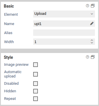
Basic properties
Basic settings for Basic properties
The basic properties name, width and hidden are available for all form elements.

| Name | Description |
|---|---|
| Element | You can change an element's type via the drop down menu. For example, you could change a single input field into a multi line input field (textarea). The element types that are available depend on the original element type. Container and fieldsets cannot be changed into other form elements. |
| Name | Technical name of the elements. Only letters and numbers are allowed. The name is used, for example, to refer to the form field during workflow processing. To change the name and update the references to this form element at the same time the Rename form elements function should be used. |
| Alias | An alternative technichal name that may contain any character. |
| Width | The width of the form element, relative to other elements in the same row. For example, when you place three elements next to each other in the same row and set their widths to 10, 10 und 30, they will take up 20% (=10/(10+10+30)), 20%, and 60% of the entire width of the row, respectively. |
| Hidden | When enabled, the form element is hidden and will not be visible to the user. If you wish to hide or show the element dynamically, depending on the value of another element, use the hidden if condition or a JavaScript function such as jQuery.fn.visible. |
| Disabled | When enabled, the value of the form element cannot be edited. Also, the value will not be transmitted to the server when the user submits the form. For text input fields you can optionally decide whether you want to transmit the value when the form is submitted. |
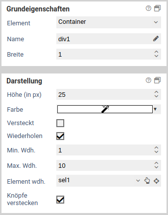
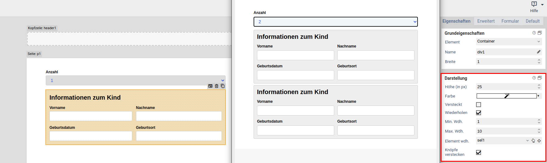
| Repeat | When enabled, the user can create an arbitrary amount of repetition (copies) of the element. This is useful, for example, when the user needs to enter one or more email addresses. Please note that repeated elements cannot be nested: A container or fieldset that is repeated cannot contain elements that are also repeated. |
| Min repetitions | Minimum number of repetition that must exist. When this limit is reached, the user cannot delete any more repetitions. This limit is also the initial number of repeated elements that are displayed when the form is opened for the first time. |
| Max repetitions | Maximumer of allowed repetitions. When this limit is reached, the user cannot add anymore more repetitions. |
| Repeat trigger | When an element is selected, the value of that element determines how many repetitions are created. For example: A select element or input field lets the user enter the number of children they have. A fieldset with the personal data of a child is marked as repeated, and its trigger is set to the select or input field. Now, when the user changes the number of children, the appropriate number of fieldsets are created automatically. |
| Hide buttons | Available only when a repeat trigger was set. When enabled, the plus and minus buttons for adding and removing elements are hidden. This is useful when the number of repetitions should depend only on the value of another field and the user should not be able to alter the number of repetitions directly. |
Alias
When a form is submitted, the entered data is transmitted as key value pairs (element name value. The name must contain only letters and number. You can use the name of an element as form variables during workflow processing to refer to the transmitted values. The name is also used when sending the submitted data to other system via an interface. Sometimes, when you need to integrate external third-party system into FORMCYCLE, the external system may require a particular name for a form field, which may include special character. In this case, you can use the alias name, which allows all special characters to be entered.
When an alias was set, you can use that alias instead of the orignal name to refer to the form field.
Renaming form elements
If form elements are simply renamed, parts of the JavaScript or form workflow may no longer work correctly because they reference the form element by its name. By clicking on the pencil icon next to the form element name, the form element can be renamed, updating all references to the form element at the same time. You can select where to search for references to the form element:
- in the JavaScript area of the form
- in the CSS area of the form
- in JavaScript form files
- in CSS form files
- in the workflow of the form
- for elements on the property "Value"
- for elements on the property "Buttons"
- for elements on the property "Options"
If a reference is found in the selected areas, it will be updated with the new name.
You need to pay special attention to JavaScript code. Common ways of referencing a form element are taken care of. The name in usual selectors such as $('[name="tfEmail"]') is replaced with the new name. However, uncommon selectors such as document.getElementByName("tfEmail") are not replaced.
Moreover, please note that it is not possible, even in principle, to replace all references in a complex programming language such as JavaScript. For example, the name may be be taken from a variable, from a computation or from an external data source: ["EMail", "Vorname", "Nachname"].forEach(name => $(`[name="tf${name}"]`).clear()). Such cases require you to adjust the JavaScript manually. If you have forms with complex JavaScript code, you should always evaluate the effects of renaming a form element beforehand.
This form element possesses the following additional properties for the section Basic properties.
| Name | Description |
|---|---|
| Image preview | When checked, displays a thumbnail of the file the user selected. For image files this is a scaled down version of that image. For other files, a file icon is shown. |
| 7.0.11+ Automatic Upload | When enabled, selected files are uploaded automatically in the background. This can help to reduce the time it takes to submit the form. |
Constraints
Basic settings for Constraints
The constraints panel contains options to check the value of form fields, when form fields should be visible and when they can be edited. Some constraints are available only for some element, see the list of element..
Properties
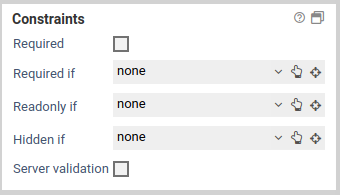
| Name | Description |
|---|---|
| hidden if | Hides the form fieldm when a certain conditions is satisfied. |
| visible if | Makes a form field that has been hidden visible again, when a certain condition is satisfied. |
| read-only if | Locks a form field and disallows any input, when a certain condition is satisfied. |
| editable if | Make a form field that has been set to read-only editable again, when a certain condition is satisfied. |
| required | When this option is activated, a value must be entered for the form field. Conditions set under required if are ignored when this option is activated. |
| required if | Marks a form field as a required field, when a certain condition is satisfied. |
| required group | Available only when the form field is a required field. Specifies the required group the form field should belong to. When two or more form fields belong to the same group, at least one of these form fields needs to be filled out, all other fields may remain empty. 7.2.0+ When using a user-defined formula as a condition, this option has no function. No server-side validation can be performed in this case. |
Condition

You can change a form field's visibility and read-only state depending on the value of another form element.
7.2.0+ You can also choose formula, which lets you enter a custom formular with your own logic. That formula may reference more than one form element. Please note the following:
- The formular must be a valid JavaScript expression, e.g. $("[name='tfFirstName']").val() === "John".
- JavaScript statements cannot be used, e.g. var x = $("[name='tfFirstName']").val() ; x === "John" will not work.
- If still necessary, you can wrap statements in an IIFE (immediately invoked function expression): (function(){var x = $("[name='tfFirstName']").val() ; return x === "John"})()
- You can use form variables to access form values more easily. The variable is replaced with a JavaScript value container the value of the form element. For example: [%tfFirstName%]==="John"
- If the value represents a valid floating point number, the placeholder is replaced with a JavaScript number value, e.g.: [%tf1%]+[%tf2%] < 10 (Sum of both fields < 10). Otherwise, the value is replaced with a JavaScript string, e.g.: [%tf1%].toUpperCase() === "JOHN" (Field equals "John", case insensitive).
- The value depends on the type of form element:
- For checkboxes, the value when checked is used, as entered in the form designer (default: on).
- For input fields and text areas, the value as entered by the user is used.
- For select elements displayed as combo boxes or list boxes, the technical value of the selected option is used.
- For select elements displayed as checkboxes or radio buttons, the sum of all technical values of all selected options is used. This applies to select elements displayed as questions as well.
- For upload elements, the file name of the selected fle is used.
- For appointment pickers, the date and time as shown by the appoinment picker is used.
- You can also use other variables such as system variables: e.g. [%$PROJECT_TITLE%] === "My form".
- NO server validation is performed for custom formulas, even if that option is enabled for a form element.
Once you have selected a form element, the following conditions are available for the options hidden if, visible if, read-only if, editable if, and required if:
- has a value
- has no value
- equals
- not equals
- lower than
- lower equal than
- greater than
- greater equal than
- between
- regular expression
| Condition | Description |
|---|---|
| has a value / has no value | The conditions evaluates to true when the value of the form field is (not) empty. In particular, having a value mean the following for different form elements:
|
| equals | The condition evaluates to true when the value of the form field equals the given value. Comparisons are case-sensitive. |
| not equals | The condition evaluates to true when the value of the form field does not equal the given value. Comparisons are case-sensitive. |
| lower than / lower or equal than | The condition evaluates to true when the value is lower (or equal) than the specified value. |
| greater than / greater or equal than | The condition evaluates to true when the value is greater (or equal) than the specified value. |
| between | The condition evaluates to true when the value is between the specified range, inclusively. The interval must be entered with a dash (-), for example 2-10. Negative numbers must be enclosed in parentheses, eg. (-10) - (- 5). |
| regexp | The condition evaluates to true when the value matches the specified regexp. |
Clear or reset automatically
For the properties hidden if and read-only if, you may choose whether the form field should be cleared or reset automatically when the form field ist hidden or disabled. Clearing a form field means that its value is removed, eg. deleting the entered text for an input field or unchecking all checkboxes for a select field. Resetting a form field, on the other hand, refers to changing its value back to the original or initial value it had when the form was openend. In case the form was opened for the first time and not submitted yet, the original value is the value as set in the Xima® Formcycle Designer. Otherwise, when the form was already submitted and is opened in the inbox, the original value is the most recently submitted (saved) value.
For example, consider the case of entering an address. The user can choose between a physical address and a post-office box, and only one input field is visible depending on the user's choice. When the form is submitted, a value should be send only for one of both fields. By selecting the empty automatically options, the input field post-office box will be cleared automatically when the user selects a physical address.
When an element is cleared or reset, all the elements it contains are cleared or reset as well. This applies to form elements of type page, container, and fieldset.
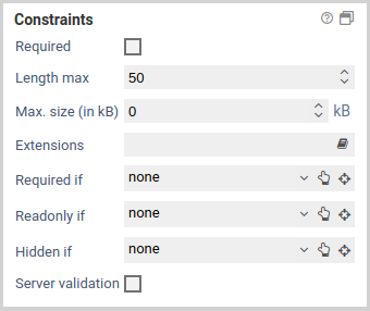
This form element possesses the following additional properties for the section Constraints.
| Name | Description |
|---|---|
| Max. size | Maximum size for the uploaded file in kilobytes. |
| Extensions | Comma separated list of allowed file extensions the user may upload. Only files with the given extensions may be uploaded by users. File extenstions may start with or without a dot. For example pdf or .pdf will restrict uploads to PDF files. |
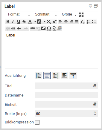
Label
Basic settings for Label
This property defines the label text of an element. A label is the text above, below or to the right or left of an element. Not every element has got this property.
| Name | Beschreibung |
|---|---|
| Label | Value of the label. This is the text that is displayed next to the element. |
| Alignment | Specifies the position (left, right, above, below) of the label. |
| Width (in px) | Distance between label and the element. Applies only when the alignment is set to left. |
| Placeholder | Placeholder text, applies only to input fields. |
| Title | Tooltip of the item (the HTML title attribute). |
| Unit | Text that after an element. Usually this is used for units, such EURO or km. |
This form element possesses the following additional properties for the section Label.
| Name | Description |
|---|---|
| File name | When no name is specified, the uploaded file will be saved with its original name. Otherwise, this name is used for saving the file on the server. |
| 7.0.11+ Compress images | When enable, uploaded images are scaled and converted to the target format. The file that was originally uploaded is discarded, only the compressed image is saved. Should the compression fail unexpectedly (such as when the server does not support the file format), the original file is saved instead. |
| Max. width | The maximum width of the compressed image. The image is scaled by an amount such that this width is not exceeded. If you enter a value of 0, no restriction applies. |
| Max. height | The maximum height of the compressed image. The image is scaled by an amount such that this height is not exceeded. If you enter a value of 0, no restriction applies. |
| Format | Target format of the image. When you select automatic, the system attempts to preserve the original format of the uploaded image. |
| As PDF | When enabled, a PDF with the images is created, assuming a resolution of 150 dpi for the page size of the PDF. |
CSS classes
Basic settings for CSS classes
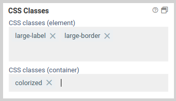
7.0.11+ This property lets you select one or many CSS classes for an element. You can enter any class name you want, and you do not have do include a dot at the beginning (an initial dot is supported for backwards compatibility). In addition, classes defined in CSS files are suggested as autocomplete suggestions. You can add classes to the form element itself, and you can also add classes to the div container of the form element.
CSS classes on the input element are added directly to the HTML input element. This is the same behavior as in previous versions when you added CSS classes to an element.
CSS classes configured for the container, on the other hand, are added to the HTML container element which contains the input element. This is a new feature introduced in 7.0.13. It makes it possible, for example, to style the label of a form element, which is located in the same container as the input element.
Until 7.0.10+ : The available CSS classes are read from the CSS in the CSS tab and from the selected CSS theme. When you select or deselect a class, the changes are applied immediately and any layout or design changes are visible in the form. You can also filter the available classes by using the filter at the end of the list.
This form elements does not possess any additional settings for the section CSS classes.
Attributes
Basic settings for Attributes
The panel attributes lets you add custom attributes to the corresponding HTML elements of each form element. You can access them with JavaScript later, or add existing HTML attributes such as the attribute type for <input> elements.
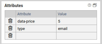
Adding an attribute
To add an HTML attribute, just enter the name and the value of the attribute into one of the columns. A new, empty column will be added automatically.
Deleting an attribute
Click on the icon to the left to delete an attribute.
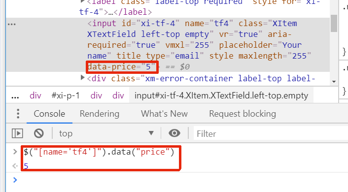
Accessing data attributes via JavaScript
If you want to add custom data to an element, use the prefix data- for the name. Additionally, the attribute name should contain no uppercase letters and use dashes to separate words. For example, data-serial-version is a good data attribute, dataSerialVersion is not. When accessing these attributes via JavaScript, remove the dashes and capitalize the first letter of each word.
Assuming the attribute data-serial-version was set to 1aFXc for the element tfSerialVer, you can access this data as follows:
console.log("Serial version is:" , serialVersion);
This form elements does not possess any additional settings for the section Attributes.
Available only if
Basic settings for Available only if
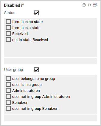
The property Available only if controls whether elements are displayed or not depending on the current state or user.
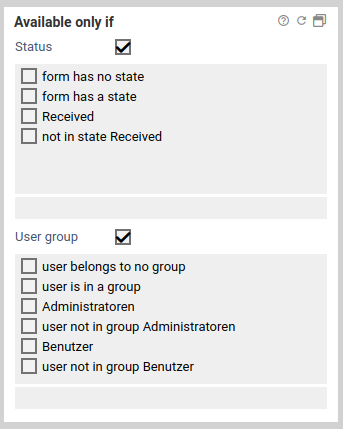
When only one state or a user group is selected, the form element is displayed only when the form is in the selected state or viewed by a user of the selected user group. For each state and user group there is also the opposite option to display a form element only when it is not in the selected state or not viewed by the selected user group. For example, when you want display a form element only when a user fills out the form for the first time, you can select the option no state.
If both a state and a user group are selected, the form element is displayed only when the form is both in the selected state as well as opened by a user belonging to one of the selected user groups.
This form elements does not possess any additional settings for the section Available only if.
Read-only if
Basic settings for Read-only if
The property read-only if determines whether an element is read-only or not.
If only one state or one user group has been selected, the form field can only be filled out, clicked at, or selected when the form is not in the selected state, or the user currently signed in is not a member of this group. For each state and user group there is also the opposite option to make a form element read-only when it is not in the selected state or not viewed by the selected user group.
When both a state and a user group are selected, the form field item can only be filled out, clicked at, or selected when the form is both not in the selected state and the user currently signed in does not belong to the selected user group as well.
This form elements does not possess any additional settings for the section Read-only if.
Other
Basic settings for Other
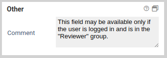
You can add a comment for internal use that will not appear anywhere in the form.
This form elements does not possess any additional settings for the section Other.